Finish palette
Materials and finishes create a tactile sense of character within our environments. Material selection and color strategy are informed by our design characteristics and a consistent point of view. These themes represent a coherent experience that can be shared by clients and IBM employees globally. The workplace should feel symbiotic, illuminating, welcoming, localized and connected. We have identified two categories of finishes that work together to create a flexible system to meet any project need—base and accent.
Base finishes
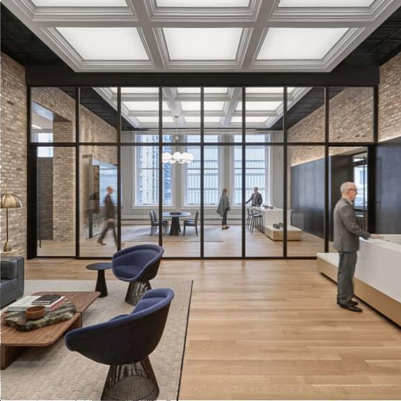
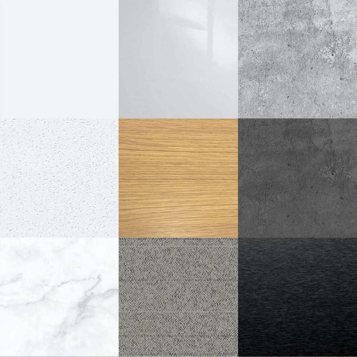
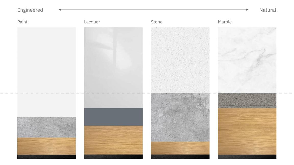
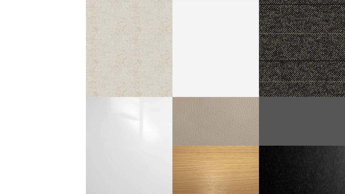
Base finishes represent the dominant materials within a space. Applications might include flooring, ceiling and wall treatments, or millwork. IBM environments may be characterized by both natural and engineered materials. Embracing the concept of duality, our base finishes maintain tension and contrast between natural and engineered substrates. Use of wood should appear in all environments to maintain a sense of warmth and continuity. Material specification may vary based on project needs, design concept and budget.
Lead with white
At least 50% of the base finishes should be light in value. Spaces should always lead with white to achieve an atmosphere that’s positive and optimistic. Material choice is flexible based on budget and design intent. Predominantly light interiors provide a backdrop for natural wood tones, accent colors, feature elements and environmental graphics to be highlighted.
Accent finishes
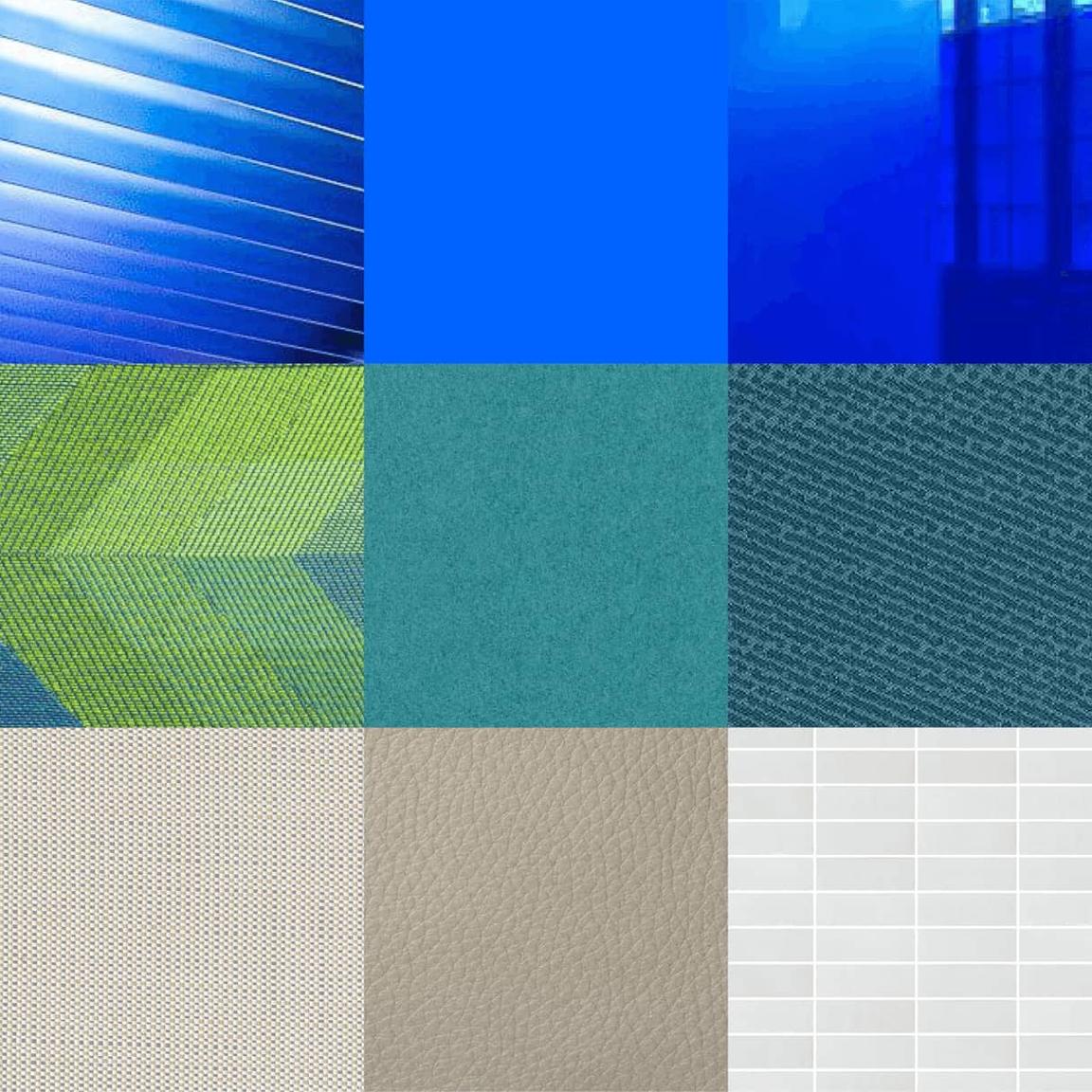
Accent finishes add texture, detail and color—creating focal points within an environment. Applications may include textiles, carpet, upholstery or furniture.
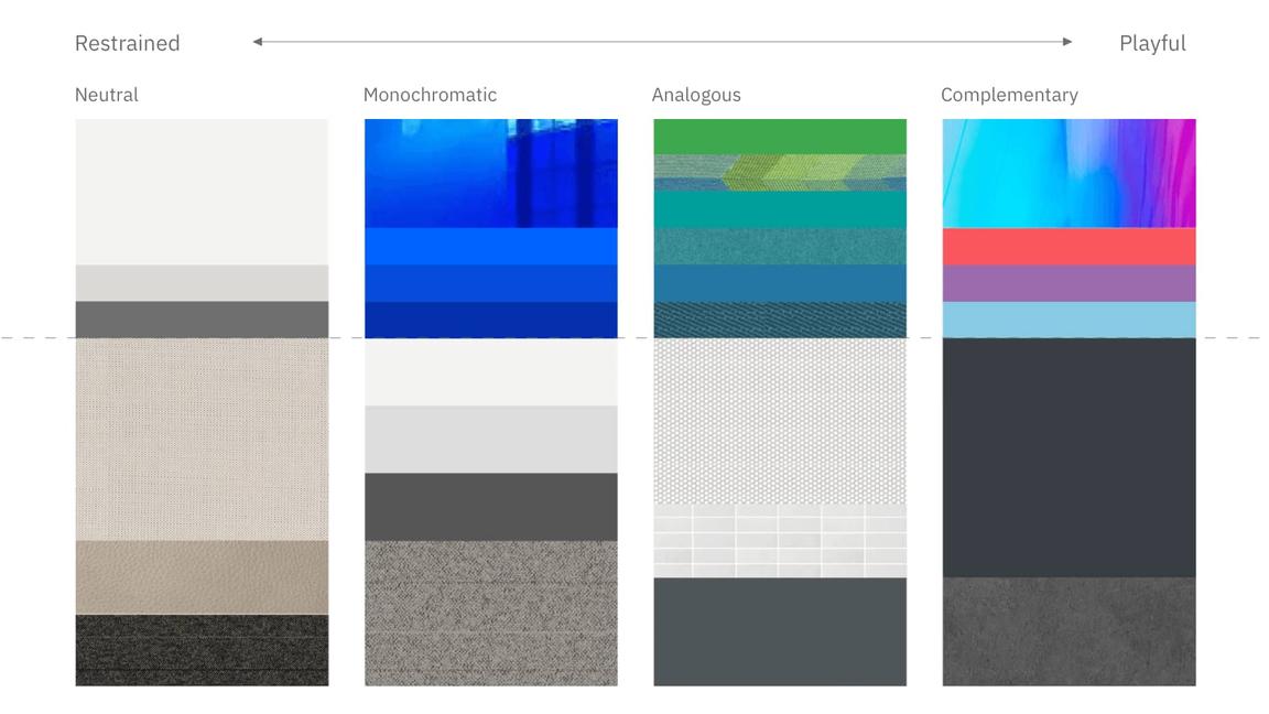
Use color with purpose. Color should be integrated into accent palettes with intention. Neutral, monochromatic, complementary and analogous palettes may be applied based on space type. Accent colors should work within IBM’s brand palette. Additional colors may be introduced on a case-by-case basis where appropriate. Learn more about the IBM color palette.
Texture and dynamism
Accent finishes add texture and dynamism to our spaces. The overall impression should be welcoming and warm to help every employee, client and visitor experience the hospitality of IBM. Integration of local context, geography and culture through material, pattern and texture creates a sense of place and belonging within the workplace. By building a connected environment, IBM celebrates individual and global communities of IBM employees and their clients.
Palette examples
Monochromatic
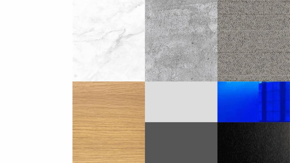
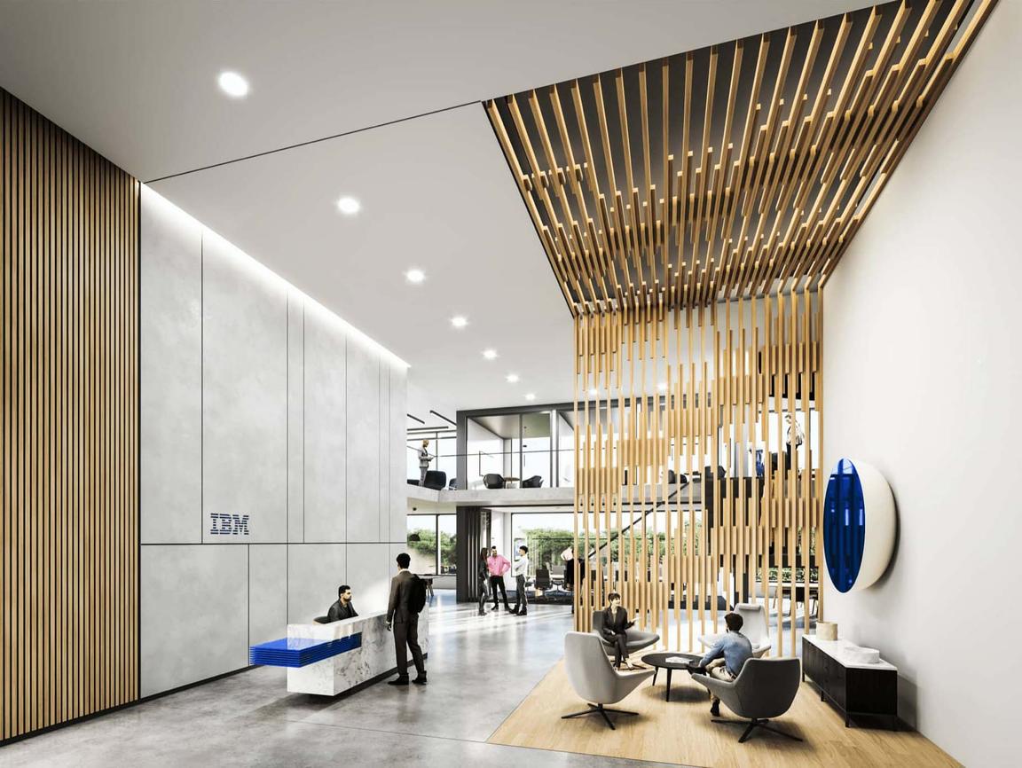
Welcome and Arrival zones should feature thoughtful blue accents within architectural finishes.
Blue serves as another expression of our brand identity. This monochromatic treatment showcases blue in unique and unexpected details. Blue should be applied with intention and treated with the same level of thoughtfulness as our logo.
The tonal nature of the surrounding finishes and textures accentuate a restrained use of blue, creating a focal point within the reception desk. A natural wood finish balances the cool gray tones within the flooring and walls.
Analogous
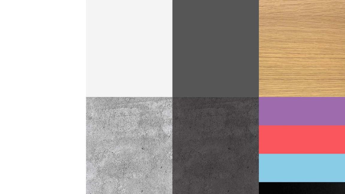
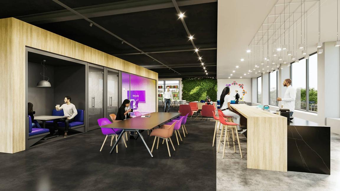
Embracing diversity, Connect and Collaborate spaces should use a broader spectrum of color.
Vibrant accent colors activate our Collaboration areas. Balance color selections with neutral surrounding finishes and furniture. Use wood within walls, flooring or furniture to maintain continuity with other space types. Coordinate color selections with adjacent environmental graphics and signage. Learn more about brand expression.
Neutral
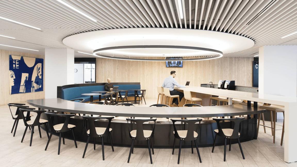
Neutral material palettes support dynamic applications of texture, light and art. Neutral environments often use dynamic texture and pattern that establish movement and tension within the space. The example shown here is a linear ceiling system that’s interrupted with curvilinear geometry and seating configurations.
The use of color in the space is minimal, creating a focal point for fine art or branded elements. Use neutral palettes to balance moments of high saturation and energy.
Glass and metal
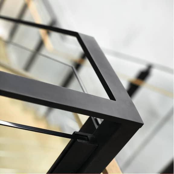
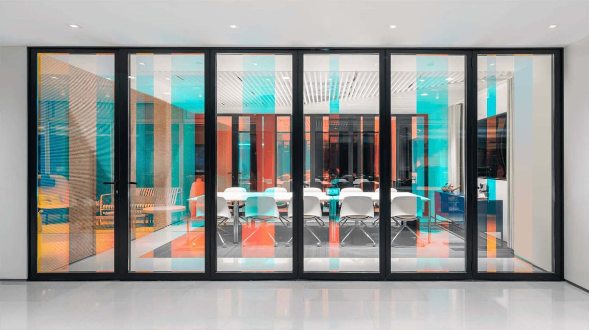
Glass helps to express the openness and transparency of an IBM environment. Glass also brings natural light deep into the environment, enhancing employee wellness and productivity. Clear, translucent and back-painted glass complement the materials in IBM’s environmental toolkit. Low-iron glass is recommended for clear glass applications.
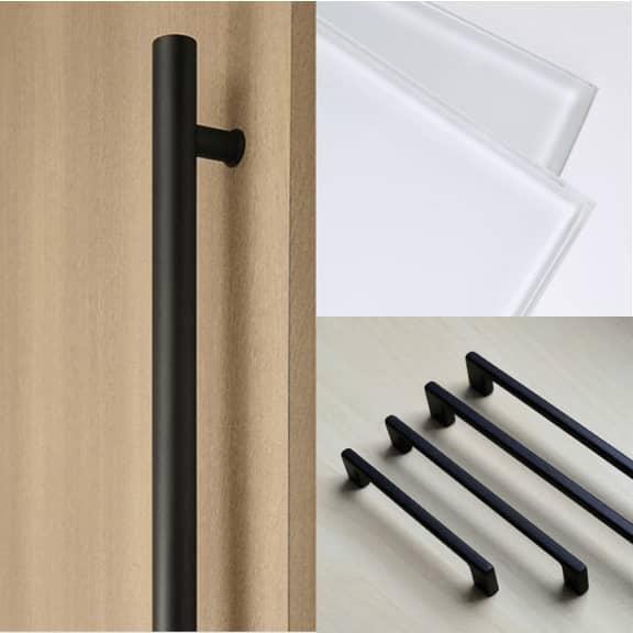
Butt-joint detailing provides a clean, modern and seamless appearance. Metal accents can be a combination of matte charcoal, matte aluminum or satin stainless steel. Demountable partitions and office fronts are key applications for flexibility of use. A dark charcoal is preferred for demountable partition frames and door hardware. A matte finish should be used for these applications. Matte black, matte aluminum or satin stainless steel can be used for cabinet hardware.
