Example: Pie Chart
We will now use a different dataset to explore some other visualization types. The dataset is customer_subset, which is a hypothetical data file that contains information about customers.
We will first create a pie chart to check the proportion of customers in different geographic regions.
- Add a Statistics File source node that points to customer_subset.sav.
- Add a Graphboard node and open it for editing.
- On the Basic tab, select Geographic indicator .
- Select Pie of Counts.
- Click Run.
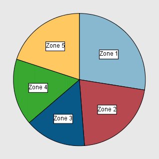
We can observe the following:
- Zone 1 has more customers than in each of the other zones.
- Customers are equally distributed among the other zones.