Example: Boxplot
A boxplot is another useful visualization for viewing how the data are distributed. A boxplot contains several statistical measures that we will explore after creating the visualization.
Note: This example uses Employee data.
- Add a Graphboard node and open it for editing.
- On the Basic tab, select Gender and Current Salary . (Use Ctrl+Click to select multiple fields/variables.)
- Select Boxplot.
- Click Run.
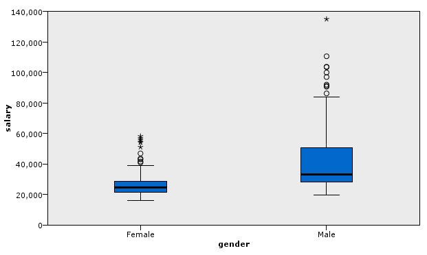
Let's explore the different parts of the boxplot:
- The dark line in the middle of the boxes is the median of salary. Half of the cases/rows have a value greater than the median, and half have a value lower. Like the mean, the median is a measure of central tendency. Unlike the mean, it is less influenced by cases/rows with extreme values. In this example, the median is lower than the mean (compare to Example: Bar Chart with a Summary Statistic ). The difference between the mean and median indicates that there are a few cases/rows with extreme values that are elevating the mean. That is, there are a few employees who earn large salaries.
- The bottom of the box indicates the 25th percentile. Twenty-five percent of cases/rows have values below the 25th percentile. The top of the box represents the 75th percentile. Twenty-five percent of cases/rows have values above the 75th percentile. This means that 50% of the case/rows lie within the box. The box is much shorter for females than for males. This is one clue that salary varies less for females than for males. The top and bottom of the box are often called hinges.
- The T-bars that extend from the boxes are called inner fences or whiskers. These extend to 1.5 times the height of the box or, if no case/row has a value in that range, to the minimum or maximum values. If the data are distributed normally, approximately 95% or the data are expected to lie between the inner fences. In this example, the inner fences extend less for females compared to males, another indication that salary varies less for females than for males.
- The points are outliers. These are defined as values that do not fall in the inner fences. Outliers are extreme values. The asterisks or stars are extreme outliers. These represent cases/rows that have values more than three times the height of the boxes. There are several outliers for both females and males. Remember that the mean is greater than the median. The greater mean is caused by these outliers.