Example: Paneled Dot Plot
Like a histogram, a dot plot shows the distribution of a continuous numeric range. Unlike a histogram, which shows counts for binned ranges of data, a dot plot shows every row/case in the data. Therefore, a dot plot provides more granularity compared to the histogram. In fact, using a dot plot may be the preferred starting point when analyzing frequency distributions.
Note: This example uses Employee data.
- Add a Graphboard node and open it for editing.
- On the Basic tab, select Current Salary .
- Select Dot Plot.
- Click the Detailed tab.
- In the Panels and Animation group, choose gender from the Panel Across drop-down list.
- Click Run.
- Maximize the resulting output window to view the plot more clearly.
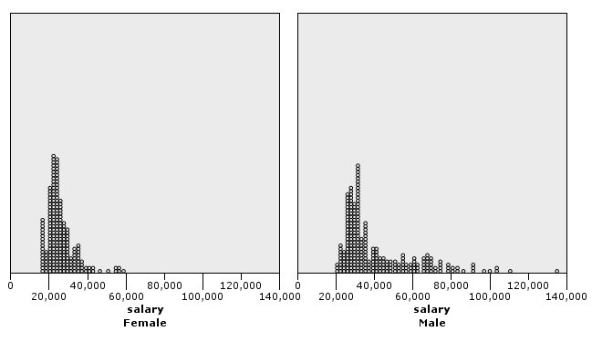
Compared to the histogram (see Example: Paneled Histogram ), we can observe the following:
- The peak at 20,000 that appeared in the histogram for females is less dramatic in the dot plot. There are many cases/rows concentrated around that value, but most of those values are closer to 25,000. This level of granularity is not apparent in the histogram.
- Although the histogram for males suggests that the mean salary for males gradually declines after 40,000, the dot plot shows that the distribution is fairly uniform after that value, to 80,000. At any one salary value in that range, there are three or more males who earn that particular salary.