Example: Stacked Bar Chart with a Summary Statistic
We will now create a stacked bar chart to see whether the difference in mean salary between males and females is subject to job type. Perhaps females, on average, make more than males for certain job types.
Note: This example uses Employee data.
- Add a Graphboard node and open it for editing.
- On the Basic tab, select Employment Category and Current Salary . (Use Ctrl+Click to select multiple fields/variables.)
- Select Bar.
- From the Summary list, select Mean.
- Click the Detailed tab. Note that your selections from the previous tab are reflected here.
- In the Optional Aesthetics group, choose gender from the Color drop-down list.
- Click Run.
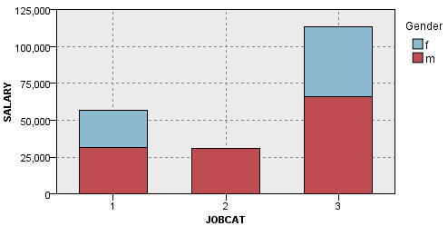
We can observe the following:
- The difference in mean salaries for each job type does not appear to be as great as it was in the bar chart that compared the mean salaries for all males and females. Perhaps there are varying number of males and females in each group. You could check this by creating a bar chart of counts.
- Regardless of job type, the mean salary for males is always greater than the mean salary for females.