Example: Bar Charts on a Map
This example shows how revenue breaks down by product in each continent.
Note: This example uses worldsales.
- Add a Graphboard node and open it for editing.
- On the Basic tab, select Continent, Product, and Revenue. (Use Ctrl+Click to select multiple fields/variables.)
- Select Bars on a Map.
- Click the Detailed tab.
When using more than one field of a specific type, it is important to check that each field is assigned to the correct slot.
- From the Categories drop-down list, choose Product.
- From the Values drop-down list, choose Revenue.
- From the Data Key drop-down list, choose Continent.
- From the Summary drop-down list, choose Sum.
- In the Map Files group, click Select a Map File.
- In the Select Maps dialog box, check that Map is set to Continents and Map Key is set to CONTINENT.
- In the Compare Map and Data Values groups, click Compare to ensure the map keys match the data keys. In this example, all of data key values have matching map keys and features. We can also see that there is no data for Oceania.
- On the Select Maps dialog box, click OK.
- Click Run.
- Maximize the resulting output window to see the display more clearly.
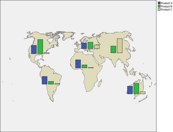
We can observe the following:
- The distribution of total revenue across products is very similar in South America and Africa.
- Product C generates the least revenue everywhere except in Asia.
- There is no or minimal revenue from Product A in Asia.