A typeface
with a story.
- Distinct Details
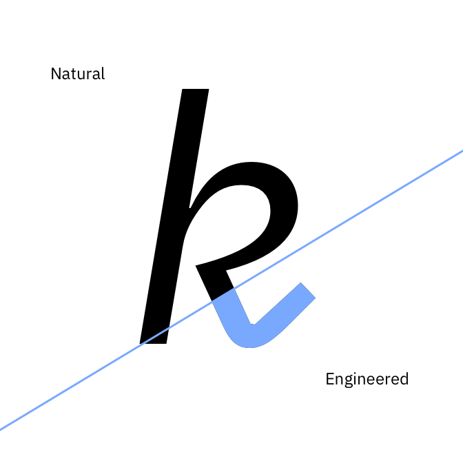
- Natural and Engineered
- The Right Choice
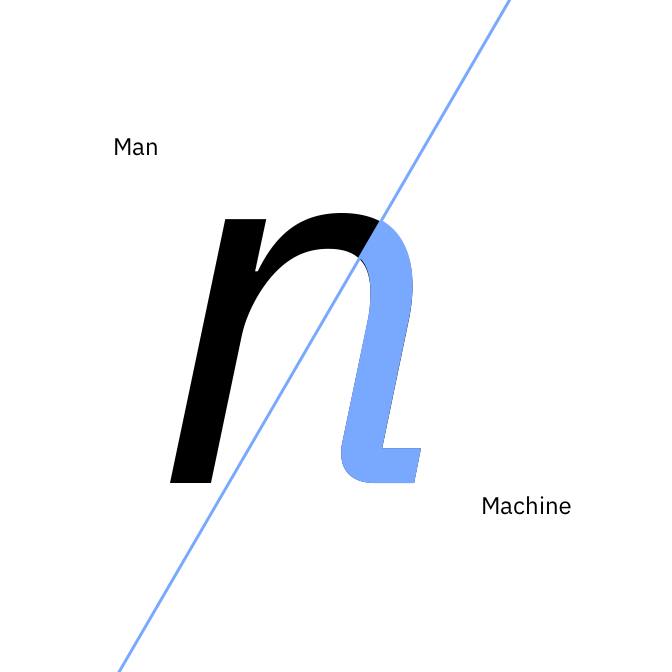
Mankind and Machine
When we set out to create a typeface that was unmistakably IBM, our own history was our greatest source of inspiration. IBM has always served as a medium between mankind and machine. Between the natural and the engineered. The emotional and rational. The classic and the cutting-edge. Our most important job is to help humanity and technology move forward together. IBM Plex® brings these relationships to life through letterforms.
![[↑] The IBM Research Center in Yorktown Heights, NY: Eero Saarinen’s design contrasted a spaceship-worthy glass exterior with a warm, organic stone wall inside. This balance of natural and the engineered is the backbone of IBM Plex.](../assets/images/concept/IBM-plex_armonk_B5.jpg)
[↑] The IBM Research Center in Yorktown Heights, NY: Eero Saarinen’s design contrasted a spaceship-worthy glass exterior with a warm, organic stone wall inside. This balance of natural and the engineered is the backbone of IBM Plex.


![[↑] The colorful IBM System/360, 1960s.](../assets/images/concept/IBM_Plex_concept_360_B5.jpg)
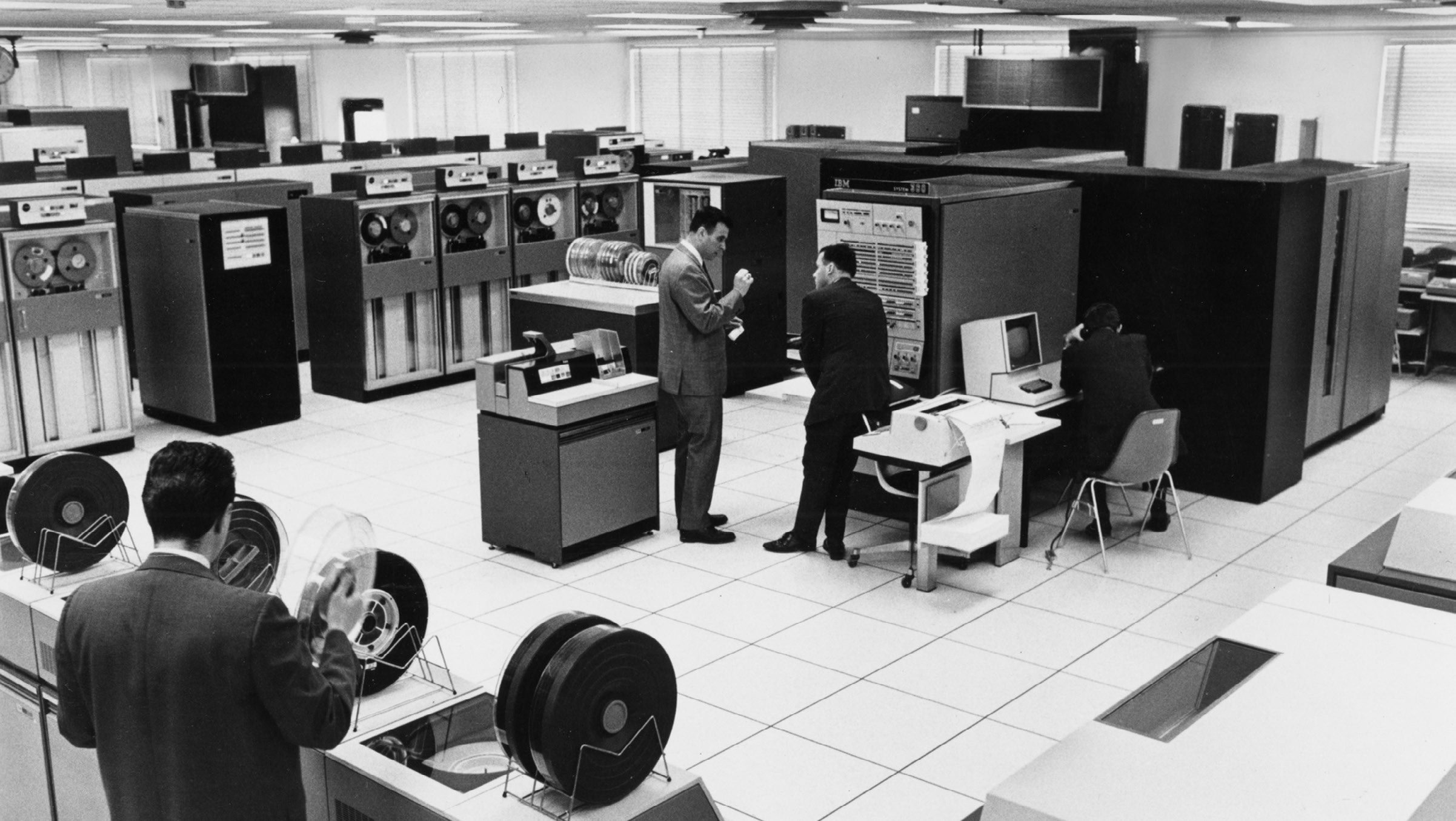
[↑] The colorful IBM System/360, 1960s.

![[↑] IBM Cloud data center in Dallas, Texas. One of nine in Texas alone.](../assets/images/concept/IBM_Plex_Concept_Q_03.jpg)
[↑] IBM Cloud data center in Dallas, Texas. One of nine in Texas alone.

The right choice
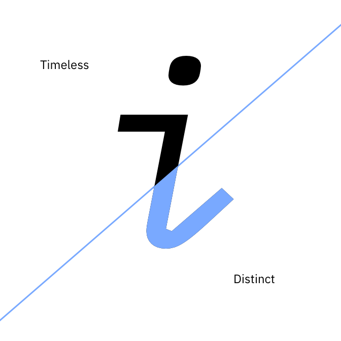
We needed Plex to be a distinctive, yet timeless workhorse—an alternative to Helvetica Neue for this new era. The Grotesque style was the perfect fit. Not only do these typefaces balance human and rational elements, the Grotesque style also came about during the Industrial Age (when IBM was born).

Plex and Helvetica: It’s easy to see
the rationalized, horizontal terminals
of Helvetica compared to the Grotesque-inspired, angled terminals of Plex.

Plex and Trade Gothic: The double decker “g” is characteristic of the Grotesques, yet it’s unexpected in modern typefaces. We adopted this style to make Plex distinctive and more humanist.

Plex and Franklin Gothic: Plex has
open-angled terminals and open counter forms to improve legibility at small sizes—more details inspired from the grotesques styles.


