Infograms
Infograms are information graphics in the style of IBM pictograms. Unlike the charts found in the IBM pictogram library, which are used to illustrate the idea of data visualization, infograms are depictions of real data. The infogram is adapted for small spaces, works well as tertiary or marginal data, and stylistically pairs with productive pictograms in visual harmony.
Resources

Infogram types
Currently, there are six infogram types. Each type has been selected to visually represent actual data in various settings. For example, the bar, line and multiline infogram types communicate one point of data, but do so in a way that can give a visual snapshot, depicting an upward or downward trend, leading to that singular data point. Each type is suited, in its own way, to a targeted and instant visual comprehension of the data represented.
Bar

Line

Multiline

Scatter plot

Circular gauge

Donut

Foundation
Draw infograms on the 32px x 32px master grid to maintain consistent positioning and proportions across the IBM pictogram set.

Standard grid

Radial grid
Construction
Use the the grid lines as your basic guideline to snap the stroked linework of your design elements. We recommend making adjustments along the way to ensure the right amount of details work at every size. The grid contains 1px padding. This padding ensures that the pictograms retain their desired appearance when exported. Only extend artwork into the padding for additional visual weight when necessary.

Strokes and data points
Infogram line weight is consistent with the line weight used in IBM pictograms, except for the highlighted data point. The highlighted data point uses a 1.5x stroke weight compared to the rest of the infogram, as well as a color fill. For circular gauge charts, a dotted line represents an inactive portion of the data sum.
| Element | Specifications |
|---|---|
| Data line | 0.72px stroke |
| Dotted line | 0.72px stroke, 2px gap |
| Regular data point | 0.72px stroke |
| Highlighted data point | 1.08px stroke, color fill |
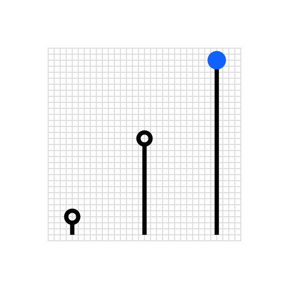
Standard grid infograms
When drawing standard grid infograms, data should be constrained to a 28px height within the grid. Data points should be placed within the 28px construction area proportional to their value. When a proportional value results in a non-integer number, round it up or down to the nearest integer and snap the line to the grid.

Raw data

Approximated data
| Carbon bar chart | IBM infogram |
|---|---|
| 20% | 6px |
| 40% | 11px |
| 60% | 17px |
| 80% | 22px |
| 100% | 28px |

Scale the number of data points on the chart so they are clearly delineated and aligned to the grid.

Don’t place so many data points on the grid that the points overlap or appear crowded.
Radial grid infograms
Infograms can be constructed on a radial grid, where necessary, based on the chart type. Unlike rules for IBM pictogram construction, infograms drawn on a radial grid should prioritize data accuracy over snapping to the grid. Occasionally, data points and line terminals will necessarily occur between grid lines.
Radial charts are typically used to display data as percentages of a whole. This data is mapped on a radial grid that breaks the circumference into 1% increments. In circular gauge charts, a solid line represents the main numerical data value of the chart, while a dotted line represents the remaining sum.

Donut chart

Circular gauge chart
Typography
Infograms contain built-in numerical values of the hero statistic to give the chart meaning. Typography should be set in IBM Plex® Sans Mono at a 6px scale. The baseline of this text should align to the 32px grid with special care taken so that any portion of the typography does not extend beyond the boundary of the grid.

Left aligned

Centered

Right aligned
Kerning
Because of the inherent kerning characteristics of monospace type, decimal points will need to be adjusted for optical balance. Decimal kerning should be set to -150 units on both sides.

Optically align the decimal within the quantifying number.

Don’t set decimal kerning to default values.
Color and emphasis
Color is an important tool for clearly communicating data within a chart. Be sure to follow color contrast rules for accessibility when coloring infograms. Highlighted data points and values should be directly associated with their quantifier. One to three color families can be used when coloring infograms, though single-color families are recommended. Make sure the chosen colors meet accessibility requirements for contrast and color blindness.

Monochrome infogram

Two-color infogram

Use fills to emphasize hero data points regardless of chart color use.

Don’t rely on color alone, even in multicolor applications.

Ensure at least 3:1 color contrast ratio between all the elements in two-color infograms.

Don’t use colors that do not ensure a 3:1 color contrast ratio.

Ensure the color of the quantifier is the same color as the hero data point.

Don’t use a quantifier color that corresponds to inactive data.