Texture and materials
IBM has always served as a medium between mankind and machine. This dynamic can be embodied in everything from the design of our products to our choice of materials. The contrast of the organic and engineered, soft and hard, warm and cool, or light and dark, creates visual tension and hierarchy in our experiences. Explore how provocative choices in material or texture can create drama within the environment—or serve to focus the attendee in critical moments.
Visual inspiration
The images below illustrate a broad range of material choices that support a strong sense of contrast. These principles apply to both permanent architecture, temporary event spaces, fixtures, furniture, and signage. Consider how light, projection, content, and digital technologies can influence—or be influenced by—material choices.
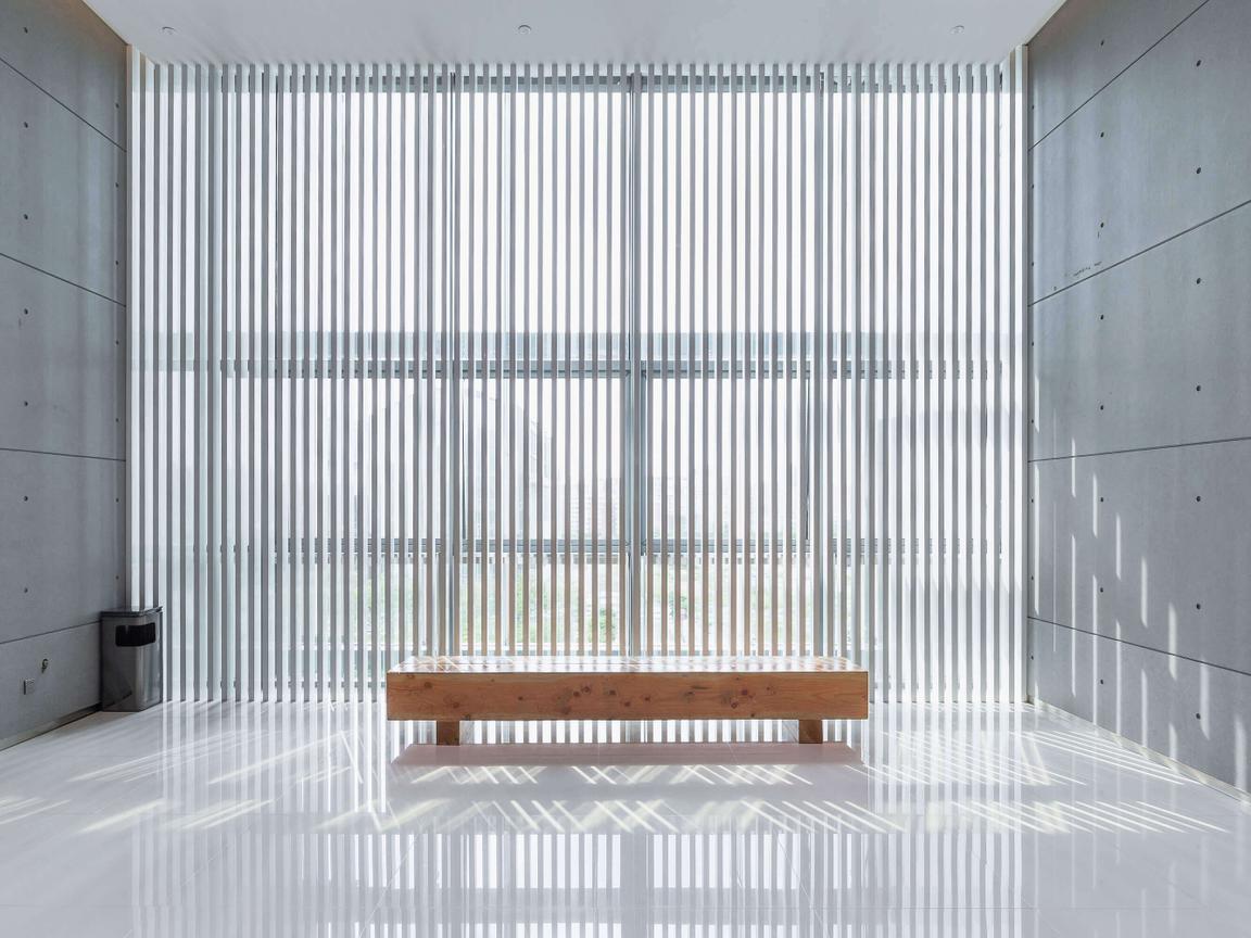
Contrast between cool and warm materials
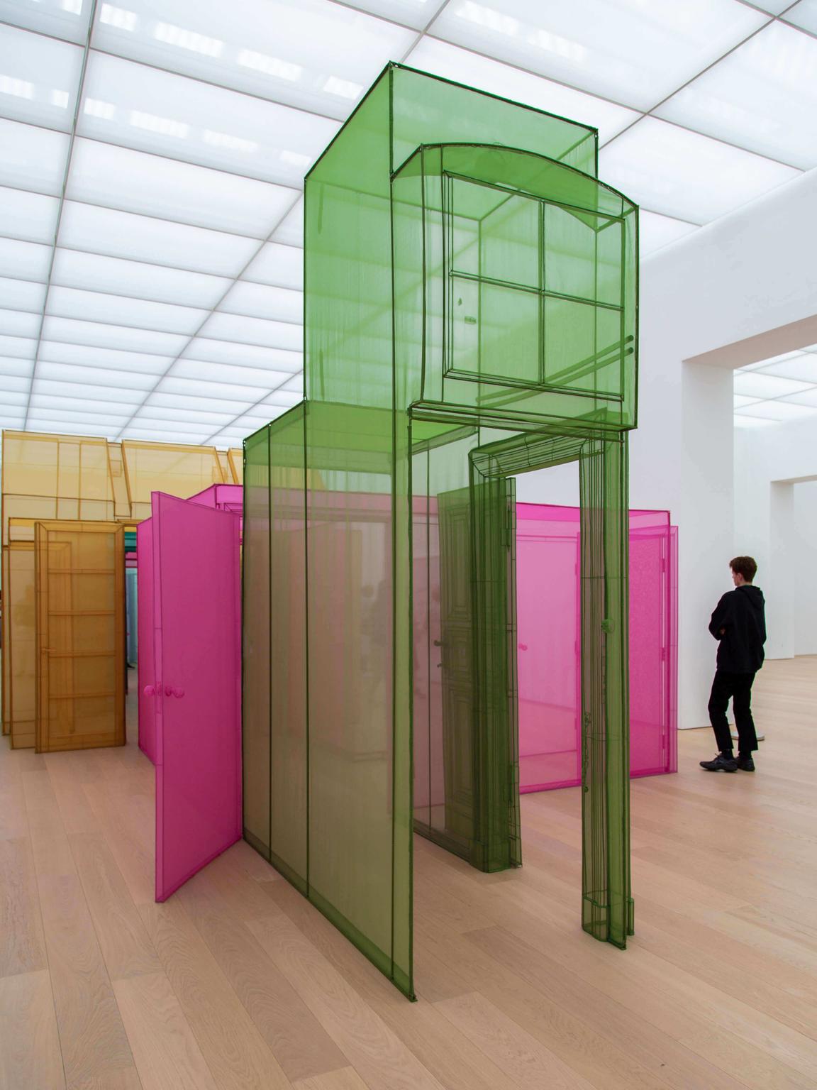
Translucent fabric and mesh
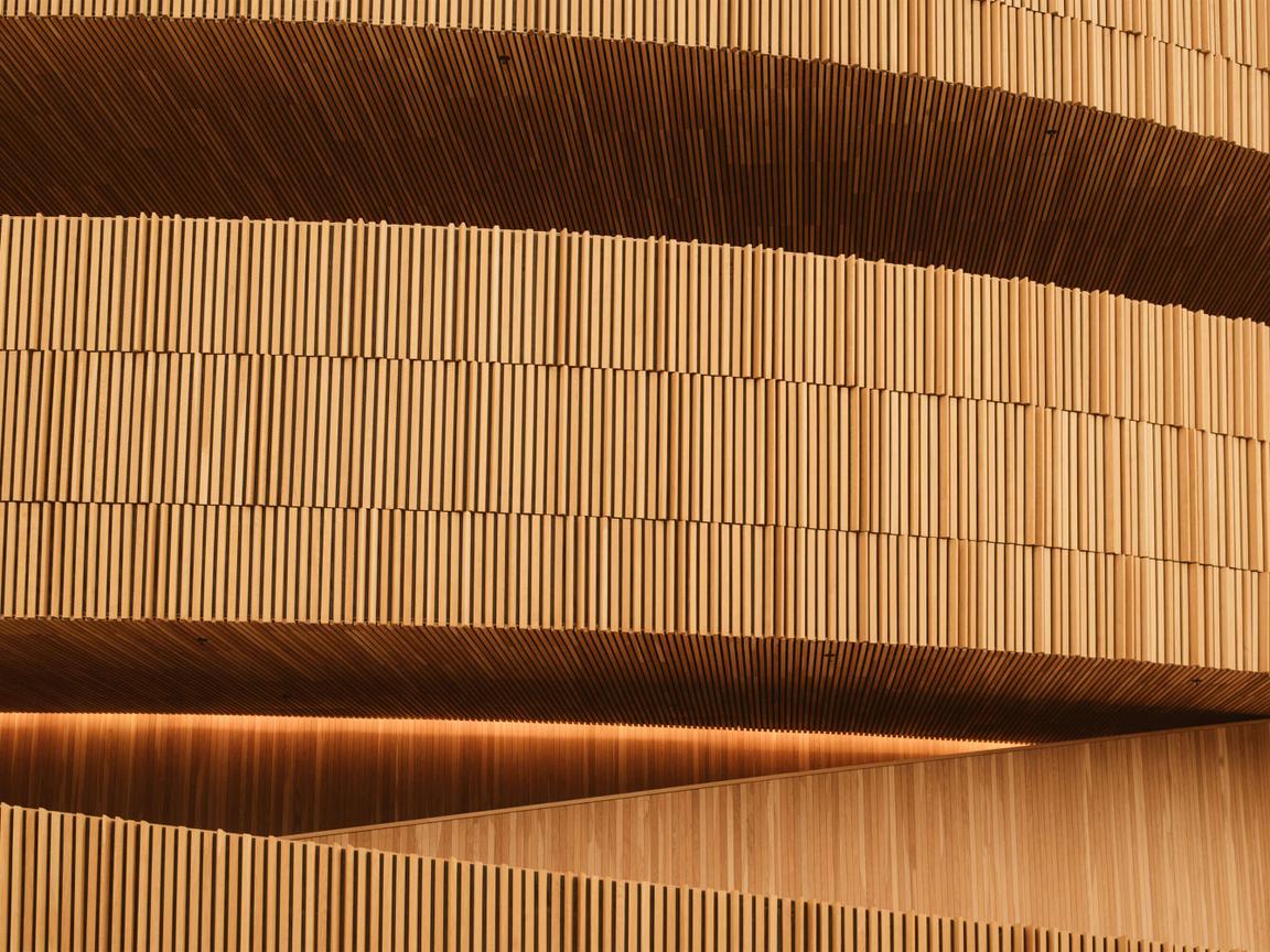
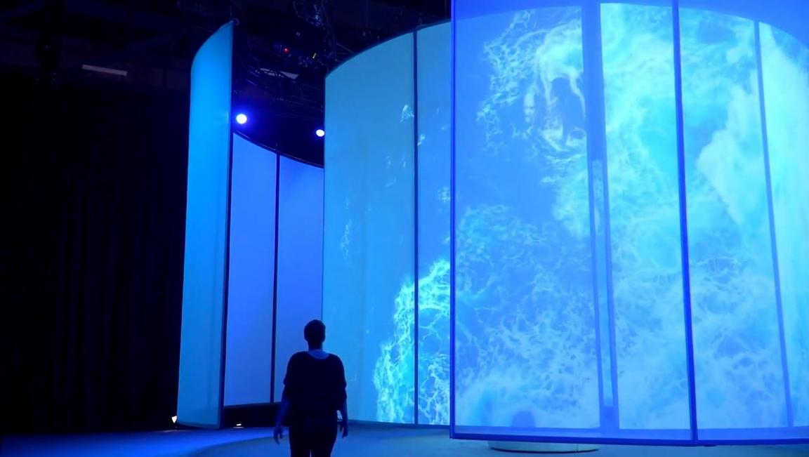
Content as texture
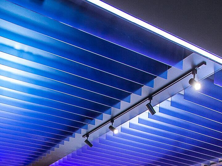
Light as texture
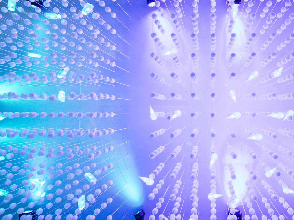
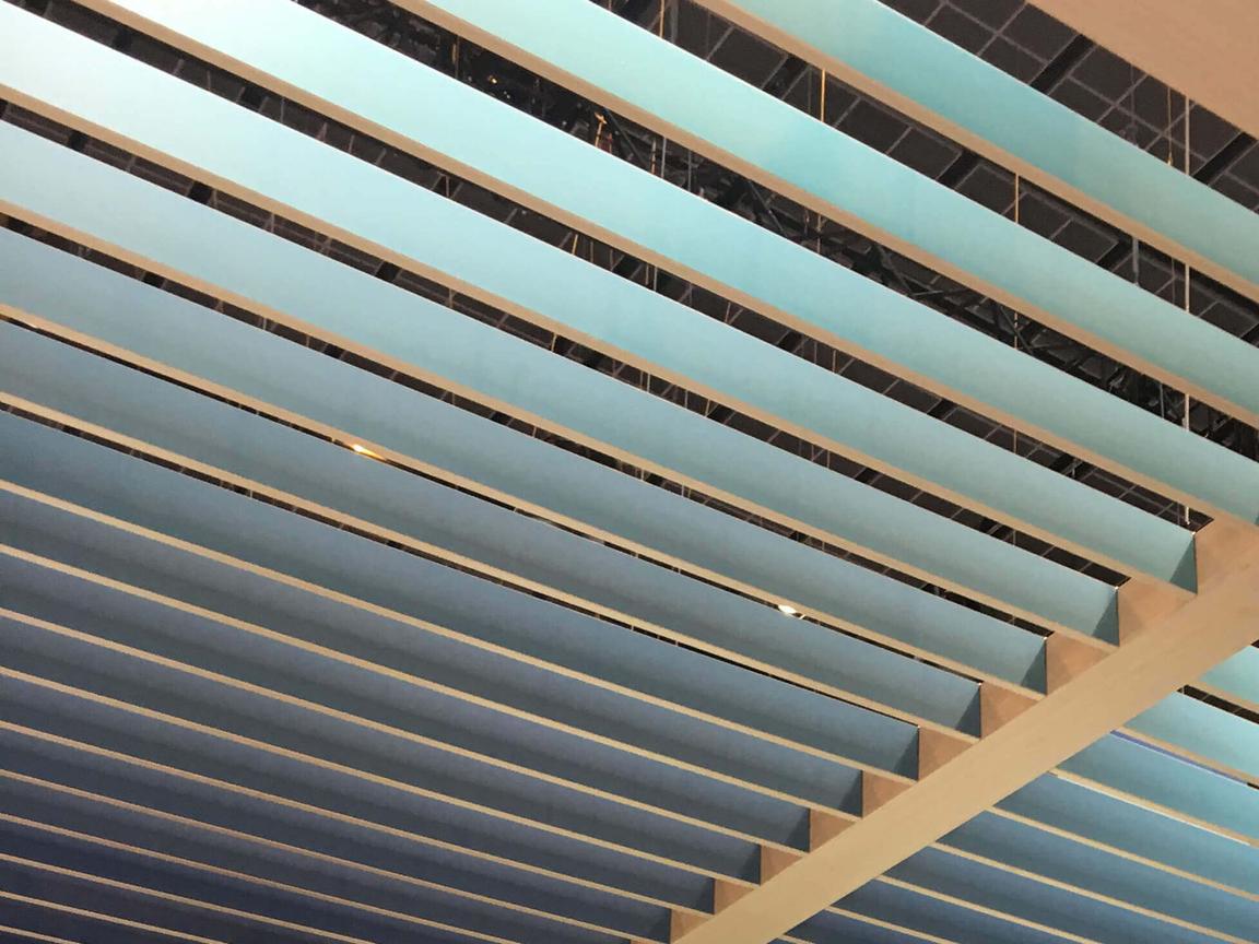
Color gradation
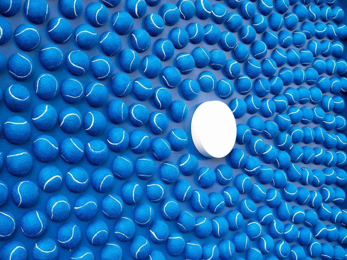
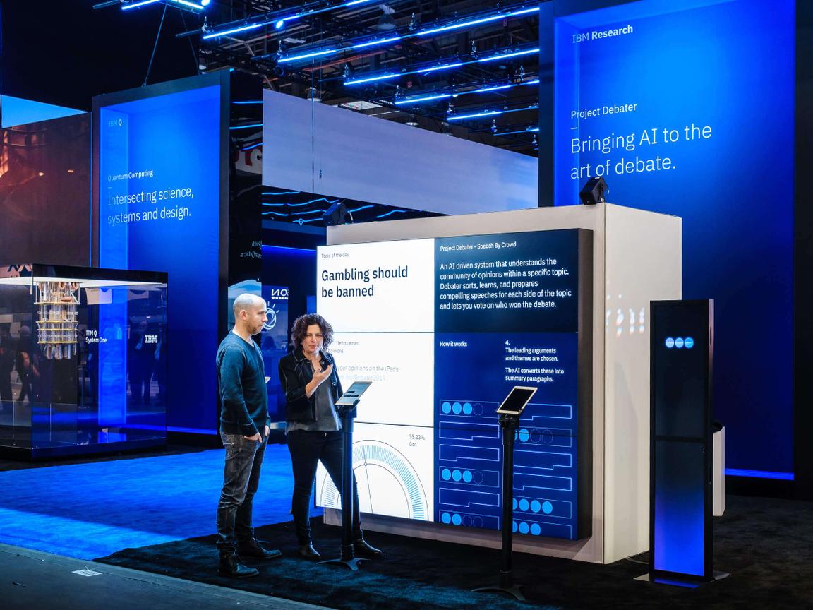
Industry reference
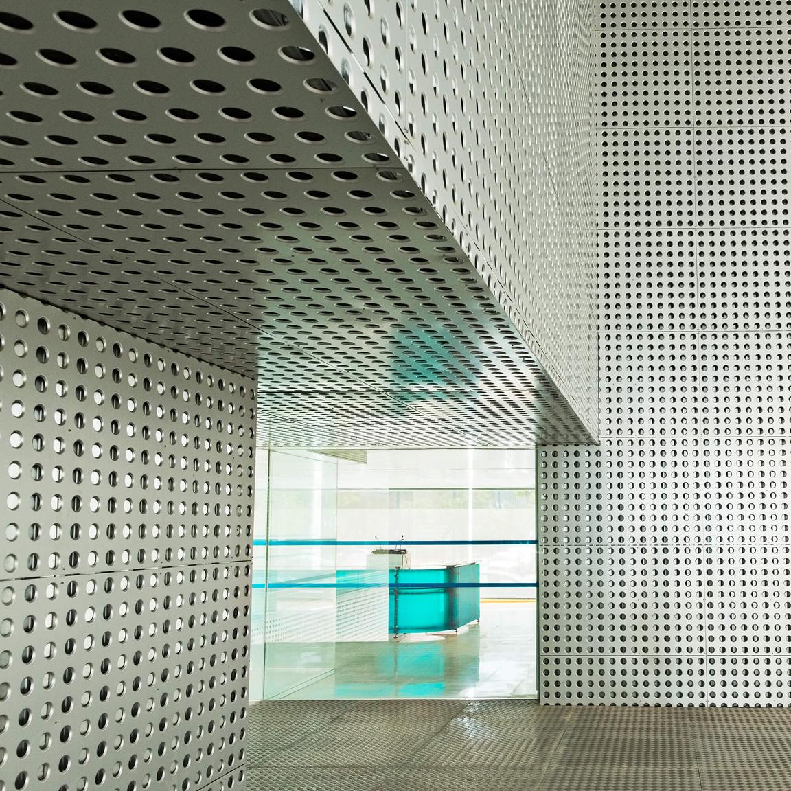
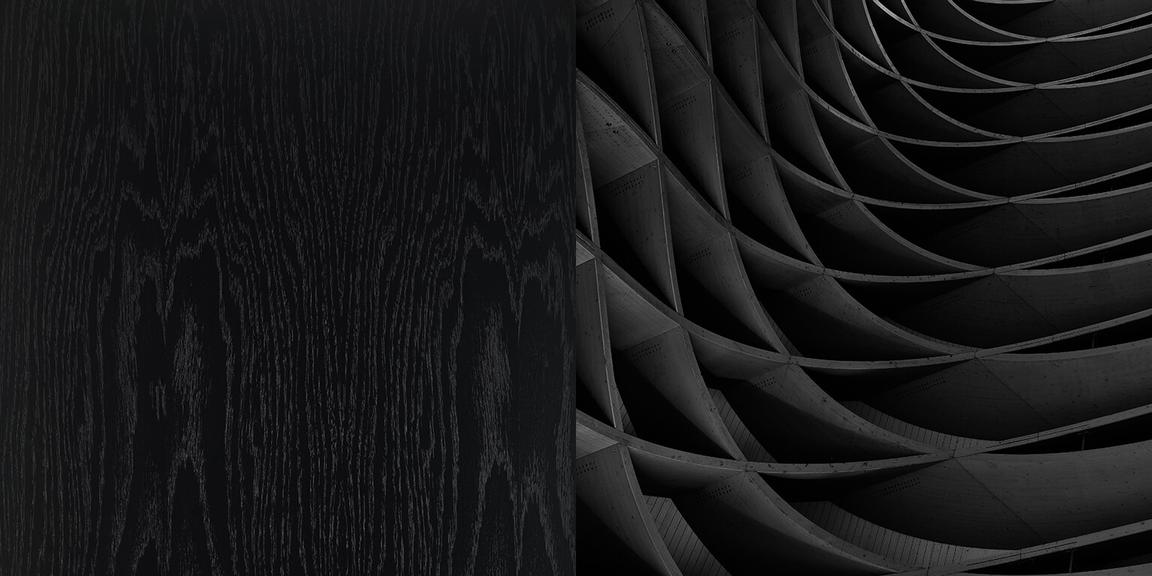
Monolithic use of pattern
Material palette
Select a contrast of material surfaces. Use materials that are translucent, light and airy: scrim fabrics, matte white surfaces, frosted and transparent glass. Combine these with materials that are bold, tactile and contemporary. Use metal and organic materials, such as natural hardwoods.

Fabric
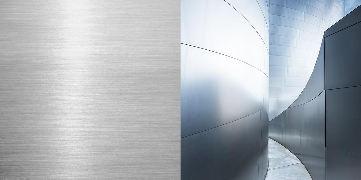
Aluminum
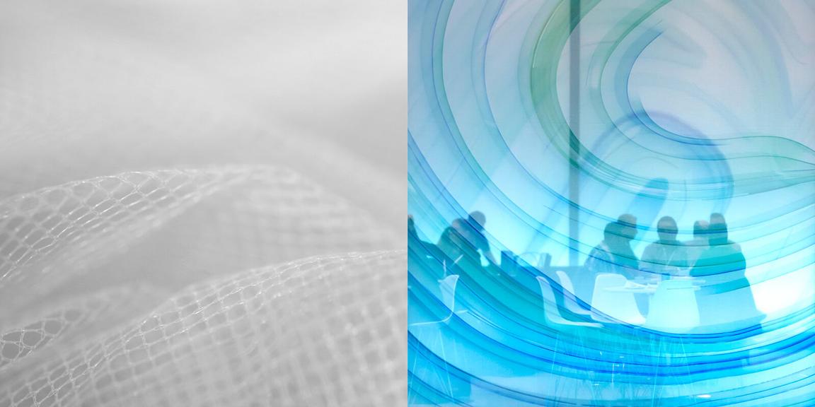
Mesh
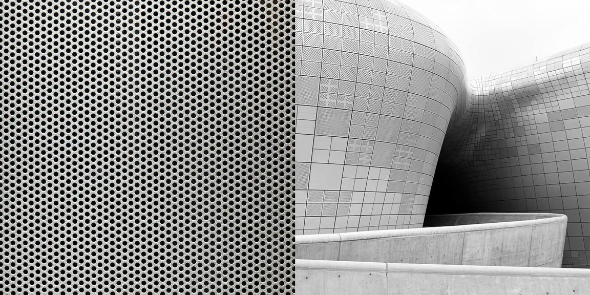
Perforated metal
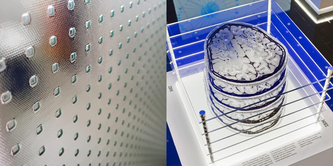
Plexiglass
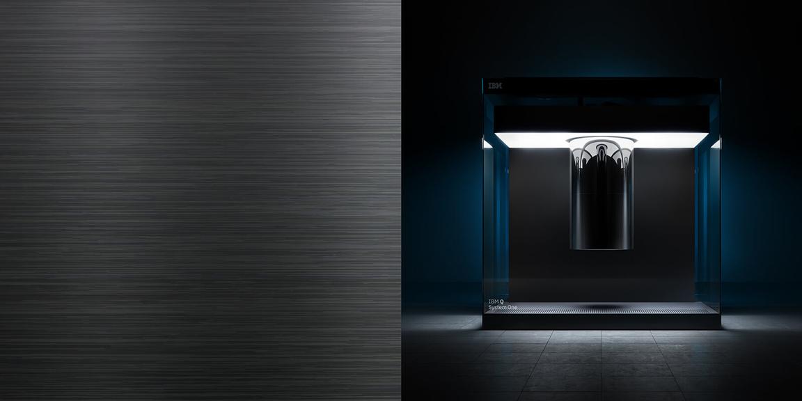
Blackened metal
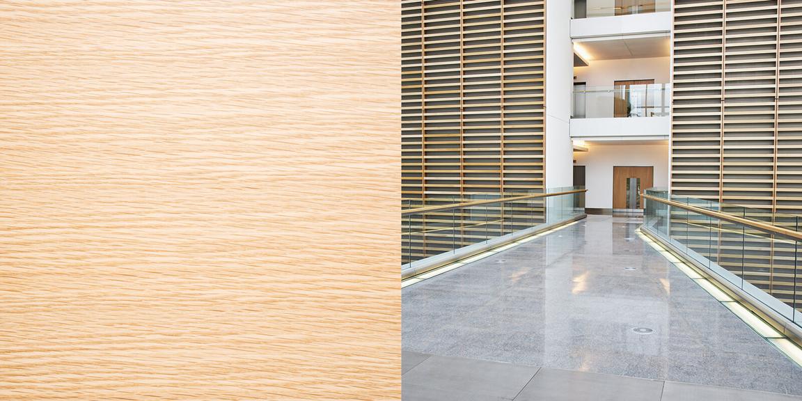
Natural wood
Blackened wood
