News
Abstract
Charting for PDI has been updated with new support
Content
PDI provides a rich set of graphical views to analyze the collection services data on your IBM i. The graphing support of PDI has been re-imagined.
Starting with the 2019 4th Quarter PTFs, we introduced a modernized charting framework using the dōjō Toolkit. Each subsequent PTF release will add more function and features. The latest in web-based graphing capabilities are now being leveraged to help bring this data to the forefront of impact. You can now more easily view the data and use the graphing controls to zoom in on specific areas.
What's new:
The first thing you will notice is that there are now two display buttons.
- Display Classic will provide you with the traditional (iLOG) chart that PDI has used
- Display will provide you with an updated JavaScript chart utilizing the Dojo Toolkit
- Note: This button will not be active for charts not yet supported for the format
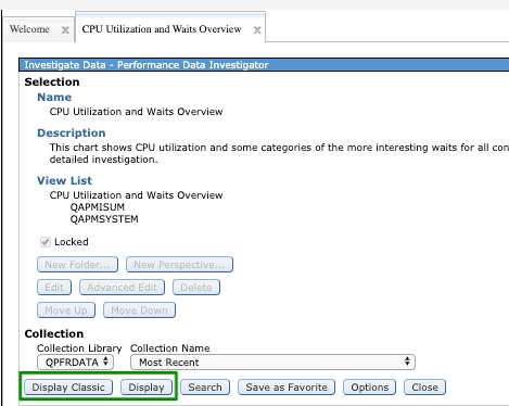
A new function provided now is the ability to select multiple collections to view on one chart from any single library. This is available on the displayed chart panel by selecting multiple collections on the Collection Name field.
Updated View Tour:
You will notice that the format and charting is similar to the previous iLOG charts. However, the look and feel is updated. Following is detail information on the functions available:
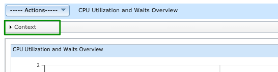
Context panel
The Collection Context panel will always be available under the heading, but will be closed on first view. When you click on the carat by Context, you will see the Collection Context panel.
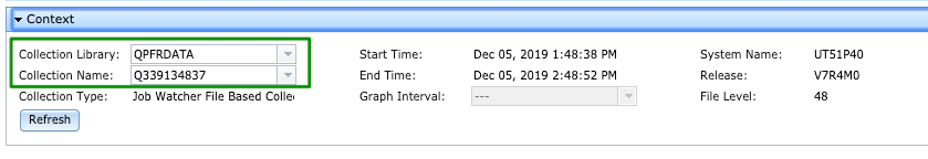
Changing Collections
The Collection Context panel has fields for Collection Library & Name that can be changed right on the panel to view a different collection. Select the library and name, then click on Refresh to update the chart shown
Selecting Multiple Collections
The Collection Name field is now a selectable and scrollable list. Select more than one collection in the library and select "Refresh".

Be aware that there may be performance implications with multiple collections and particularly with a smaller graph interval. Consider increasing the graph interval size for more than one collection. It is not recommended that you select more than 5 collections at a time, but the interface will not prevent you from doing so.
Also note that certain perspectives do not support multiple collections at this time. Certain groups such as Memory Charts and Storage Allocation require updates to support multiple collections. These changes will be coming in future PTFs.
Certain function features are not compatible with display of multiple collections. If viewing a perspective with multiple collections, it is not possible to do a selected filter drill down by selecting one or two points on the chart and selecting another perspective. Go back to one collection before drilling down on a filtered selection.
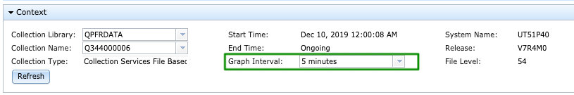
Graph Interval
The Graph Interval is a new function inherited from Graph History. When you first display, you will get a default interval. This can be modified for collections that support static intervals (not available for Disk Watcher, etc). Use the drop down arrow to select a different Graph Interval and click Refresh to view the results.
The Chart
The updated chart will always display the full timespan of the collection in the first view. This was not the case with the "Classic" PDI charts which would show fewer intervals for views with more metrics and breakdown dimensions. This means that some charts will take longer for initial display. The extra time is worth it for the consistency it provides.
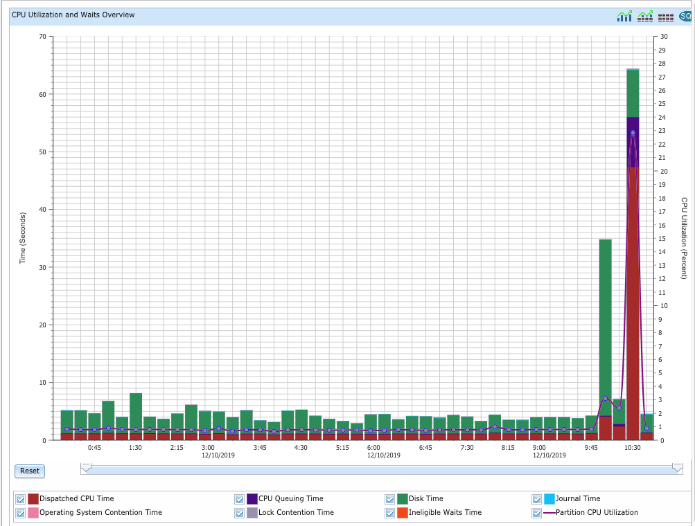
There are a lot of useful features on this updated chart. They will be described one at a time.
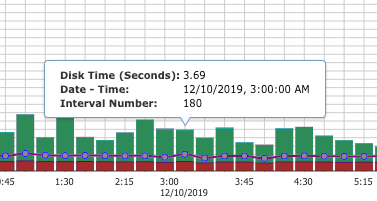
Tooltips
Tooltips is available without selecting an interactor as was required with the classic charts. By hovering over a line or bar on the chart, you will see the metric data point information:
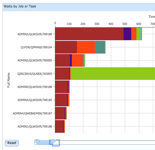
Legend
The legend is interactive. By clicking on the checkboxes by each metric, you can remove them from the chart and re-add them. This allows you to customize your view on the fly and more clearly see the metrics that matter most to you.
Here is an example with the original chart and a chart with the metric "Disk Time" removed. Note in the second view, the y-axis labels are changed as the max value charted is recalibrated to provide a more detailed view of the metrics being charted.
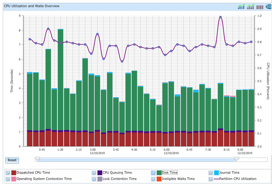
Figure: Initial chart view showing all metrics

Figure: Chart with one metric removed
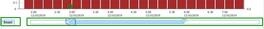
Scroll bar & Reset button
The scroll bar gives you efficient manipulation of the intervals displayed as well as zoom capability. It reflects the current view section of the entire collection.
- By clicking on one of the sliders on either end of the blue portion of the scroll bar, you can move the sliders in or out to display less or more of the chart collection timespan.
- By clicking the blue bar, you can grab and shift the "window" of the chart being displayed.
For example: with a view displayed by intervals, as you move left, you will see the earlier times in the chart; and as you move right, you will see more of the later times.
Select the Reset button to display the full collection as was shown on the first view.
This also works for horizontal bar charts where the scroll bar is still shown at the bottom, but the changes will happen along the y-axis for zooming in to see more detail on the chart and moving to the top or bottom entries available.
The mouse wheel will default to modify this horizontal scroll bar. To use the mouse wheel to scroll up or down on the browser page, first select the region of the browser vertical scroll bar.
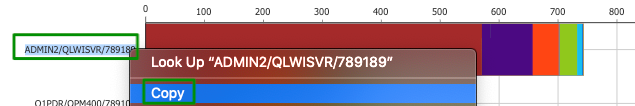
Copy Text from Chart
A new feature that a customer was looking for (and was not available with classic PDI charting) came free with our JavaScript charts. You can now copy text from the panel to paste elsewhere, such as a job name. Select and right click to select Copy:
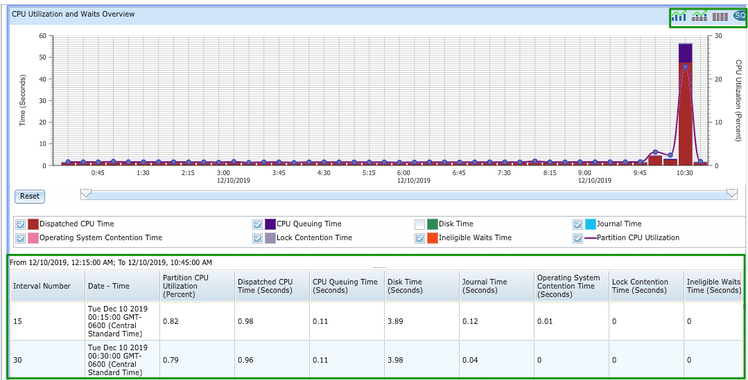
Integrated Table View
Using the icons on the top right of the chart, you can immediately view the table data behind the chart both on its own or at the same time as viewing the chart itself. This is a great improvement over the class PDI "View as Chart" function! Hover over each icon to find its use.
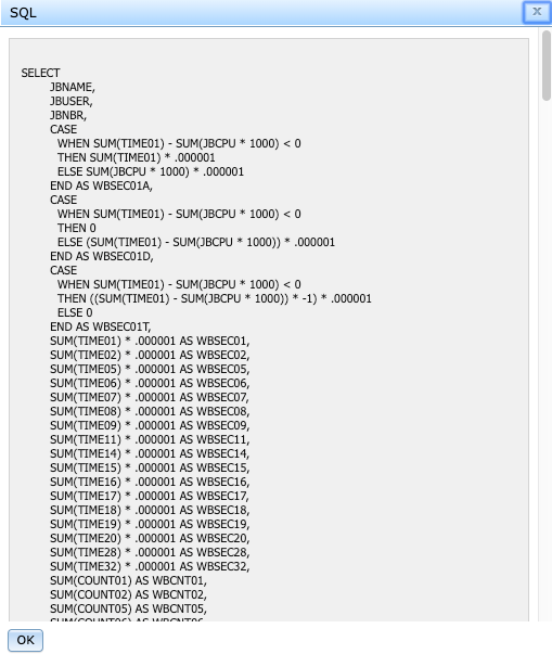
SQL Button
Using the SQL button, you can view the SQL used to generate the data.
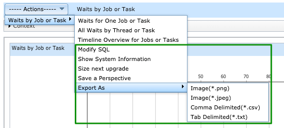
Actions Menu
The Actions menu provides all the functions available for each view. This includes the drill down perspectives available as well as actions to take with this view:
Updated Perspectives
Not all functionality has been converted with this first release of the updated charting. We wanted to bring you this modernization as soon as possible, so provided the portions that are ready now with the rest to come in future PTFs.
Supported charts will allow the Display button to be used from the selection panel (as shown above)
Perspectives and Packages supported for the updated charting:
- General Health Indicators
- Define Health Indicators function is not yet supported
- Collection Services - fully supported
- Timeline - released in 2020 Q2 PTFs
- QAPMCONF panel - released in 2020 Q2 PTFs
- Job Watcher - fully supported
- Interval Details panel - released in 2020 Q2 PTFs
- System Monitor - fully supported
- Database - fully supported
- in SQL Performance Data folder, pie charts - released in 2020 Q3 PTFs
- SQL Plan Cache Snapshots and Event Monitors
- SQL Overview
- SQL Attribute Mix
- SQL Performance Monitor folders
- SQL Overview
- SQL Attribute Mix
- SQL Plan Cache Snapshots and Event Monitors
- in SQL Performance Data folder, pie charts - released in 2020 Q3 PTFs
- Disk Watcher - fully supported
- Batch Model - released in 2020 Q3 PTFs
Coming in future PTFs will be support for Performance Explorer (PEX package).
- The drilldown information is not yet provided on the charted that have been drilled down from other charts. Information on the job name, interval filters or other information will be provided in a future PTF as it has been in classic PDI.
- Edit & Save Perspectives is not fully functional with dojo framework. For this functionality, it will be necessary to return to the classic PDI charts.
- Use classic PDI for editing & saving perspectives, creating new packages, etc.
- Your customized Perspectives may not be ported to updated charts
- A new attribute enableDojoDisplay="true" needs to be added at the package or perspective level in the customized pml file in order to utilize the new dojo charting.
- If you have specific questions on converting your customized charts to dojo, please contact us.
- Change Context function is not available with the new dojo panels. The function is provided with the context panel modifiable fields. Some items are not yet available such as: filtering by date & time, filter for a specific job name, etc
- Thresholds for action and reset are not displayed in the System Monitor PDI perspectives. They will be shown in the System Monitors as before, but with the update this feature has not been added back in yet.
- Scrollable legend function for charts with a large number of breakdown dimensions (partitions or pools) is needed
Was this topic helpful?
Document Information
Modified date:
06 July 2021
UID
ibm11128357