Design
Consider the different ways users interact with web applications via the keyboard or assistive technologies.
 Level 1 - core
Keyboard users, especially users who are blind, navigate interactive elements on a page by pressing the Tab key. The tab order is the sequence that the interactive elements follow. The standard behavior follows the reading order: top to bottom, left to right.
What to do
- Annotate the tab order if it doesn’t follow the standard behavior
- Reduce tabbing by grouping components
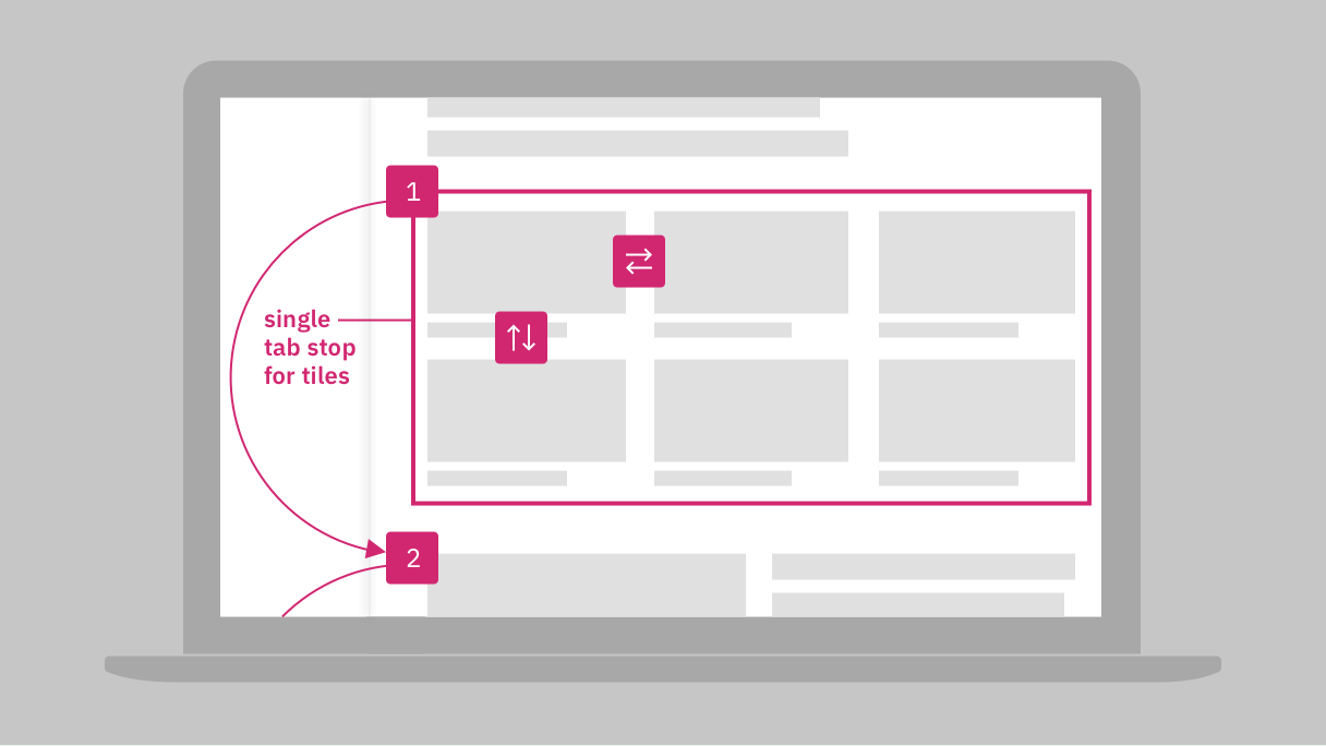
Consider grouping components as a single tab stop. Annotate that arrows are used to navigate between items.
Resources
- Toolbar, ARIA authoring practices
- Grids: Interactive tabular data and layout containers, ARIA authoring practices
- Annotating wireframes and UX designs, BBC
- How do you present tabbing order, Stack Exchange™
Requirements
- 2.1.1 Keyboard, IBM accessibility requirements
- 2.4.3 Focus Order, IBM accessibility requirements
Related toolkit topics
- Keyboard interaction, this page
- Data tables, Visual design
Standard HTML elements have default keyboard behaviors, however complex or custom components will need annotations on intended keyboard behavior for implementation. Another option is to surface keyboard instructions directly in the UI.
What to do
- Annotate intended keyboard interaction for modified or custom components
- Provide keyboard instructions in the UI for unfamiliar keyboard operations
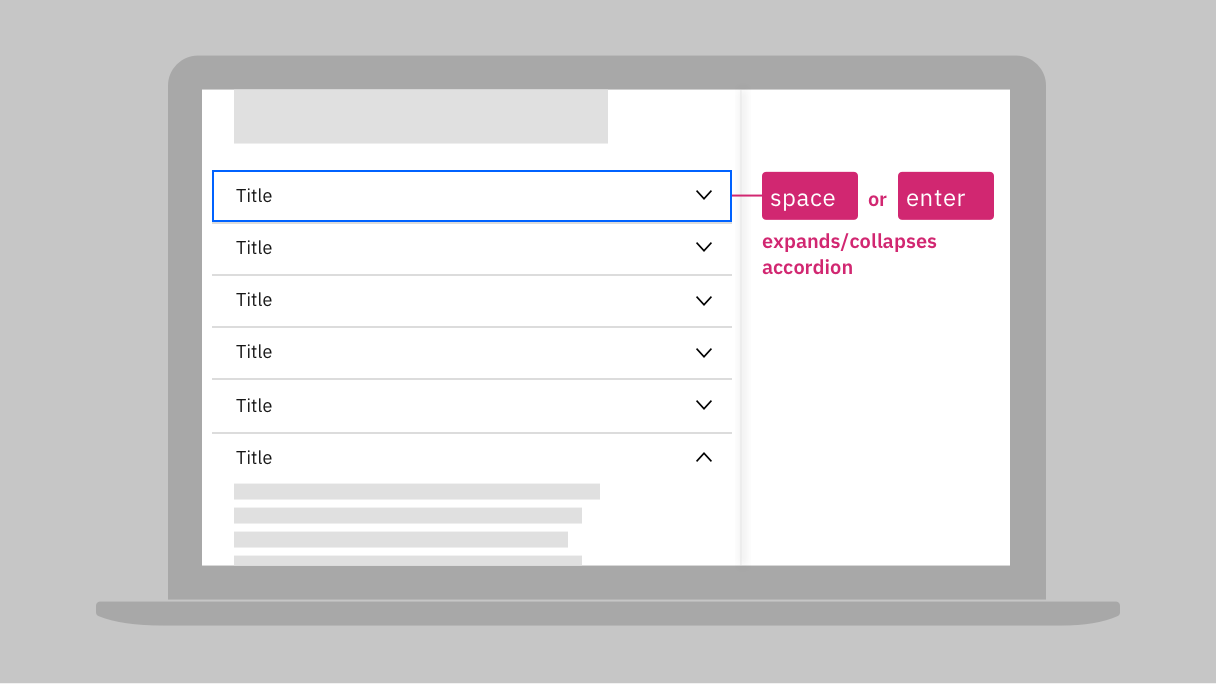
Annotate intended keyboard interaction for components that aren't standard HTML elements.
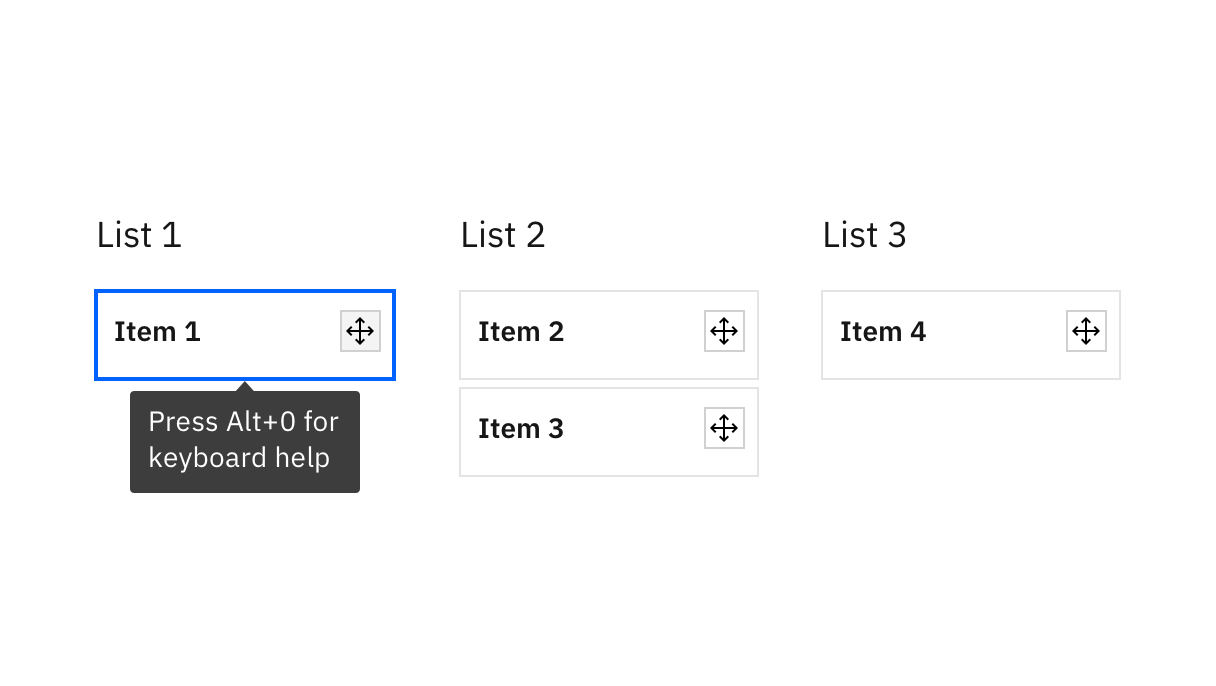
Provide keyboard instructions in the UI for components where keyboard operation is less familiar. For this drag and drop component, the instructions appear on keyboard focus.
Resources
- Annotating wireframes and UX designs, BBC
- What are wireframe annotations and why use them?, Balsamiq wireframing academy
- Design patterns and widgets, ARIA authoring practices
Requirements
- 2.1.1 Keyboard, IBM accessibility requirements
Related toolkit topics
- Tab order, this page
- Data tables, Visual design
- Custom component keyboard guidance, this page
- Mouse operable components, this page
Users who are blind rely heavily on keyboard navigation. Any component that can be operated with a mouse should be reachable and operable by keyboard, or have a keyboard equivalent.
What to do
- Ensure all mouse-operable components are reachable by keyboard
- Provide a keyboard equivalent for drag and drop
- Annotate keyboard equivalents for components with multiple mouse operations
For drag and drop components, provide the keyboard equivalent for how to select the item, how to move the item, and where to drop the item.
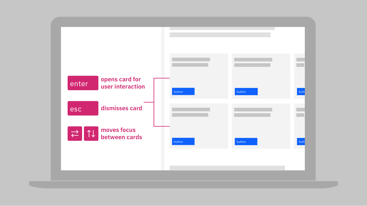
Annotate the keyboard equivalent for components (such as these tiles) that have multiple mouse operations.
Resources
- Developing a keyboard interface, ARIA authoring practices
- Keyboard compatibility, W3C® web accessibility perspectives
- Keyboard-only navigation for improved accessibility, Nielsen Norman Group
- DOM order matters, Google
- Accessible drag and drop examples, Salesforce®
Requirements
- 2.1.1 Keyboard, IBM accessibility requirements
- 2.1.2 No Keyboard Trap, IBM accessibility requirements
- 2.4.3 Focus Order, IBM accessibility requirements
Related toolkit topics
- Keyboard interaction, this page
- Tab order, this page
- Pointer operation, this page
Blind users navigating a page via keyboard can get stuck in a UI if keyboard navigation is not properly implemented. An easy way to reduce keyboard traps is to ensure the Esc key performs the same function as Cancel or Close mouse actions.
Sighted keyboard users have a different challenge with overlays. If the new content persists after the user has left it, it can potentially obscure other content, and prevent some controls from being visible as they get focus. One option is to position pop-ups in white space. Another is to ensure notices are dismissed automatically when they no longer have focus.
What to do
- Communicate that Esc key is always the keyboard equivalent for Cancel or Close
- Position pop-ups so they do not obscure other content, or dismiss pop-ups on loss of focus (WCAG 2.2 only)
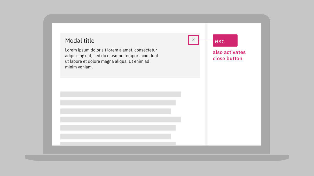
Communicate for development that the Esc key always triggers the same function as Cancel or Close buttons.
Resources
- Modal accessibility, Carbon design system
- Dialogs, Carbon design system
Requirements
- 2.1.1 Keyboard, IBM accessibility requirements
- 2.1.2 No Keyboard Trap, IBM accessibility requirements
- 2.4.11 Focus Not Obscured (Minimum), IBM accessibility requirements (7.3 only)
Related toolkit topics
- Keyboard interaction, this page
- Pointer interaction, this page
- Keep item receiving focus visible, Develop - Keyboard
Blind users rely on proper implementation for screen readers to relay the label that an input is associated with. Communicate with development any such relationships in your designs.
What to do
- Connect each label and input in your wireframes
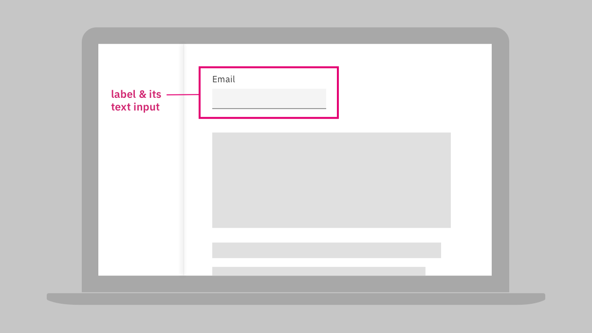
Annotate the association between the labels and UI elements for implementation.
Requirements
- 1.3.1 Info and Relationships, IBM accessibility requirements
Custom components often don’t have standard HTML keyboard behavior. The ARIA authoring practices provide detailed guidance to ensure such components meet expected keyboard behavior and are accessible to users with assistive technology.
What to do
– Follow the ARIA keyboard guidance for custom components
Resources
- Design patterns and widgets, ARIA authoring practices
- Developing a keyboard interface, ARIA authoring practices
- Standard keystrokes, WebAIM
Requirements
- 2.1.1 Keyboard, IBM accessibility requirements
- 2.1.2 No Keyboard Trap, IBM accessibility requirements
Related toolkit topics
- Keyboard interaction, this page
- Tab order, this page
- Pointer operation, this page
Users with visual and cognitive disabilities are likely to miss errors that are not directly brought to their attention, but it’s important to surface error messages in a way that alerts users without being overly disruptive. Screen reader users who navigate an entire form before entering data can also be disrupted if validation occurs each time a required field is left empty.
What to do
- Ensure error messages are obvious to everyone
- Avoid carrying out validation before users fill out the input and exit focus
- Ensure users can easily get to form elements that need to be fixed

If design requires the page to reload before validation, an error summary at the top of page and provide a link to each input in error. Also consider placing focus on error summary on page load.
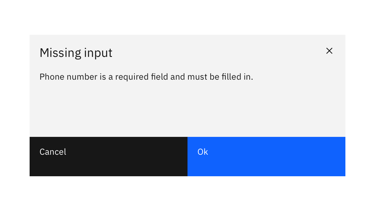
For dialogs, one of the user actions should move the focus to the item in error. In this example, pressing the Ok button should move the focus to the Phone number field.
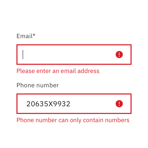
For inline errors detected after form submission, focus should move to first input in error.
Resources
- In-line feedback, W3C web accessibility tutorials
- How to report errors in forms: 10 design guidelines, Nielsen Norman Group
- How to provide accessible form error identification, Level Access
- Modal code, Carbon design system
- The best place for error messages on forms, UX Movement
Requirements
- 3.3.1 Error Identification, IBM accessibility requirements
- 3.3.3 Error Suggestion, IBM accessibility requirements
Related toolkit topics
- Error Messages, Content design
- Provide errors accessibly, Develop - Dynamic content
- Transactions, this page
- Reverse and undo, this page
To prevent serious consequences, allow users to review their input data in a concise form, especially for transactions that involve money, legal commitments, or user-controlled data.
What to do
- Summarize pending transactions so that users can check and confirm

A dialog box confirms with the user whether or not to go through with the permanent result of deleting selected data.
Resources
- Provide undo functionality, Validating input, W3C web accessibility tutorials
- Preventing user errors: avoiding conscious mistakes, Nielsen Norman Group
Requirements
- 3.3.4 Error Prevention (Legal, Financial, Data), IBM accessibility requirements
To prevent serious consequences, allow users to reverse actions in order to correct a mistake, especially for transactions that involve money, legal commitments, or user-controlled data.
What to do
- For important transactions, allow users to verify, correct, or reverse actions
- Provide clear instructions when users can reverse an action
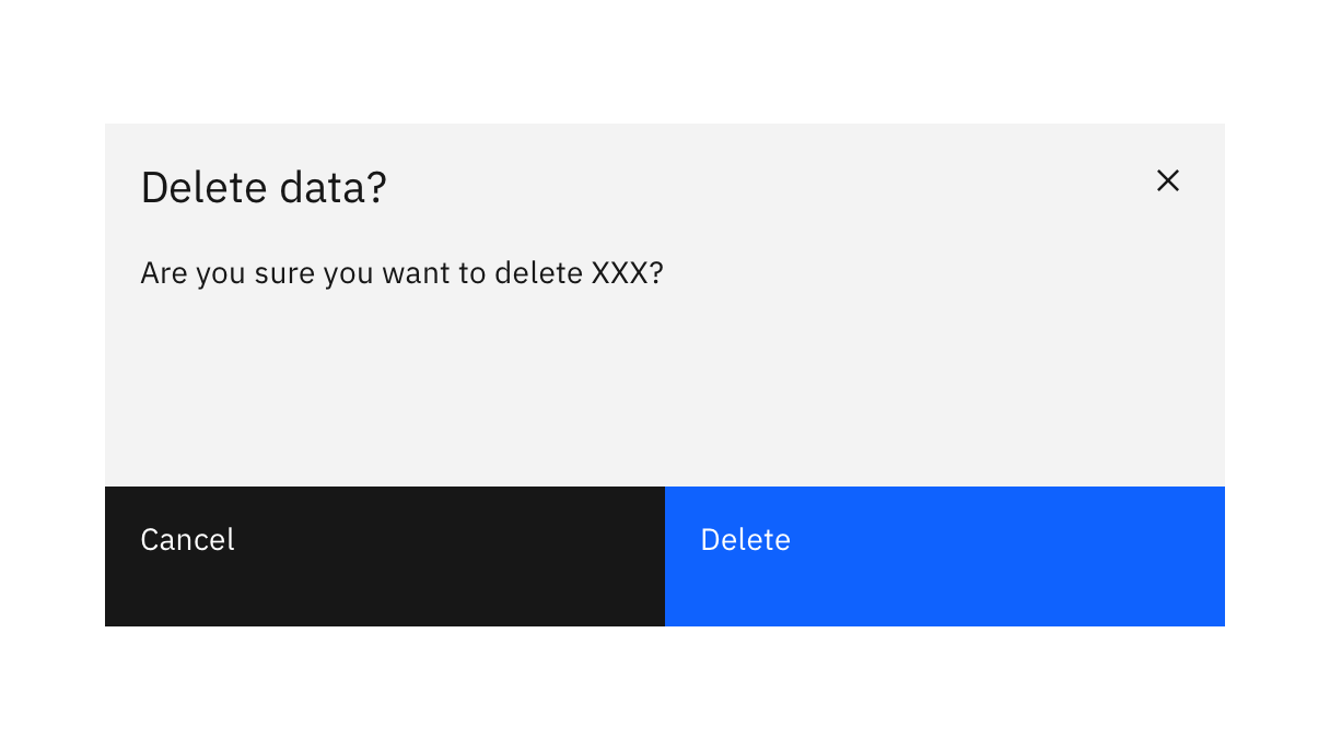
Allow users to confirm or cancel important transactions.

Allow users to reverse actions for important transactions, such as selecting the Undo button.
Resources
- G99: Providing the ability to recover deleted information, WCAG 2 technique
- G164: Providing a stated time within which an online request (or transaction) may be amended or canceled by the user after making the request, WCAG 2 technique
- Provide undo functionality, Validating input, W3C web accessibility tutorials
- Transactional modal usage, Carbon design system
- Preventing user errors: avoiding conscious mistakes, Nielsen Norman Group
Requirements
- 3.3.4 Error Prevention (Legal, Financial, Data), IBM accessibility requirements
Related toolkit topics
- Transactions, this page
- Reverse and undo, this page
Tab order
Keyboard interaction
Mouse-operable components
Pop-ups and overlays
Input components
Custom components keyboard guidance
Surfacing error messages
Transactions
Reverse and undo
 Level 2 - continued
Content that appears on hover can be be missed by low vision users who zoom in to navigate a page. Determine whether or not it makes more sense to surface dynamic content through persistent labels in the UI. Users with cognitive disabilities may also need more time to read hover content, so make sure the content persists until dismissed by user actions.
What to do
- Surface dynamic content on click rather than hover, if possible
- Avoid dismissing hover content after a certain amount of time
- Hover content must remain visible until dismissed by mouse or keyboard actions
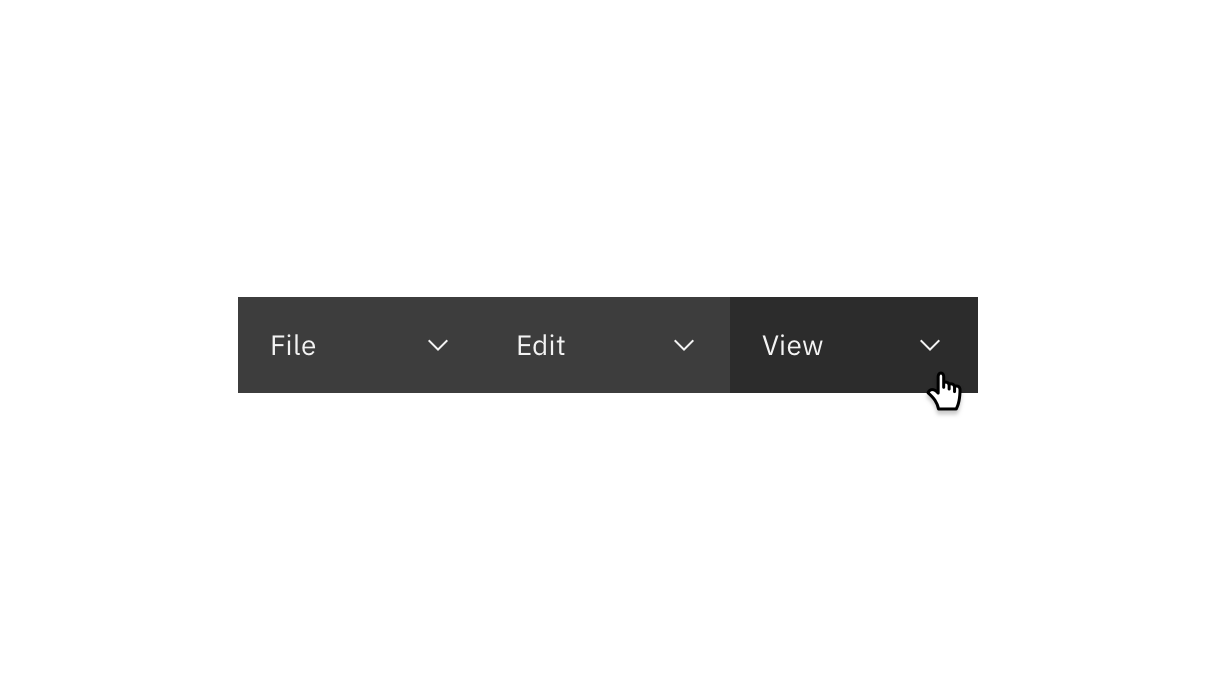
Use click rather than hover to trigger dynamic content.
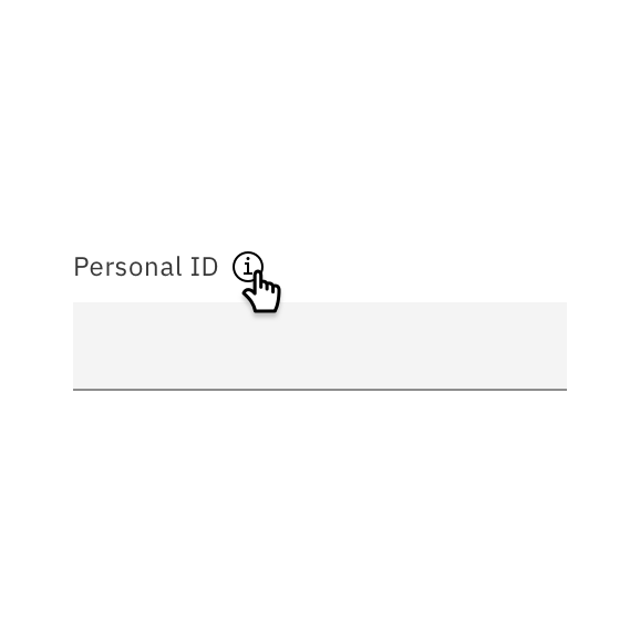
Include necessary instructions permanently in the UI, or consider clickable icons for displaying tips.
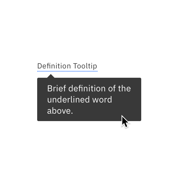
Display hover content until users move the pointer off the trigger and hover content, presses Esc key, or move keyboard focus.
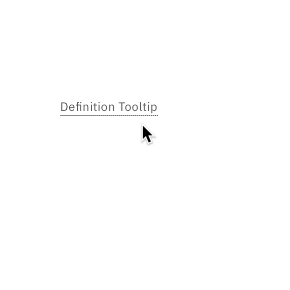
Don't allow content to disappear after a set period of time, or without proper user dismissal, such as clicking the trigger.
Resources
- Tooltip pattern, ARIA authoring practices
- Why hover menus do users more harm than good, UX Movement
- Navigation drop-downs. Should they be hover or click?, Liquid Light
- Tooltip guidelines, Nielsen Norman Group
- Icon tooltip usage, Carbon design system
Requirements
- 1.4.13 Content on Hover or Focus, IBM accessibility requirements
Related toolkit topics
- Mouse operable components, this page
- Input labels, Content design
- Make content accessible that appears on hover or focus, Develop - Dynamic content
Users who are blind navigate the page via keyboard and screen readers. Autoplaying audio competes with their screen reader’s audio, making it difficult or impossible to find and turn off the disruption. Autoplaying content can also be distracting, especially for users with cognitive disabilities, and affect their ability to complete a task, or even trigger debilitating physical reactions.
What to do
- Inform development that all media player controls must be keyboard operable
- Stop autoplaying content on keyboard focus or provide a simple pause mechanism

Communicate with development so that all media controls are operable by keyboard. Copyright IBM; all rights reserved.
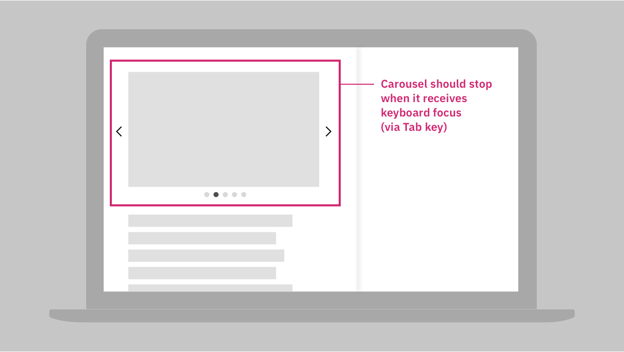
The wireframe annotations show the carousel stops auto-playing when it receives focus.
Resources
- Media players, W3C accessibility fundamentals
- Accessible HTML5 media players & resources, DigitalA11y
- Video usability, Nielsen Norman Group
- Audio and video, Smashing magazine
- Animation for attention and comprehension, Nielsen Norman Group
- Animation and effects, Smashing magazine
Requirements
- 1.4.2 Audio Control, IBM accessibility requirements
- 2.1.1 Keyboard, IBM accessibility requirements
- 2.1.2 No Keyboard Trap, IBM accessibility requirements
- 2.2.2 Pause, Stop, Hide, IBM accessibility requirements
- 2.4.7 Focus Visible, IBM accessibility requirements
Related toolkit topics
- Video captions, Content design
- Confirm component keyboard interaction, Core considerations - Unit testing
- Make custom media player and animation controls keyboard accessible, Develop – Keyboard interactions
- Autoplaying content, Content design
Any pointer action should be achievable by simple pointer actions, such as single clicks (or taps), on a target of sufficient size. It is fine to provide user actions through dragging, multipoint touch, and path-based gestures. However, designers should include a simpler way of achieving the same function, because these more complex pointer operations all pose challenges for users with reduced dexterity, who have tremors, lack fine motor skills, or are missing a thumb or finger. Many of the same users will be further challenged by small targets, especially if they are near other targets.
What to do
- Provide an alternative to complete all tasks with simple pointer actions
- Don’t rely on multipoint gestures like pinch to zoom for custom widgets
- Don’t require dragging, swiping, or path-based gestures for custom widgets
- Ensure all targets are a minimum of 24x24 CSS pixels, or have sufficient space around them. (WCAG 2.2 only)
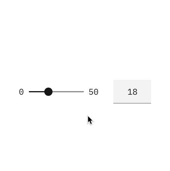
The user can drag the slider or tap and click on the slide bar to change the value.

Provide simple pointer actions in addition to multi-point gestures. The map's buttons support taps and clicks to zoom.
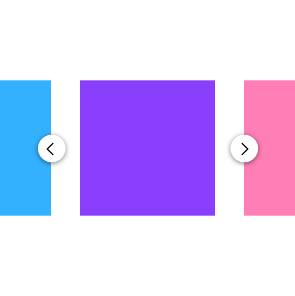
Provide simple pointer actions in addition to swiping. Here, the carousel's arrow keys support taps and clicks.
Resources
- G212: Using native controls to ensure functionality is triggered on the up-event, WCAG 2 technique
- G215: Providing controls to achieve the same result as path based or multipoint gestures, WCAG 2 technique
- G216: Providing single point activation for a control slider, WCAG 2 technique
- G219: Ensuring that an alternative is available for dragging movements that operate on content, WCAG 2.2 technique
- Why implementing swipe gestures causes a mobile accessibility issue, LinkedIn® article
- Announce your actions: making gesture actions accessible, Buffer blog
Requirements
- 2.5.1 Pointer Gestures, IBM accessibility requirements
- 2.5.7 Dragging Movements, IBM accessibility requirements (7.3 only)
- 2.5.8 Target Size (Minimum), IBM accessibility requirements (7.3 only)
Related toolkit topics
- Mouse operable components, this page
Most mobile devices have sensors that allow them to respond to user motion. However, users who have tremors may unintentionally trigger a response, and users who have no mobility in their arms will be unable to trigger any response.
What to do
- Ensure device motion responses can also be activated by alternative controls
- Provide a way to turn off device motion triggers
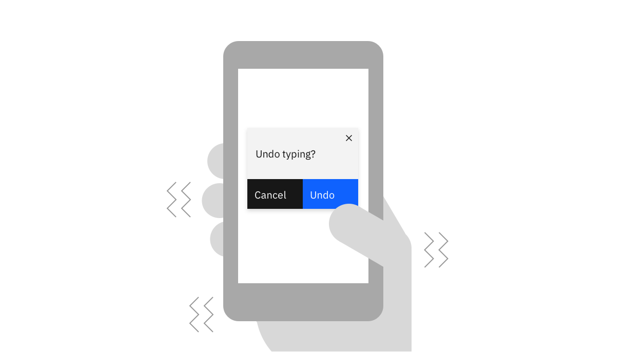
Do not rely on functionality offered through shake to undo and other motion, and make sure you can turn the motion detection off.
Resources
- F106: Failure due to inability to deactivate motion actuation, WCAG 2 technique
- G213: Provide conventional controls and an application setting for motion activated input, WCAG 2 technique
Requirements
- 2.5.4 Motion Actuation, IBM accessibility requirements
Related toolkit topics
- Check motion operation, Verify - Manual
- Flashing content, Content design
Discoverability of feedback and notifications is especially challenging for users with low vision who enlarge content in order to more easily read it. However, feedback that doesn’t require immediate attention should be implemented as such so users with screen readers don’t get interrupted by feedback that moves their keyboard focus to the message.
What to do
- Determine whether feedback is important enough to disrupt users
- Optimally position pop-ups and overlays
- Mark non-disruptive feedback as status messages, when appropriate
- Distinguish between errors and status messages
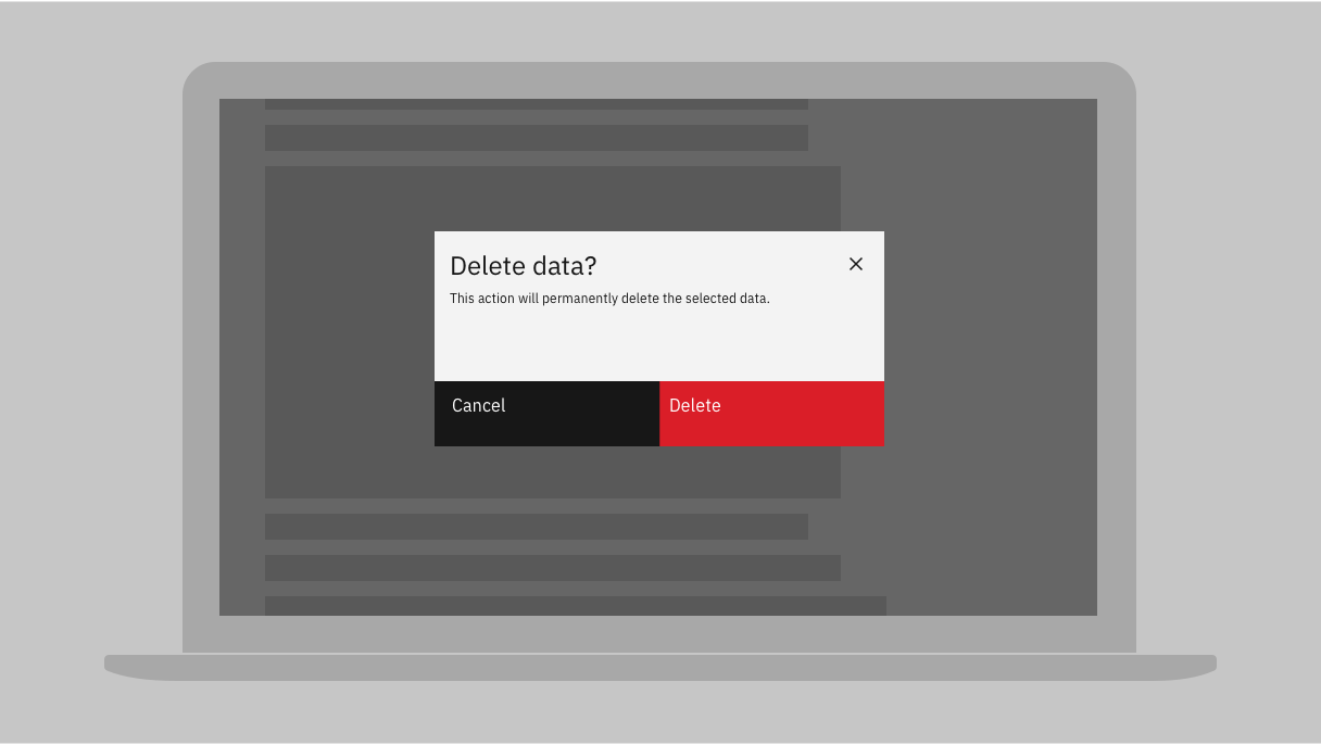
You can flag errors or warn users by changing the focus (such as by using a dialog)
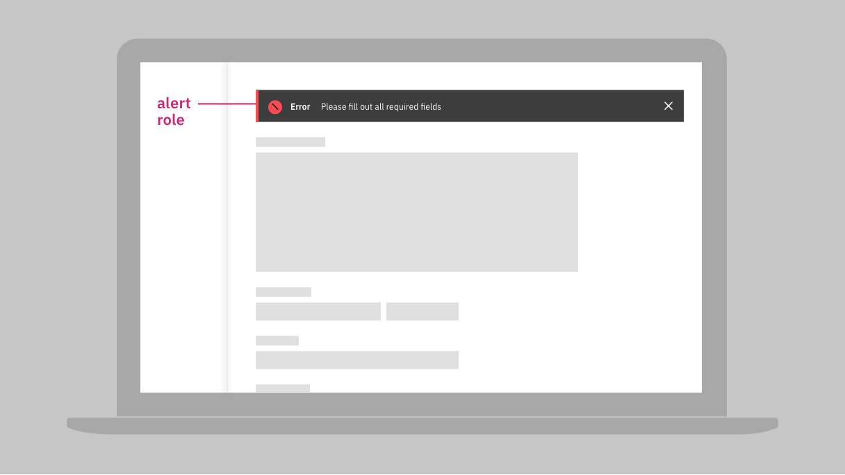
If you need to provide important information without disrupting users (by causing a change of focus), mark the new content as “alert role” in the wireframe for developers.
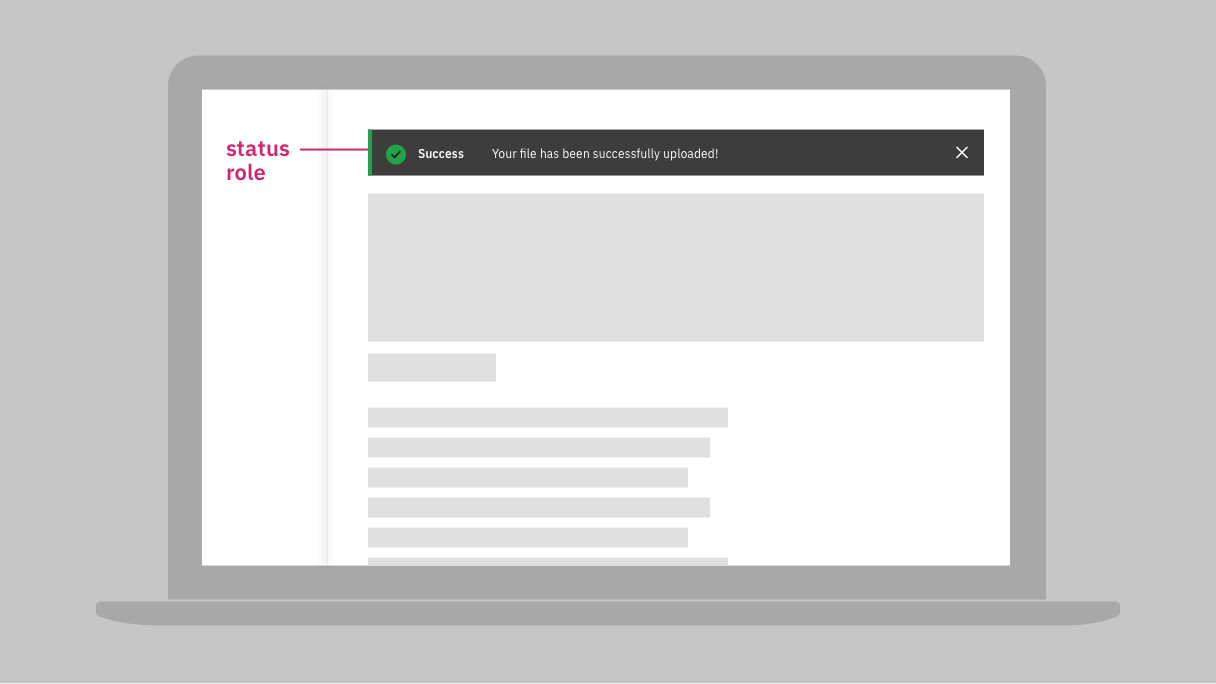
When you need to provide a status update based on user actions or system’s state, provide a screen update and mark as “status” for developers.

When you want to promote a new product or tell the user about an available update, provide information but do not assign any “alert role” or “status role.”
Resources
- ARIA22: Using role=status to present status messages, WCAG 2 technique
- Pop-ups and adaptive help get a refresh, Nielsen Norman Group
- Change blindness in the user interfaces, Nielsen Norman Group
- Instructional overlays and coach marks for mobile apps, Nielsen Norman Group
- Modal and nonmodal dialogs: when (and when not) to use them, Nielsen Norman Group
Requirements
- 1.4.13 Content on Hover or Focus, IBM accessibility requirements
- 3.3.1 Error Identification, IBM accessibility requirements
- 4.1.3 Status Messages, IBM accessibility requirements
Related toolkit topics
- Tooltips and overlays, Visual design
- Hover content, this page
- Make content accessible that appears on hover or focus, Develop – Dynamic content
- Properly code status messages, Develop – Dynamic content
Hover content
Media players
Pointer operation
Device motion
Feedback and notifications
 Level 3 - complete
Users with vestibular (inner ear) disorders can experience debilitating reactions from motion on a computer screen. A known trigger is motion effects (beyond simple text scrolling) that occur as they scroll through a page, such as autoplaying looped videos of panning camera movement. Limit the risks of seizures or dizziness by limiting the use of motion effects.
What to do
- Avoid using unnecessary motion effects
- Reduce size, luminosity and frequency of interaction-triggered motion effects
- Provide controls for users to turn off, hide, or reduce motion
Resources
- Understanding 2.3.3 Motion from Interactions, WCAG 2 (level AAA)
- Designing safer web animation for motion sensitivity, A List Apart
Related toolkit topics
- Implement motion media queries to reduce user risk, Develop - Dynamic content
Users who are blind rely on screen readers to read out the contents on a page. Communicate with development if there is content that follows a specific order so that screen reader users can navigate the page as intended.
What to do
- Annotate if any content has meaningful order
- Present menus in the same relative order
Resources
- G57: Ordering the content in a meaningful sequence, WCAG 2 technique
- G61: Presenting repeated components in the same relative order each time they appear, WCAG 2 technique
Requirements
- 1.3.2 Meaningful Sequence, IBM accessibility requirements
- 3.2.3 Consistent Navigation, IBM accessibility requirements
Tables of content and site maps make it easy for users to see all that a digital platform has to offer at a quick glance.
What to do
- Use tables of content and site maps, if appropriate
Resources
- G63: Providing a site map, WCAG 2 technique
- G64: Providing a Table of Contents, WCAG 2 technique
Requirements
- 2.4.5 Multiple Ways, IBM accessibility requirements
Having different ways of navigating and searching digital platforms ensures that users can easily find what they’re looking for.
What to do
- Consider links and other mechanisms to bypass blocks of content
- Provide a search function or other features to improve navigation and findability
Resources
- G1: Adding a link at the top of each page that goes directly to the main content area, WCAG 2 technique
- G123: Adding a link at the beginning of a block of repeated content to go to the end of the block, WCAG 2 technique
- G124: Adding links at the top of the page to each area of the content, WCAG 2 technique
- G125: Providing links to navigate to related Web pages, WCAG 2 technique
- G126: Providing a list of links to all other Web pages, WCAG 2 technique
- G161: Providing a search function to help users find content, WCAG 2 technique
- G185: Linking to all of the pages on the site from the home page, WCAG 2 technique
Requirements
- 2.4.1 Bypass Blocks, IBM accessibility requirements
- 2.4.5 Multiple Ways, IBM accessibility requirements
Having unexpected or inconsistent changes can throw users off and make the experience stressful and confusing.
What to do
- Don’t trigger disorienting content changes when a component receives focus
- If component’s setting changes, don’t trigger changes elsewhere without warning
Resources
- G13: Describing what will happen before a change to a form control that causes a change of context to occur is made, WCAG 2 technique
- G80: Providing a submit button to initiate a change of context, WCAG 2 technique
- G107: Using "activate" rather than "focus" as a trigger for changes of context, WCAG 2 technique
Requirements
- 3.2.1 On Focus, IBM accessibility requirements
- 3.2.2 On Input, IBM accessibility requirements
Asking for the same information more than once during a multi-step process places unnecessary burden on users, especially those with some cognitive disabilities.
What to do
- Avoid requesting repetitive user input
- Where the user needs to provide the same information twice, auto-populate or make it available for user selection
Resources
- G221: Provide data from a previous step in a process, WCAG 2.2 technique
Requirements
- 3.3.7 Redundant Entry, IBM accessibility requirements (7.3 only)
Users will often misclick or trigger unintended pointer actions, make sure they have a way to back out of unintended consequences.
What to do
- Provide a way for users to abort pointer actions
- Provide ways to reverse or undo pointer actions
Resources
- F101: Failure of Success Criterion 2.5.2 due to activating a control on the down-event, WCAG 2 technique
- G210: Ensuring that drag-and-drop actions can be cancelled, WCAG 2 technique
- G212: Using native controls to ensure functionality is triggered on the up-event, WCAG 2 technique
Requirements
- 2.5.2 Pointer Cancellation, IBM accessibility requirements
Time limits can be a frustrating experience for users with cognitive disabilities who may need more time to read through content.
What to do
- Avoid time limits
- If time limits are necessary, allow user to turn off, adjust, or extend the limit
- Make time-limit notifications accessible
Resources
- G4: Allowing the content to be paused and restarted from where it was paused, WCAG 2 technique
- G133: Providing a checkbox on the first page of a multipart form that allows users to ask for longer session time limit or no session time limit, WCAG 2 technique
- G198: Providing a way for the user to turn the time limit off, WCAG 2 technique
Requirements
- 2.2.1 Timing Adjustable, IBM accessibility requirements
Logging into a system should be as simple as possible, while still being secure. Where possible, use a single sign-on (SSO) mechanism, or other means of allowing users to easily authenticate.
What to do
- Don’t make people recall or transcribe something to log in
- Don’t use CAPTCHA as part of an authentication process
Resources
- G218: Email link authentications, WCAG 2.2 technique
Requirements
- 3.3.8 Accessible Authentication, IBM accessibility requirements (7.3 only)
Related toolkit topics
- Allow pasting and auto-fill in password fields, Develop - User input