z/OSMF table layout
Details about a collection of items are often presented in either a standard table or tree table (contains nested rows). In both types of tables, each row represents an item and each column represents various properties of the item.
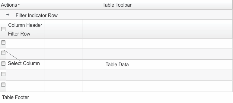
Figure 1 depicts the layout of standard tables and tree tables. For a description of each area, see Table 1.
For more information about tree tables, see About tree tables.
| Area | Description |
|---|---|
| Table Toolbar | Contains the Actions menu, search, and other table controls. For tree tables with a non-tree view, it also lists the table view, Table view: Tree or Table view: Non-tree. |
| Filter Indicator Row | Indicates whether a filter is applied to the
table. If no filter is applied to the table, the label for the define
rules ( ) icon is No filter applied. Otherwise,
the label is the number of items that match the filter rules out of
the number of items included in the table. For example, if the table
contains 20 items and 11 items match the filter rules, the label will
be 11 of 20 items shown. In this case, a Clear Filter link
is also provided. ) icon is No filter applied. Otherwise,
the label is the number of items that match the filter rules out of
the number of items included in the table. For example, if the table
contains 20 items and 11 items match the filter rules, the label will
be 11 of 20 items shown. In this case, a Clear Filter link
is also provided. If a filter is defined, place your cursor over the filter indicator row to display the filter rules. The rules are listed in a Filter window, which also indicates whether an item must match all the rules (All rules) or at least one rule (Any rule) to be displayed in the table. In the Filter window, click the remove rule (X) icon to remove the corresponding rule. To remove all the filter rules defined for the table, click the Clear Filter link provided in the filter indicator row. You
can also click the define rules ( |
| Column Headers | Displays the column title. In most tables, you can click the header to sort, click and drag the header to move the column, and drag the divider between the headers to resize the column. |
| Filter Row | Displays the filter criteria as a link if a filter is set for a column. Otherwise, a Filter link is displayed. Click the link to set or modify the filter criteria. If a link is not displayed, the column is not filterable. |
| Select Column | Contains a radio button or check box so that you can select an item in the table. |
| Table Data | Lists the data. For tree tables, a column in this area contains expand (+) and collapse (-) icons. Click the icons to show or hide nested rows. |
| Table Footer | Displays status information, such as the total
number of rows (Total) and the number of rows selected (Selected). If the Page and Rows fields are displayed in the Table Footer, the table contains multiple pages. Use the Rows field to specify how many rows to include on each page, and use the Page field to select the page to be displayed. |