The user interface
The following table describes where you can find features and functions in Cognos Analytics - Reporting.
| Cognos Analytics - Reporting icon | Description |
|---|---|
 and and  |
 Navigation menu. See Navigation menu. Navigation menu. See Navigation menu. |
 |
Data sources. See Sources tab. |
 |
Data items. See Data items tab. |
|
Toolbox. See Toolbox tab. |
 |
Save as Convert to Template Convert to Active Report |
 |
Toggle between editing the report and viewing the report. Tip: These two states
are referred to as
edit modeand view mode. |
|
Undo and redo the last change you made to the report |
 |
Specify run options for the report and run the report. Run options include output format, orientation of the report, how much data to return, language, rows per page, accessibility features, bidirectional support, and performance details. Appears only in edit mode. |
 |
Run the report using the current run options. The data is refreshed (database re queried) only if you change the output format from the last time you ran the report. To change the output format, click the down arrow. Appears only in view mode. The run option is also available when you are on the Pages tab in a report. You can run an individual page with the output format you require. |
|
Refresh the report using the same prompt values. Appears only in view mode.
Note: To ensure that
the data is refreshed, disable the Use local cache property in the properties
for the query.
|
 |
Switch between the Welcome page and other views that you have open in Cognos Analytics |
 |
Clear all parameters |
 |
Toggle between locking and unlocking objects on the canvas. |
|
Switch between page design, page preview, or page structure view |
 |
Open report from clipboard Copy report to clipboard Visual aids Find. See Find objects in a report. Validate report Validate options Auto correct Layout component cache Manage conditional styles Show generated SQL/MDX Add shared set report Manage Shared Set Reports Manage Shared Set References Show specification Options. See Options in Reporting. |
 |
Toggle between showing and hiding the Properties pane for the active object. The properties that are displayed are different, depending on the object. For a list of the available properties for a report, see Properties pane. |
On-demand toolbar
The on-demand toolbar (formerly known as the report object toolbar) contains the actions you can perform on an object.
You can disable the on-demand toolbar. For more information, see Disabling the on-demand toolbar.
- Pin
 , Unpin
-
When the on-demand toolbar is pinned, it stays at the upper left corner of the canvas, regardless of which object is active. When it's unpinned, it floats near the object that is active.
You can also control the display of the on-demand toolbar by setting the Show on demand toolbar on right-click option. Click the More icon
. Select
. When the Show on demand toolbar on
right-click check box is selected, the on-demand toolbar displays when you right-click
an object. When cleared, the on-demand toolbar displays when you click an object. If the on-demand
toolbar is pinned, it appears at the top left corner of the canvas, regardless of the setting of the
Show on demand toolbar on right-click option. - Cut
 , Copy
  , Paste
  ,
and Delete
,
and Delete 
- Cut, copy, paste, or delete an object
- 24Filters

- Click the down arrow to add, edit, or delete filters or add filter text to the visualization
- Swap rows and columns

- In a table, switch the row and columns around
- Apply style

- rpt_swap_row
- Font

- Edit the font for an object
- Border

- Apply a border. You can choose the style, width, and color.
- Background color
- Apply a background color

- Horizontal alignment
- Change the horizontal alignment

- Vertical alignment

- Change the vertical alignment
- Style current selection

- Create and apply a custom style to the selected object
- Apply layout

- Select a different layout for the report
- Insert table
- Insert a table
- Select ancestor

- Select an ancestor of the current object
- More
- Other actions that vary, depending on the type of object that is active. For example, for a visualization, you can change the headers and footers. For a table, you can apply a table style. For a table cell, you can build a prompt page.
Sources tab
The Sources tab contains items from the package selected for the report, such as
data items and calculations. When you drag an item to the canvas, the visualization recommender
chooses a visualization to represent the data. If you don't like the visualization, you can change
it.
Search through the sources by typing a value in the Find field. As you type, the items that match your search string appear in the tab.
Data items tab
The Data Items tab shows the queries in the report.
Toolbox tab
The Toolbox tab contains various objects that you can add to a report, such as visualizations, text, layout
objects, and prompts. You can also add advanced objects such as custom controls and hyperlinks.
Depending on the type of object, you can drag it from the Toolbox to the canvas or double-click it
to open a window in which you define values for the object. When the object is placed on the canvas,
its properties are displayed in the Properties pane.
Search through the objects by typing a value in the Find field. As you type, the items that match your search string appear in the tab.
Toolbox items are organized into groups. Click  to show all of the items available in each group or
  to collapse the groups. Click
  to toggle between a list
view or a tree view of the items in the groups.
to toggle between a list
view or a tree view of the items in the groups.
Add items that you use often to the PINNED group. Items in the
PINNED group appear in the Add circular menu icon  on the canvas when you create a new report. To add a toolbox item to the
PINNED group, right-click the item and click Add to pinned toolbox
items. To remove an item from the PINNED group, right-click the
item and click Remove from pinned toolbox items.
on the canvas when you create a new report. To add a toolbox item to the
PINNED group, right-click the item and click Add to pinned toolbox
items. To remove an item from the PINNED group, right-click the
item and click Remove from pinned toolbox items.
Active reports
- Active report controls

- Shows the controls and active report variables inserted in a report and their relationships to one another. You can click a control in this tab to quickly locate the control in the report and set default values for variables.
- Active report variables

- Shows the active report variables defined in a report. Use this tab to create new variables and set default values.
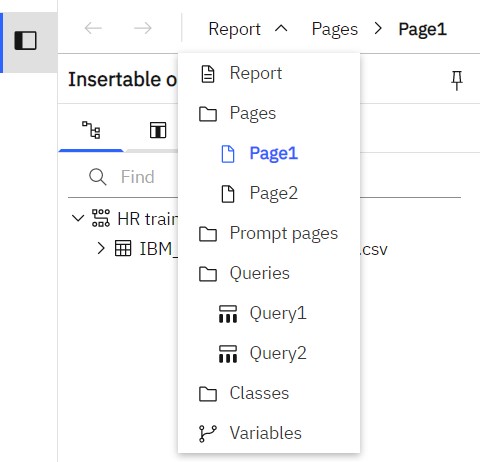
Navigation menu
You can quickly navigate through the pages, prompt pages, queries, classes,
and variables in a report by selecting an item in the navigation menu.
 or to navigate through the last objects you viewed.
 Report overview pane
 in
the navigation drop-down to see the following information:
in
the navigation drop-down to see the following information: - A description of the report
- Data sources used in the report
- The parameters used in the report
- Number of report objects
- Number of page objects
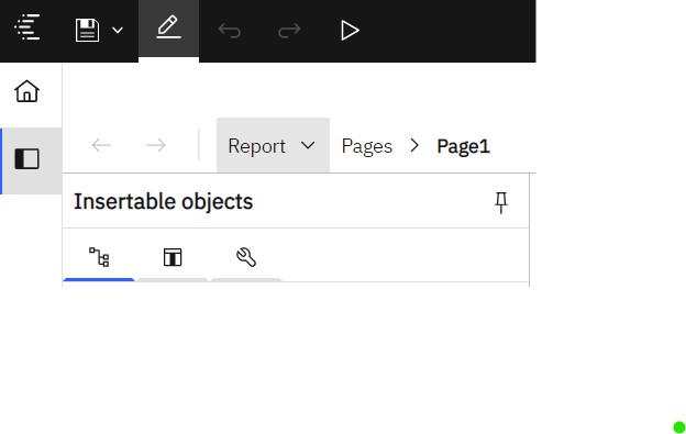
Pages pane
Click  to view or create
new report pages and prompt pages, and to create and modify classes. You can insert a page, a set of
pages, or a reference to a report from the pages pane.
to view or create
new report pages and prompt pages, and to create and modify classes. You can insert a page, a set of
pages, or a reference to a report from the pages pane.
Queries pane
Click  to create or
modify queries in relational reporting or dimensional reporting and to perform complex tasks, such
as defining joins, unions, intersects, excepts, and writing SQL and MDX statements.
to create or
modify queries in relational reporting or dimensional reporting and to perform complex tasks, such
as defining joins, unions, intersects, excepts, and writing SQL and MDX statements.
Click a specific query to add a calculation, detail or summary filter, or a set expression.
Classes pane
Click  to define a
style. For example, you can define a style for the title of an axis. You can then apply the style to
all axis titles in the report.
to define a
style. For example, you can define a style for the title of an axis. You can then apply the style to
all axis titles in the report.
Variables panes
Click  to add a
variable that has values in a different language, values as strings, and values in boolean.
to add a
variable that has values in a different language, values as strings, and values in boolean.
Filters pane
The Filters
pane is available in View mode. It displays all filters that are created by the
report consumer on the report output. When you click a filter in this pane, all data containers that
use the selected filter are automatically highlighted in the report. When a data container is
selected, the filter pane is updated instantly to display only filters that are applied to the
selected data container. You can edit or delete the filter directly in the pane.
You can resize the filter pane, and pin or unpin the pane depending on the screen resolution. Report authors can also make an authored filter visible to report consumers so that they can interact with it in this pane.
The pane cannot be used to create or view low-level filter expressions that are manually created in the expression editor. By default, interactive filtering is disabled for filters that were created in earlier versions of Cognos Analytics.
This feature is not available for active reports.
Properties pane
The properties pane lists the properties that you can set for an object in a report or for the
entire report. The properties that are displayed vary depending on the type of object. When you
specify a value for a property, press Enter, click another property, or save
the report to ensure that the value is saved. Click to show or hide the properties pane.
- Burst options
- Specifies the data item on which to burst reports. Specify recipients.
- Run with full interactivity
- Enable users to change the report
- Theme
- Apply local and global styles from another report
- Language
- Specifies the language package
- Name
- Name of the report, specified when you save it
- Report styles
- Specifies the product classes used to format objects. You can select between ReportNet, 8.x, 10.x, 11.x, and simplified styles.
- Page break for interactive HTML
- For reports with multiple data containers, specifies whether to render the default number of rows of each data container on each page.
- View pages as tabs
- In HTML output, specifies whether to show each report page in its own tab, and the location where the tabs appear in the browser.
- Paginate saved HTML output
- Specifies whether to create multiple pages or one scrollable page
- Use 1.x CSV export
- For Cognos ReportNet, specifies whether to create CSV report output.
- Group repeating cells - export to Excel
- Group repeating cells - export to Excel
- PDF page setup
- Sets PDF page options
- Conditional layouts
- Add layouts to a report based on conditions
- Data formats
- Specifies the default data format properties for each type of data
- Package-based drill-through source
- Enable or disable the report to be used as the source during a package drill-through. This property can also be set in the Basic tab of the Advanced drill behavior property.
- Dynamic filtering
- When the report is a drill-through target, specifies whether to apply more filtering when names from the context in the source report match names of items in the target report. This property can also be set in the Basic tab of the Advanced drill behavior property.
For other types of objects, like containers, you can set conditional styles, queries, pagination, margins, color and background, font and text, and many other properties.
Visual aids
Visual aids include the following options to help you when you are designing reports in the
layout. You can enable and disable visual aids by accessing the Visual aids
menu item from the More icon in the toolbar. You must be in Page design or
Page preview mode.
|
Option |
Description |
|---|---|
|
Show Boundary Lines |
Shows all boundary lines around objects |
|
Show Repeating |
Repeats objects when you insert them. For example, when you insert a data item in a crosstab, the data item appears in each row or in each column of the crosstab. |
|
Show Page Header & Footer |
Shows the page header and page footer |
|
Show Drag & Drop Padding |
Shows drag-and-drop zone when the Padding property for an object is set to 0. If the Padding property is set to a value that is greater than the minimum padding that IBM Cognos Analytics - Reporting uses to show drag-and-drop zones, only the minimum padding is shown. |
|
Show Hidden Objects |
Shows objects for which the Box Type property was set to None or for which the Visible property was set to No. |
|
Show Sorting |
Shows the sorting icon for data items for which a sort order was specified. For more information about sorting data, see Sorting Relational Data or Sorting Dimensional Data. |
|
Show Grouping |
Shows the grouping icon for grouped data items |
|
Show Source Type |
Shows the icon for the source type of objects, such as layout calculation |
|
Show Data Item Type |
Shows the icon for the type of data item, such as query item, member, or measure |
|
Show Drill-through Definitions |
Shows data items for which the drill-through definition was defined as a hyperlink |
|
Show Table of Contents Entries |
Shows table of contents entries inserted in the report |
|
Show Bookmarks |
Shows bookmarks inserted in the report |
|
Show Master Detail Relationships |
Shows master detail relationships defined in the report Tip: Pausing the pointer over the master detail relationship icon shows the
relationship
|
|
Show No Data Contents Tab Control |
Shows tabs if the data container's No Data Contents property is set to Yes |
|
Show Repeater and Singleton Containers |
Shows repeater and singleton containers inserted in the report |
|
Show Deck Controls |
Show the deck controls for active reports. For more information, see Adding Controls to a Report and Recommendation - use master detail relationships when authoring decks. |
|
Show Container Selectors |
Shows a small selector (three orange dots) for the following container objects: list, crosstab, repeater table, table of contents, table, and active report application objects. You can click to select all the objects within a container. |
|
Show Empty Text |
Shows empty text item objects that were inserted in the report |
|
Show Insertion Icons |
Shows the Add circular menu |
Page layers area
When you are working with dimensional data, use the page layers area to create sections, or page
breaks, in a report to show values for each member on a separate page. For example, you can drag
Northern Europe sales territory from the Sources tab
to the Page
layers area. The report is broken into a separate page for each territory within northern Europe.
Each page's context appears in the report header.
For more information, see Create page layers.
Context filter area
When you work with dimensional data, use the Context filter area to filter
your report to show values, or context, for only a specific data item. This technique is also known
as a slicer filter. For example, you can drag Sales Territory from the
Source tab to the Context filter area. When you click a specific territory from
the list, the values in the crosstab change to represent data for that territory.
For more information, see Create a context filter.