Applying filters to change the sampling of data displayed in visualizations
You can apply different types of filters to change your view of the data in your IBM® API Connect visualizations.
Filtering API events in your visualizations
In a dashboard, the visualizations depict information that relates to all the API events that occur for the selected Catalog in the IBM API Connect organization, and which are scoped to a specified time range. You can further filter the API events by using a free text search or a Lucene search query.
Procedure
To filter the API events, complete the following steps:
-
To perform a free text search, delete the asterisk character (*) if shown, and then enter a
text string in the search bar. For example, to filter for an API called
accounts, enter accounts in the search bar.Then, press Enter or click the Search icon .The visualizations are refreshed to show the results of your search query.
 -
To use the Lucene query syntax, complete the following steps:
-
In the search bar, delete the asterisk character (*) if shown, and then enter a search
string.
For basic search queries, use the following guidelines:
Guideline Example Construct searches on field names and their actual values by using this syntax: field_name:valueField names and their values are case-sensitive.
app_name:legacyquoteWhere required for numeric fields, use comparison operators such as greater than (>), less than (<), or equal to (=). rateLimit.count:>10Use the logic operators AND, OR, and NOT to combine search terms. app_name:livequote OR app_name:legacyquoteFor detailed information about the Lucene query syntax, see Apache Lucene - Query Parser Syntax. For information about the API event fields that you can specify in search queries, see API event record fields.Tip: Two quick ways to check for the field names on certain visualizations are to check the tooltip, or to click the caret icon to display the raw data behind the visualization.
-
Press Enter or click the Search icon .
The visualizations are refreshed to show the results of your search query.
-
In the search bar, delete the asterisk character (*) if shown, and then enter a search
string.
Specifying a time period and auto-refresh rate for the data in your visualizations
You can change the time period to which your visualization data relates by using the Time Picker. The defined time filter will be applied to all relevant visualizations in the IBM API Connect dashboard.
Procedure
To apply a time filter and auto-refresh rate, complete the following steps:
-
From the dashboard, click the Time Picker icon
 .
.
-
If you set an auto-refresh interval as described in the previous step, click the
auto-refresh value, which is displayed next to the Time Picker icon , to confirm your settings and close the time selection panels. If you did not set an
auto-refresh interval, close the Time Picker panel by clicking within the box where the
Time Picker icon is located. The search query is resubmitted as you make your selections and the
visualizations in the dashboard are automatically refreshed to show the matching data. The specified
quick, relative, or absolute filter setting is shown with the Time Picker
icon . If set, the auto-refresh interval is shown with the Time Picker
icon, together with a Pause icon that can be used to pause auto-refresh if
required.
Tip: To switch off the auto-refresh capability, click the auto-refresh value next to the Time Picker icon, and click Off. Then, close the Refresh Interval panel by clicking within the Auto-refresh box next to the Time Picker icon.
Drilling down into data in your time-based visualizations
On time-based visualizations that display histograms, you can zoom in on a specific time
range on the chart. This is equivalent to applying a filter for an absolute
time period.
Procedure
To zoom in on your data, complete one of the following steps:
-
In the chart, move your cursor to the area that depicts the start time, and hover over the
x-axis so that the cursor changes to a plus (+). Click and then drag the mouse to select a boxed
area that depicts the time range you want to examine. Release the mouse button to zoom in on the
area and view the data in greater detail.
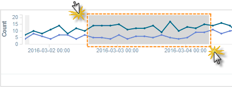
The filter is applied to all time-based visualizations in the current dashboard, and the start and end time range is shown to the right-hand side of the Time Picker icon (
).Tip: To remove the filter, click the browser Back button. Alternatively, use the Time Picker icon to select the previous, or a different time range.
Applying a filter by using the legend in a visualization
For any chart that includes a legend, you can use the legend labels to apply inclusion (or positive) filters to that chart and other relevant charts on the dashboard. When you use the legend in this way to specify inclusion, data is displayed only for the selected item. You can alternatively apply exclusion (or negative) filters to exclude the data for a selected item. You can also apply other filter conditions in addition to inclusion and exclusion filters.
Procedure
To apply a filter from the legend of a chart such as an area chart, line chart, pie chart, or bar chart, complete the following steps:
-
In the chart, click a legend label to apply a filter for that item.
The color picker opens as displayed in the following example, which shows the label and color picker for a Product named
Clothing. Notice that two icons are also shown above the colored dots.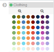 Tip: You can change the color of the lines, slices, or bars on a chart by clicking the colored dots in the color picker to select a preferred color. To retain these colors, save the dashboard.
 -
Apply an inclusion or exclusion filter as follows:
- To apply an inclusion filter that shows data associated with that item only (for example,
the
ClothingProduct), click the Positive Filter icon . A blue inclusion filter oval and an Actions twistie are displayed
beneath the search bar of the dashboard, as shown in the following example. The filter condition
(which in this case is
. A blue inclusion filter oval and an Actions twistie are displayed
beneath the search bar of the dashboard, as shown in the following example. The filter condition
(which in this case is product_name:"Clothing") is also shown in the filter oval.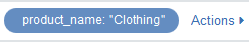
- To apply an exclusion filter that excludes data about that item from the chart, click the
Negative Filter icon
 . A red exclusion filter oval and an Actions twistie are displayed
beneath the search bar of the dashboard, as shown in the following example. The filter condition
(for example,
. A red exclusion filter oval and an Actions twistie are displayed
beneath the search bar of the dashboard, as shown in the following example. The filter condition
(for example, product_name:"Clothing") is also shown in the filter oval.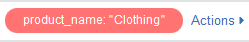
- To apply an inclusion filter that shows data associated with that item only (for example,
the
-
Highlight the filter oval to view the filter icons and use these icons to apply other filter
conditions.
The following image shows an example of the filter icons for an inclusion filter, and also shows the Actions twistie in an expanded state. The Actions twistie provides equivalent options for the icons. For an exclusion filter, similar icons are shown in a red oval.
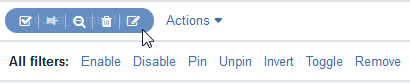
Icon Description Equivalent Actions option 
Click this icon to temporarily disable the inclusion or exclusion filter that was set in step 2. When you disable an inclusion filter, the filter oval is shown in a blue striped color, and the chart displays all the data again. (For a disabled exclusion filter, the filter oval is shown in a red striped color.) To enable the filter again, click the icon again. Disable Enable
Toggle is an alternative for Enable/Disable.

Click this icon to pin the filter. A pin icon is shown to the left-hand side of the filter condition in the blue (or red) oval as an indication. Pinning a filter causes it to be applied to other dashboards that you open. To unpin the filter, highlight the oval and click the pin icon again. Pin Unpin

Click this icon to toggle the filter to instead show excluded items (that is, those items that do not match the filter condition). The toggle action switches between applying an inclusion filter and an exclusion filter to the data in the visualization. When the exclusion filter is applied, the filter oval switches from blue to red 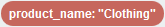 .
.Invert 
Click this icon to remove the filter and restore the chart to its original state. Remove 
Click this icon to display the JSON representation of the filter. If required, you can directly modify the JSON code to change your filter query and then specify an alias that can be used as the filter name. To see an example of how to use this option, see the Edit Filter section within the Filtering by Field topic in the Kibana documentation.
Example of how an inclusion filter works when enabled: Suppose the filter conditionproduct_name:"Clothing"is applied to the first visualization, which shows the five most active Products. A second visualization in the same dashboard, which shows the five most active APIs, would automatically be refreshed to display data only for those APIs in the Product namedClothing.