Investigating the performance of storage resources
You can investigate the information that is collected about the storage resources that you add to IBM Storage Insights Pro. To identify performance issues, the information that is collected is shown in charts and tables.
About this task
Use the performance charts and tables to analyze, detect, and investigate issues that might affect your storage environment such as slow response times and workloads with high I/O rates.
| Tiles | Description |
|---|---|
| Performance | Use breadcrumbs to navigate. Select the storage system type from the Device type list. The modern UI currently supports fleet-level performance charts for block storage systems only. |
| Storage systems | View all available storage systems. By default, 6 systems are selected to simplify the view.
You can select up to 10 storage systems. Click the expand icon to view maximum, minimum, and average
values for selected metrics.
|
| Toolbar | Select your time zone, customize the chart period by changing start and end dates, and choose the granularity (sample, hourly, or daily). Export performance data in CSV, PNG, or JPG format. Click the expand icon to view the chart in full screen. |
| Performance graph | The graph shows storage system performance trends over time.
|
If you are in the classic UI of IBM Storage Insights Pro, go to and click Performance.
| Number | Description |
|---|---|
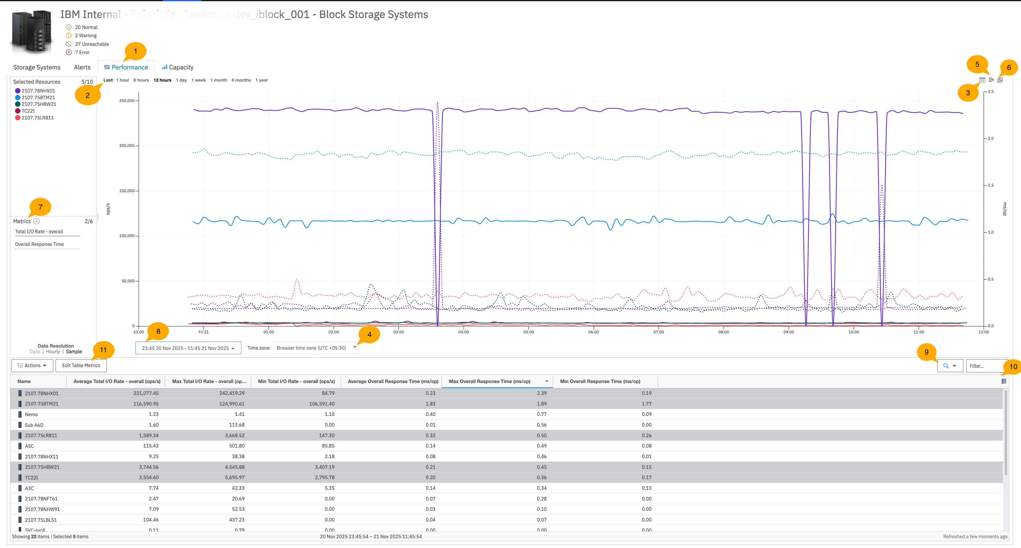
| 1 |
When you click the Performance tab, a highly granular chart is automatically generated that tracks the performance of key metrics, such as I/O rates and response times over the last 12 hours. By default, charts are generated for 5 of the resources. To refine the information that is shown in the chart, you can complete these actions:
|
| 2 | Highly granular charts at sample data resolution are shown by default for the last hour, 6 hours, 12 hours, and day. That is, performance is analyzed, measured, and reported at 5-minute intervals. To analyze performance at sample data resolution for longer periods, such as 1 or 2 weeks, reduce the number of resources that are selected. You can also use the calendar tool to customize the reporting period to a number of days instead of a week or a month. |
| 3 |
To switch from chart to a table view of the performance metrics that are shown in the chart, click the Toggle button.
|
| 4 | Select the time zone from the drop down. You can select the time zone in which you want the performance metrics to be visible when you export it. |
| 5 | To export the performance metrics that are shown in the chart to a spreadsheet, click the Export button. |
| 6 |
To open the chart in a new window, click the Open in new window button. For example, you detect slow response times for one of the storage systems. You want to find out
which of the storage system's internal resources is causing the slow response times. To investigate,
you want to examine and compare the performance metrics that are shown at the storage system level
with the performance metrics that are shown at the node, pool, or volumes levels. So, you complete
these actions:
|
| 7 | To add or change the performance metrics that are shown in the chart, click the Add Metrics button. You can add up to six metrics with two different metrical units to the chart. |
| 8 | You can customize the period that is examined in the chart by changing the start and end dates. |
- The average value of the performance metric over the selected period.
- The minimum value of the performance metric over the selected period.
- The maximum value of the performance metric over the selected period.
| Number | Description |
|---|---|
| 9 | Use the filter to group the resources that you want to view in the table and the chart. For example, if you have a naming convention for types of storage systems, you can type the letters in the filter and press Enter. The chart and the table are updated to show the resources that you want to see. |
| 10 | Click |
| 11 |
Explore the following actions:
|