White Papers
Abstract
Ji Yong HUANG,
Senior Technical Specialist
This article guides you through the development of a RUI application with EGL Bootstrap Widgets to build a responsive web application, along with a walkthrough of all the bootstrap widgets provided out of the box by RBD, (categorized into several aspects such as layout, navigation, data display, input and so on) to help you pick up appropriate widgets for different purposes. Migration from RUI widgets to Bootstrap widgets to gain responsive support easily is also discussed here.
Content
Introduction
Responsive Web Design
Responsive Web Design is an approach that makes Web pages render well on a variety of devices with varying window or screen sizes. A multitude of different screen sizes exists across phones, tablets, desktops, game consoles, televisions, and wearables. Screen sizes are always changing, so it is important that your site can adapt to any screen size, today or in the future. With responsive design, it is possible to create pages once and make them adapt to phones, desktops, and other devices.
Bootstrap
Bootstrap is one of the most popular front-end component libraries to build responsive, mobile-first projects on the web. It is an open-source toolkit for developing applications using HTML, CSS, and JS.
EGL Bootstrap Widgets
Starting with RBD v9.6, EGL provides a bundle of RUI widgets based on Bootstrap. Like EGL Dojo widgets, the EGL Bootstrap widgets are also a set of EGL RUI widgets that are highly integrated with the EGL framework and development environment, which shields the user from the underlying technology. The usage, development pattern and API have a style similar to EGL. It is handy for EGL RUI users to switch from EGL RUI or Dojo widgets; which enables EGL developers to write responsive design web applications even without the knowledge of bootstrap.
Audience
This article assumes that you already have installed IBM Rational Business Developer (RBD) and have the basic knowledge of EGL Rich UI and RBD environment.
Section 1: Develop with Bootstrap widgets
This section will walk you through the general steps to develop a RUI application with Bootstrap widgets. Bootstrap widgets are another set of RUI widgets, so the development is almost the same as using RUI widgets. It is recommended to skip this section if you are already familiar with EGL RUI.
The outline of development tasks are as follows:
- Create a Rich UI project to import the Bootstrap widgets.
- Create an EGL Rich UI handler, which is the main UI part of the project.
- Open the handler in the EGL Rich UI editor and add content to the Rich UI handler.
- Revise and test the source code using Preview and Debug options.
- When you are ready, deploy the code as a Web application.
Import EGL Bootstrap widgets
To work with EGL RUI, you must create a new RUI project and select the dependent RUI widget projects. The same applies to EGL Bootstrap widgets.
To create a RUI project, complete the following steps:
- Click File -> New -> Project. The New Project wizard is displayed.
- Expand EGL, click EGL Project and then Next. The New EGL Project page is displayed.
- Type a project name and select Rich UI Project and then Next.
- Select EGL Rich UI widgets and EGL Bootsrap widgets in the Widget libraries as in Figure-1 and then click Finish.
NOTE: A new project must be created, into which, the 'com.ibm.egl.rui.bootstrap.widgets_1.0.0' plugin should be imported.
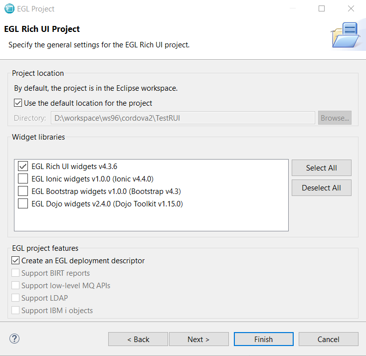
Figure-1: Select EGL bootstrap widgets during project creation
Coding and Visual Editing
This task shows how to add content to the Rich UI Handler as the business logic and User Interface. You can add content by the following ways:
- By coding widget details directly into the Rich UI handler.
- By writing the following types of logic directly into the Rich UI handler:
- Startup logic - runs when the browser first receives the application from a Web Server.
- Event logic - runs in response to user actions such as a button click.
- By accessing libraries, services, and other Rich UI handlers.
- By visual editing of the page like dragging on-screen controls called widgets onto a web page surface, setting properties in the property view, and creating events in the property view.
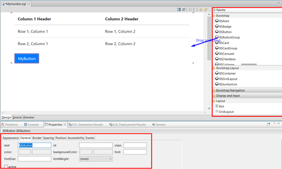
Figure-2: Visual editing the RUI handler
For more information about the visual editor, refer to EGL Rich UI Editor.
Preview, Run, and Debug
When a part of the coding is completed, you can preview it in the Rich UI Editor by switching to the Preview pane. For Developers, the Preview pane is a browser wrapper to quickly review the page.
If you want to run the application in an external browser, go to Project Explorer, right-click Rich UI handler file and select Run As -> EGL Rich UI Application. An external browser is opened and you can select the URL in the address bar and run the application in any of the browsers.
If there are bugs in the application, you can debug them directly in EGL. Open the RUI Handler in Source pane and add breakpoints in the left ruler. Then go to the Project Explorer, right-click Rich UI handler file and select Debug As -> EGL Rich UI Application. The application stops at the breakpoints and allows you to inspect the state. For more information, refer to Rich UI Debugging.
Deployment
When the Development and Testing are completed, and the RUI application is ready to be deployed to the production environment as a Web application, you must run the RUI Deployment. The common and simplest deployment steps are:
- Open the *.eglbld file in the RUI project/EGLSource folder.
- Under the General tab, in the Target project field, click New... to create a new Web project targeted for the WebSphere application server or Tomcat.
- Click Deploy at the top right. The EGL project starts to deploy the Web Project created in step 2.
You can then export the Web Project as a WAR or EAR and deploy it to the production environment.
There are a lot of options available to configure in the deployment descriptor. Refer to Overview of EGL Rich UI Deployment for more information.
Samples
To help developers, RBD provides a set of EGL bootstrap widget samples to demonstrate the usages.
- Click Help -> Samples. The Help dialog box is displayed.
- Expand Samples, Technology samples.
- Click EGL Bootstrap sample.
- Click the entry to import the samples or manually import it from: %IBMIMShared%\plugins\com.ibm.etools.examples.egl_7.0.202.v20190822_1129\install\com.ibm.egl.rui.bootstrap.samples.zip
- In the Workbench Project Explorer, expand the project com.ibm.egl.rui.bootstrap.samples, file EGL Source, and package bootstrap.samples.
- Double-click Gallery.egl to explore the composite sample for all widgets. You can also click the single sample inside bootstrap.samples.perwidget package.

Figure-3: EGL Bootstrap Samples
Notice that this sample is responsive. Users can try resizing the browser window, and see that the sample would be adaptive to the screen size.
Section 2: Responsive Layout
EGL Bootstrap widgets provide additional widgets to layout the RUIHandler. Some of these layout widgets add responsive support that was not available in previous RBD versions.
Media Query
Media query is a CSS technique introduced in CSS3. This is one of the basic techniques that support responsive design. It uses the @media rule to include a block of CSS properties only if a certain condition is true. EGL Bootstrap widgets use the underlying media query, but it is still open for the Users to specify the media query css directly. The media query css can be added to the cssFile of the RUIHandler like any other css.
Example 1 Media query in RUIHandler
RUIHandler file
handler MyHandler type RUIhandler {initialUI = [ ],onConstructionFunction = start, cssFile="css/testRUI.css", title="MyHandler"}
function start()
end
//Content here
end
CSS file testRUI.css
@media (min-width: 992px) {
.navbar-collapse {
display: -ms-flexbox!important;
display: flex!important;
-ms-flex-preferred-size: auto;
flex-basis: auto;
}
#galleryLayout >div >div{
position: -webkit-sticky;
position: sticky;
top: 4rem;
}
#galleryNav {
max-height: calc(100vh - 6rem);
overflow-y: auto;
overflow-x: hidden;
}
}
Responsive Breakpoint
Breakpoints are the points where your site's content becomes responsive and provides the user with the best possible layout to consume the information. In EGL, the bootstrap responsive breakpoint standard is followed. The breakpoints used in EGL are shown in Table 1.
|
EGL breakpoints |
size |
|
default |
<576px |
|
small |
>=576px |
|
medium |
>=768px |
|
large |
>=992px |
|
extralarge |
>=1200px |
Table-1: EGL Responsive Breakpoints
BSGridLayout
For EGL RUI users, Gridlayout is one of the most used widgets to layout the page. BSGridLayout is the widget presented to support responsive design. It provides an API and visual editor that is very similar to the GridLayout, which makes it easier for RUI users to switch from GridLayout. Also, visual editing support is user-friendly.
Like GridLayout, BSGridLayout also has rows and columns that embed Child widgets. Each Child widget has a layoutData property, which can be assigned a value, to specify the location of the widget. Unlike GridLayout, BSGridLayout does not support Column or Row span. Instead, its Columns and Rows are independent of each other, which means that you can specify different width or height for different cells without affecting other cells.
The main properties are as follows:
- children - holds an array of widgets as described in Widget properties and functions.
- columns - holds an integer value that identifies the number of columns in the layout.
- row - holds an integer value that identifies the number of rows in the layout.
- cellPadding - holds an integer value that identifies the number of bootstrap spacers between a child widget and its parent. By default, the bootstrap spacer is 1rem. The valid values are as follows:
|
cellPadding |
width |
|
0 |
0 |
|
1 |
0.25 rem |
|
2 |
0.5 rem |
|
3 |
1 rem |
|
4 |
1.5 rem |
|
5 |
3 rem |
Table-2: BSGridLayout cellPadding available values
LayoutData
The layoutData property in the child widgets define the position of the child and affects the overall layout. It is defined by the BSGridLayoutData record. LayoutData has the following properties:
- row - an integer that represents the topmost layout row where the widget resides.
- column - an integer that represents the leftmost layout column where the widget resides.
- colWidth - a BSGridLayoutColWidth record to specify the width for various screen sizes (breakpoints).
- horizontalAlignment - the widget's horizontal position within the columns that the widget reserves for itself with one of the following values:
- BSLib.ALIGN_LEFT - at the left of the columns
- BSLib.ALIGN_CENTER - at the center of the columns
- GridLayoutLib.ALIGN_RIGHT - at the right of the columns
- verticalAlignment - the widget's vertical position within the rows that the widget reserves for itself with one of the following values:
- BSLib.VALIGN_TOP - at the top of the rows
- BSLib.VALIGN_MIDDLE - at the middle of the rows
- BSLib.VALIGN_BOTTOM - at the bottom of the rows
Notice that the alignment of BSGridLayout is different from GridLayout. For BSGridLayout, it is to set the alignment of the whole cell. Only when the cells' width does not take up the whole row can the user visually distinguish the alignment. For detailed information about Bootstrap, refer to : https://getbootstrap.com/docs/4.4/layout/grid/#horizontal-alignment
(Note : The justify-content-around and justify-content-between are not yet implemented in EGL.)
The colWidth parameter is the key to responsive layout. The BSGridLayout follows the 12-column grid design of Bootstrap. Each row is virtually split into 12 columns, thus the width can be presented by how many virtual columns it takes. For example, the value 3 indicates 3 columns that are 1/4th of the total width. If the row width gets larger, the column will also be enlarged proportionally to adapt to different screen sizes.
BSGridLayoutColWidth is the type used to define the width in various responsive breakpoints in unit of virtual columns. In Example 1, Button1 has a width of {default=12, medium=6, large = 3}, which means that it will take up the whole row when screen size is extra small and small, respectively (because small width is not defined, it will continue to use the default width); half of the row width when the screen size becomes medium; and 1/4th of the row width when the screen size becomes large and larger, respectively.
Example 2 BSGridLayout with responsive cells
Grid BSGridLayout{
rows = 2, columns = 2, cellPadding=2,
children = [ BSButton, Button, Button1, BSBadge ]
};
Button BSButton{ text="Row1Col2",
layoutData = new BSGridLayoutData{ row = 1, column = 2 }
};
//Button with responsive cell
Button1 BSButton{ text="Row1Col1",
layoutData = new BSGridLayoutData{ row = 1, column = 1,
colWidth = new BSGridLayoutColWidth{default=12, medium=6, large = 3} }
};
//Badge with responsive cell
BSBadge BSBadge{text="Row2Col1", colorType = BSLib.COLOR_TYPE_DANGER,
layoutData = new BSGridLayoutData{ row = 2, column = 1,
colWidth = new BSGridLayoutColWidth{default=6, small=5, medium=4, large = 3, extraLarge = 2}
}};
BSButton BSButton{ layoutData = new BSGridLayoutData{ row = 2, column = 2 },
text="Row2Col2", colorType=BSLib.COLOR_TYPE_PRIMARY
};
Figure 4 shows the rendering page of this example in different widths. Among them, Row1Col1 and Row2Col2 have responsive width. In the left smaller viewport, Row1Col1 takes up the whole row because its colWidth default=12, while Row2Col1 takes up half of the row as its colWidth default=6. In the right larger viewport, medium size is taken. So Row1Col1 takes up half while the Row2Col1 takes up 1/3rd of the width.

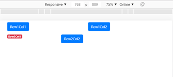
Figure-4: BSGridLayout in different screen size
Visual Editor Support
The Rich UI Editor helps in working with a grid layout. In particular, you can do the following tasks:
- Drag-and-drop widgets from the palette into specific cells of the BSGridLayout, to set the layoutData properly.
- Move widgets from one cell to another.
- Add or Delete a row/column.
- Drag-and-drop records from the Data view and use the BSGridLayout as the layout widget.
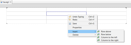
Figure-5: BSGridLayout in design view
BSContainer
BSContainer is the most basic layout element in EGL Bootstrap widgets. This is recommended as it is the top-level container widget for Boostrap widgets, except for BSGridLayout. To use bootstrap widgets properly, make the root UI widget to be BSGridLayout or BSContainer. It is usually not required to use BSContainer nested in other widgets.
The main property of BSContainer is:
- isFluid: If true, the container takes the fluid-width (which means that it is 100% wide all the time) else it will be a responsive, fixed-width container (which means that it's max-width changes at each breakpoint).
Section 3: Navigation
In the previous EGL RUI application, there is no out-of-box navigation framework. Developers can create a button or link and can add to or remove contents from the page, in the event of a Click. The EGL bootstrap widgets are enhanced with a navigation framework by making a bunch of navigation widgets work together. The look and feel of the navigation widgets are enhanced and would still fit in the existing programming model.
Navigation framework based on BSNavs
Tab style navigation by BSNavs
Based on the BSNavs, several widgets are provided to form a navigation framework. BSNavs is the navigation widget with tab or link styles. It is provided with a collection of BSNavItem as the data to specify the link text, and the target content, a BSNavPane. When the link is clicked, the referred BSNavPane becomes the active content and the other content is hidden. BSNavPanes are children of BSNavContainer that hold a place on the page. BSNavContainer can be placed anywhere like other widgets and does not need to be placed next to the BSNavs, which provides a lot of flexibility for navigation.
|
Widget |
Description |
|
BSNavs |
Define the list of navigation link |
|
BSNavItem |
A single navigation link points to a navPane |
|
BSNavContainer |
A container widget for navigated area |
|
BSNavPane |
The content to be navigated |
Table-3: Navigation by BSNavs
A simple BSNavs example must contain all of these widgets. An example is shown below:
Example 3 The simplest BSNavs
handler MyHandler type RUIhandler {initialUI = [ui ], cssFile="css/testRUI.css", title="MyHandler"}
ui BSContainer{
children = [
navs,navCont
]
};
panes BSNavPane[] = [new BSNavPane{children=[new Div{innerText="HelloTab"}]},
new BSNavPane{children=[new Div{innerText="HelloTab2"}]},
new BSNavPane{children=[new Div{innerText="HelloTab3"}]}];
navCont BSNavContainer{children = panes, class="mb-3"};
navs BSNavs{ selection = 1, data=[
new BSNavItem{text="tab1", target=panes[1]},
new BSNavItem{text="tab2", target=panes[2]},
new BSNavItem{text="tab3", target=panes[3]}
]};
end
The main properties of BSNavs are as follows:
- data - a list of BSNavItem to specify the text and target of the navigation links.
- selection - an integer that represents which link is active. It is the index of the data.
- vertical - a boolean to specify whether the tab title is vertical. The default is horizontal.
- navType - the widget's style. The available values are:
- BSLib.NAV_TYPE_DEFAULT - the default link style
- BSLib.NAV_TYPE_TAB - the navigation header looks like tabs
- BSLib.NAV_TYPE_PILL - the pill style which is like a button link
BSNavPane and BSNavContainer are container widgets, which have a children property to contain child widgets. They do not have additional properties.
Bar style navigation by BSNavBar
BSNavBar is a wrapper widget for BSNavs. BSNavBar presents the navigation link in a bar, within the header or footer, which is a popular style used in mobile phones. It is responsive out of the box. The Navs are hidden in small devices and expanded in bigger views.
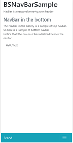
Figure-6: Bottom NavBar in phone and desktop
In a Responsive breakpoint, the navbar expands to show all the navigation items. The breakpoint can be specified by the expandPoint property. A sample NavBar that expands at a LARGE responsive breakpoint is shown below:
Example 4 A BSNavBar example
BSNavBar BSNavBar{
colorType = BSLib.COLOR_TYPE_DARK,
expandPoint = BSLib.BREAKPOINT_LARGE ,
brand = new Span{text="Brand"},
nav = new BSNavs{
selection=1,
data=[
new BSNavItem{text="tab1", target=panes[1] },
new BSNavItem{text="tab2", target=panes[2] },
new BSNavItem{text="tab3", target=panes[3] }
]
},
placement = BSLib.PLACEMENT_FIXEDBOTTOM,
bgColorType = BSLib.COLOR_TYPE_INFO
};
The main properties of BSNavBar are as follows:
- nav: a BSNav widget to conduct the navigation
- brand: a widget to be displayed as the brand at the leftmost
- expandPoint: a responsive point that will expand the navs
- placement: where the bar is placed, the default is at the top. The values are as follows:
- BSLib.PLACEMENT_DEFAULT - fixed at the top
- BSLib.PLACEMENT_FIXEDTOP - fixed at the top
- BSLib.PLACEMENT_FIXEDBOTTOM - fixed at the bottom
- BSLib.PLACEMENT_STICKYTOP - sticky to the top (scrolls with the page until it reaches the top, then stays there)
- colorType: the color of the text and foreground element
- bgColorType: the color of the background
Other Navigation by Event
There are also some widgets available for navigation. The navigation for these widgets is not automatically done, the developer must specify how to navigate in the click event.
BSBreadcrumb
Breadcrumb is a popular style to indicate the current page's location with a navigational hierarchy. BSBreadcrumb presents a widget to show the breadcrumb and enables the navigation by onChange and onClick events.
Example 5 A BSBreadcrumb sample
bc BSBreadcrumb{ values = ["Home", "Library", "Data"],
selection = 3, onChange ::= BSBreadcrumb_onChange, onClick ::= BSBreadcrumb_onClick };
function BSBreadcrumb_onChange(event Event in)
// do navigation
end
function BSBreadcrumb_onClick(event Event in)
// do navigation
end
The main properties are as follows:
- values - a string list to specify the navigational hierarchy
- selection - the index of the selected navigation in the values list
BSPagination
BSPagination presents a widget to indicate the paging of content in a proper style. It also requires a navigation handling for the onClick event.
The main properties are as follows:
- data - a string list to specify the paging, such as ["1", "2", "3"]
- selection - the index of the selected page in the data list
Section 4: Content Display
In order to present the page content properly, EGL bootstrap widget library provides many widgets in addition to the existing RUI widgets.
Display Data by DataTable
BSDataTable is a responsive table to display data like a list of records. It is the fundamental widget to display data. As one of the most used RUI widget DataGrid, BSDataTable provides a subset of compatible APIs and features to deal with various data manipulation tasks. To enhance the responsive support, DataGrid user would be comfortable to use BSDataTable instead.
You must be familiar with the following issues for a better understanding of the data grid:
- How to define column headings and data rows.
- How to define behavior, which is a property that takes an array of functions. When the grid is being rendered, the functions for a given behavior run in array-element order.
- How to define a listener, which is also a property that takes an array of functions. The functions for a given listener run in array-element order in response to a user action such as a click or, in some cases, in response to a function call that selects or deselects a row, or that updates a checkbox.
- How to customize a mechanism for sorting the grid by column.
Define BSDataTable
BSDataTable is designed for displaying a list of structural data. In EGL, the data could be a record or dictionary array. To define a BSDataTable, you must define a data structure, then define the corresponding column in DataTable. Finally, assign the data array to the BSDataTable. The following example offers a simpler beginning:
- Define a Record part to be the basis of an array of records. Each record holds a set of values that you want to display in a single row of a data grid.
Following is an example of a Record part:
Record Stock type BasicRecord
Symbol STRING;
NumShares INT;
Quote DECIMAL(5,2);
SelectQuote Boolean;
end
The field names are important because they are referenced later, in the declaration of the grid columns.
stockList Stock[] = [
new Stock{SelectQuote = false, Symbol = "Company1", Quote = 100.00, NumShares = 40 },
new Stock{SelectQuote = false, Symbol = "Company2", Quote = 200.00, NumShares = 10 } ];
The order of fields in each data record is not meaningful. However, by default, the order of the data records in the array is the order of rows in the data grid.
- Declare the data grid in a location that follows the previous record declaration.
myTable BSDataTable{...};
The declaration typically includes the columns and data properties:
- For the columns property, assign an array of records of type DataGridColumn. Here is the setting for the current example:
columns = [
new BSDataTableColumn { name = "Symbol", displayName = "Company Symbol"},
new BSDataTableColumn { name = "Quote", displayName = "Price Per Share" },
new BSDataTableColumn { name = "NumShares", displayName = "Number of Shares" },
new BSDataTableColumn { name = "Total",
displayName = "Value of Shares",
formatters = [totalFormatter] }
]
- Each of the first three declarations of type DataGridColumn references a record field in the array of Stock records. The fourth declaration identifies a calculated column, which is a column that has no corresponding record field; in this case, there is no record field named Total. The order of the DataGridColumn elements determines the order in which the columns are displayed.
- For the data property, assign the array of records of type Stock. Here is an example setting:
data = stockList as any[]
Each element in the array provides a subset of the data required for a row in the data grid.
In most cases, Rich UI requires that you declare variables before you reference them. In this example, stockList must be declared before the data grid.
Create BSDataTable by Visual Editor
Defining a BSDataTable manually is tedious and error-prone. RBD visual editor supports D&D. Drag and drop a BSDataTable widget from the palette to the design canvas just like other widgets. It generates a template for all the data and columns. Using the property view, the developer can continuously add or modify properties; this way it is easier to display the data.
Additionally, it is supported to D&D record arrays from the Data view to create a BSDataTable with all the columns in place. Once you have the data definition in place, you could have a data table created in the D&D.

Figure-7: Data Drag and Drop to BSDataTable
Behavior and Formatter
Behavior and formatter are function delegate. They can affect style characteristics and can invoke the logic of various kinds. For example, to sort by column, to access a service, to calculate a value and place it into a grid column, or to configure a widget and place it into a grid column. You can build on these ideas in various ways.
Behavior can be applied to the header and row separately. And there is a common task to add a widget into a table cell, which can be done by editorBehavior. The behavior function will have access to the grid and you can make changes to it with any logic.
In the below example, the headers will be applied with whiteCells behavior that adds a css class to the header cell to make it white and the common cells will apply grayCells behavior that has another css class added. And the editorBehavior myFunction will add the widget to a cell according to its column name.
Example 6 BSDataTable behaviors
headerBehaviors = [whiteCells],
behaviors = [grayCells],
editorBehaviors = [myFunction],
function whiteCells(grid BSDataTable in, td Widget in, row any in, rowNumber int in, column BSDataTableColumn in)
td.class = td.class + " EglRuiGridCellColor2";
end
function grayCells(grid BSDataTable in, td Widget in, row any in, rowNumber int in, column BSDataTableColumn in)
td.class = td.class + " EglRuiGridCellColor1";
end
function myFunction(grid BSDataTable in, cell Widget in,rowData any in, rowIndex int in, column BSDataTableColumn in, value any in) returns (Widget)
case(column.name)
when("name")
combo BSList { values = [ "Jane", "Joe", "Mary", "Fred" ],sizeType = BSLib.SIZE_TYPE_SMALL, onChange ::= handleComboChange };
selIndex int = 0;
for (n int from 1 to combo.values.getSize() by 1)
if (value as String == combo.values[n])
selIndex = n;
exit for;
end
end
combo.selection = selIndex;
return (combo);
when("age")
editor BSTextField {
text = value,
sizeType = BSLib.SIZE_TYPE_SMALL,
onChange ::= handleTextFieldChange
};
return (editor);
otherwise
return (null);
end
end
As BSDataTableColumn is a column-level function, formatter can be applied to it. By applying the formatter, the user can also modify the table at a column level. It focusses on the data value and is used to do some conversion for the data or even create a virtual column by calculation. In the below formatter, the column value is calculated.
Example 7 BSDataTable formatter
function totalFormatter(class String inout, value String inout, rowData any in)
// display the total value of the shares after calculating the value
// from the content of two other columns in the same row
value = rowData.NumShares as INT * rowData.Quote as DECIMAL(5,2);
end
The following properties are used to control paging:
- behaviors - an array of behaviors function to specify the common row cell behaviors
- headerBehaviors - an array of behaviors function to specify the header row cell behaviors
- editorBehaviors - an array of behaviors function which returns a widget to add a widget into common row cells
- manageEditorBehaviors - a boolean value, default is true. It specifies whether the widgets returned by the editorBehavior is automatically managed by EGL. This includes destroying the widget when re-rendering the DataTable. If false, the user must handle destroying the widget to prevent any memory leakage.
Selection
Unlike DataGrid, BSDataTable provides only one way of selection: click a row to select or deselect it. Checkbox is not supported as of now.
- Four functions are used: setSelection, selectAll, deSelectAll, and getSelection.
- The value of the BSDataTable selectionMode property specifies whether row selection is valid and if so, how many rows can be selected. That property affects the row selection done by the user or code. The values are:
- BSLIb.MULTIPLE_SELECTION is the default value. Users can select multiple rows at one time. Hold Ctrl key and click rows, which will select multiple rows.
- BSLIb.SINGLE_SELECTION - only a row is selected at one time. When you click a row, the row is highlighted. And if there is a previously selected row, it will be deselected.
- BSLib.DISABLE_SELECTION – Row selection is disabled, so no row can be selected.
- When row selection is valid, listener functions run in response to the user clicking a row or in response to the invocation of any of the following functions: setSelection, selectAll, or deSelectAll.
- The listener functions are referenced from the BSDataTable selectionListeners property.
Paging and Sorting
For BSDataTable, the paging and sorting are enabled by default. The paging is done by integrating the BSPagination widget. The sorting is set at the column level.
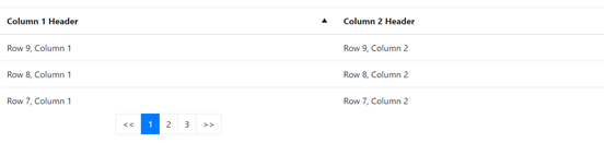
Figure-8: BSDataTable with paging and sorting
The following properties are used to control paging and sorting:
- pageSize - an integer value to specify how many rows are presented on a page. The default value is 10. If pageSize is 0, the paging is disabled, which means all rows are presented.
- startRow - an integer value to indicate the index for the first row to be displayed on the current page. The default value is 1. Together with pageSize, it will decide which page to show. For example, 21 with a pageSize of 10 will make the DataTable show the 3rd page.
- showButtonBar - a boolean to indicate whether the pagination will be presented. If it is false, the developer will have to create a custom pagination UI.
- pageChangeListeners - an array of functions that are invoked when the page is changed.
- enableSorting - a boolean value to indicate whether sorting is allowed. The default value is true.
- sortListeners - an array of functions that are invoked when a column is sorted.
The sorting is also controlled by column level, which means the developer can enable columnA's sorting but disable columnB. It supports customizing the sorting method. The following properties in BSDataTableColumn are used to control sorting:
- enableSorting - a boolean indicating whether the column can be sorted. If it is true, then when clicking in the column header a sorting icon (triangle) is shown specifying the sorting direction and the rows are sorted with the column.
- columnComparator - a function delegate to customize the sorting method.
- sortDirection - an integer to specify the sort direction. The value can be DataGridLib.SORT_NONE, DataGridLib.SORT_DOWN, DataGridLib.SORT_UP.
- ignoreCase - a boolean value defaults to true. It specifies whether the case is ignored when sorting string values.
Responsive support
One of the main enhancements of BSDataTable is the support of responsive design. The BSDataTable can automatically adapt and expand to the width of the page. The common pattern is to set the smallest width for the DataTable in which it can show the contents in a good shape. For a larger width, the DataTable will adapt. For a smaller width, the DataTable will not shrink but show a scrollbar horizontally; this would ensure that the content is big enough to read even in small devices.
The responsivePoint property is the property used to define the smallest width. The valid values are:
- BSLib.BREAKPOINT_EXTRA_SMALL
- BSLib.BREAKPOINT_SMALL
- BSLib.BREAKPOINT_MEDIUM
- BSLib.BREAKPOINT_LARGE
- BSLib.BREAKPOINT_EXTRA_LARGE
BSDataTableColumn
The column definition for DataTable is defined as BSDataTableColumn. The sorting properties have already been discussed in the previous section.
Other properties are listed for your reference:
- displayName - the name to be displayed in the DataTable header cell of this column.
- name - the name of the column. It should be the same as its name in the data structure (record field name or dictionary key name).
- width - specify the width of the column.
- formatters - an array of formatter functions to format the values in this column.
Other Properties for UI
Another important enhancement for BSDataTable is the abundant style properties. Here are the properties:
- colorType - the color of bootstrap color utilities. This is syntactic sugar to specify the color.
- sizeType - the size of bootstrap size utilities. This is syntactic sugar to specify the color.
- striped - a boolean value to indicate whether the data table row is striped with different colors of odd and even rows.
- hoverable - a boolean value to indicate if hovering over a row would activate it (changes the color of the row).
- borderType - to specify the border type of the DataTable (bordered or borderless).
ListGroup
List groups are a flexible and powerful component for displaying a series of content. In mobile applications, such content is almost everywhere.
List contents
BSList has two independent ways to specify the contents. If the content is plain text, just specify the values property. If the content is complex and needs customization, just use the list as a widget container and specify its child widgets.
Example 8 Simplest BSListGroup
//ListGroup with only text content
BSListGroup BSListGroup{values=["item1", "item2", "item3"], flush=true};
//ListGroup with button action
BSListGroup2 BSListGroup{children = [ BSButton, BSButton1 ]};
Various Styles
BSListGroup has some properties to set the style.
- flush - a boolean value to indicate whether to display list in flush style (edge-to-edge without border).
- horizontal - a boolean value to indicate whether to display list horizontally.
Media
When displaying the content list, one common pattern for a list row is to have a thumbnail and content with the title. This is extracted as a new widget, BSMedia. BSMedia consists of the thumbnail image, title, and content. The user can specify to display the thumbnail ahead or in the last by setting imageAhead property. BSMedia should be used only as a child of BSListGroup.
Example 9 BSListGroup of BSMedias
BSListGroup BSListGroup{
children = [
new BSMedia{image = new Image{src="images/image3.jpg", class="mr-2", width="64"}, header="Media in list 1", content="The first media in list"},
new BSMedia{image = new Image{src="images/image3.jpg", class="mr-2", width="64"}, header="Media in list 2", content="The second media in list"},
new BSMedia{image = new Image{src="images/image3.jpg", class="mr-2", width="64"}, header="Media in list 3", content="The third media in list"}
]};
The rendered list is as shown in figure 9.
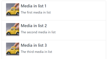
Figure-9: BSMedia List
Card
A card is a flexible and extensible content container. It includes options for headers and footers, a wide variety of content, contextual background colors, and powerful display options. It is a popular content container for modern applications in smaller devices.
Components of a card
By default, a card is composed of one or many components. The components from the top to the bottom are listed in the table below. Note that they are all optional so that the developer can specify any combination of these components.
|
Component |
Description |
|
header |
The text in the header bar |
|
image |
The url of the image that shows below header |
|
title |
The title of the content |
|
subtitle |
The subtitle of the content |
|
text |
The text content |
|
footer |
The text in the footer bar |
Table-4: Components of BSCard
In the below screenshot, all the components are specified.
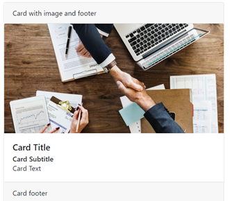
Figure-10: A BSCard with all components
Customize card content
The content of the card is specified by the title, subtitle, and text properties. If customization is required, we can specify the children of the card that will replace the content. You can provide any kind of content into a card. One of the most commonly used functions is to embed a list into a card. Below is the example of a card with a list.
Example 10 Customize BSCard content
card BSCard{header="Card With list children", children = [ BSListGroup ]};
BSListGroup BSListGroup{values=["item1", "item2", "item3"]};
Card group
In order to layout multiple cards properly, a container widget BSCardGroup is provided. It provides three ways to layout the cards by specifying the groupType property. The valid values are:
- BSLib.GROUP_TYPE_DEFAULT: render cards as a single, attached element with equal width and height columns.
- BSLib.GROUP_TYPE_DECK: render cards with equal width and height that are not attached to one another.
- BSLib.GROUP_TYPE_COLUMNS: render cards with equal width, but not equal height which is not attached to one another.
Other containers
Collapse
BSCollapse is a content container that can toggle the visibility of its content. It can contain any children widgets and provide them the ability to hide or show.
- shown: a boolean value to indicate if the content is shown
- onChange: an event when the collapse status changes
- children: its children widgets as the content
Example 11 A simple BSCollapse
BSCollapse BSCollapse{shown=true,
children = [ BSCard ], onChange ::= BSCollapse_onChange};
Jumbtron
BSJumbtron is a lightweight, flexible widget for showcasing hero-unit style content. You can treat it as a pre-styled content displayer. It is simple to use by only specifying the children.
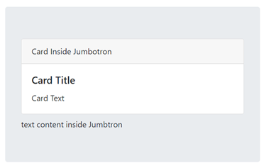
Figure-11: BSJumbtron example
Single purpose displayer
There are other widgets which are used only for specific content display. For example, BSCarousel for image gallery, BSSpinner, and BSProgress for progress indication. We will discuss these widgets in the next section.
Carousel
Carousel is a slideshow component for cycling through elements, which can be images or slides of text. It is a commonly used widget in modern websites for various purposes like advertisement display, image gallery, and so on. BSCarousel is an out of box EGL implementation of Carousel.
Example 12 A Carousel sample
carousel BSCarousel{withControl=true, withIndicator=true, data=[
new BSCarouselItem{image="images/carousel1.jpg",slideInterval=5000, captionTitle="First Image", captionText="hello world"},
new BSCarouselItem{image="images/carousel2.jpg", slideInterval=2000, captionTitle="Second Image"}]};
The content of the BSCarousel is defined by the data property. It is an array of BSCarouselItem record that specifies each carousel elements. The properties of BSCarouselItem include:
- image - a string value to specify the image URL
- slideInterval - the amount of time to transit to the next slide in a millisecond. The default value is 5000.
- captionTitle - the text title to be shown
- captionText - the content text to be shown
NOTE: It is recommended to use images of the same size for all carousel items for a better look.
The following are the properties and functions used to control BSCarousel.
- withControl - a boolean value to indicate whether to display the previous/next control so that the user can manually navigate the slides.
- withIndicator - a boolean value to indicate whether an indicator is displayed for paging information.
- crossFade - a boolean value to indicate whether to animate slides with a fade transition instead of a slide.
The following are the functions used to control the movement of the slides:
- start() - start cycling the slides
- pause() - pause cycling the slides
- moveTo(index) - move the slides to the element in the index
- moveToPrev() - move to the previous slide
- moveToNext() - move to the next slide
Spinner
Spinner is a simple widget to indicate the loading status. The usage pattern of a BSSpinner is as follows:
- Add a BSSpinner instance to the page when loading starts.
- Remove the BSSpinner instance from the page when loading is completed through a done event.
The properties for BSSpinner are:
- spinnerStyle - the style of the spinner. The supported values are border and grow.
- colorType - the color of the spinner with bootstrap color. For more information, refer to Section7 Bootstrap CSS.
- sizeType - the size of the spinner with bootstrap size. For more information, refer to Section7 Bootstrap CSS.
Progress
BSProgress is a widget to show a custom-styled progress bar to indicate progress, which is controlled by the progress property. The usage pattern is to first create a BSProgress with progress=0. When the progress is updated, update the BSProgress progress property. By default, there is no text in the progress bar. Set the progressLabel to display a label in the progress bar. If progressLabel is related to progress, update progressLabel when the progress is updated. For example, to use percentage as the progress label, update progressLabel = "" + progress + "%" and each time the progress is updated.
The following properties of BSProgress refer to the style:
- bgcolorType - the background color set with the bootstrap color. For more information, refer to Section7 Bootstrap CSS.
- striped - a boolean value to indicate whether to use a striped progress bar.
- animated - a boolean value to indicate whether to animate the progress bar.
Section 5: Inputs
There are many input EGL RUI widgets. We provide more input widgets in the EGL bootstrap widget set. Most of them have the same functionality as the RUI correspondents. The main target is to provide a bootstrap style input widget set so that they can work in sync with other bootstrap widgets. Additionally, some collection widgets are provided to bundle several inputs together to give a better look and feel.
Note that these form labels and input widgets are integrated into the Visual editor data view. When you drag and drop a record into the palette, these bootstrap input widgets are available for selection as the display or input widgets.
Label widgets
BSLabel widget is presented as a bootstrap version label. Additionally, BSBadge is presented to display a badge for highlight.
BSLabel widget is a simple widget that is usually used as a text label for a form field. The following are the properties:
- text - the string content of the label
- forId - the id of the element that the label is bound to. If forId is set when the focus is on the label, the bounded form control also gets the focus.
BSBadge widget is a simple widget with a predefined badge style. The properties are as follows:
- text - the string content of the badge
- pill - a boolean value to indicate if pill style is used
- colorStyle - the color of the spinner with bootstrap color. For more information, refer to Section7 Bootstrap CSS.
Action widgets
Button
BSButton is a bootstrap version button with abundant style options. It is the most useful widget to trigger actions. The feature of BSButton is the same as RUI Button. There are two kinds of styles for BSButton, the default, and the outline style. The color and size can be easily customized with bootstrap predefined values.
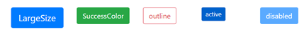
Figure-12: Various BSButtons
The additional style properties of BSButton are:
- outline - a boolean value to indicate whether the display button is in outline style.
- block - a boolean value to indicate whether to display the button as a block. In this case, each button will take up a whole line.
- active - a boolean value to indicate if the button is active. An active button will have a predefined active style to distinguish from a normal button.
- colorType - the color of the button with bootstrap color. For more information, refer to Section7 Bootstrap CSS.
- sizeType - the size of the button with bootstrap size. For more information, refer to Section7 Bootstrap CSS.
Dropdowns
BSDropdown is a widget that contains a list of action items (BSDropdownItem) and can be toggled using a dropdown list or menu. It is usually used as a menu. It is a container of BSDropdownItem.
Example 13 BSDropdown menu
BSDropdown BSDropdown{text="Hello", colorType=BSLib.COLOR_TYPE_PRIMARY, children=[
new BSDropdownItem{itemType=BSLib.ITEM_TYPE_DEFAULT, text="menu1", onClick ::= BSDropdown_onClick},
new BSDropdownItem{itemType=BSLib.ITEM_TYPE_DEFAULT, text="menu2", onClick ::= BSDropdown_onClick},
new BSDropdownItem{itemType=BSLib.ITEM_TYPE_DEFAULT, text="menu3", onClick ::= BSDropdown_onClick}
],
colorType = BSLib.COLOR_TYPE_PRIMARY};
The major properties for BSDropdown are:
- children - a list of BSDropdownItem widget to specify the dropdown items
- text - the dropdown title
- split - specifies if the dropdown icon is split from the text
- direction - to specify the dropdown direction with any of the following values: BSLib.DIRECTION_DOWN, BSLib.DIRECTION_UP, BSLib.DIRECTION_RIGHT, and BSLib.DIRECTION_LEFT
- colorType - the color of the button with bootstrap color. For more information, refer to Section7 Bootstrap CSS.
- sizeType - the size of the button with bootstrap size. For more information, refer to Section7 Bootstrap CSS.
BSDropdownItem has the following properties:
- text - the dropdown item title
- itemType - three types are supported. The default is BSLib.ITEM_TYPE_DEFAULT, which is a normal action item. The other types are BSLib.ITEM_TYPE_HEADER and BSLib.ITEM_TYPE_DIVIDER for formation purposes.
- active - whether the item is in an active state, which will have a different style.
Form controls of bootstrap style
A series of bootstrap style form control widgets are provided. In most cases, the properties are the same as the RUI correspondents with some additional style properties.
Various form control
A series of bootstrap style form control widgets are presented in EGL bootstrap widgets. All the widgets are listed in the below table:
|
Bootstrap widget |
Corresponding RUI Widget |
Additional properties |
Key common properties |
|
BSTextField |
TextField |
|
|
|
BSCheckbox |
Checkbox |
|
|
|
BSList |
List |
|
|
|
BSListMulti |
ListMulti |
|
|
|
BSRadioGroup |
RadioGroup |
|
|
Table-5: Comparison of bootstrap form control widgets and RUI form control widgets
New form controls
Two new kinds of form controls are added into EGL: BSRangeInput and BSSwitch.
BSRangeInput is an alternative for numeric input. Its usage is almost the same as BSTextField with the type BSLib.FIELD_TYPE_NUMBER. The major difference is that its value is specified by value property of integer type. The properties supported are:
- value - the integer value of the widget
- min - the minimum value
- max - the maximum value
- step - the interval between numbers, only valid for NUMBER type
- sizeType - the bootstrap size type
BSSwitch is an alternative for a boolean value input other than BSCheckbox. The usage and properties are the same as BSCheckbox.
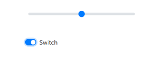
Figure-13: BSRangeInput and BSSwitch
Input collection
In order to layout multiple input widgets, three composite container widgets are provided: BSButtonGroup, BSInputGroup, and BSToolBar.
BSButtonGroup is a container of buttons that groups them in a line horizontally or vertically and provides properties to be applied to all of them at once. The properties supported include:
- children - an array of BSButtons that is a part of the group.
- sizeType - the bootstrap size type that applies to all buttons in the group.
- Vertical - whether to lay out the group vertically. By default, it lays out horizontally.
BSInputGroup is a composite input widget that contains several inputs clubbed together to form a single input overall. Apart from the layout purpose, it gives a better look and completeness of the newly formed composite input. For example, for input to enter a currency, there is a dollar sign at the left that could be implemented as a BSInputGroup.
Figure-14: BSInputGroup Example
BSInputGroup can combine widgets as per the following three properties:
- children - an array of a widget, usually a BSTextField, but any input is supported.
- Prepend - an array consisting of any value to show before the children. The values can be mixed with strings and widgets.
- Append - an array consisting of any value to show after the children. The values can be mixed with strings and widgets.
To prepend and append, if a string value is provided, a text label with the string is displayed. If a widget is provided, the widget is displayed.
The sizeType property is also supported to set bootstrap size type to be applied for all contained widgets.
BSToolbar is a container of button group and input group to layout horizontally. The only property is children, to specify its child containers.
Section 6: Popup Widgets
We will discuss popup widgets in this section. It is common to dynamically create a new window upon the main view for notification purposes or other usages. EGL bootstrap widgets provide a set of popup widgets for different complexity and flexibility.
Modal
BSModal pops up a customized dialog box on the page. It is the most customized popup widget. It is a container widget that can put any UI into it so that the content is totally customized. Besides the children property, title and buttons properties are the structural components that form a modal.
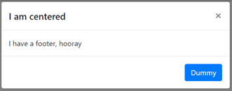
Figure-15: BSModal components
The centered and scrollable properties are provided to control the behavior of the modal. The main properties for BSModal include:
- children - the children widgets to display in the dialog
- title - string to show in the header of the dialog
- buttons - an array of BSButton or Button widgets. They will be shown in the bottom right of the dialog box.
- centered - a boolean value to specify whether the dialog box is centered on the page.
- scrollable – a boolean value to specify whether the dialog box content is scrollable.
There are also functions and events to control the show and hide the effects of the modal.
- showModal() - a function to manually show the modal
- closeModal() – a function to close the modal
- toggleModal() - a function to toggle show/close of the modal
- handleUpdate() - a function to manually re-adjust the modal's position if the height of modal changes while it is open (if a scrollbar appears).
- onShow - event handler that is triggered when the modal is shown
- onClose - event handler that is triggered when the modal is closed
Notification
When there are any state changes in a page, it is a good practice to provide some feedback to the users. Notification widgets are provided for this purpose. BSAlert is a bootstrap color style text notification widget and BSToast is a lightweight message notification that is more commonly used in mobile devices.
BSAlert supports text content only. It is dismissed by calling the dismiss() function. It is also supported to show a close icon in the alert so that the user can close it from the UI. The main properties and functions are:
- text - the content of the alert message
- Dismissable - whether the alert can be closed by the user. If true, a close icon appears in the message else it can only be closed programmatically.
- colorType - the bootstrap color type for the alert
- dismiss() - a function to close the alert
- onClose - events that will be triggered when the alert is closed
BSToast is an advanced alert with different styles and rich features. It has a richer user interface that is composed of header and content, and image is supported. And it is supported to be closed automatically with a delay. You can reuse it as it supports the show and closes more than once. The shown properties can indicate the current shown status and can be changed to shown or hidden.
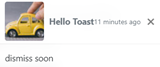
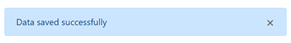
Figure-16: BSToast and BSAlert
The properties for BSToast are:
- title - the header title of the toast
- headerImage - the URL of the header image
- headerNote - a note next to the title
- text - the text content of the toast
- shown - whether the toast is shown or not
- closable - whether the toast is closable by the user or not. If true, a close icon is shown.
- delay - an integer to specify after how many milliseconds the toast is closed automatically. If the value is less than or equal to 0, the toast is not closed automatically.
- onShow - an event that is triggered when the toast is shown
- onClose - an event that is triggered when the toast is closed
Tooltip
To display contextual messages upon specific components, tooltip widgets are provided. BSTooltip is a simple tooltip with only text and BSPopover can have more messages that can be customized. They both have a target widget to be attached. In the below example, a BSPopover is attached to a button. When hovering over the button, the tooltip is shown.
Example 14 BSTooltip upon a BSButton
BSButton BSButton{ text = "Tooltip", colorType=BSLib.COLOR_TYPE_PRIMARY };
p BSTooltip{title="hello", target=BSButton, defaultPosition=BSLib.POSITION_BOTTOM};
The two widgets are almost the same except that BSPopover content is separated as title and content, and BSTooltip has a text content only. The properties are listed below:
- target - the target widget to be associated with, upon which the tooltip will show up
- title - the text content of the tooltip
- content - the content body of BSPopover. It is not supported in BSTooltip.
- triggerType - how will the tooltip be triggered. The available options are:
- BSLib.TRIGGER_CLICK - shows the tooltip when the target widget is clicked
- BSLib.TRIGGER_HOVER - shows the tooltip when hovering over the target widget (default value)
- BSLib.TRIGGER_FOCUS - shows the tooltip when focusing on the target widget
- defaultPosition - the default position to show the tooltip relative to the target widget. The available values are:
- BSLib.POSITION_AUTO
- BSLib.POSITION_TOP
- BSLib.POSITION_BOTTOM
- BSLib.POSITION_LEFT
- BSLib.POSITION_RIGHT
Section 7: Bootstrap CSS
By importing EGL bootstrap widgets, the bootstrap css utility classes are also imported. It is a supplement of style properties and pure css that makes some common style task handy. Additionally, it is also applicable to RUI widgets.
Bootstrap originated as a css framework. Many css classes are provided to style the web application to a modern look and feel. Those classes are named utility class and can be used directly as the css class to the widget. For example, to specify the margin of a widget, the "m{sides}-{breakpoint}-{size}" can be used. The sides and breakpoint are optional. So, m-5 means margin 5 and mt-5 means margin-top 5.
Bootstrap provides hundreds of utility classes. A full list can be found in bootstrap utilities. Those utility classes can be used to style the spacing, size, color, border and so on.
Use utility class in EGL
Ensure that the EGL bootstrap widgets are in the build path, then the bootstrap css utility class is available. The developer can specify the widget class property to a utility class, but it is not recommended. Note that the EGL widgets have implicit css class and setting the class property overrides all these classes. For EGL bootstrap widgets, the implicit classes are important to keep the correct style and functionality. Since RBD 9.6, addClass and removeClass functions are added to the widget. It can be used to dynamically append or remove css class to the widget.
In the below example, two classes m-5 and p-2 are added to the BSBadge widget specifying a margin 5px and padding 2px style.
Example 15 Using bootstrap css utility classes
handler testCSS type RUIhandler {initialUI = [ BSContainer ],onConstructionFunction = start, cssFile="css/testRUI.css", title="testCSS"}
BSBadge BSBadge{text="Badge",colorType = BSLib.COLOR_TYPE_PRIMARY};
BSContainer BSContainer{
children = [ BSBadge ]
};
function start()
BSBadge.addClass("m-5");
BSBadge.addClass("p-2");
end
end
Section 8: Migration
Many EGL RUI applications have been created without responsive support. To evolve those applications to responsive design, the bootstrap widgets with compatible APIs are provided.
Migrate from EGL RUI
To migrate from the RUI applications to EGL bootstrap widget applications, the backend service, and RUIHandler must be kept as it is. The only migration will be in the UI. It may be impractical to migrate all the widgets. The priority must be the container and the data display widgets. When the page skeleton is a responsive container widget, the application will become responsive.
- Use bootstrap container widgets. BSGridLayout to replace GridLayout.
- Use bootstrap data display widget. BSDataGrid to replace DataGrid.
- Use bootstrap counterpart widget, for example, BSCheckbox to replace Checkbox.
For these widgets, the migration in most cases will be as easy as changing the widget name.
Example 17 Migrate from GridLayout to BSGridLayout
Change from
Grid GridLayout{
rows = 2, columns = 2, cellPadding=2,
children = [ BSButton, Button, Button1, BSBadge ]
};
To:
Grid BSGridLayout{
rows = 2, columns = 2, cellPadding=2,
children = [ BSButton, Button, Button1, BSBadge ]
};
We also provide a rewritten DB access tutorial from Bootstrap widgets. It is a migration example from RUI to bootstrap. For more information, refer to bootstrap access database sample. The sample is located at com.ibm.etools.examples.egl plugin /install/paymentSample.zip. For RBD 9.6, the plugin can be found at %IBMIMShared%\plugins\com.ibm.etools.examples.egl_7.0.202.v20190822_1129. Import as existing projects and work with it.
Work with EGL Dojo Widgets
By default, using EGL Dojo widgets together with bootstrap widgets is not supported because of the conflict of Dojo AMD and jQuery. Bootstrap contains jQuery underneath. As a workaround, the user can change the include files for Dojo and Bootstrap widgets to make them work together. This will work only when the EGL project depends on both the widget sets and the RUIHandler uses widgets from both widget sets.
- Copy all content from includeDojo.html. Then remove the content in includeDojo.html. Do not delete that file, instead leave it as an empty file.
- Append the copied content to includeBootStrap.html.
By this approach, the widgets from Dojo and Bootstrap can work together in RUIHandler.
Was this topic helpful?
Document Information
Modified date:
11 March 2021
UID
ibm11096150