This tutorial guides you through the end-to-end scenario about how to perform root cause analysis by analyzing data from multiple data providers. In this tutorial, you will perform root cause analysis of a performance defect that is found in the zMobile Health Care application
Prerequisite
Trish is a test lead who is testing the response time of the Inquire Patient feature of the zMobile Health Care application. During the testing, Trish found that in the latest development build, the response time of the Inquire Patient feature increased to 2 minutes from less than a second in the previous build. She reported it to you, the development lead. And you investigate the issues by consulting dashboards and reports in ADI.
- Navigate your browser to IBM ADDI Extension home page https://healthcare.example.com:9753/addi/web/workbook.
- Log in with the following credentials. After you log in, the Workbooks page
is displayed.
- Email address: adiadmin@healthcare.example.com
- Password: adiadmin
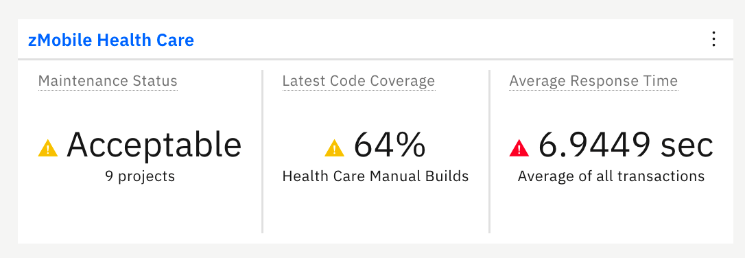
You can see the dashboard that summarizes the overall status of zMobile Health Care application. You can notice the problem that Trish reported right away. The average response time of zMobile Health application is almost 7 seconds. It is higher than the service level agreement for your company. And you can notice that the code coverage percentage is also in the warning area.
- Click the name of zMobile Health Care to view detailed analysis. The zMobile Health Care page loads with summary charts of the contributing providers.
- View the reports on the workbook summary view of zMobile Health
Care page. The reports are organized into 3 tabs: Code
Coverage, Static Analysis, and Performance.
All the reports are analyzed based on three data providers that are
associated with this analysis workbook:
- A Manual Builds data provider that collects the code coverage results.
- An Application Discovery data provider that collects static analysis data about transactions, programs and project-level metrics in the zMobile Health Care application.
- An OMEGAMON for CICS data provider that monitors performance of the zMobile Health Care application CICS transactions.
With reports from multiple providers in one workbook, you can correlate different data from different sources.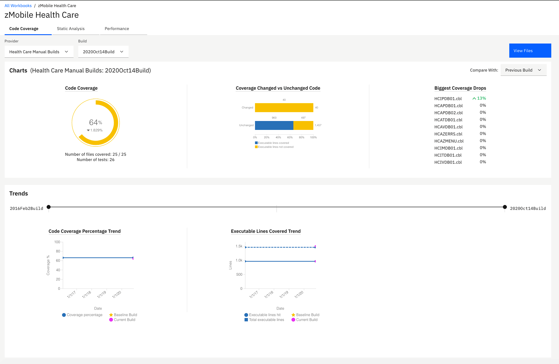
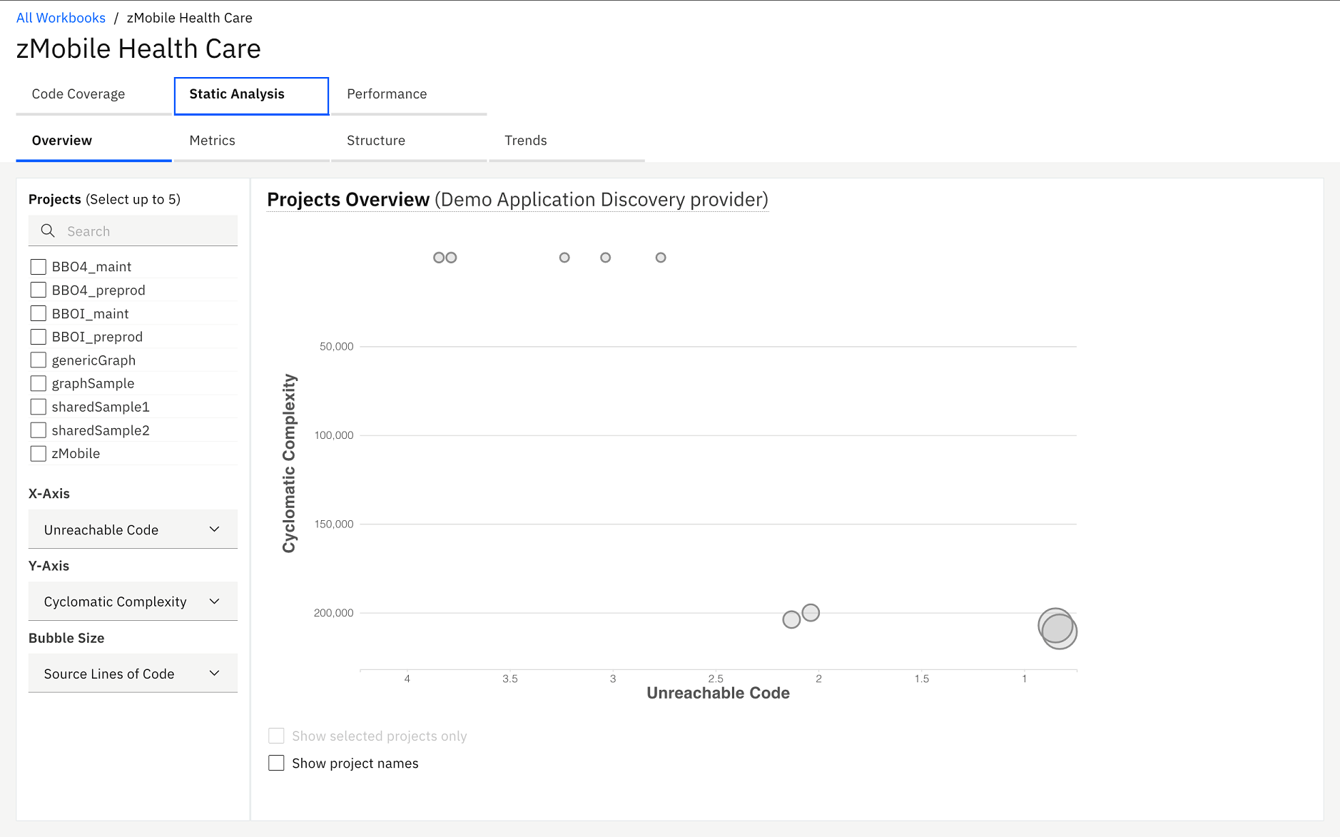
- Select Static Analysis tab and Performance tab
to navigate to static analysis reports and performance reports respectively.
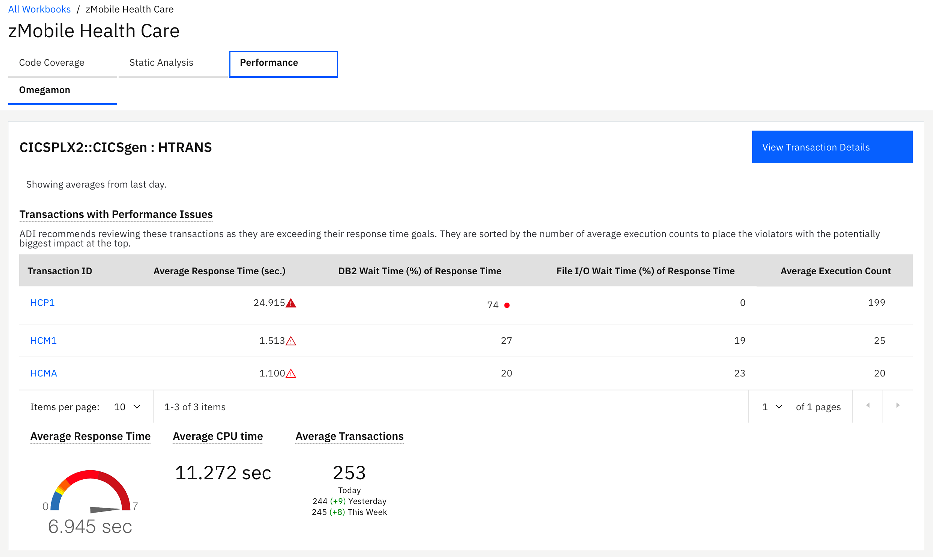
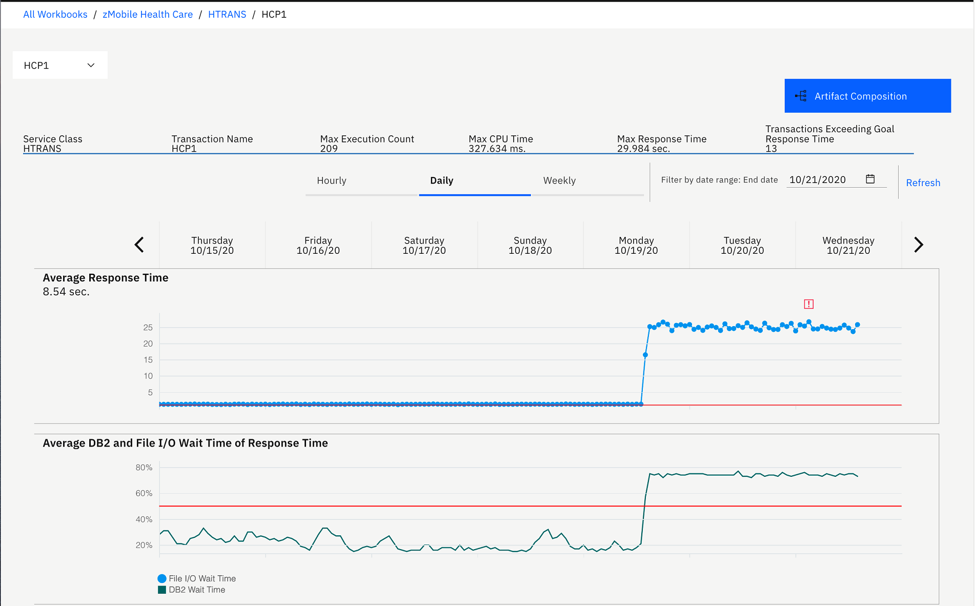
On the Performance tab, you can see the detailed analysis of program and transactions within the zMobile project that displays along with the performance reports of HTRANS.
HTRANS is a service class in OMEGAMON for CICS data provider. Service class is a concept that OMEGAMON for CICS uses to allow grouping related transactions together. If no service class is defined, OMEGAMON for CICS would define a default service class.
In the Demo OMEGAMON provider: HTRANS section, you can investigate the performance issue that Trish reported. Besides the average response time that is in the red zone, you notice that on the Transactions with Performance and Reliability Issues table, HCP1 transaction that is run by the *Inquire Patient* feature is flagged as exceeding the goal response time threshold by more than 400%. Average execution count of HCP1 is also much higher than the other transactions. Then you think that this transaction probably causes the application to slow down.Note: Goal response time threshold is the setting in OMEGAMON for CICS to indicate the severity of response time that exceeds the standard service level agreement that the company requires. The different warning icons on the Transactions with Performance and Reliability Issues table indicate different levels of severity. For example, the transparent red warning icon indicates that the response time exceeds threshold by 400%, and the opaque red warning icon indicates that the response time exceeds threshold by more than 400%. - Click the HCP1 transaction on the Transactions with Performance
and Reliability Issues table to view the detailed transaction analysis.
You now see the history of the average response time comparing to
Average DB2 and File I/O wait time of response time, average CPU time,
and execution count.
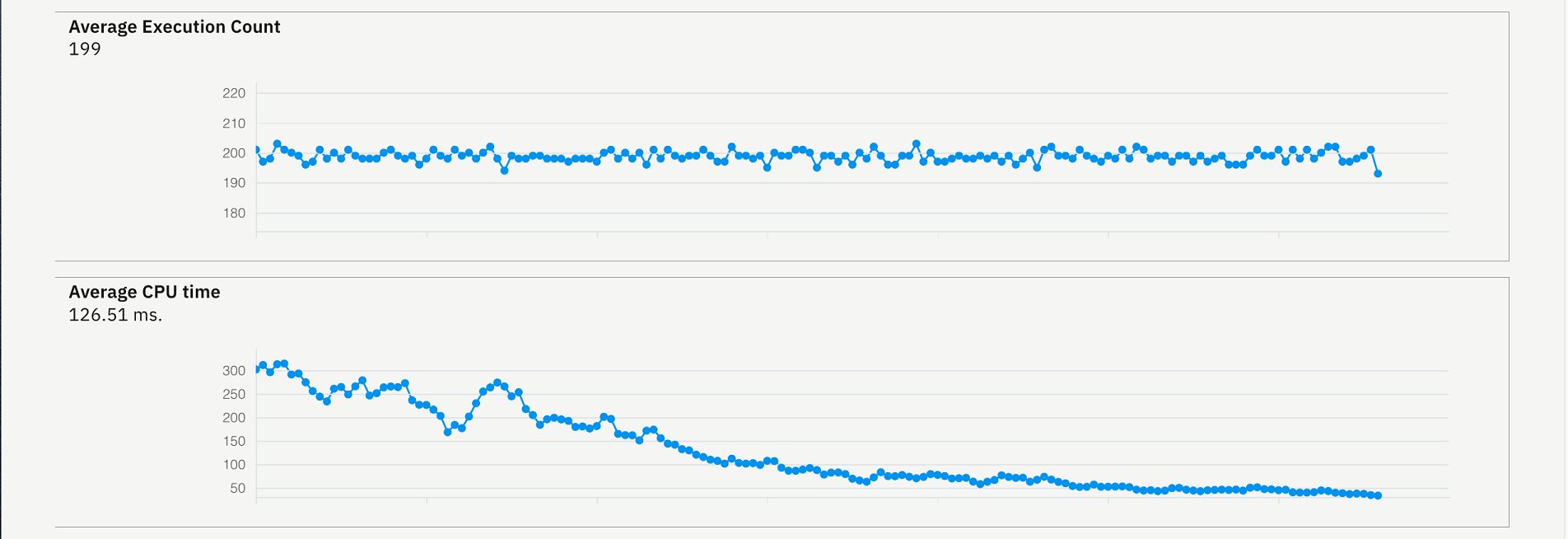
On the header of the report, the maximum number of the execution count, CPU time, and response time for a given timeframe display on this view.
From the chart, you notice that the average response time was constantly rising high for the past 3 days from 2 seconds to 26 seconds. The same pattern occurs to DB2 wait time. DB2 wait time went up from about 20 - 30% to over 70% which is higher than the suggested level 50% that is indicated by the red line on the Average DB2 and File I/O Wait Time of Response Time.
You notice that the execution is always at about almost 200 which means this transaction has been executed frequently. You suspect that there probably are some changes made to the program within this transaction 3 days ago.
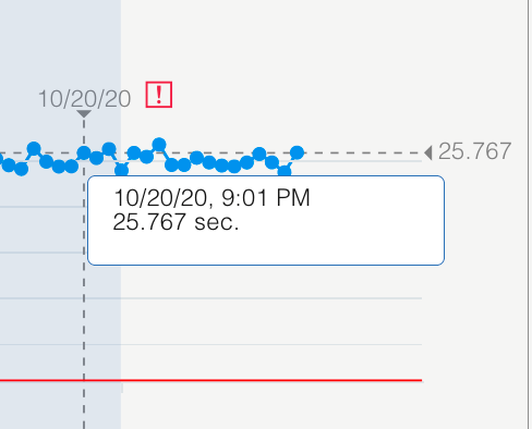
- Hover over the chart on the area where the response time exceeds
the threshold and the average DB2 time is high. You can see response
time value and percent DB2 wait time value.

- Click OK to do further analysis.
- Click Artifact Composition button on the
upper right corner to go to the Artifact Composition view.
 Artifact Composition analysis is the analysis of key program and transaction metrics collected from Application Discovery. This view shows Artifact Composition graph which is the connected graph of all artifacts (transactions, programs, and database tables) calling in a transaction. The arrow direction represents the calling direction.
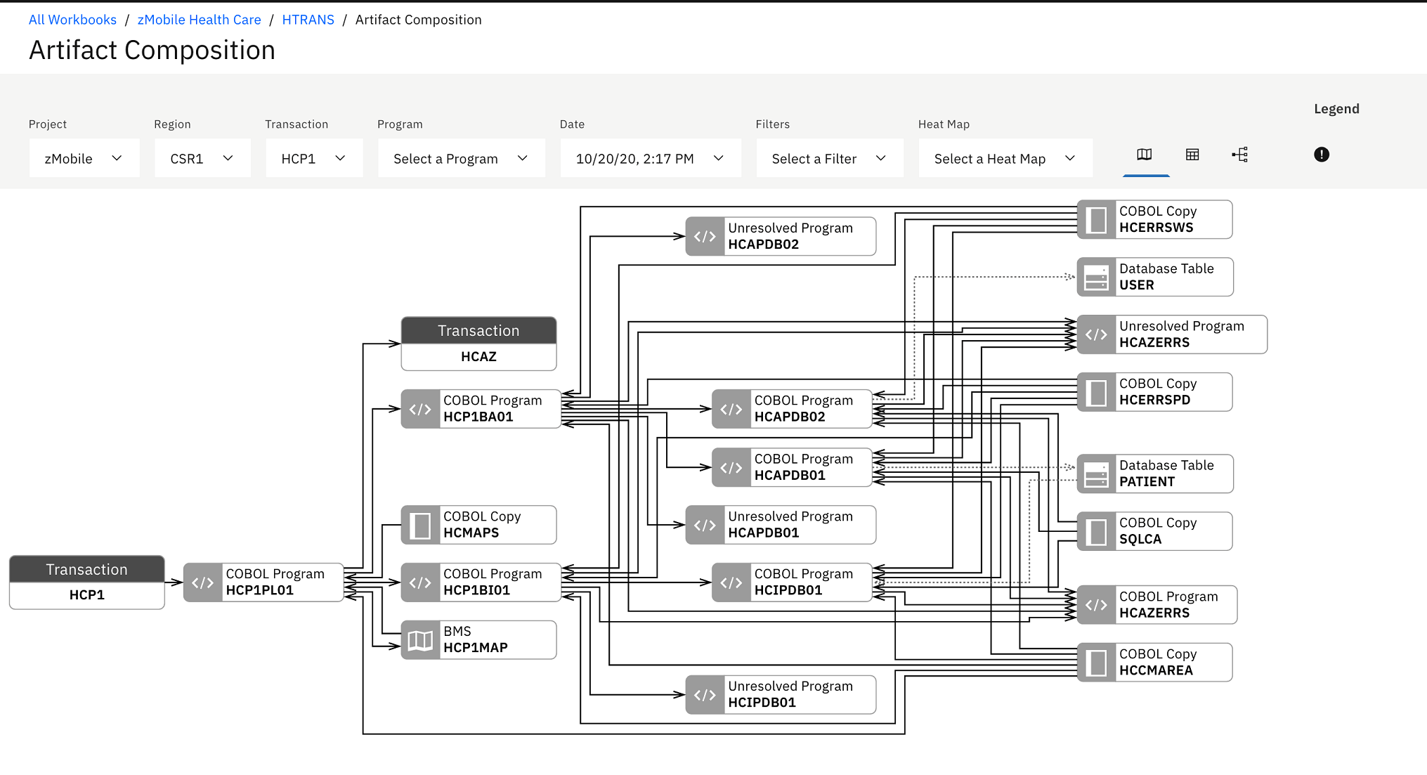
- Select the Warning icon (
 ) on the upper
right of the header area to display the risk areas. You notice the warning icons on top of the artifacts. The blue warning icon indicates that there could be some changes to the artifacts. Because there are changes to artifact metrics during the interval time that you have set when you set up an analysis collection in the previous tutorial. In this case, it is 7 days which is between October 13th and October 28, 2020. For ADDI Extension, the changed artifact is indicated by one of the following method.
) on the upper
right of the header area to display the risk areas. You notice the warning icons on top of the artifacts. The blue warning icon indicates that there could be some changes to the artifacts. Because there are changes to artifact metrics during the interval time that you have set when you set up an analysis collection in the previous tutorial. In this case, it is 7 days which is between October 13th and October 28, 2020. For ADDI Extension, the changed artifact is indicated by one of the following method.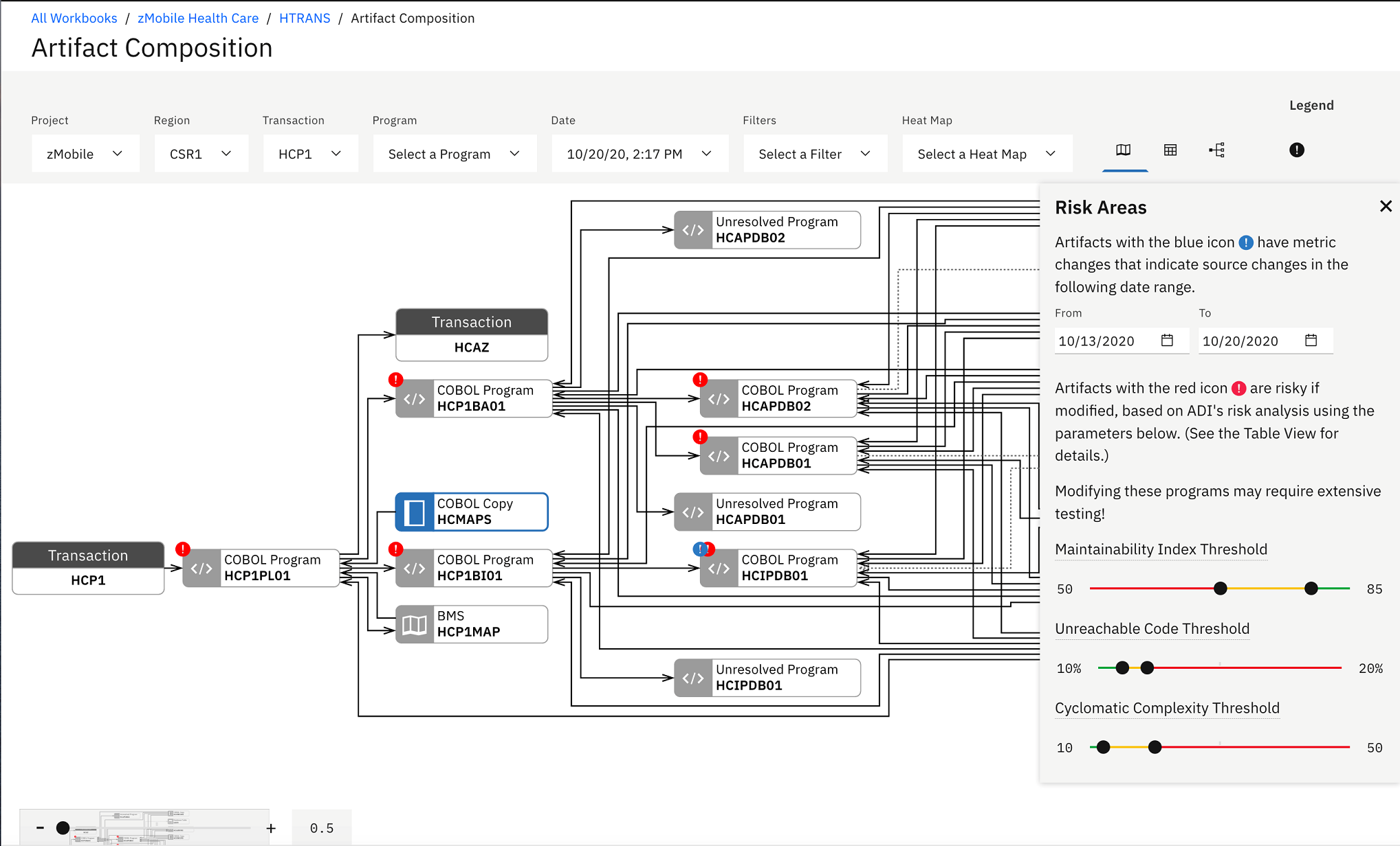
- Check if there is the LASTUPDATED metric that is collected from IBM Application Discovery.
- Check if the Maintainability Index and Number of Source Line of Code have been updated between the change interval time you have defined.
The red warning icon indicates that the artifact is risky to modify. The Risk Areas dialog box on top of the chart explains the meaning of blue and red icons with the threshold setting for key metrics.
- You notice the warning icons on top of the artifacts. The blue
warning icon indicates that there could be some changes to the artifacts.
Because there are changes to artifact metrics during the interval
time that you have set when you set up an analysis collection in the
previous tutorial. In this case, it is 7 days which is between February
28th and March 7, 2018. For ADI, the changed artifact is indicated
by one of the following method.
- Check if there is the LASTUPDATED metric that is collected from IBM Application Discovery.
- Check if the Maintainability Index and Number of Source Line of Code have been updated between the change interval time you have defined.
The red warning icon indicates that the artifact is risky to modify. The Risk Areas dialog box on top of the chart explains the meaning of blue and red icons with the threshold setting for key metrics.
- Click X on top right of the Risk Areas dialog to close the dialog box. The Risk Areas dialog disappears along with the warning icons.
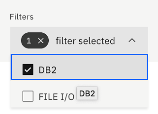
- Click the Filters drop-down list and select DB2.
The Artifact Composition graph is updated to show only artifacts that
are connected to DB2.
- Click the Risk Areas icon (
 ) on the top menu.
The Risk Areas dialogue displays with the warning icons on
the Artifact Composition graph.
) on the top menu.
The Risk Areas dialogue displays with the warning icons on
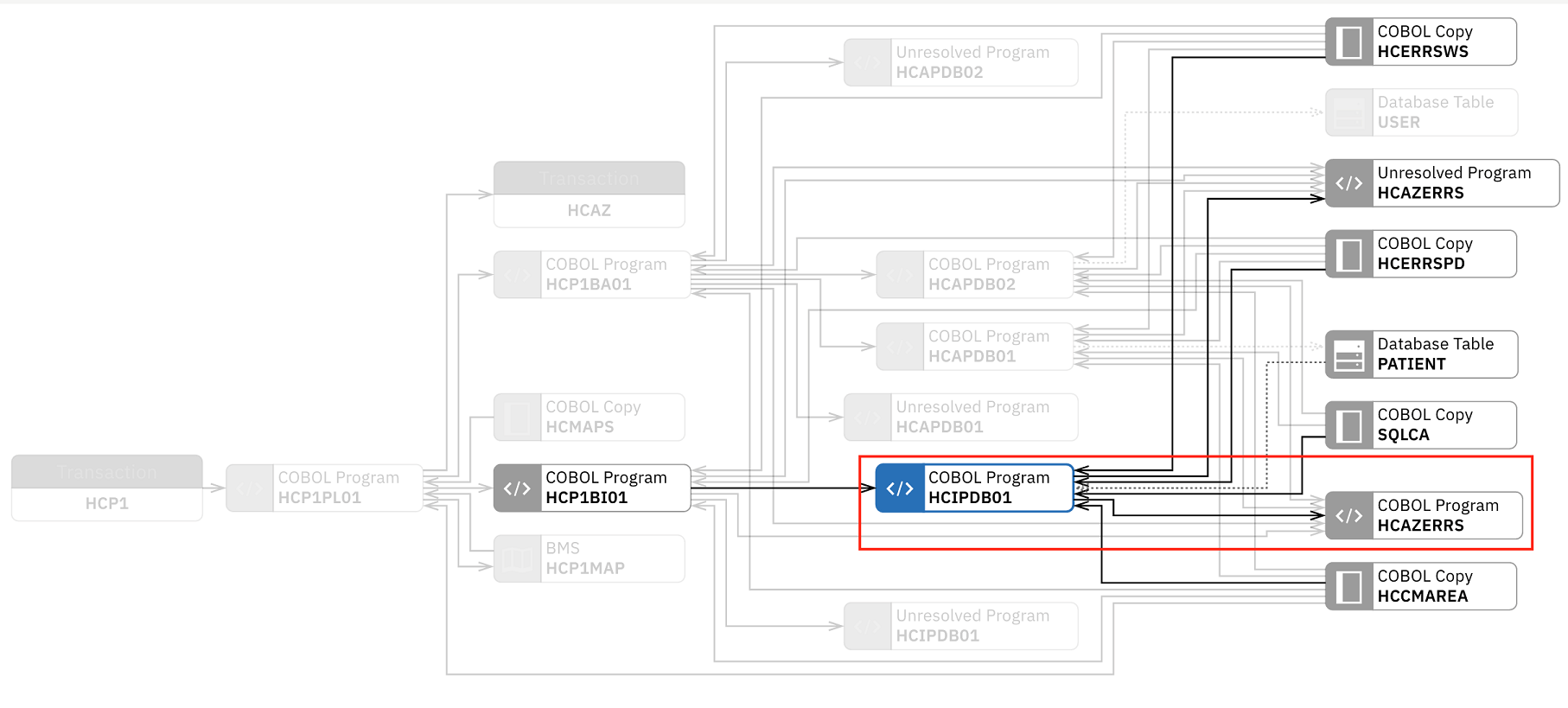
the Artifact Composition graph.You can see the blue warning icon on HCIPDB01. This means that there could be some changes made to HCIPDB01 in the past week.
- Close the Risk Areas dialogue and click HCIPDB01 box.
The key metrics collected from Application Discovery for this artifact
are displayed. You can see that the Maintainability Index is in red
area but it is not your concern at this point.
You can notice that the code coverage is 82%. When you hover over the question mark on the Test Code Coverage metric for HCIPDB01, you see that the date of the last test code coverage data is a week from today, which is before the date when the program was changed last time. This means that it has not been properly tested.
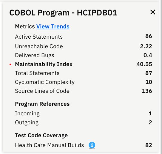
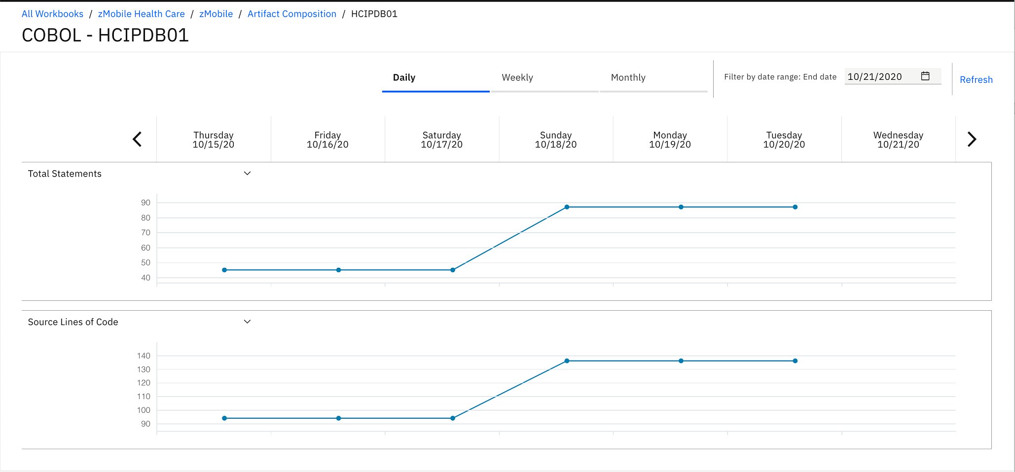
- Click View Trends link next to the Metrics
header. The Trends page for HCIPDB01.cbl appears.
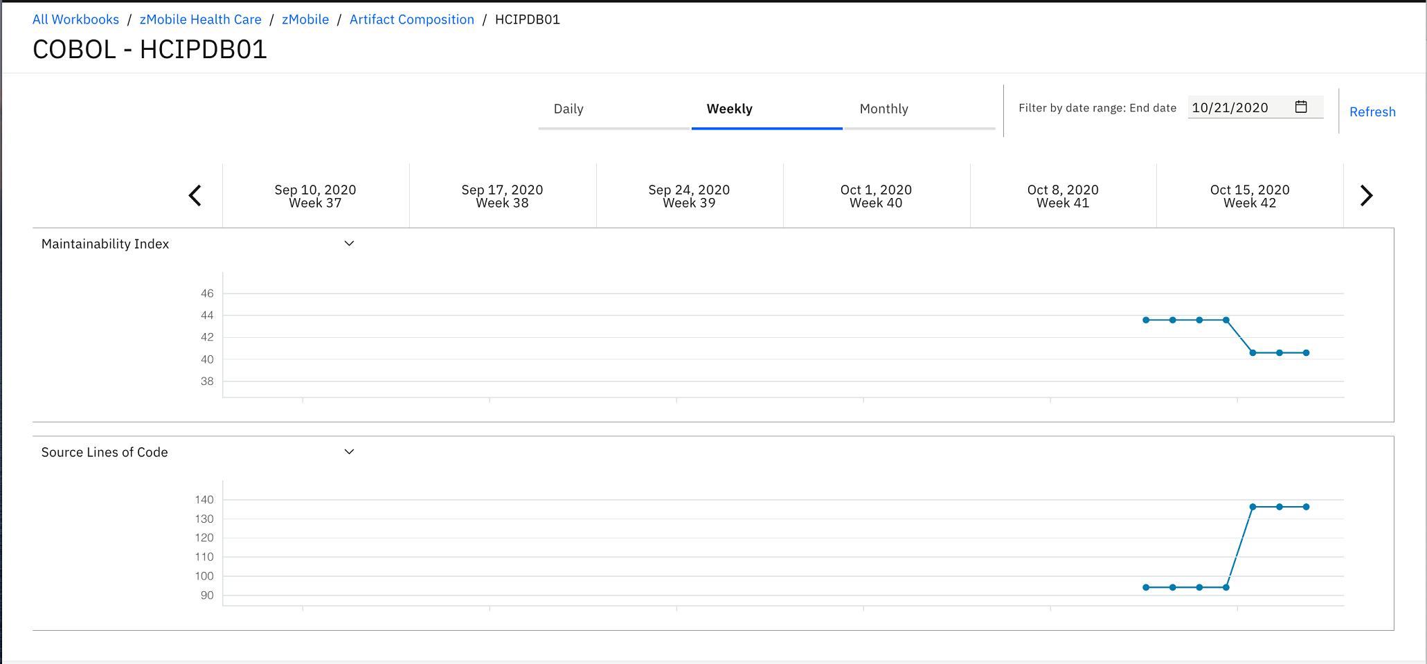
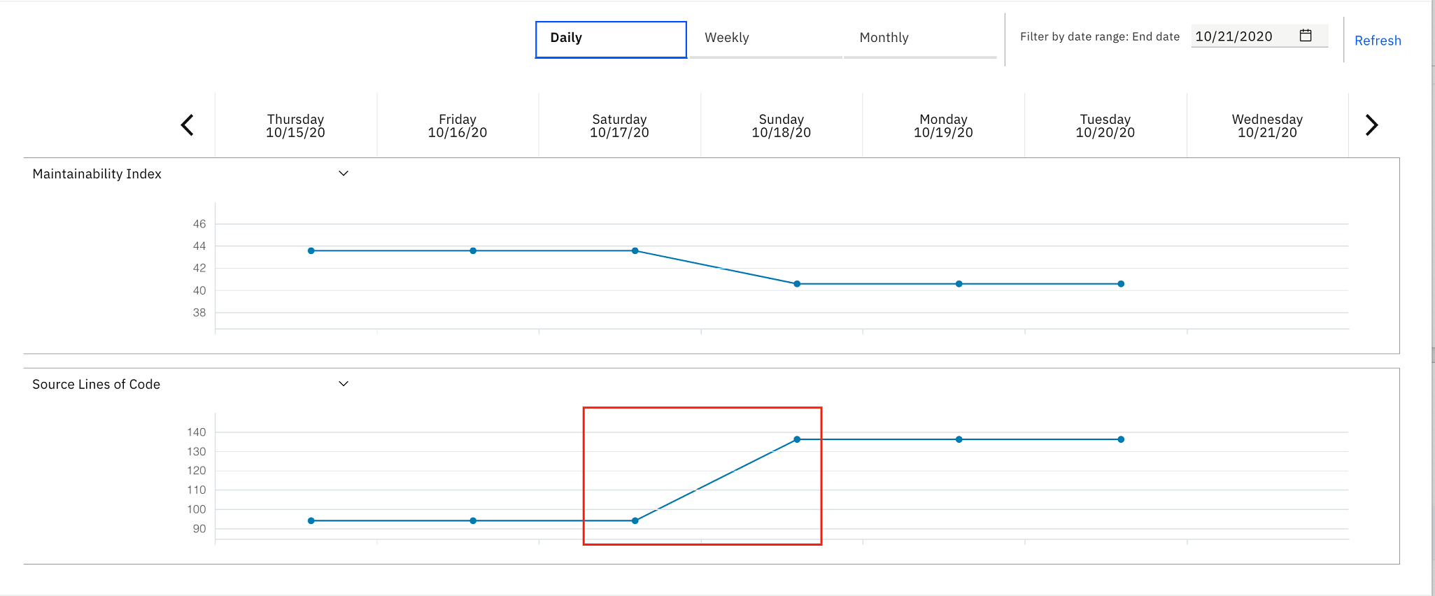
- Click Daily to change the view from Weekly view
to Daily view. Observe the Trends page
that shows the trend lines of Maintainability Index and Source Lines
of Code. You notice that Source Lines of Code went up about 4 days
ago.
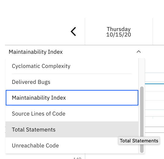
- Select the drop-down list of Maintainability Index and
select Total Statements. You notice that both
metrics have the same trending. About 40 statements are added to HCIPDB01.cbl.
Now you as the development lead conclude that the HCIPDB01 should be the area of concern. You discuss with Jane, the developer. You two investigate further into the code and find that an extra SQL Join statement contributes to the excessive wait time. Before making modifications, you and Jane go back to ADDI Extension.
- Select Artifact Composition link on the
breadcrumb to go back to the Artifact Composition table.

- Click the Table (
 )
icon on the top header to update the view to table view.
)
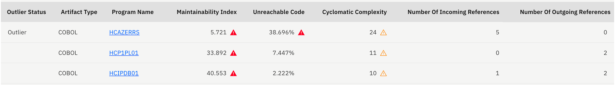
icon on the top header to update the view to table view. 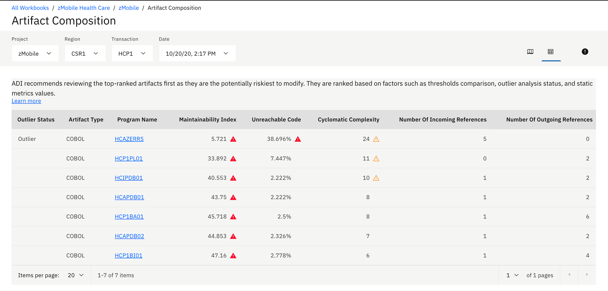 The Artifact Composition table shows the list of all program artifacts within a transaction. The table is sorted based on the analysis of high risk to modify. The rank of risk to modify is calculated based on combination of the following criteria:
- Whether the artifact is in risk areas: Risk areas are based on the thresholds setting.
- Whether the artifact is an outlier: Outlier artifacts are analyzed based on the outlier detection algorithm leveraging Mahalanobis distance of each artifact to the center of the distribution. Artifacts with large Mahalanobis distances mean that they are outlier or abnormal because they are very far away from majorities.
- Metrics values sorting: Given the same risk area and outlier status, artifacts are finally sorted by the values of Maintainability Index, Unreachable Code, and Cyclomatic Complexity.
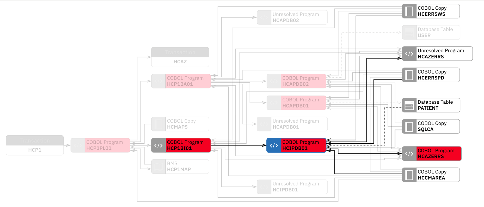
- On the Artifact Composition table, you and Jane notice that HCIPDB01 is
at medium risk to modify. Another program HCAZERRS is at high
risk. Hence making another changes would not make much impact to the
zMobile Health Care application.
 You can click on the Risk Areas icon () to update the threshold
settings and see the effect of the changes. For example, move the
lower slider of Maintainability Index threshold to 40%. You now see
that the warning icons of the programs with Maintainability Index
higher than 40% are changed from red warning icons to transparent
yellow warning icons.
You can click on the Risk Areas icon () to update the threshold
settings and see the effect of the changes. For example, move the
lower slider of Maintainability Index threshold to 40%. You now see
that the warning icons of the programs with Maintainability Index
higher than 40% are changed from red warning icons to transparent
yellow warning icons.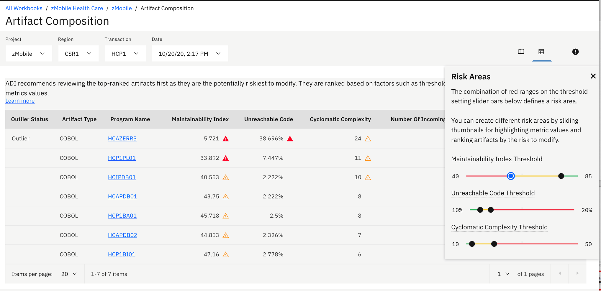
- Click the Graph View (
 )
icon on the top right menu to go back to the Artifact Composition
graph view.
)
icon on the top right menu to go back to the Artifact Composition
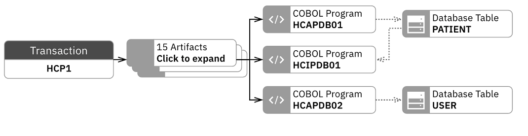
graph view. - Click on the HCIPDB01 box on Artifact Composition graph view to only shows the relationship of artifacts related to HCP1BA01.
- Click Close (X) icon to close the information
dialog box to get the full view of the Artifact Composition graph.
You and Jane notice that HCIPDB01 has dependency with HCAZERRS which has high risk to modify. These two programs have a very strong impact. Jane needs to test both module very well to make sure that after fixing the SQL problems, her changes to HCIPDB01 would not cause any regressions to HCAZERRS.
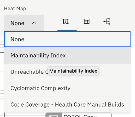
- Click the Heat Map drop-down list on the
top and select Maintainability Index.The nodes in the graph are displayed with color. The color indicates the threshold status of metric that you have selected. For example, HCIPDB01 and HCAZERRS both are in red, which indicates that their maintainability index is in an unacceptable value. You need to pay close attention when you modify the code.
- Click the Close (X) icon to close the HCIPDB01
information dialog box to get full view of the graph.
- Click the Heat Map drop-down list again and select Code Coverage – Health Care Manual Builds.
- Click the Close (X) icon to close the HCIPDB01
information dialog box to get full view of the graph.
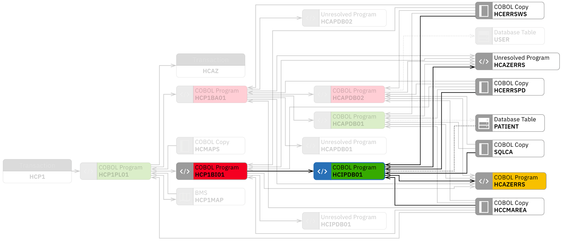
The graph updates with the colored nodes that indicate the code coverage status of each node in the graph. The nodes without color indicate that no metric data is associated with those nodes.
You can see that the code coverage status of HCAZERRS is in poor (yellow) and HCP1BI01 is in insufficient (red) areas. Both have dependency with HCIPDB01. This means that after making changes, the development team needs to make sure that both programs are fully tested.
Jane then performs the fix as discussed with you. In the next build after the fixing, Trish reports that the problem with the "Inquire Patient" feature is fixed and it again takes only 2 seconds to respond.
You have seen how you can correlate performance data from OMEGAMON for CICS and static analysis data from Application Discovery to perform the root cause analysis of the performance issues. IBM ADDI Extension facilities you to identify the potential programs that cause the issues without going through the entire artifacts within transactions. With Application Discovery data, it also recommends the Risk Areas where you need to take extra care when you modify them. You can see the dependency of artifacts to ensure that there would be no regressions in the future builds.