Creating Charts
Although some statistical procedures can create charts, you can also use the Graphs menu to create charts.
For example, you can create a chart that shows the relationship between wireless telephone service and PDA (personal digital assistant) ownership.
- From the menus choose: Figure 1. Chart Builder dialog box with completed drop zones
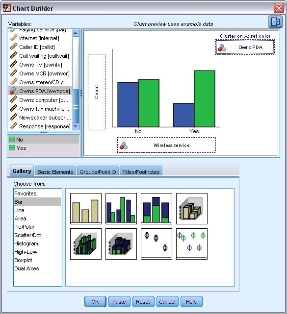
- Click the Gallery tab (if it is not selected).
- Click Bar (if it is not selected).
- Drag the Clustered Bar icon onto the canvas, which is the large area above the Gallery.
- Scroll down the Variables list, right-click Wireless service [wireless], and then choose Nominal as its measurement level.
- Drag the Wireless service [wireless] variable to the x axis.
- Right-click Owns PDA [ownpda] and choose Nominal as its measurement level.
- Drag the Owns PDA [ownpda] variable to the cluster drop zone in the upper right corner of the canvas.
- Click OK to create the chart.
Figure 2. Bar
chart displayed in Viewer window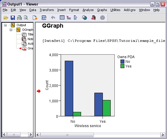
The bar chart is displayed in the Viewer. The chart shows that people with wireless phone service are far more likely to have PDAs than people without wireless service.
You can edit charts and tables by double-clicking them in the contents pane of the Viewer window, and you can copy and paste your results into other applications. Those topics will be covered later.