HATS provides host components and widgets that are used to convert
elements of a host screen to objects that can be displayed on a Web
page. Some component and widget settings can be modified using the
wizards and editors in the HATS Toolkit. This chapter describes HATS host components and widgets and
the settings you can modify.
You can also create your own custom components and widgets by using
the HATS wizard. To launch the wizard, select HATS
> New > Component or HATS > New > Widget from
the HATS menu. You can also launch
the wizard by selecting File > New > HATS
Component or File > New
> HATS Widget.
The components and widgets supplied by HATS have default settings
that you can modify, either for an entire project using the project
editor, or for an individual transformation using the Insert Host
Component wizard. Not all components and widgets have customizable
settings.
Note:
The vertical bar (|) character,
which is valid in many component and widget settings, implies OR.
For example, the function key component has a setting called start
delimiter. You can specify PF|F for the start delimiter value. This
means HATS will look for PFxxxx or Fxxxx on the host screen when looking
for function keys.
Host component settings
The settings for a host component specify how that component is
to be recognized on the host screen.
Some host components have more complicated settings. For example,
several settings are used to recognize a function key or a selection
list. These settings will be described under each host component.
HATS provides the host components that are described in
the following sections.
The Command line component is responsible
for recognizing input fields which have a specific string of characters
(the token) preceding the input field.
A recognized command line can be rendered by the following widgets:
The Dialog component is used to aid default rendering in recognizing
modal (pop-up) frames on the host screen.
The concept of the Dialog component is to find the
smallest area around the cursor that fits the description of the border
in a rectangular form, assuming you are working with modal dialogs.
A modal dialog retains the input focus while open. The user must close
or otherwise satisfy the dialog before switching to another window.
To input data and complete a modal dialog, HATS assumes
that the cursor must be within the dialog's border. Starting from
the cursor character's coordinates on the screen, HATS searches to
the left for a valid vertical border character as defined by the Vertical border characters setting.
If a valid left vertical border character is located, HATS returns
to the same cursor coordinate and searches to the right for a valid
vertical border character. If valid vertical border characters are
found on the left and right of the cursor coordinates, HATS measures
the distance between them to ensure that a valid length exists.
HATS also searches for the top and the bottom horizontal
border characters, as defined by the Horizontal border characters setting,
using the same process as the search for the vertical border characters.
Because a dialog window is a rectangle, HATS uses
the columns of the left and right borders and the rows of the top
and bottom borders to determine whether the columns meet the vertical
criteria and the rows meet the horizontal criteria of a modal dialog.
If the outer rows and columns of the rectangle align, assuming the Minimum row count attribute
has been satisfied, the Dialog component declares the window as a
match and the recognized area is rendered.
To configure this component, go to the Project
Settings of your HATS project, select the Rendering tab
and click Default Rendering.
Note:
The dialog component is only available in default rendering.
The dialog component is rendered using the Dialog
widget.
The following figure shows how a Dialog component
might appear on your host screen:
Figure 13. Dialog component example
Horizontal border characters
Vertical border characters
Cursor must be positioned within dialog
The following settings can be configured for this
component:
Horizontal border characters
Specifies the characters that make up the top and bottom borders
of the dialog. By default, horizontal border characters are any protected
reverse-video character, a period (.), a hyphen (-), or an underscore
(_). Multiple characters are separated by a vertical bar (|) and are
evaluated left to right.
Vertical border characters
Specifies the characters that make up the side borders of the
dialog. By default, vertical border characters are any protected reverse-video
character, a colon (:), or a vertical bar (|). Multiple characters
are separated by a vertical bar (|) and are evaluated left to right.
Note:
Because the vertical bar (|) is used as the separator when
specifying multiple characters, use &vl. to specify a vertical
bar (|) as a vertical border character.
In addition to characters, field attributes for border
characters can also be specified in the Horizontal border characters and Vertical border characters settings
for this component. The following indicators are used when specifying
the attributes of a field. Each field specification is enclosed within
a set of curly braces ( {...} ). Each indicator is separated by a
space. To indicate a negative (NOT), add an exclamation point (!)
as a prefix to the indicator, with no space between them.
Protected field: p
Hidden field: h
Numeric only field: no
High intensity field: hi
Foreground color of a field, post-indicated by hex character,
example f_7
Reversed video field: rv
Underlined field: ul
Blinking field: b
Column separator field: c
Example: {!p hi no} specifies an unprotected highlighted
numeric only field.
Notes:
When specifying field attributes for border characters, the specification
is intended to be a modifier to the data directly preceding it, if
any. For example:
{p rv} matches any protected, reverse video character.
:{p rv} matches only a single, protected, reverse video
colon character.
{p rv}: matches any protected, reverse video character
because the colon is not considered since it follows the field specification.
The ordering of the indicators within the field attribute definition
does not matter, because all indicators within a pair of curly braces
must match for a border character to be recognized.
Minimum row count
The minimum number of rows the region must contain for it to
be recognized as a dialog. The default is 3.
Minimum column count
The minimum number of columns the region must contain for it
to be recognized as a dialog. The default is 3.
Cursor must be positioned within dialog
Specifies whether the cursor has to be within the region recognized
as a dialog. If not selected, the region recognized as a dialog does
not have to contain the cursor, and the user may get unexpected results
if the dialogs are modal.
Allow interaction outside dialog
Specifies whether the area outside of the border should be disabled.
Note:
Text replacement for content within the borders of a dialog
cannot be defined using the Dialog component settings. The Dialog
component itself is only the border of the dialog window (the box
around it). The content within the borders is rendered by other components
of the default rendering. To perform text replacement for content
within a dialog, you can specify text replacement
for the default rendering item that renders the dialog content. For
example, text replacement can be specified for the Field component. To
get an accurate view of the combination of Dialog and other components,
click Full page preview.
Enhanced Non-Programmable Terminal User Interface (ENPTUI) enables
an enhanced interface on non-programmable terminals (NPT) and programmable
work stations (PWS) over the 5250 full screen menu-driven interface,
taking advantage of 5250 display data stream extensions. HATS supports
a subset of the ENPTUI feature which includes graphical interface
constructs. These constructs are represented by two
HATS components: Scrollbar and Selection Field.
You can add ENPTUI support during the creation
of a new HATS project from the HATS toolbar by selecting HATS > New > Project(or File > New > HATS Project) to launch
the Create a Project wizard. When
you get to the Connection Settings panel and select either 5250 or 5250W for
your connection type, select the Add
graphical interface DDS keywords (ENPTUI) rendering support check
box to enable the support.
Note:
This option is not available in projects that are optimized
for mobile devices.
If the check box is selected, the default rendering set
in the application.hap file will include standard ENPTUI rendering
items and the component and widget registry (ComponentWidget.xml)
will include the ENPTUI components and widgets for inclusion in either
default rendering or custom transformations. Also,
the default connection object created will have
ENPTUI=true added to the advanced connection properties, which is
required for HATS to receive the ENPTUI data from the host.
If the check box remains cleared, the Create a Project wizard will
edit the component and widget registry and the application.hap file
and remove ENPTUI rendering items, components, and widgets from the
files laid down by the wizard in the new project.
Note:
This
is the only chance to have HATS add ENPTUI components and widgets
to the project. If you want to add ENPTUI to your project after creation,
all edits to ComponentWidget.xml, application.hap, and main.hco must
be done manually (by comparing to find the changes required). This
is not recommended. Creating a new project is the recommended method
to add ENPTUI support.
Following are the ENPTUI components and their
settings. These components do not appear in the HATS
Components section in the Palette view
of the Page Designer. If the ENPTUI support has been enabled as described
above, these components are accessible from the Rational® SDP menu bar
by clicking HATS Tools > Insert Host Component.
Scrollbar field (ENPTUI)
The Scrollbar field (ENPTUI) component is responsible for recognizing
ENPTUI scrollbar fields from the 5250 data stream. This component
will recognize any selected host screen region and this component
can be rendered using the Scrollbar (ENPTUI) widget.
There are no customizable settings for this component.
Selection field (ENPTUI)
A recognized ENPTUI selection field can be rendered by the following
widgets:
The Field component is responsible for recognizing protected text
and input fields. This component will recognize any selected host
screen region and this component can be rendered using the Field widget.
Note:
The Field component includes only the region you specify. If the selected
region cuts through an actual host screen field, only the part inside
the selection will be rendered.
The following figure shows how a field component might appear on
your host screen:
Figure 15. Field component example
The following setting can be configured for this component:
Support character level attributes for protected fields
This setting allows you to accurately render
the color and extended attributes of all characters in a protected
field, instead of rendering the entire field with the color and attributes
of the first character in the field.
If not selected, which
is the default, the first character of the field will determine the
attributes for every character in the field even if an attribute,
such as color, changes in the middle of the field.
If selected,
different color and extended attribute (for example reverse video)
information is supported within a field by rendering Field component
elements as segments of sequential, similar characters. For example,
a field that is ten characters in length, where the first five characters
are green and the last five characters are red, will be represented
by two Field component elements.
Note:
This setting only
applies to protected fields, not input fields.
The Function key component is responsible for recognizing function
(PF) keys. This component is used to transform static text on the
host screen representing a function key into a button or link which
your user can click. Because function keys appear differently on different
host systems, HATS gives you flexibility in configuring the different
parts. For example, a host screen might contain the following function
keys:
F3: Exit
F4: Back
F5: Fwd
A function key can be rendered by the following widgets:
The following figure shows how a Function key component might appear
on your host screen:
Figure 16. Function key component example
String before leading token (a space)
Start delimiter (#, signifying a number)
Delimiter (an equal sign (=))
String after description (a space)
The following settings can be configured for this component:
String before the leading token
Optional. The string that must precede the start delimiter.
You can specify more than one value, separated by the vertical
bar (|) character. For a function key candidate to be recognized,
it must be preceded by this value.
Start delimiter
Required. The string that marks the beginning of the potential
function key. You can specify more than one value, separated by the vertical bar (|) character. Any of the values will
be recognized as beginning a function key. This value can contains
a "#" (pound sign) - which will be evaluated as "a number" during
recognition.
Delimiter
Optional. The string that separates the start delimiter from
the description. You can specify more than one value, separated by
the vertical bar (|) character.
String after description
Optional. The string that immediately follows the
description. The
default is " " (two spaces) to allow for detection of multiple
word descriptions for function keys.
When using Function
key component settings, consider the following example. Suppose a
host screen has the following function key descriptions on it:
F1=Help F2=Open F3=Exit
where
there is only one space between each description. HATS will recognize
this as three individual function keys even though the default value
for the String after description setting
is " " (two spaces). This is because the Function key component searches
for a Start delimiter, a Delimiter, and then the String after description. But, if it finds
a new Start delimiter before finding
the String after description, then
the start of a new function key description is assumed.
Notes:
The HATS Function key component only recognizes and
renders F# keys, PA keys, Enter, and Clear. To disable recognition
of Enter and Clear, remove the last # from the start delimiter definition.
The HATS Function key component does not
recognize other host function keys such as Help, PageUp (also called
rollup), PageDown (roll down), System Request, Attention, and Print.
These other functions are available on the host keypad. You can also
add these host keys to a HATS transformation using
the HATS Tools menu item.
If you use
the Drop-down (selection) widget to render the Function key
component in default rendering, multiple drop-down
widgets may be rendered in the preview and during runtime. To
correct this during runtime, in the source for the application.hap
file, locate the <renderingItem ...> tag for the FunctionKeyComponent
with the SLDropdownWidget. Then change the value for the setting, keepOutputTogether,
from false to true. The preview will continue
to display multiple drop-down widgets.
If you use the function key components in default rendering
and want them to appear on different lines in your transformation,
you must use the <BR> tag or map them to a table to force the move.
This can be done by viewing and editing your transformation under
the Source tab.
Using the HTML DDS keyword in IBM® i display files allows the sending of HTML
fragments along with the 5250 data stream. This feature is not intended
for display with standard emulation programs; it is only sent to 5250
Workstation Gateway devices, and host access products such as HATS,
that have been enhanced to show this HTML data in a browser
HTML DDS is available as a component when the host type is specified
as 5250. The use of this component is not part of the default rendering
and must be added to either the default rendering or custom transformations,
if needed.
The HTML DDS Keyword component is responsible for recognizing this
HTML data if it is present in the 5250 data stream
This component can be rendered using the Label widget.
The following settings can be configured for this component:
Ignore DDS data using filter
Click this button if you want to recognize the DDS data as it
was sent in the 5250 data stream, or as it was sent except for those
tags which are specified by these "ignore" filters.
Ignore these tags
Enter any tags (without the < and > characters) that you
want to ignore. The data between the tag and its end tag is kept.
For example, specify a <b>b</b> if you wanted to keep some
data surrounded by the bold tags, but not the tag itself.
Ignore all DDS data in these tags
Enter any tags (without the < and > characters) for which
you want to ignore the data between the tag and its end tag.
Accept DDS data using filter
Click this button if you want to recognize, from the HTML DDS
data in the 5250 data stream, only the HTML tags which pass these
"accept" filters. HTML DDS data which doesn't pass these filters is
ignored.
Accept these tags
Enter any tags (without the < and > characters) that you
want to keep. The data between the tag and its end tag is ignored
Accept all DDS data in these tags
Enter any tags (without the < and > characters) for which
you want to keep the data between the tag and its end tag.
You can include a keyword, HTML, which will allow you to embed
raw HTML data into the data stream for interpretation only by browser-like
recipients. This support in HATS will enable data that is sent from
a host application in the HTML DDS keyword to be used in either default
rendering or custom transformation.
To enable HTML DDS keyword support for a connection definition,
take the following steps:
Open the Connection Editor by clicking your
main HATS connection in the HATS Projects view.
Select the Advanced tab and click the Add button to configure an advanced connection setting.
Select HTMLDDS for Name from the drop-down list and type in true in the Value field.
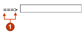
The Input field component is for recognizing input fields (non-protected
fields). This component, besides recognizing input fields, can also
extract the field's accompanying caption. To find the field's caption,
this component looks for protected text directly preceding the input
field (on the same row) first. If the algorithm cannot find a caption,
it will look directly above the field for protected text.
A recognized input field can be rendered by the following widgets:
The following figure shows how an input field component might appear
on your host screen:
Figure 17. Input field component example
Field caption (extracted from component)
The following settings can be configured for this component:
Extract field caption
If selected, a caption for the recognized input field is extracted
(see the description above for more information about this algorithm).
This extracted caption can be used by the widget.
Restrict caption to selected region
If selected, the caption is limited to the text within the
selected part of the screen.
Strip end of caption
If selected, the end of the caption is stripped after (and including)
the first occurrence of any value specified in the Strip after setting. This
setting is useful for cleaning up extracted captions.
Strip after
Required. The string (or set of strings) that is used to strip
the extracted caption. For example, if the extracted caption is Command ==> and the value
for this setting is =,
everything after (and including) the first = is stripped off.
Replace with
Optional. The string to replace the stripped off portion (if
applicable) of the caption with.
Trim spaces on caption
If selected, white space (for example spaces and tabs) is removed
from both ends of the extracted (and stripped) caption.
Clip input field to selected region
If selected, only the part of the input field inside of the
selected region is recognized and rendered. If cleared, if any part
of an input field is inside the selected region, the entire input
field is recognized and rendered. This setting is useful if you need
to break a large host screen input field into multiple, smaller Web
page input fields.
The Input field with hints component is for recognizing input fields
(non-protected fields) which have accompanying hints (text immediately
following the input field on the same row). This component is functionally
similar to the Input field component, except
that hints must be found next to the candidate input. For example,
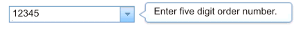
suppose your host screen had the following input field:
Product code: [ ] (Valid codes: A, B,
C, D)
In this example, the start of the hints is Valid codes:, the end of the hints is a
close parenthesis [)], the separator
is a comma (,), and the leading token
type is None.
A recognized input field can be rendered by the following widgets:
The input field also uses valid value hints. By default, the
input field does not recognize hints, therefore you will have to modify
the component settings in order to pass these along to the rendering
widget.
The following figure shows how an input field with hints component
might appear on your host screen:
Figure 18. Input field with hints component example
Delimiter: position of delimiter, but leading token type was set
to None.
Start of hints: open parenthesis (
Separator: or
End of hints: close parenthesis )
Leading token type is not marked. In this example, the leading
token type is None. No
letter or digit precedes the hints.
The following settings can be configured for this component:
Extract field caption
If selected, a caption for the recognized input field is extracted
(see the description above for more information about this algorithm).
This extracted caption can be used by the widget.
Restrict caption to selected region
If selected, the caption is limited to the text within the
selected part of the screen.
Strip end of caption
If selected, the end of the caption is stripped after (and including)
the first occurrence of any value specified in the Strip after setting. This
setting is useful for cleaning up extracted captions.
Strip after
Required. The string (or set of strings) that is used to strip
the extracted caption. For example, if the extracted caption is Command ==> and the value
for this setting is =,
everything after (and including) the first = is stripped off.
Replace with
Optional. The string with which to replace
the stripped off portion (if applicable) of the caption.
Trim spaces on caption
If selected, white space (for example spaces and tabs) is removed
from both ends of the extracted (and stripped) caption.
Clip input field to selected region
If selected, only the part of the input field inside of the
selected region is recognized and rendered. If cleared, if any part
of an input field is inside the selected region, the entire input
field is recognized and rendered. This setting is useful if you need
to break a large host screen input field into multiple, smaller Web
page input fields.
Start of hints
Optional. The string of characters which identifies where the
set of hints starts. Multiple values can be specified for this setting;
separate with the vertical bar (|) character.
End of hints
Optional. The string of characters which identifies where the
set of hint ends. Multiple values can be specified for this setting;
separate with the vertical bar (|) character.
Separator
Required. The string of characters which separates each hint
in the hint set. Multiple values can be specified for this setting;
separate with the vertical bar (|) character.
Leading token type
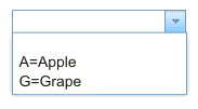
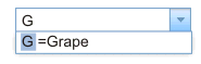
Specifies what each hint is. For example, if
the hint set was A=Apple,O=Orange,G=Grape,
you would set this value to Letter (or Letter or Digit) because A, O, and G are
all letters. You would set the delimiter to =.
Maximum length of leading token
Specifies the maximum length of the leading token. The default
is 4.
Delimiter
Required. The string of characters which separates the leading
token from the hint description. This setting only applies when the
leading token type is not None.
Minimum required hints
The minimum number of hints that must be found for this input
field to be recognized by this component. This setting is useful for
avoiding errant recognition.
The item selection component is responsible for recognizing screens
with list of items, where the interaction is to select a character
next to the item.
The item selection component can be rendered by the following widgets:
The following figure shows how an item selection component
might appear on your host screen:
Figure 19. Item selection component example
Input field
Caption
The following settings can be configured for this component:
Extract field caption
Select this box if you want available captions extracted for
the selected input fields.
Strip end of caption
Enabled only if Extract
field caption is selected. Select this box to delete the ending
text of a caption. Specify where to begin the deletion in Strip after, and any characters with which to replace
the deleted caption text in Replace with.
Trim spaces on caption
Enabled only if Extract
field caption is selected. Select this box to remove any extra
spaces on either end of the captions.
Captions are after input fields
Enabled only if Extract
field caption is selected. Select this box if the captions to
be extracted are on the right of the input fields. Clear this box
if captions are on the left of the input fields.
Input fields must have a caption
Select this box of you only want input fields with captions
to be recognized on the host screen.
Clip input field to selected region
Select this box if you want to render only the selected part
of an input field. Clear this box if you want to render the entire
field if any part of the field is selected.
The light pen (attention) component is responsible for recognizing
a light pen (also known as selector pen) attention field on
3270 host screens.
Note:
This component does not appear
in the HATS Components section in the Palette view
of the Page Designer. If
light pen support was enabled by selecting the Add
light pen rendering support check box during the initial creation
of a 3270 or 3270E project, this component is accessible from the Rational SDP menu
bar by clicking HATS Tools > Insert Host
Component.
A recognized light pen attention field can be rendered by the following
widgets:
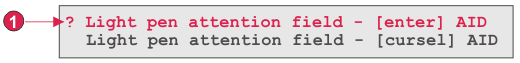
Depending on the designator character (the first character of the
field), clicking the rendering widget (button, link, or radio button)
causes either an [enter] or a [cursel] attention identifer (AID) to
be sent to the host. If the designator is an ampersand character (&),
an [enter] AID is sent. If the designator is a blank character, a
[cursel] AID is sent.
The following figure shows how a light pen (attention) component
might appear on your host screen:
Figure 20. Light pen (attention) component example
Designator character (the first character of the field)
The following settings can be configured for this component:
Consume remainder of field
Specifies whether the entire field or just the first character
of the field is consumed and rendered by the widget. Select this check
box to specify that the entire field is consumed and rendered. For
example, the contents of the field are rendered as the caption of
the rendering widget (button, link, or radio button). Clear this check
box to specify that only the first character will be rendered by the
widget. This is useful to preserve colors or extended attributes in
the remainder of the field. When in Default Rendering, clearing this
check box will cause the remainder of the field (everything except
for the first character of the field) to be rendered by some other
widget (in most cases by the Field widget). The default is selected.
The light pen (selection) component is responsible for recognizing
a light pen (also known as selector pen) selection field on
3270 host screens.
Note:
This component does not appear
in the HATS Components section in the Palette view
of the Page Designer. If
light pen support was enabled by selecting the Add
light pen rendering support check box during the initial creation
of a 3270 or 3270E project, this component is accessible from the Rational SDP menu
bar by clicking HATS Tools > Insert Host
Component.
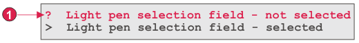
A recognized light pen selection field can be rendered by the Check box widget.
If the designator character (the first character of the field)
is a question mark (?), the rendered check box is not selected. If
the designator character is a greater-than sign (>), the rendered
check box is selected.
The following figure shows how a light pen (selection) component
might appear on your host screen:
Figure 21. Light pen (selection) component example
Designator character (the first character of the field)
The following settings can be configured for this component:
Consume remainder of field
Specifies whether the entire field or just the first character
of the field is consumed and rendered by the widget. Select this check
box to specify that the entire field is consumed and rendered. For
example, the contents of the field are rendered as the caption of
the rendering widget (check box). Clear this check box to specify
that only the first character will be rendered by the widget. This
is useful to preserve colors or extended attributes in the remainder
of the field. When in Default Rendering, clearing this check box will
cause the remainder of the field (everything except for the first
character of the field) to be rendered by some other widget (in most
cases by the Field widget). The default is selected.
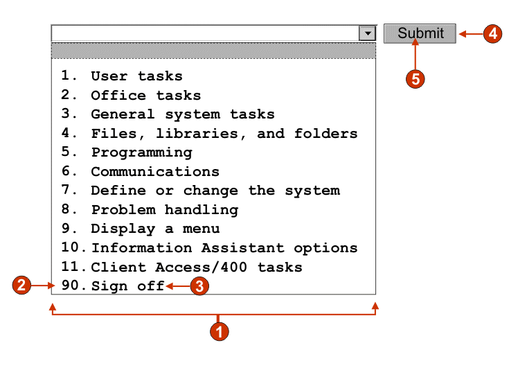
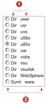
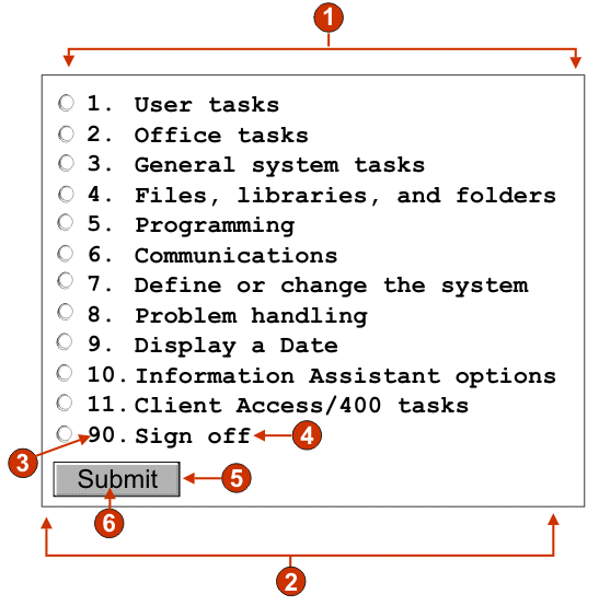
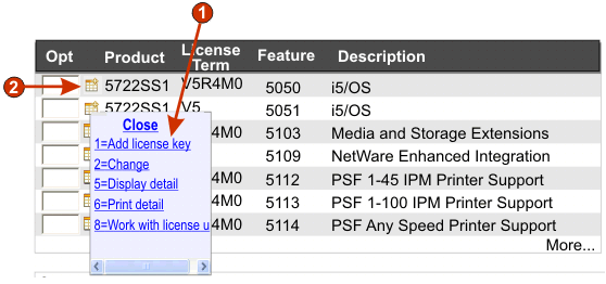
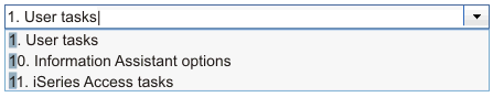
The Selection List component is responsible for recognizing selection
lists. Selection lists are like menus, but they are presented as a
list of options, each of which is preceded by a leading token and
a delimiter, such as in the following example:
Option 1. Prepare form
Option 2. Work with forms
you submitted
Option 3. Work with forms
requiring action
In this example, Option is
the string before the leading token, 1, 2,
and 3 are the leading
tokens, and the delimiter is a period followed by a space (. ).
Once a list item has been selected (either clicked or selected
depending on the widget), its leading token is placed in the targeted
host input field.
A recognized selection list can be rendered by the following widgets:
The following figure shows how a selection list component might
appear on your host screen:
Figure 22. Selection list component example
String before the leading token (a space)
Leading token type (digit)
Delimiter (a period (.))
End delimiter (a space)
List options (or items)
The following settings can be configured for this component:
String before the leading token
Optional. The string which precedes the leading token of each
list item.
Leading token type
Specifies whether each list item starts with letters, digits,
or both letters and digits.
Maximum length of leading token
Specifies the maximum length of the leading token. The default
is 4.
Delimiter
Required. The string of characters between the leading token
and the description. You can specify more than one value, separated
by the vertical bar (|) character.
End delimiter
Optional. The string of characters which must follow each list
item.
Minimum required options
The minimum number of list items that must be found in order
for the selected region to be recognized as a selection list.
Group Items Individually
Select this box if you want to group items individually.
Selection target field
Specifies which input field receives the selection. Options: First on screen, Last on screen, Previous field, Next field, Cursor position, or User defined.
Row
Specifies the row of the input field which should receive the
selection.
Note:
This setting only applies
if User defined is selected as the
selection target.
Column
Specifies the column of the input field which should receive
the selection.
Note:
This setting only applies
if User defined is selected as the
selection target.
Auto submit on select
If selected, an AID key is automatically sent to the host even
if the input field is blank. If cleared, an AID key is not automatically
sent.
Action key
Optional. Specifies the host aid key that should be pressed
after the target input field has been updated with the user's selection.
The default value is [enter] meaning
that the enter key will be pressed once the user makes a selection.
Sort list options
If selected, list items are sorted according to either their
leading token or description (see below for more information about
other settings).
Sort by
Specifies whether to sort the set of list options by their leading
token or description.
Sort order
Specifies whether to sort the set of list options in ascending
or descending order.
Note:
The locale-sensitive
sorting methods, built into Java™,
are used to perform this operation.
Placeholder options
Specifies whether to embed placeholder list items when gaps
(such as empty space) exist between list items. Options: Actual, None, or Single.
Note:
For information about using this
component with DBCS support see Selection list.
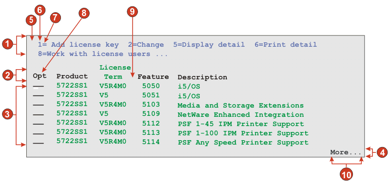
The following figure shows how a subfile component might appear
on your host screen:
Figure 23. Subfile component example
Action region
Header region
Data region
Marker region
Action settings
String before the leading token (a space)
Leading token type (digit)
Delimiter (an equal sign (=))
Header setting
Beginning text for header (Opt)
Data setting
Column delimiter (a space)
Marker setting
Marker text (More...)
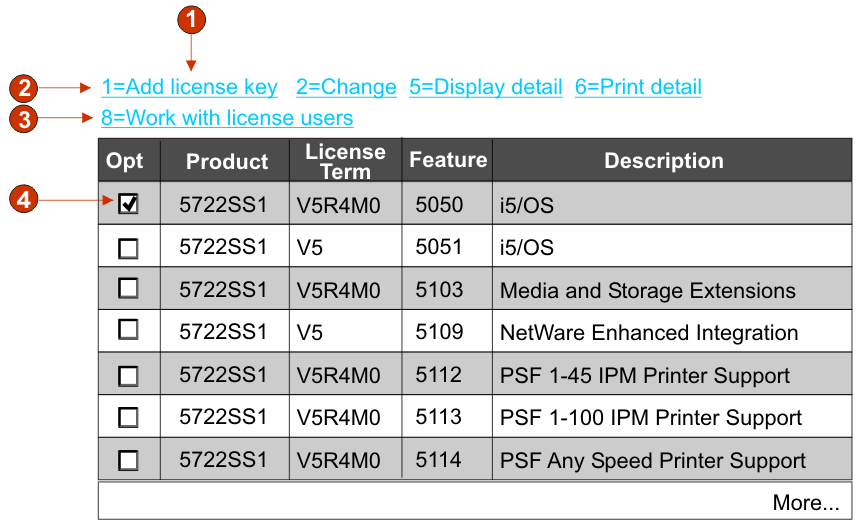
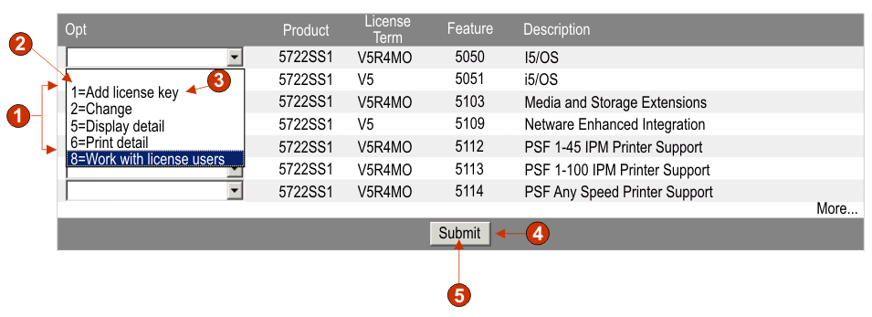
To launch Subfile Settings, follow these steps:
Go to the HATS Projects view and
click on your Project Settings.
Select the Rendering tab.
In the Rendering tab, expand the Components tree and select the Subfile component.
Click on the Settings button to
the right to display the Subfile Settings window.
Figure 24. Subfile settings example
The Subfile component settings consist of four tabs,
Action, Header, Data, and Marker. Each tab is used to define the criteria
for recognizing a particular element of the subfile. Icons on each
tab indicate the following states:
Recognized: This state means the element of the subfile is recognized
on the selected screen. If the Matches option
is selected, the recognized element is highlighted. To change the
highlighting color, use the Pattern matches setting
in the Screen capture highlighting colors section
of the HATS preferences. For more information, see Using HATS preferences.
Unrecognized: This state means the element of the subfile is not
recognized. You must adjust the screen region or recognition criteria
to tune the settings until recognized.
Unknown: This state indicates that the recognition of this element
depends on another element that is not yet recognized. Tune the unrecognized
settings on the other tabs first, then come back to this tab.
When all four tabs display recognized indicators, click OK. You can see the recognized result in
the widget preview.
Each recognition tab is described below.
Action
Select the screen you want to use from the drop-down list. You
can also specify the region of the Selection area
on the host screen by either using your mouse, or by entering the
coordinates of the region in the following boxes:
Start row
The first row to look for the subfile action. The default is 3.
End row
The last row to look for the subfile action. The default is 12.
Start column
The first column to look for the subfile action. The default
is 1.
End column
The last column to look for the subfile action. The default
is 80.
You can highlight certain fields on your host screen
by selecting the different options beside Highlight
fields. To see where input fields are defined on the screen,
select Input. To see what fields are
protected, select Protected. To highlight
hidden fields, select Hidden. To
see matching patterns, select Matches.
To modify the highlighting colors of the input, protected, hidden,
or pattern matching fields, see Using HATS preferences.
Action Recognition
Additional action recognition criteria can be configured by
selecting the following individual settings.
String before leading token
String. This value specifies the string before
the leading token. The default value is a space.
Leading token type
String. This value is the type of token this host application
uses for the host command. In the example where 1=Edit, the 1 token
is the host command, and its type is a digit. In the example where A=Edit, the A token is the host command,
and its type is a letter. The allowable values are Digit, Letter, Show
both. The default is Show
both.
Maximum length of leading token
The maximum length of the leading token. The default is 4.
Delimiter
String. This value is the token used in the subfile action to
delimit the host command from the description of the host command.
In the example where 1=Edit, 1 is the host command, the = token is the delimiter,
and Edit is the description
of the host command. The allowable value is one or more strings concatenated
by the vertical bar (|). The default is =. Example: =| = |-| - |:.
End delimiter
String. This is used to recognize the end of a subfile action
item description. Separate multiple character with a vertical
bar (|).
Must be specified color
This box is used in conjunction with previous settings
to designate that the subfile action's host command must be of a specific
type and the subfile action must be a specific color. For example,
the subfile action must be a digit, and must be blue.
Color
See description for the previous setting.
High intensity
String. This value specifies whether the subfile action uses
the high intensity field attribute. The allowable values are Yes, No, Don't
care. The default is Don't
care.
Actions not required
Select this box if you want the subfile to be recognized even
if it does not have any actions. The subfile header, data, and marker
are still recognized and rendered.
Consume non-empty rows immediately
above the actions
Select this box if you want rows on the screen that contain
text immediately above and adjacent to the actions, which meet the
recognition criteria (color and/or intensity), consumed but not displayed
by the subfile widget.
Header
Specify the region of the Selection area
on the host screen by either using your mouse, or by entering the
coordinates of the region in the following boxes:
Start row
The first row to look for the subfile header. The default is 3.
End row
The last row to look for the subfile header. The default is 16.
Start column
The first column to look for the subfile header. The default
is 1.
End column
The last column to look for the subfile header. The default
is 80.
You can highlight certain fields on your host screen
by selecting the different options beside Highlight
fields. To see where input fields are defined on the screen,
select Input. To see what fields are
protected, select Protected. To highlight
hidden fields, select Hidden. To
see matching patterns, select Matches.
To modify the highlighting colors of the input, protected, hidden,
or pattern matching fields, see Using HATS preferences.
Header Recognition
Additional header recognition criteria can be configured by
selecting the following individual settings.
Recognize by text
Boolean. This value specifies whether the subfile header should
be recognized based on strings. The allowable values are true or false. The default is true.
Begins with
String. Strings that can be used to identify subfile headers;
use \n to define multi-row
headers. The allowable values should be concatenated with the vertical bar (|). More specific headers should be
listed first. For example, if Option, Opt , and Opt are all possible headers,
they should be ordered to ensure that the most specific header is
listed first, Option|Opt |Opt The
default is true. Example: Description\nof Record|Option|Opt
|?.
Must be specified color
Boolean. This value is used in conjunction with the Text setting to designate
that the subfile headers must have a specific string and must be a
specific color. For example, the subfile header must contain the word Opt. and it must be blue. The allowable values
are true or false. The default is false.
Color
Specifies the color of the subfile header.
High intensity
Select this box to specify whether the Subfile
Header can be recognized by text at the top of a table of data, which
uses the high intensity field attribute.
Specified color
Select this box to specify if the subfile header
can be recognized by text of a specific color at the top of a table
of data.
Color
Specifies the color of the subfile header.
Data
Specify the region of the Selection area
on the host screen by either using your mouse, or by entering the
coordinates of the region in the following boxes:
Start row
The first row to look for the subfile data. The default is 4.
End row
The last row to look for the subfile data. The default is 22.
Start column
The first column to look for the subfile data. The default is 1.
End column
The last column to look for the subfile data. The default is 80.
You can highlight certain fields on your host screen
by selecting the different options beside Highlight
fields. To see where input fields are defined on the screen,
select Input. To see what fields are
protected, select Protected. To highlight
hidden fields, select Hidden. To
see matching patterns, select Matches.
To modify the highlighting colors of the input, protected, hidden,
or pattern matching fields, see Using HATS preferences.
Data Recognition
Additional data recognition criteria can be configured by selecting
the following individual settings.
Recognition Option:
This setting specifies how the subfile data region
is recognized.
Field Web-only
Recognize subfile data row by row.
Note:
For rich client applications,
if you want the see the subfile rendered row by row use the following
subfile widget settings:
Select Show alternative row colors
Clear Show grid lines
For Column header source, select From component
Select Use classic header style
Select Override font and select Monospaced font
Table (field) Web-only
Recognize subfile data by field information.
Table (visual)
Recognize subfile data that appears as a table with visible
vertical column delimiters.
Table
Recognize subfile data that appears as a table using user defined
column breaks.
Column delimiter:
Enabled only if the Recognition Option: is
set to Table (visual).
The string of characters which must exist in the same columns of every
row in the selected region for the host screen column to be marked
as a table column. If consecutive columns are each marked as a delimiting
column, only the last column is actually rendered as the delimiting
column of the generated table. The default is a space
character.
Column breaks:
Enabled only if the Recognition Option: is
set to Table. A comma-separated
list of column numbers where column breaks are wanted. For example,
specifying 1,7,22 would indicate that
new columns should begin in columns 1, 7 and 22. When the Restore Defaults button is clicked, the Column breaks field is filled with values
based on the Table (visual) default
recognition values.
Notes:
Column breaks can also be added or removed by using the mouse
to select a column in the host screen view, right-clicking,
and selecting either Add or Remove. Column breaks are indicated by
a dotted vertical line on the host screen view.
Column breaks cannot split an input field.
For information about using this setting with DBCS
support see Subfile.
Override action input field start column
If selected, you can override the starting
column of the action input field to prevent other input fields from
being rendered incorrectly as drop-down lists.
Column Start
Start column of the action input field. The default value is 1.
Override action input field length
If selected, you can override the length
of the action input field to prevent other input fields from being
rendered incorrectly as drop-down lists.
Field Length
Field length of the action input field. The default value is 1.
Data not required
Select this box if you want the subfile to be recognized even
if it does not have any data. If any subfile actions are detected,
they are still rendered as drop-down lists.
Include empty rows
Select this box if you want rows that are empty in a table
on the host screen to be included when the table is transformed. Clear
the box if you want empty rows to be discarded.
Marker
Specify the region of the Selection area
on the host screen by either using your mouse, or by entering the
coordinates of the region in the following boxes:
Start row:
The first row to look for the subfile marker. The default is 4.
End row:
The last row to look for the subfile marker. The default is 22.
Start column
The first column to look for the subfile marker. The default
is 1.
End column
The last column to look for the subfile marker. The default
is 80.
You can highlight certain fields on your host screen
by selecting the different options beside Highlight
fields. To see where input fields are defined on the screen,
select Input. To see what fields are
protected, select Protected. To highlight
hidden fields, select Hidden. To
see matching patterns, select Matches.
To modify the highlighting colors of the input, protected, hidden,
or pattern matching fields, see Using HATS preferences.
Marker Recognition
Additional marker recognition criteria can be configured by
selecting the following individual settings.
Recognize by text
If selected, the end marker of the subfile
can be recognized by the specified text string.
Text
String. This can be used to identify the subfile end marker.
Multiple values are allowed. Example: More...|Bottom|End|+. The default value is More...|Bottom|+.
High intensity
If selected, the end marker of the subfile
can be recognized by a high intensity field below the data table.
No visual text is required
If selected, the high intensity field can be an empty string.
Empty row
If selected, the end marker of the subfile
can be recognized by an empty row within the specified region below
the data table.
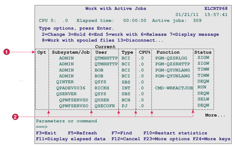
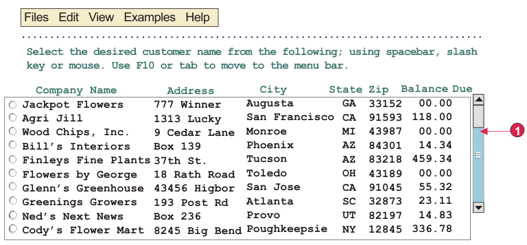
The Table component is responsible for recognizing tables. It can
be used instead of the Table
(visual) component if you must indicate specific column numbers to
use for column breaks in order to achieve the result you want.
Care should be taken when using the Table component in a default
rendering set because the Table component will recognize almost every
screen in the selected region, and no rendering items lower in the
list will be recognized.
A recognized table can be rendered by the following widgets:
The following figure shows how a table component might appear on
your host screen:
Figure 25. Table component example
Title rows
Column breaks
The following settings can be configured for this component:
Column breaks:
A comma-separated list of column numbers where column
breaks are wanted. For example, specifying 1,7,22 would
indicate that new columns should begin in columns 1, 7 and 22. When
the Restore Defaults button is clicked,
the Column breaks field is filled with
values based on the Visual table default
recognition values.
Notes:
Column breaks can also be added or removed by using the mouse
to select a column in the host screen view, right-clicking,
and selecting either Add column or Remove column. Left-clicking on
a column can also add or remove a column break. Column breaks are
indicated by a dotted vertical line on the host screen view.
Column breaks cannot split an input field.
For information about using this setting with DBCS
support see Table.
Include empty rows
If selected, empty rows (rows without any visible text or input
fields) will be included in the rendered table or graph.
Table rows to exclude
The comma-separated or ranged set of rows to exclude from the
recognized table. This setting is useful for hiding specific rows
of data on a table or graph. The rows represented by this value are
based on the recognized table, not on the actual host screen. Example
values: 1,2,3...., 1,2-4, 3-5.
Table columns to exclude
The comma-separated or ranged set of logical columns to exclude
from the recognized table. The columns represented by this value are
based on the recognized table, not on the actual host screen. Example
values: 1,2,3...., 1,2-4, 3-5.
Number of title rows
Specifies the number of rows, starting at the top of the region,
that should be rendered as the header. If the value is greater than
1, for each column, the header lines will be rendered as a string
in a single row.
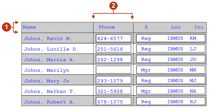
The Table (field) component is responsible for recognizing
logical columns of vertically aligned fields. For a region to be recognized
as a table (field), the left and right boundaries
of each field contained within the selected region (including partial
fields) must be the same as the left and right boundaries of the field
directly above (if the field in question is not on the first row)
and directly below (unless the field in question is not on the last
row).
A recognized table (field) can be rendered
by the following widgets:
The following figure shows how a table (field) component
might appear on your host screen:
Figure 26. Table (field) component example
Rows
Columns
The following settings can be configured for this component:
Include empty rows
If selected, empty rows (rows without any visible text or input
fields) will be included in the rendered table or graph.
Rows to exclude
The comma-separated or ranged set of rows to exclude from the
recognized table. This setting is useful for hiding specific rows
of data on a table or graph. The rows represented by this value are
based on the recognized table, not on the actual host screen. Example
values: 1,2,3..., 1,2-4, 3-5.
Columns to exclude
The comma-separated or ranged set of logical columns to exclude
from the recognized table. The columns represented by this value are
based on the recognized table, not on the actual host screen. Example
values: 1,2,3..., 1,2-4, 3-5.
Minimum row count
The minimum number of rows the specified region must contain
for the region to be recognized as a table.
Note:
The number of recognized rows is evaluated before the specified
rows are excluded (see Rows to exclude).
Minimum column count
The minimum number of logical columns (not host screen columns)
the specified region must contain for the region to be recognized
as a table.
Note:
The number of recognized
columns is evaluated before the specified columns are excluded (see Columns to exclude).
Extract column header text from row above
table
Select this box if you want the text from the line above the
table to be used as the column headers of the table. The column headers
must be in protected fields.
Note:
Unless you have access to the host screen map
which created the table, use the Table
(visual) component to recognize a tabular region. If this is not possible,
turn on the Input, Protected, and Hidden options
on the first page of the Insert Host Component wizard to help determine
where fields break within the selected host screen region.
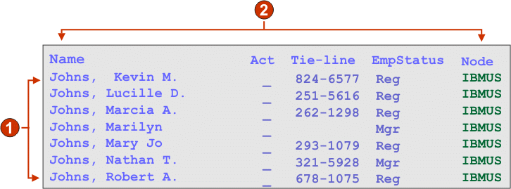
The Table (visual) component is responsible
for recognizing tables. The Table (visual) component
is different from the Table (field) component
in that it does not require that the underlying host screen fields
line up vertically. It looks for columns in the selected region which
contain the column delimiter for each row in the selection. Rule of
thumb: If a region has the appearance of a table, the Table (visual) component should be able to recognize
it.
A recognized table can be rendered by the following widgets:
The following figure shows how a Table (visual) component
might appear on your host screen:
Figure 27. Table (visual) component example
Rows (minimum row count = 1)
Columns (minimum column count = 1)
Column delimiter (a space)
The following settings can be configured for this component:
Column delimiter
Required. The string of characters which must exist in every
row of the selected region for the host screen column to be marked
as a table column. If consecutive columns are each marked as a delimiting
column, only the last column is actually rendered as the delimiting
column of the generated table.
Include empty rows
If selected, empty rows (rows without any visible text or input
fields) will be included in the rendered table or graph.
Rows to exclude
The comma-separated or ranged set of rows to exclude from the
recognized table. This setting is useful for hiding specific rows
of data on a table or graph. The rows represented by this value are
based on the recognized table, not on the actual host screen. Example
values: 1,2,3...., 1,2-4, 3-5.
Columns to exclude
The comma-separated or ranged set of logical columns to exclude
from the recognized table. The columns represented by this value are
based on the recognized table, not on the actual host screen. Example
values: 1,2,3...., 1,2-4, 3-5.
Minimum row count
The minimum number of rows the specified region must contain
for the region to be recognized as a table.
Note:
The number of recognized rows is evaluated before the specified
rows are excluded (see Rows to exclude).
Minimum column count
The minimum number of logical columns (not host screen columns)
the specified region must contain for the region to be recognized
as a table.
Note:
The number of recognized
columns is evaluated before the specified columns are excluded (see Columns to exclude).
Extract column header text from row above
table
Select this box if you want the text from the line above the
table to be used as the column headers of the table. The column headers
must be in protected fields.
The Text component is responsible for recognizing visible text,
including text within an input field.
This component can be rendered using the Label widget.
The following figure shows how a text component might appear on
your host screen:
Figure 28. Text component example
Line break (preserved)
The following settings can be configured for this component:
Preserve line breaks
If selected, multiple selected rows will be rendered as multiple
rows on the resulting Web page. If cleared, the text from each row
will be concatenated together into a single string.
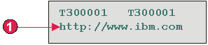
The URL component is responsible for recognizing links. It searches only within protected, non-hidden fields. This
component can be rendered using the Link widget.
The following figure shows how a URL component might
appear on your host screen:
Figure 29. URL component example
Start indicator (http://)
The following settings can be configured for this component:
Start Indicators
Specify one or more character strings to recognize the beginning
of an URL on the host screen
Widget settings
When you customize a host component, you specify how it will be
recognized. When you customize a widget, you specify how the widget
will appear on the Web page.
You can customize the settings of the widgets described
in the following sections.
When you set or modify widget settings
in any widget settings dialog, the widget preview area is automatically
updated to show you the effect of the changes you make, before you
click OK to commit those changes.
The Button widget is responsible for rendering HTML buttons. Clicking
one of these buttons will generally cause a host-specific action to
occur (for example, an aid key will be sent to the host or an input
field will be updated).
This widget renders data supplied by the following components:
The following figure shows how a button widget appears on a transformation,
using the data from the Function key component
example as input:
Figure 30. Button widget example
Rows
Columns (3 per row)
Caption type (show description)
The following settings can be configured for this widget:
Caption type
Specifies how the caption for each button is determined. The
value of the leading token and the description are derived from the
component; you can select what appears on the button caption. For
example, if the host screen had a menu item that read 4. Mail, you can have the
caption display 4, or Mail, or 4. Mail.
Trim spaces on caption
If selected, white space (extra space) is trimmed from both
ends of the caption.
Layout
Specifies how the buttons will be arranged on the HTML page.
Options: Table, Separated.
Notes:
This setting is not applicable in default rendering if the function key component is being used.
The widget preview does not always match the full page preview. This happens
because the widget preview simply renders the component's output. It does
not try to preserve the alignment of the screen when it renders, as is done
in the full page preview.
Number of columns per row
The number of buttons to display horizontally before wrapping
to the next line. Tweaking this setting can cause your buttons to
appear vertically (if this value is 1) or horizontally (if this value
is equal to or greater than the number of buttons to be rendered).
Separator
Specifies what separator you want to use to separate the rendered
buttons on the HTML page. You can select from the drop-down list or
type in your own in the entry field.
Enable foreground colors Web-only
If selected, the button text is rendered using the color extracted
from the host screen by the component (only applicable when the function
key component is used).
Color information is extracted for the first
host field containing any part of the function key. If the function
key is split over two fields, such as F12= and Exit,
the color information for the field containing F12= is
extracted.
Button style class Web-only
Optional. The CSS style class associated with each generated
button. The value of the class attribute of the HTML button tag will
be set to this value. The default value is HATSBUTTON. See Using style sheets for
more information.
Style Web-only
Optional. Any CSS properties that you want to override. For
example, you can specify font-color:
red; font-size: 18pt; in this field to change the font color
and size for this widget. The properties you enter apply to each element
of this widget. Use the launcher
button next to this field to open a style properties dialog. This
dialog frees you from the need to understand CSS to change the font,
color, or other style settings for the widget. See Using style sheets for more information.
Override font RCP-only
Select this option and use the supplied Font setting controls to override the default font name, font style, and
font size.
The following figure shows how a button table widget appears on
a transformation, using the data from the Function key component example as input:
Figure 31. Button table widget example
Rows
Number of columns per row (2)
Caption
The following settings can be configured for this widget:
Number of columns per row
The number of buttons to display horizontally before wrapping
to the next line.
Notes:
This setting is not applicable in default rendering if the function key component is being used.
The widget preview does not always match the full page preview. This happens
because the widget preview simply renders the component's output. It does
not try to preserve the alignment of the screen when it renders, as is done
in the full page preview.
Button style class Web-only
Optional. The CSS style class associated with each generated
button. The value of the class attribute of the HTML button tag will
be set to this value. The default value is HATSBUTTON. See Using style sheets for more
information.
Caption style class Web-only
Optional. The CSS style class associated with each item description
(to the right of the generated button). The default value is HATSCAPTION. See Using style sheets for more information.
Table style class Web-only
Optional. The CSS style class associated with the generated
table. The value of the class attribute of the HTML table tag will
be set to this value. The default is HATSTABLE. See Using style sheets for more information.
Style Web-only
Optional. Any CSS properties that you want to override. For
example, you can specify font-color:
red; font-size: 18pt; in this field to change the font color
and size for this widget. The properties you enter apply to each element
of this widget. Use the launcher
button next to this field to open a style properties dialog. This
dialog frees you from the need to understand CSS to change the font,
color, or other style settings for the widget. See Using style sheets for more information.
Override font RCP-only
Select this option and use the supplied Font setting controls to override the default font name, font style, and
font size.
Override color RCP-only
Select this option and use the supplied Foreground
color and Background color setting controls
to override foreground and background colors.
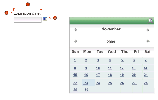
The Calendar widget is responsible for rendering an input field
with an associated launcher button, link, or image. This launcher
opens a pop-up calendar
date picker which your users can use to select a date; this date
is then inserted into the associated input field.
Notes:
If you are testing your project using the Web browser built in
to the Rational SDP, using the WebSphere® Test
Environment, you may see the calendar widget come up in a browser
window bigger than expected and with additional unneeded controls.
This will not happen when the application is run in an external browser,
or when you run a deployed application.
To display the pop-up calendar and image launcher when
the HATS application is accessed through a proxy server, you must
configure the HATS application to use the proxy server. For instructions
see Configuring HATS applications to use a proxy server.
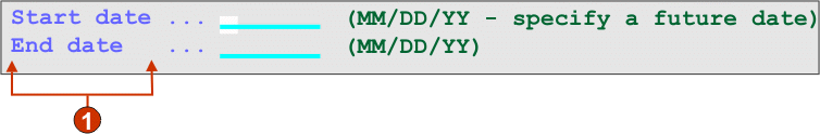
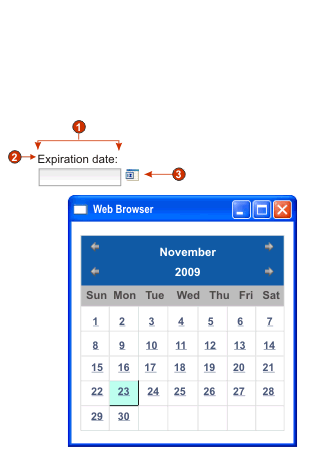
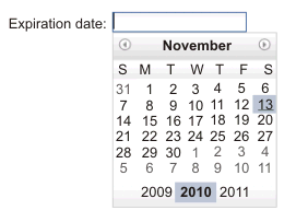
The following figure shows how the calendar widget
and its date picker appear on a transformation when the Use inline calendar setting is selected:
Figure 32. Example of calendar widget with inline date picker
The following figure shows how the calendar widget
and its date picker appear on a transformation when the Use inline calendar setting is cleared:
Figure 33. Example of calendar widget with windowed date picker
Number of columns per row (1)
Caption (from component)
Launcher type (image)
Note:
The examples have no captions for the launchers because the
launchers are images. If the launchers are buttons or links, the launcher
captions are shown on the buttons or in the links.
The following settings can be configured for this widget:
Pattern
Required. When the user selects a date from the calendar
widget, the selected date must be formatted to map correctly to what
is expected in the host application’s input field. This setting
specifies the pattern HATS uses to correctly format the selected date.
For information about the meaning of symbols in the pattern, see http://java.sun.com/j2se/1.3/docs/api/java/text/SimpleDateFormat.html.
When
you enter a pattern and save it, the HATS Toolkit performs the following
conversions to ensure correct symbols are used:
Uppercase D to lowercase d
Uppercase Y to lowercase y
Lowercase m to uppercase M
Lowercase e to uppercase E
Note:
The HATS Toolkit always displays the pattern
in uppercase characters. To see the actual case of the pattern symbols,
see the pattern setting for the com.ibm.hats.transform.widgets.CalendarWidget
class in the source of the application.hap file.
You
can spread the selected date over multiple consecutive
host input fields by separating pattern elements with a tilde
(~). For example, suppose you have the following input fields
on your host screen:
Month: [ ] Day: [
] Year: [ ]
If you specify a pattern of MM~DD~YYYY,
a single launcher will be created. Once your user has selected a date,
it will be spread over your three input fields: the 2-digit month
will be placed in the first input field, the 2-digit day will be placed
in the second input field, and the 4-digit year will be placed in
the third input field.
Note:
Click the Build button to use an aid to specify a
pattern that spans multiple host input fields.
Pattern locale
Specifies the locale of the pattern. This setting is useful
if you have entered a pattern segment which should output a day name
(example: Wednesday). Options: Use
server locale, Use browser
locale, or Use specified
locale.
Locale
If you specify Use specified locale,
select the locale for which to format the date specified by the user.
Restrict earliest selectable date
If selected, the value specified will be the earliest
date a user can select from the pop-up calendar.
Notes:
The date pattern is MM/DD/YYYY for all locales.
A user is not prevented from manually entering an earlier date
directly into the associated input field because of this setting.
Restrict latest selectable date
If selected, the value specified will be the latest
date a user can select from the pop-up calendar.
Notes:
The date pattern is MM/DD/YYYY for all locales.
A user is not prevented from manually entering a later date directly
into the associated input field because of this setting.
Default value
Optional. This field represents the initial date
selected on the pop-up calendar when the host application does not
pre-fill the associated input field with a valid date between the
specified restricted dates. It is also used when the user enters an
incorrect date (including a date out of range) before selecting the
pop-up calendar control. The interaction between this field and the
associated host input field is handled as follows:
If the host application pre-fills the input field with zeros or
an incorrect date format, the default value does not overwrite the
host field data. To update the associated input field, the user must
either manually enter a date, or select a date with the pop-up
calendar.
If the default value is not specified or is in an incorrect format,
today's date will be initially selected on the pop-up calendar.
If you want to pre-fill the associated input field, add an Insert Data action to your screen customization
event before applying the transformation.
Note:
The date pattern is MM/DD/YYYY for all locales.
Caption source
Specifies how the caption for the generated input field is determined.
Options: From component (use
the extracted caption from the component) or Custom (use the specified caption).
Custom caption
Optional. Specifies the caption for the input field.
Note:
Leave this setting blank to not generate a caption for the
input field.
Number of columns per row
Specifies how many instances of this widget should appear in
each row in the rendered Web page.
Notes:
This setting is not applicable in default rendering.
The widget preview does not always match the full page preview. This happens
because the widget preview simply renders the component's output. It does
not try to preserve the alignment of the screen when it renders, as is done
in the full page preview.
Launcher type
Specifies the style of the launcher. The launcher is used to
open the calendar date picker. Options Button, Link, or Image.
Caption
The caption of the launcher button or link.
Button style class
Optional. The CSS style class associated with the generated
launcher button. The value of the class attribute of the HTML button
tag will be set to this value. The default value is HATSBUTTON . See Using style sheets for more information.
Link style class
Optional. The CSS style class associated with the generated
launcher link. The value of the class attribute of the HTML link tag
will be set to this value. The default value is HATSLINK. See Using style sheets for more information.
Note:
Depending on the Web browser, there
may be limitations to using the Tab key to tab to this launcher if
either the Link or Image style is selected. For a list of
supported Web browsers and limitations, see "System Requirements
for Host Access Transformation Services" at http://www.ibm.com/support/docview.wss?uid=swg27011794 and "Host
Access Transformation Services 9.5 - Known issues and workarounds"
at http://www.ibm.com/support/docview.wss?uid=swg27046998.
Use inline calendar
If selected, when the calendar date picker is launched, it
is displayed in the current Web page. If cleared, the date picker
is displayed in a new browser window. The default for newly created
projects is selected. The default for projects migrated from releases before HATS V7.5.1 is cleared.
Notes:
Using the inline calendar date picker is helpful in cases where
pop-up blockers prevent the display of the date picker in a
new browser window.
Use of the inline calendar date picker is not supported for HATS
applications for mobile devices.
Read only
If selected, rendered input fields are read only. A read only
input field appears as a regular input field, but does not allow the
user to modify its contents. This is useful in cases where you want
to display the contents of a non-protected field to a user, but you
do not want the user to modify the contents.
Strip underscores on input field
Select this box if you want to strip the underscores from text
when it is rendered.
Trim spaces on input field
Selecting this trims leading and trailing spaces from the input
field.
Enable foreground colors
If selected, host screen foreground colors are rendered.
Colors
are mapped to CSS stylesheet classes representing
that color. For example, if a host screen field is marked as RED, the Field widget will enclose the
generated HTML for that field in a tag whose class name attribute
is set to HRED. This allows for you
to remap host screen colors on your generated Web page.
Note:
The
blacktheme.css directly maps host screen field foreground colors (for
example, red text on the host screen will appear as red text on the
generated Web page). However, other stylesheet files
like monochrome.css, map field colors differently in an attempt to
create a consistent, modern style.
Enable extended attributes
If selected, extended field attributes (blink, reverse video,
underline, and column separator) are rendered. Also, for 3270 Web
applications, extended field colors are mapped (see the Enable foreground colors setting for more
information). See Using style sheets for more information.
Blink style
The CSS style setting you want to use to render blinking text
from the host screen.
Reverse video style
The CSS style setting you want to use to render reverse video
text from the host screen.
Underline style
The CSS style setting you want to use to render underlined text
from the host screen.
Column separator style
The CSS style setting you want to use to render column separators
from the host screen.
Input field style class
Optional. The CSS style class associated with the generated
input field. The value of the class attribute of the HTML input tag
will be set to this value. The default value is HATSINPUT. See Using style sheets for more information.
Caption style class
Optional. The CSS style class associated with the generated
input field's caption. The default value is HATSCAPTION. See Using style sheets for more
information.
Table style class
Optional. The CSS style class associated with the generated
table. If more than one set of input fields is rendered, an HTML table
will be generated to enclose these input fields. The value of the
class attribute of the HTML table tag will be set to this value. The
default value is HATSTABLE.
See Using style sheets for more information.
Style
Optional. Any CSS properties that you want to override. For
example, you can specify font-color:
red; font-size: 18pt; in this field to change the font color
and size for this widget. The properties you enter apply to each element
of this widget. Use the launcher
button next to this field to open a style properties dialog. This
dialog frees you from the need to understand CSS to change the font,
color, or other style settings for the widget. See Using style sheets for more information.
The following figure shows how a check box widget appears on a
transformation, using the data from the input field of the Input field with hints component example as input:
Figure 34. Check box widget example
Number of columns per row (1)
Caption (from component)
The following settings can be configured for this widget:
Selected value
Required. The string that is inserted in the host screen input
field when the check box is selected. This value is also used to set
the initial state of the check box when the Web page is loaded.
Deselected value
Required. The string that is inserted in the host screen input
field when the check box is deselected. This value is also used to
set the initial state of the check box when the Web page is loaded.
Caption source
Specifies how the caption for the generated check box is determined.
Options: From component (use
the extracted caption from the component) or Custom (use the specified caption).
Custom caption
Optional. Specifies the caption for the check box.
Note:
Leave
this setting blank to not generate a caption for the check box.
Trim spaces on caption
If selected, white space (extra space) is trimmed from both
ends of the caption.
Number of columns per row
The number of check boxes to display horizontally before wrapping
to the next line.
Notes:
This setting is not applicable in default rendering.
The widget preview does not always match the full page preview. This happens
because the widget preview simply renders the component's output. It does
not try to preserve the alignment of the screen when it renders, as is done
in the full page preview.
Check box style class Web-only
Optional. The CSS style class associated with the generated
check box. The value of the class attribute of the HTML input tag
will be set to this value. The default value is HATSCHECKBOX. See Using style sheets for more
information.
Caption style class Web-only
Optional. The CSS style class associated with the caption of
the generated check box. The default value is HATSCAPTION.
See Using style sheets for more information.
Table style class Web-only
Optional. The CSS style class associated with the generated
table. If more than one check box is rendered, an HTML table will
be generated to enclose these check boxes. The value of the class
attribute of the HTML table tag will be set to this value. The default
value is HATSTABLE. See Using style sheets for more information.
Style Web-only
Optional. Any CSS properties that you want to override. For
example, you can specify font-color:
red; font-size: 18pt; in this field to change the font color
and size for this widget. The properties you enter apply to each element
of this widget. Use the launcher
button next to this field to open a style properties dialog. This
dialog frees you from the need to understand CSS to change the font,
color, or other style settings for the widget. See Using style sheets for more information.
Override font RCP-only
Select this option and use the supplied Font setting controls to override the default font name, font style, and
font size.
The Combo widget is responsible for rendering editable drop-down
combination boxes.
Notes:
For security reasons, the Combo widget
should not be used to render password fields. Characters typed into
a password field rendered with the Combo widget will be visible as
the user types.
For DBCS considerations when
using this widget see AutoIME switching.
This widget renders data supplied by the following components:
The following figure shows how a combo widget appears on a transformation,
using the data from the Input field with hints component
example as input:
Figure 35. Combo widget example
Caption (from component)
Number of columns per row (defaults to 1)
Fill (from hints)
The following settings can be configured for this widget:
Fill from global variable
If selected, fill the drop-down from the specified global variables.
Global variable containing list values
Specifies the name of the indexed global variable containing
the set of values. An item for each index in the global variable will
be created in the drop-down.
Shared
HATS local and shared global variables can have the same name.
Select this box if you want to use the shared global variable to populate
the list items. When this box is cleared, the local global variable
is used.
Global variable containing list captions
Optional. Specifies the name of the indexed global variable
containing the set of captions. The size of the global variable specified
by this value should be greater than or equal to the size specified
in the preceding setting. The indexes in this indexed global variable
should also match up with the indexes in the values global variable
(so that the actual value and caption shown to the user are in sync).
If this value is not specified, the caption for each item in the drop-down
will be its value.
Fill from string
If selected, fill the drop-down from the specified string.
List items
Optional. Specifies the string of items to include in the drop-down list. Items should be separated with a semicolon
(;). To have the list item caption be different than the list
item value, enter both separated by an equal sign
(=). For example, a value of Apple=A;Grape=Grenders a drop-down list with two items: Apple and Grape. Selecting the first
item causes an A to be inserted in the associated host screen input
field.
If you want both the item in the drop-down and the
value inserted in the host screen to be the same, you only need to
enter the item. For example, Apple=A;G.
In this example, a G appears
in the drop-down and in the host screen input field.
Fill from hints
If selected, fill the drop-down from hints recognized by the
component (only applicable when the Input Field with Hints component
is used).
Caption source
Specifies how the caption for the generated drop-down is determined.
Options: From component (use
the extracted caption from the component) or Custom (use the specified caption).
Custom caption
Optional. Specifies the caption for the drop-down.
Note:
Leave this setting blank to not generate a caption for the
drop-down.
Number of columns per row
The number of drop-downs to display horizontally before wrapping
to the next line. Default is 1.
Notes:
This setting is not applicable in default rendering.
The widget preview does not always match the full page preview. This happens
because the widget preview simply renders the component's output. It does
not try to preserve the alignment of the screen when it renders, as is done
in the full page preview.
Override maximum length
If selected, the specified maximum length value will be set
on each generate input field. This setting is useful for manually
restricting the number of characters that can be entered into an input
field. If cleared, the maximum number of allowable characters is determined
by the recognizing component.
Maximum length
The maximum number of characters that can be entered into each
input field.
Enable foreground colors
If selected, host screen foreground colors are rendered.
Colors
are mapped by the rich client template.
Note:
This setting
is overridden by the Override color > Foreground
color setting.
Enable extended attributes
If selected, extended field attributes (blink, reverse video,
underline, and column separator) are rendered.
Extended field attributes
are mapped by the rich client template.
Override font
Select this option and use the supplied Font setting
controls to override the default font name, font style, and font size.
Override color
Select this option and use the supplied Foreground
color and Background color setting
controls to override foreground and background colors.
The following figure shows how a data entry drop-down list widget
appears on a transformation, using the data from the Input field with hints component example as input:
Figure 37. Data entry drop-down list widget example
Caption (from component)
Number of columns per row (1)
Fill (from hints)
The following settings can be configured for this widget:
Fill from global variable
If selected, fill the drop-down list from
the specified global variables.
Global variable containing list values
Specifies the name of the indexed global variable containing
the set of values. An item for each index in the global variable will
be created in the drop-down list.
Shared
HATS local and shared global variables can have the same name.
Select this box if you want to use the shared global variable to populate
the list items. When this box is cleared, the local global variable
is used.
Global variable containing list captions
Optional. Specifies the name of the indexed global variable
containing the set of captions. The size of the global variable specified
by this value should be greater than or equal to the size specified
in the preceding setting. The indexes in this indexed global variable
should also match up with the indexes in the values global variable
(so that the actual value and caption shown to the user are in sync).
If this value is not specified, the caption for each item in the drop-down list will be its value.
Fill from string
If selected, fill the drop-down list from
the specified string.
List items
Optional. Specifies the string of items to include in the drop-down list. Items should be separated with a semicolon
(;). To have the list item caption be different than the list item
value, enter both separated by an equal sign (=). For
example, a value of Apple=A;Grape=Grenders a drop-down list with two items: Apple and Grape. Selecting the first
item causes an A to be inserted in the associated host screen input
field.
If you want both the item in the drop-down list and the value inserted in the host screen to
be the same, you only need to enter the item. For example, Apple=A;G. In this example,
a G appears in the drop-down list and in the host screen input field.
Fill from hints
If selected, fill the drop-down list from
hints recognized by the component (only applicable when the Input
Field with Hints component is used).
Caption source
Specifies how the caption for the generated drop-down list is determined. Options: From component (use the extracted caption from the
component) or Custom (use
the specified caption).
Custom caption
Optional. Specifies the caption for the drop-down list.
Note:
Leave this setting blank to not generate a caption for the
drop-down list.
Number of displayable rows
The number of rows in the drop-down list that are visible
to the user. If more than this number of items are
in the list, scroll bars appear so the user can scroll through the
entire list. The default is 1.
Number of columns per row
The number of drop-down lists to display
horizontally before wrapping to the next line.
Notes:
This setting is not applicable in default rendering.
The widget preview does not always match the full page preview. This happens
because the widget preview simply renders the component's output. It does
not try to preserve the alignment of the screen when it renders, as is done
in the full page preview.
Auto submit on select
If selected, once a selection is made in the drop-down list, it is submitted.
Show submit button
If selected, a submit button is rendered
next to the drop-down list.
Submit button caption
Optional. Specifies the caption of the submit button.
Drop-down style class Web-only
Optional. The CSS style class associated with the generated
drop-down list. The value of the class attribute
of the HTML drop-down tag will be set to this value. The default value
is HATSDROPDOWN. See Using style sheets for more information.
List option style class Web-only
Optional. The CSS style class associated with each option in
the drop-down list. The default value is HATSOPTION. See Using style sheets for more information.
Caption style class Web-only
Optional. The CSS style class associated with the caption
of the generated drop-down list. The default value is HATSCAPTION. See Using style sheets for more information.
Table style class Web-only
Optional. The CSS style class associated with the generated
table. If more than one drop-down list is rendered,
an HTML table will be generated to enclose these drop-down lists. The value of the class attribute of the HTML
table tag will be set to this value. The default value is HATSTABLE. See Using style sheets for more information.
Style Web-only
Optional. Any CSS properties that you want to override. For
example, you can specify font-color:
red; font-size: 18pt; in this field to change the font color
and size for this widget. The properties you enter apply to each element
of this widget. Use the launcher
button next to this field to open a style properties dialog. This
dialog frees you from the need to understand CSS to change the font,
color, or other style settings for the widget. See Using style sheets for more information.
Override font RCP-only
Select this option and use the supplied Font setting controls to override the default font name, font style, and
font size.
Override color RCP-only
Select this option and use the supplied Foreground
color and Background color setting controls
to override foreground and background colors.
The following figure shows how a selection list drop-down list
widget appears on a transformation, using the data from the Selection list component example as input:
Figure 38. Selection list drop-down list widget example
Caption type (show both)
Leading token (show both)
Description (show both)
Submit button (show submit button)
Submit button caption (submit)
The following settings can be configured for this widget:
Caption type
Specifies how the leading token of the list item is displayed.
The value of the leading token and the description are derived from
the component; you can select what appears in the drop-down list. For example, if the host screen had a menu
item that read 4. Mail,
you can have the caption display 4,
or Mail, or 4. Mail.
Auto submit on select
If selected, once a selection is made in the drop-down list, it is submitted. If
the drop-down list contains function keys, the
selected list item's key is sent to the host. If the drop-down list contains selection list items, the selected
item's value is inserted into the target field and the specified action
key is sent to the host.
Show submit button
If selected, a submit button is rendered
next to the drop-down list. Does not apply when
using this widget with the function key component.
Submit button caption
Optional. Specifies the caption of the submit button.
Button style class Web-only
Optional. The CSS style class associated with the generated
submit button. The value of the class attribute of the HTML button
tag will be set to this value. The default value is HATSBUTTON. See Using style sheets for more information.
Drop-down style class Web-only
Optional. The CSS style class associated with the generated
drop-down list. The value of the class attribute
of the HTML drop-down tag will be set to this value. The default value
is HATSDROPDOWN. See Using style sheets for more information.
List option style class Web-only
Optional. The CSS style class associated with each option in
the drop-down list. The default value is HATSOPTION. See Using style sheets for more information.
Caption style class Web-only
Optional. The CSS style class associated with the caption
of the generated drop-down list. The default value is HATSCAPTION. See Using style sheets for more information.
Table style class Web-only
Optional. The CSS style class associated with the generated
table. If more than one drop-down list is rendered,
an HTML table will be generated to enclose these drop-down lists. The value of the class attribute of the HTML
table tag will be set to this value. The default value is HATSTABLE. See Using style sheets for more information.
Style Web-only
Optional. Any CSS properties that you want to override. For
example, you can specify font-color: red;
font-size: 18pt; in this field to change the font color and size
for this widget. The properties you enter apply to each element of
this widget. Use the launcher button
next to this field to open a style properties dialog. This dialog
frees you from the need to understand CSS to change the font, color,
or other style settings for the widget. See Using style sheets for
more information.
Override font RCP-only
Select this option and use the supplied Font setting controls to override the default font name, font style, and
font size.
Override color RCP-only
Select this option and use the supplied Foreground
color and Background color setting controls
to override foreground and background colors.
The following figure shows how a field widget appears on a transformation,
using the data from the Field component
example as input:
Figure 39. Field widget example
Protected text
The primary goal of the table layout of
the Field widget is to preserve the layout of the original host screen
when it is rendered in a GUI. In default rendering, a table is used
to preserve the layout of the screen. This table typically has 80
columns and 24 rows. Each of the different alignment settings in the
Field widget (Normal, Character by character Web-only , and Word by word) change how the table cells
in this table are created.
With normal alignment, each host field is represented
by a table cell within the table. The cell may consume one or more
columns. See the "colspan" HTML
attribute for more details. If a field starts at column 10 on the
host screen, it will be positioned at column 10 in the table. Normal
alignment guarantees that each field begins at the correct column
location.
Global rules can impact the alignment of a page because
typically a global rule consumes more page space than the field it
has transformed. For example, imagine you have an input field that
is five characters in length. Default rendering allocates five columns in the table for this field. If the
field is rendered by a global rule that takes up more than five characters
of space, the table cell it resides in is forced to expand, that is,
the cell's width is increased. This impacts the entire table because
the entire column is affected. Typically cells to the right of the
field, in any row, are shifted to the right since the columns containing
the transformed field are now wider. Therefore, a field starting at
column 60 of row 5 will always be aligned with a field starting at
column 60 of row 20.
Character by character alignment is supported only
in HATS Web projects. This alignment option causes each character
of a field, except for input fields, to be rendered in its own table
cell. Although using this option guarantees
that every character on the screen is located at the correct starting
location, it also causes the size of the generated page to be very large.
Word by word alignment causes each word on the screen
to be rendered in its own table cell. This means that a single field
made up of multiple words will be rendered in more than one table
cell. This guarantees that every word on the screen is rendered at
the correct location. This option is typically used when a host screen
has a mix of input fields scattered throughout the screen. Input fields
can cause a page to become misaligned since input fields consume more
page space than regular text.
The following example shows how the different alignment
options map fields and characters into table cells in default rendering.
The table cells are invisible in actual default rendering.
Figure 40. Field widget alignment examples
The following settings can be configured for this widget:
Read only
If selected, input fields are not rendered. If an input field
contains text (and is not password protected), the text is displayed
instead. This setting is useful if you want to show users a page of
information, but you do not want them editing it.
Layout
Use this setting to specify the layout of the
output rendered by this widget. Select Table to
render the output in a table, with the goal of preserving the layout
of the original host screen. This is the default for Web applications
not optimized for mobile devices. Select Separated to
render the output using inline span tags to differentiate between
fields, with the goal of reducing the amount of HTML and blank space.
This is the default for Web applications optimized for mobile devices.
Alignment
When using table layout, indicate how
you want HATS to map text characters into table cells in order to
improve their alignment (Normal, Character by character Web-only , or Word by word)
Table style class Web-only
Optional. The CSS style class associated with the generated
table. The value of the class attribute of the HTML table tag will
be set to this value. The default value is HATSFIELDTABLE. See Using style sheets for more
information.
nowrap Web-only
When you specify Word
by word for the Alignment setting,
multiple fields are aligned word by word in the transformation. However,
another widget could create output that causes cells in the default
rendering table to compress, thereby causing the text to wrap. To
ensure that the text does not wrap, a nowrap flag is automatically
added to the HTML output when word by word alignment is used. Use
this nowrap setting to turn off the
automatic addition of the nowrap flag to the HTML output.
Setting nowrap to false, with any value of the alignment settings, prevents the addition
of the nowrap flag to the HTML output of the field widget, enabling
the text in the cell to wrap. You should only set nowrap to false when
you are using word by word alignment and continue to have alignment
problems.
In default rendering, if a table cell wraps, both
vertical and horizontal alignment can be adversely affected, causing
undesirable output.
If you set nowrap to true with any value of the alignment setting, wrapping of text to
the next line within a table cell does not occur.
Note:
The nowrap setting does not appear in the GUI
as a configurable setting. It must be set in the source of the application.hap
file. For example, to set nowrap to false, on the HATS Projects view double-click
the Project Settings file in the project
folder to launch the editor for the application.hap file. On the Source tab locate the class, name="com.ibm.hats.transform.widgets.FieldWidget",
in the <classSettings> tag and add the following setting:
<setting name="nowrap" value="false"/>
Allow cursor positioning on protected fields
If selected, clicking one of these protected fields causes the
host cursor to be set to that specific position. This setting is useful
if your host application is cursor position-sensitive and needs for
your user to position the cursor on a protected field.
For
Web applications, how precisely the cursor position can be set is
determined by the Alignment setting
(Normal, Character by character Web-only , or Word by word).
For rich client applications,
the cursor position can be set anywhere within the field. The Alignment setting does not affect how precisely
the cursor position can be set.
At runtime in the browser, HATS is notified when one of these fields is clicked.
HATS updates the cursor position internally and then visually indicates
the new cursor position to the user. By default, the visual indication
is to set the background color of the text to yellow. For
Web applications, this visual indication can be controlled by
the developer using the CSS style, HCURSORINDICATOR.
See Using style sheets for more information. With this setting
enabled, the following capability is provided:
Allows you to position the cursor by clicking on an area of a
protected field.
Allows you to see the cursor's initial position when the page
loads, even if the cursor is not inside an unprotected field.
Note:
This setting alone will not work correctly
when the same area of a screen is rendered multiple times using the
Field widget. For example, in the case where the same region of the
screen is rendered on multiple tabs in a tabbed folder, you must in
addition render the protected fields as links (see Allow tabbing using links below) in order
to provide your users with the ability to position the cursor on that
region of the screen.
Allow tabbing using links Web-only
If selected, each protected field is rendered as an HTML link
which allows tabbing between protected fields. The cursor position
will display as an underlined character.
Note:
Selecting
this option causes an HTML anchor <A> tag to be generated for each
protected field on the page and as a result increases the size of
the Web page.
To avoid unnecessarily
increasing the size of the resulting Web page, this option is not
selected by default.
Link style class Web-only
The CSS style class associated with each generated link. The
value of the class attribute of the HTML link tag will be set to this
value. The default value is HATSPROTLINK.
See Using style sheets for more information.
Action key
Optional. Specifies the host AID key mnemonic that
should be sent to the host when a protected field is selected. For
example: [enter] , which
causes the cursor to be set to the specified location and for enter
to be sent, or [pf1] , which causes
the cursor to be set to the specified location and for pf1 to be sent.
Trim spaces on links
If selected, white space (extra space) is trimmed from both
ends of the protected field links. This setting is useful for reducing
the amount of text that is rendered as links.
Enable cursor positioning option on input fields Web-only
Select this box to allow the user to switch from data input mode to
cursor positioning mode for input fields. When in data input mode, the user
can enter data into the input field. When in cursor positioning mode, the
user can tab to or otherwise position the cursor on any character in the input
field. This setting is useful for Web projects that are optimized for mobile
devices that do not have other cursor positioning capabilities. For more information
about other settings for this option that do not appear in the HATS Toolkit
GUI, see Considerations and limitations for mobile devices.
Enable foreground colors
If selected, host screen foreground colors are rendered.
For
Web applications, colors are mapped to CSS stylesheet classes
representing that color. For example, if a host screen field is marked
as RED, the Field widget
will enclose the generated HTML for that field in a tag whose class
name attribute is set to HRED.
This allows for you to remap host screen colors on your generated
Web page.
Note:
The blacktheme.css directly maps host screen
field foreground colors (for example, red text on the host screen
will appear as red text on the generated Web page). However, other stylesheet files like monochrome.css, map field
colors differently in an attempt to create a consistent, modern style.
For rich client applications, colors are mapped by
the rich client template.
Note:
This setting is overridden
by the Override color > Foreground color setting.
Field style class Web-only
Optional. The CSS style class associated with the generated
field. The value of the class attribute of the HTML tag will be set
to this value. The default value is HATSFIELD.
See Using style sheets for more information.
Enable extended attributes
If selected, extended field attributes (blink Web-only , reverse
video, underline, and column separator) are rendered. Also, for 3270
Web applications, extended field colors are mapped (see the Enable foreground colors setting for more
information).
For rich client applications, reverse
video is rendered using the color mapped by the rich client template
as the background color and black as the foreground color. Column
separators are rendered with dashed lines under the field.
Blink style Web-only
The CSS style setting you want to use to render blinking text
from the host screen.
Reverse video style Web-only
The CSS style setting you want to use to render reverse video
text from the host screen.
Underline style Web-only
The CSS style setting you want to use to render underlined text
from the host screen.
Column separator style Web-only
The CSS style setting you want to use to render column separators
from the host screen.
If selected, the field is rendered using a monospaced
font. Otherwise, it is rendered using the default font for the
locale environment.
Enable 3270 numeric lock
If selected, the user can enter only numbers 0 through 9, plus
sign, minus sign, period, comma, and Hindi numerals into
3270 numeric fields. If cleared, any characters can be entered. The
default is cleared.
Note:
For Web applications, you can customize
the list of acceptable keys in the lxgwfunctions.js file in the allowNumLockOnly()
and allowNumLockOnlyForIEMobile() functions, as appropriate, using
character code values.
Strip underscores on input field
Select this box if you want to strip the underscores from text
when it is rendered.
Trim spaces on input field
Selecting this trims leading and trailing spaces from the input
field.
Style Web-only
Optional. Use the launcher
button next to this field to open a style properties dialog. This
dialog frees you from the need to understand CSS to change the font,
color, or other style settings for the widget. See Using style sheets for
more information.
Note:
Because of the
large number of tags generated by this widget, you may considerably
increase the download time of your page if you specify a value for
this setting. Specify style overrides in the enclosing transformation
or the included stylesheet file.
Override font RCP-only
Select this option and use the supplied Font setting controls to override the default font name, font style, and
font size.
Override color RCP-only
Select this option and use the supplied Foreground
color and Background color setting controls
to override foreground and background colors.
To display the graph widget when the HATS application is accessed
through a proxy server, you must configure the HATS application to
use the proxy server. For instructions see Configuring HATS applications to use a proxy server.
This widget may not be suitable for rendering extreme ranges
of data.
The following examples show how the horizontal bar graph, line
graph, and vertical bar graphs appear on a transformation, using the
data from the Table (visual) component example
as input:
Figure 41. Horizontal bar graph widget example
Figure 42. Line graph widget example
Figure 43. Vertical bar graph widget example
Data sets (6)
X-axis title (Year; Quantity on horizontal bar graph)
Y-axis title (Quantity; Year on horizontal bar graph)
Data point label (extract)
Data set label (extract)
The following settings can be configured for this widget:
Number of data sets
Specifies the number of data sets to be depicted in the graph.
This setting is only displayed in the Insert
Host Component wizard.
Data set source
Specifies how to obtain values for one or more
data sets. Options: Row (each
row of the table constitutes one set of data to be graphed) or Column (each column of the
table constitutes one set of data to be graphed).
Width (pixels)
Width, in pixels, of the graph.
Height (pixels)
Height, in pixels, of the graph.
Background color
Specifies the color to use as the background of the graph. Click
the color selector button to display a color palette.
Background image
Enter the name of the image to use for the background of the
graph (relative to the Web project's Web Content\Common\Images folder or the rich client project’s Rich Client Content\Images
folder). Click the Browse button
to import an image from your system.
Default Font
Specify the font, type and font size.
X-axis title
Optional. String specifying the X-axis label of the graph.
Y-axis title
Optional. String specifying the Y-axis label of the graph.
Axis color
Specifies the color to draw the axes of the graph in. Click
the color selector button to display a color palette.
Label color
Specifies the color to draw the labels of the graph in. Click
the color selector button to display a color palette.
Text antialiasing
If selected, text antialiasing will be used to smooth the edges
of the drawn text.
Alternate text
Optional. Specifies the text that appears if the rendered graph
image cannot be loaded by the user's client browser.
As with the Number of data sets settings, the following settings
are only displayed in the Insert Host Component
wizard.
Extract data point labels
Select this box if you want labels for the graph's data
points to be extracted from a row (or column) of the table.
Row (or Column)
Specify the number of the row (or column) from which data point
labels should be extracted. The label for this entry field (Row or
Column) is dependent upon the value specified for the Data set source setting.
Extract data set labels (for legend)
Select this box if you want labels for the graph's data
sets to be extracted from a row (or column) of the table.
Row (or Column)
Specify the number of the row (or column) from which data set
labels should be extracted. The label for this entry field (Row or
Column) is dependent upon the value specified for the Data set source setting.
Data sets
Click this button to display the Data Source Settings dialog,
which enables you to specify the following additional settings for
the data sources:
Data set 'n', 'row' or 'column'
The number ('n') of these fields matches the value specified
in the Data set source setting. Enter the number of any row or column
of data you want to use for the data set. This enables you to reorder
or duplicate sets of data in the graph. The last part of the label
for this entry field is dependent upon the value specified for the
Data set source setting. The entry field label matches the value specified
for the Data set source setting.
color
There is a color button for each of the Data set 'n', 'row'
or 'column' settings. The buttons show the color to use for the data
set in the graph. Click the button to display a color palette if you
want to change the data set color.
legend label
Supply the label to use for the legend. Only enabled if Extract data set labels (for legend) is
not selected.
The following figure shows how a label widget appears on a transformation,
using the data from the Text component
example as input:
Figure 44. Label widget example
Label
The following settings can be configured for this widget:
Trim spaces
If selected, white space (extra spaces) is removed from both
ends of the selected text.
Style class Web-only
Optional. The CSS style class associated with the generated
text. The default value is HATSCAPTION.
See Using style sheets for more information.
Style Web-only
Optional.Use the launcher
button next to this field to open a style properties dialog. This
dialog frees you from the need to understand CSS to change the font,
color, or other style settings for the widget. See Using style sheets for more information.
Override font RCP-only
Select this option and use the supplied Font setting controls to override the default font name, font style, and
font size.
Override color RCP-only
Select this option and use the supplied Foreground
color and Background color setting controls
to override foreground and background colors.
The following figure shows how a link widget appears on a transformation,
using the data from the Selection list component
example as input:
Figure 45. Link widget example
Rows
Number of columns per row (1)
Leading token (show both)
Description (show both)
The following settings can be configured for this widget:
Caption type
Specifies how the caption for each link is determined. The value
of the leading token and the description are derived from the component;
you can select what appears as the text for the link. For example,
if the host screen had a menu item that read 4. Mail, you can have the text display 4, or Mail, or 4.
Mail.
Trim spaces on caption
If selected, white space (extra space) is trimmed from both
ends of the caption.
Layout
Specifies how the links will be arranged on the HTML page. Options: Table, Separated.
Notes:
This setting is not applicable in default rendering if the function key component is being used.
The widget preview does not always match the full page preview. This happens
because the widget preview simply renders the component's output. It does
not try to preserve the alignment of the screen when it renders, as is done
in the full page preview.
Number of columns per row
The number of links to display horizontally before wrapping
to the next line.
Separator
Specifies what separator you want to use to separate the rendered
links on the HTML page. You can select from the drop-down list or
type in your own in the entry field.
Target Web-only
Select from the drop-down list the target where you want to
display the contents of the linked URL; the same, new, parent, or
top window.
Link style class Web-only
Optional. The CSS style class associated with each generated
link. The value of the class attribute of the HTML link tag will be
set to this value. The default value is HATSLINK. See Using style sheets for more information.
Style Web-only
Optional. Use the launcher
button next to this field to open a style properties dialog. This
dialog frees you from the need to understand CSS to change the font,
color, or other style settings for the widget. See Using style sheets for more information.
Override font RCP-only
Select this option and use the supplied Font setting controls to override the default font name, font style, and
font size.
Override color RCP-only
Select this option and use the supplied Foreground
color and Background color setting controls
to override foreground and background colors.
The link (item selection) widget is responsible for rendering the
item selection component as links.
The following figure shows how a link (item selection)
widget appears on a transformation, using the data from the Item selection component example as input:
Figure 46. Link (item selection) widget example
Show input field (no)
Number of columns per row (defaults to 1)
Layout (table)
The following setting can be configured for this widget:
Layout
Specifies how the links will be arranged on the HTML page. Options: Table, Separated.
Number of columns per row
Specifies how many instances of this widget should appear on
each row of the rendered HTML page.
Separator
Specifies what separator you want to use to separate the rendered
links on the HTML page. You can select from the drop-down list or
type in your own in the entry field.
Show input field
Specifies whether to display an input field for each link,
and the location of the input field (to the left/right of the links).
Options: No, Left of captions, Right of captions.
Selection value
Specifies characters to place to the left of the input field.
Key to automatically send
Specifies which AID key to send to the host, or none.
Link style class
Optional. The CSS style class associated with the generated
launcher link. The value of the class attribute of the HTML link tag
will be set to this value. The default value is HATSPROTLINK HBLANK. See Using style sheets for
more information.
Style
Optional.Use the launcher
button next to this field to open a style properties dialog. This
dialog frees you from the need to understand CSS to change the font,
color, or other style settings for the widget. See Using style sheets for more information.
The following figure shows how a list widget appears on a transformation.
Figure 47. List widget example
Caption (custom)
Fill (from string)
Number of displayable rows (defaults to 5)
Number of columns per row (defaults to 1)
The following settings can be configured for this widget:
Fill from global variable
If selected, fill the list from the specified global variables.
Global variable containing list values
Specifies the name of the indexed global variable containing
the set of values. An item for each index in the global variable will
be created in the list.
Shared
HATS local and shared global variables can have the same name.
Select this box if you want to use the shared global variable to populate
the list items. When this box is cleared, the local global variable
is used.
Global variable containing list captions
Optional. Specifies the name of the indexed global variable
containing the set of captions. The size of the global variable specified
by this value should be greater than or equal to the size specified
in the preceding setting. The indexes in this indexed global variable
should also match up with the indexes in the values global variable
(so that the actual value and caption shown to the user are in sync).
If this value is not specified, the caption for each item in the list
will be its value.
Fill from string
If selected, fill the list from the specified string.
List items
Optional. Specifies the string of items to include in the list.
Items should be separated with a semicolon (;). To have the list item
caption be different than the list item value, enter
both separated by an equal sign (=). For example, a value of Apple=A;Grape=Grenders a
list with two items: Apple and Grape. Selecting the first item causes an A to be
inserted in the associated host screen input field.
If you want
both the item in the list and the value inserted in the host screen
to be the same, you only need to enter the item. For example, Apple=A;G. In this example, a G appears in the list and in the host screen
input field.
Fill from hints
If selected, fill the list from hints recognized by the component
(only applicable when the Input Field with Hints component is used).
Caption source
Specifies how the caption for the generated list is determined.
Options: From component (use the extracted
caption from the component) or Custom (use
the specified caption).
Custom caption
Optional. Specifies the caption for the list.
Note:
Leave
this setting blank to not generate a caption for the list.
Number of displayable rows
The number of rows in the list box that are visible to the user. If more than this number of items are in the list, scroll
bars appear so the user can scroll through the entire list. The
default is 5.
Number of columns per row
The number of lists to display horizontally before wrapping
to the next line. The default is 1.
Notes:
This setting is not applicable in default rendering.
The widget preview does not always match the full page preview. This happens
because the widget preview simply renders the component's output. It does
not try to preserve the alignment of the screen when it renders, as is done
in the full page preview.
Auto submit on select
If selected, once a selection is made in the list, it is submitted.
Show submit button
If selected, a submit button is rendered
next to the list.
Submit button caption
Optional. Specifies the caption of the submit button.
List style class Web-only
Optional. The CSS style class associated with the generated
list. The value of the class attribute of the HTML list tag
will be set to this value. The default value is HATSDROPDOWN.
See Using style sheets for more information.
List option style class Web-only
Optional. The CSS style class associated with each option in
the list. The default value is HATSOPTION.
See Using style sheets for more information.
Caption style class Web-only
Optional. The CSS style class associated with the generated
list's caption. The default value is HATSCAPTION. See Using style sheets for more
information.
Table style class Web-only
Optional. The CSS style class associated with the generated
table. If more than one list is rendered, an HTML table will be generated
to enclose these lists. The value of the class attribute of the HTML
table tag will be set to this value. The default value is HATSTABLE. See Using style sheets for more information.
Style Web-only
Optional. Any CSS properties that you want to override. For
example, you can specify font-color: red;
font-size: 18pt; in this field to change the font color and size
for this widget. The properties you enter apply to each element of
this widget. Use the launcher button
next to this field to open a style properties dialog. This dialog
frees you from the need to understand CSS to change the font, color,
or other style settings for the widget. See Using style sheets for
more information.
Override font RCP-only
Select this option and use the supplied Font setting controls to override the default font name, font style, and
font size.
Override color RCP-only
Select this option and use the supplied Foreground
color and Background color setting controls
to override foreground and background colors.
The Popup widget is responsible for rendering an input field with
an associated launcher button, link, or image. This launcher opens
a popup which your user can use to select a valid value for the associated
input field.
This widget renders data supplied by the following components:
To display the popup widget image launcher when the HATS application
is accessed through a proxy server, you must configure the HATS application
to use the proxy server. For instructions see Configuring HATS applications to use a proxy server.
The following figure shows how a popup widget appears on a transformation,
using the data from the Input field with hints component
example as input:
Figure 48. Popup widget example
Caption (from component)
Number of columns per row (1)
Fill (from hints)
Launcher type (button)
Launcher caption (Values)
The following settings can be configured for this widget:
Fill from global variable
If selected, fill the popup list from the specified global variables.
Global variable containing list values
Specifies the name of the indexed global variable containing
the set of values. A link for each index in the global variable will
be created in the popup window.
Shared
HATS local and shared global variables can have the same name.
Select this box if you want to use the shared global variable to populate
the list items. When this box is cleared, the local global variable
is used.
Global variable containing list captions
Optional. Specifies the name of the indexed global variable
containing the set of captions. The size of the global variable specified
by this value should be greater than or equal to the size specified
in the preceding setting. The indexes in this indexed global variable
should also match up with the indexes in the values global variable
(so that the actual value and caption shown to the user are in sync).
If this value is not specified, the text for each link will be its
value.
Fill from string
If selected, fill the popup list from the specified string.
List items
Optional. Specifies the string of items to include in the popup
window. Items should be separated with a semicolon
(;). To have the list item caption be different than the list
item value, enter both separated by an equal sign
(=). For example, a value of Apple=A;Grape=Grenders a popup window with two items: Apple and Grape. Selecting the first
item causes an A to be inserted in the associated host screen input
field.
If you want both the item in the popup window and the value
inserted in the host screen to be the same, you only need to enter
the item. For example, Apple=A;G.
In this example, a G appears
in the popup window and in the host screen input field.
Fill from hints
If selected, populate the popup from hints recognized by the
component (only applicable when the Input Field with Hints component is used).
Caption source
Specifies how the caption for the generated input field is determined.
Options: From component (use
the extracted caption from the component) or Custom (use the specified caption).
Custom caption
Optional. Specifies the caption for the input field. Note: Leave
this setting blank to not generate a caption for the associated input
field.
Number of columns per row
The number of input fields to display horizontally before wrapping
to the next line.
Notes:
This setting is not applicable in default rendering.
The widget preview does not always match the full page preview. This happens
because the widget preview simply renders the component's output. It does
not try to preserve the alignment of the screen when it renders, as is done
in the full page preview.
Enable cursor positioning option on input fields Web-only
Select this box to allow the user to switch from data input mode to
cursor positioning mode for input fields. When in data input mode, the user
can enter data into the input field. When in cursor positioning mode, the
user can tab to or otherwise position the cursor on any character in the input
field. This setting is useful for Web projects that are optimized for mobile
devices that do not have other cursor positioning capabilities. For more information
about other settings for this option that do not appear in the HATS Toolkit
GUI, see Considerations and limitations for mobile devices.
Read only
If selected, rendered input fields are read only. A read only
input field appears as a regular input field, but does not allow the
user to modify its contents. This is useful in cases where you want
to display the contents of a non-protected field to a user, but you
do not want the user to modify the contents. In the case of the Popup
widget, it enables you to control the input supplied into the field.
Only values available in the popup can be supplied
to the field.
Enable foreground colors
If selected, host screen foreground colors are rendered.
For
Web applications, colors are mapped to CSS stylesheet classes
representing that color. For example, if a host screen field is marked
as RED, the Field widget
will enclose the generated HTML for that field in a tag whose class
name attribute is set to HRED.
This allows for you to remap host screen colors on your generated
Web page.
Note:
The blacktheme.css directly maps host screen
field foreground colors (for example, red text on the host screen
will appear as red text on the generated Web page). However, other stylesheet files like monochrome.css, map field
colors differently in an attempt to create a consistent, modern style.
For rich client applications, colors are mapped by
the rich client template.
Note:
This setting is overridden
by the Override color > Foreground color setting.
Enable extended attributes
If selected, extended field attributes (blink, reverse video,
underline, and column separator) are rendered. Also, for 3270 Web
applications, extended field colors are mapped (see the preceding
setting for more information). See Using style sheets for more
information.
For rich client applications, extended field attributes
are mapped by the rich client template.
Blink style Web-only
The CSS style setting you want to use to render blinking text
from the host screen.
Reverse video style Web-only
The CSS style setting you want to use to render reverse video
text from the host screen.
Underline style Web-only
The CSS style setting you want to use to render underlined text
from the host screen.
Column separator style Web-only
The CSS style setting you want to use to render column separators
from the host screen.
Launcher type
Specifies the style of the launcher. The launcher is used to
open the popup. Options Button, Link, or Image.
Image filename
The name of the image file. This is only enabled if launcher
type is an Image. Click Import to import
an image into your project. A preview window displays the currently
selected image.
Caption
The caption of the launcher button or link. This is only enabled
if launcher type is either Link or Button.
Link style class Web-only
Optional. The CSS style class associated with the generated
launcher link. The value of the class attribute of the HTML link tag
will be set to this value. The default value is HATSLINK. See Using style sheets for more information.
Button style class Web-only
Optional. The CSS style class associated with the generated
launcher button. The value of the class attribute of the HTML button
tag will be set to this value. The default value is HATSBUTTON. See Using style sheets for more information.
Close link caption Web-only
The caption to appear for the Close action.
Input field style class Web-only
Optional. The CSS style class associated with the generated
input field. The value of the class attribute of the HTML input tag
will be set to this value. The default value is HATSINPUT. See Using style sheets for more information.
Caption style class Web-only
Optional. The CSS style class associated with the generated
input field's caption. The default value is HATSCAPTION. See Using style sheets for more
information.
Table style class Web-only
Optional. The CSS style class associated with the generated
table. If more than one set of input fields is rendered, an HTML table
will be generated to enclose these input fields. The value of the
class attribute of the HTML table tag will be set to this value. The
default value is HATSTABLE.
See Using style sheets for more information.
Popup window style class Web-only
Optional. The CSS style class associated with the generated
popup window. The default value is HATSPOPUP.
See Using style sheets for more information.
Close link style class Web-only
Optional. The CSS style class associated with the link used
to close the popup window. The default value is HATSLINK. See Using style sheets for more information.
Item link style class Web-only
Optional. The CSS style class associated with the links used
to select an item from the popup. The default value is HATSPOPUPITEMLINK. See Using style sheets for more information.
Style Web-only
Optional.Use the launcher
button next to this field to open a style properties dialog. This
dialog frees you from the need to understand CSS to change the font,
color, or other style settings for the widget. See Using style sheets for more information.
Note:
There are times when the popup widget may appear
too translucent. If you want to make the widget more opaque, you must
modify the cascading style sheet (CSS) that your template is using
by doing the following steps:
Open the CSS your template is using.
Under the DIV.HATSPOPUP class,
search for: filter: alpha (opacity=40,
style=0)
Changing the opacity value will adjust the transparency of the
popup widget. Where 0 is
transparent, and 100 is
completely opaque.
Override font RCP-only
Select this option and use the supplied Font setting controls to override the default font name, font style, and
font size.
Override color RCP-only
Select this option and use the supplied Foreground
color and Background color setting controls
to override foreground and background colors.
The following figure shows how a data entry radio button widget
appears on a transformation, using the data from the Input field with hints component example as input:
Figure 49. Data entry radio button widget example
Caption (from component)
Number of columns per row (1)
Fill (from hints)
The following settings can be configured for this widget:
Fill from global variable
If selected, populate the set of radio buttons from the specified
global variables.
Global variable containing list values
Specifies the name of the indexed global variable containing
the set of values. A radio button for each index in the global variable
will be created.
Shared
HATS local and shared global variables can have the same name.
Select this box if you want to use the shared global variable to populate
the list items. When this box is cleared, the local global variable
is used.
Global variable containing list captions
Optional. Specifies the name of the indexed global variable
containing the set of captions. The size of the global variable specified
by this value should be greater than or equal to the size specified
in the preceding setting. The indexes in this indexed global variable
should also match up with the indexes in the values global variable
(so that the actual value and caption shown to the user are in sync).
If this value is not specified, the caption for each radio button
will be its value.
Fill from string
If selected, populate the set of radio buttons from the specified
string.
List items
Optional. Specifies the string of items to include in the set
of radio buttons. Items should be separated with a semicolon (;). To have the
list item caption be different than the list item value, enter
both separated by an equal sign (=). For example, a value of Apple=A;Grape=Grenders radio
buttons for two items: Apple and Grape. Selecting the first
item causes an A to be inserted in the associated host screen input
field.
If you want both the item in the radio button set and the
value inserted in the host screen to be the same, you only need to
enter the item. For example, Apple=A;G.
In this example, a G appears
next to the radio button and in the host screen input field.
Fill from hints
If selected, populate the set of radio buttons from hints recognized
by the component (only applicable when the Input Field with Hints
component is used).
Caption source
Specifies how the caption for the generated set of radio buttons
is determined. Options: From
component (use the extracted caption from the component) or Custom (use the specified
caption).
Custom caption
Optional. Specifies the caption for the set.
Note:
Leave this setting blank to not generate a caption for the
set.
Trim spaces on caption
If selected, white space (extra space) is trimmed from both
ends of the caption.
Number of columns per row
The number of radio buttons to display horizontally before wrapping
to the next line.
Label style class Web-only
Optional. The CSS style class associated with the generated
caption for the set of radio buttons. The default value is HATSCAPTION. See Using style sheets for more information.
Radio button style class Web-only
Optional. The CSS style class associated with each radio button.
The default value is HATSRADIOBUTTON.
See Using style sheets for more information.
Radio button description style class Web-only
Optional. The CSS style class associated with each radio button
description. The default value is HATSTEXT.
See Using style sheets for more information.
Table style class Web-only
Optional. The CSS style class associated with the generated
table. If more than one radio button is rendered, an HTML table will
be generated to enclose them. The value of the
class attribute of the HTML table tag will be set to this value. The
default value is HATSTABLE.
See Using style sheets for more information.
Style Web-only
Optional.Use the launcher
button next to this field to open a style properties dialog. This
dialog frees you from the need to understand CSS to change the font,
color, or other style settings for the widget. See Using style sheets for more information.
Override font RCP-only
Select this option and use the supplied Font setting controls to override the default font name, font style, and
font size.
The following figure shows how a radio button (item
selection) widget appears on a transformation, using the data from
the Item selection component example as input:
Figure 50. Radio button (item selection) widget example
Caption (from component)
Number of columns per row (defaults to 1)
The following settings can be configured for this widget:
Caption
Specifies how the caption for the generated input field is determined.
Options: From component (use
the extracted caption from the component) or Custom (use the specified caption).
Custom caption
Optional. Specifies the caption for the input field.
Note:
Leave this setting blank to not generate a
caption for the check box.
Trim spaces on caption
If selected, white space (extra space) is trimmed from both
ends of the caption.
Number of columns per row
The number of input fields to display horizontally before wrapping
to the next line.
Selection value
The value to be entered in the input field of the host screen
when the value is selected. Options: /, S,
or 1.
Auto submit on select
If selected, once a radio button is selected, the
item selection is submitted. If the radio button was generated
from a function key, the selected item's key is sent to the host.
Show submit button
If selected, a submit button is rendered
below the set of radio buttons. Does not apply when using this widget
with the function key component.
Submit button caption
Optional. Specifies the caption of the submit button.
Button style class Web-only
Optional. The CSS style class associated with the generated
submit button. The value of the class attribute of the HTML button
tag will be set to this value. The default value is HATSBUTTON. See Using style sheets for more information.
Radio button style class Web-only
Optional. The CSS style class associated with each radio button.
The default value is HATSRADIOBUTTON.
See Using style sheets for more information.
Radio button description style class Web-only
Optional. The CSS style class associated with each radio button
description. The default value is HATSTEXT.
See Using style sheets for more information.
Label style class Web-only
Optional. The CSS style class associated with the generated
caption for the set of radio buttons. The default value is HATSCAPTION. See Using style sheets for more information.
Table style class Web-only
Optional. The CSS style class associated with the generated
table. If more than one radio button is rendered,
an HTML table will be generated to enclose them.
The value of the class attribute of the HTML table tag will be set
to this value. The default value is HATSTABLE. See Using style sheets for more information.
Style Web-only
Optional.Use the launcher
button next to this field to open a style properties dialog. This
dialog frees you from the need to understand CSS to change the font,
color, or other style settings for the widget. See Using style sheets for more information.
Override font RCP-only
Select this option and use the supplied Font setting controls to override the default font name, font style, and
font size.
The following figure shows how a selection list radio button widget
appears on a transformation, using the data from the Selection list component example as input:
Figure 51. Selection list radio button widget example
Caption type (show both)
Number of columns per row (1)
Leading token (show both)
Description (show both)
Submit button (show submit button)
Submit button caption (submit)
The following settings can be configured for this widget:
Caption type
Specifies how the caption for each button is determined. The
value of the leading token and the description are derived from the
component; you can select what appears on the button caption. For
example, if the host screen had a menu item that read 4. Mail, you can have the
caption display 4, or Mail, or 4. Mail.
Trim spaces on caption
If selected, white space (extra space) is trimmed from both
ends of the caption.
Number of columns per row
The number of radio buttons to display horizontally before wrapping
to the next line.
Auto submit on select
If selected, once a radio button is selected, the
selection is submitted. If the radio button was generated from
a function key, the selected item's key is sent to the host. If the
radio button was generated from a selection list, the selected item's
value is inserted into the target field and the specified action key
is sent to the host.
Show submit button
If selected, a submit button is rendered
below the set of radio buttons. Does not apply when using this widget
with the function key component.
Submit button caption
Optional. Specifies the caption of the submit button.
Button style class Web-only
Optional. The CSS style class associated with the generated
submit button. The value of the class attribute of the HTML button
tag will be set to this value. The default value is HATSBUTTON. See Using style sheets for more information.
Radio button style class Web-only
Optional. The CSS style class associated with each radio button.
The default value is HATSRADIOBUTTON.
See Using style sheets for more information.
Radio button description style class Web-only
Optional. The CSS style class associated with each radio button
description. The default value is HATSTEXT.
See Using style sheets for more information.
Label style class Web-only
Optional. The CSS style class associated with the generated
caption for the set of radio buttons. The default value is HATSCAPTION. See Using style sheets for more information.
Table style class Web-only
Optional. The CSS style class associated with the generated
table. If more than one radio button is rendered,
an HTML table will be generated to enclose them.
The value of the class attribute of the HTML table tag will be set
to this value. The default value is HATSTABLE. See Using style sheets for more information.
Style Web-only
Optional.Use the launcher
button next to this field to open a style properties dialog. This
dialog frees you from the need to understand CSS to change the font,
color, or other style settings for the widget. See Using style sheets for more information.
Override font RCP-only
Select this option and use the supplied Font setting controls to override the default font name, font style, and
font size.
The following figure shows how a Scrollbar (ENPTUI) widget appears
on a transformation, using the data from the Scrollbar field (ENPTUI) component example as input:
Figure 52. Scrollbar (ENPTUI) widget example
Scrollbar
The following settings can be configured for this widget:
Scrollbar style class Web-only
Optional. The CSS style class associated with the scrollbar
appearance. The default value is HATSESCROLL.
See Using style sheets for more information.
Scrollbar button style class Web-only
Optional. The CSS style class associated with the scrollbar
buttons. The default value is HATSESCROLLBUTTON.
See Using style sheets for more information.
Button arrow color Web-only
The color of the button arrow. The default value is Black.
Style Web-only
Optional. Any CSS properties that you want to override. For
example, you can specify font-color:
red; font-size: 18pt; in this field to change the font color
and size for this widget. The properties you enter apply to each element
of this widget. Use the launcher
button next to this field to open a style properties dialog. This
dialog frees you from the need to understand CSS to change the font,
color, or other style settings for the widget. See Using style sheets for more information.
Override color RCP-only
Select this option and use the supplied Background
color setting control to override background color.
The following figure shows how a subfile (check box) widget appears
on a transformation, using the data from the Subfile component example as input:
Figure 53. Subfile (check box) widget example
Caption type (show both)
Actions type (link)
Actions location (above subfile)
Check box
The following settings can be configured for this widget:
Caption type:
Specifies how the caption for each check box is determined.
The value of the leading token and the description are derived from
the component; you can select what appears as the caption. For example,
if the host screen had an action that read 5.
Display, you can have the caption display 5,
or Display, or 5.
Display.
Actions type
Specifies whether to use a Button or
a Link to trigger the actions.
Actions location
Specifies the location of the buttons or links that trigger
the actions. Options are Above and below
subfile, Above subfile, and Below subfile.
Specify the fixed number of rows per record in your subfiles.
Columns placement Web-only
This widget can be configured to display primary columns
of data, and optionally to have a details section to view additional
detail columns. This setting is useful when displaying table data
on a mobile device. For more information about these settings and
about other settings for this option that do not appear in the HATS
Toolkit GUI, see Considerations and limitations for mobile devices.
Primary columns
Use this field to specify which columns to display, and in what
order. The field allows for numeric any-order listing of column numbers
with expansion shorthand, and columns are allowed to be displayed
more than once or not at all, for example, 1,3,2,5-7,2-3,9.
A
hyphen (-) between two numbers indicates a range of columns.
You can use the asterisk character (*) to indicate the last available
column. An asterisk alone means columns 1 through n where n is the
last available column. You can also use 5* as a shorthand for 5-*.
These mean the same thing: 1-*, *.
For Web projects, this setting
defaults to *, or all columns. For
Web projects optimized for mobile devices, this setting defaults to 1-2, or columns 1 and 2.
Note:
The numbers represent columns provided to the widget by
the component. They do not represent the columns originally recognized
by the component, which may or may not be excluded, before providing
them to the widget.
Detail columns
Use this optional field to specify which detail columns to display
when requested, and in what order. The field allows for numeric any-order
listing with expansion shorthand.
For Web projects, this setting
defaults to empty, or no detail columns section. For Web projects
optimized for mobile devices, this setting defaults to 3*, or column 3 through the last column.
Keep detail columns on the server
Select this option to keep the detail columns section on the
server until requested by the user. This reduces the amount of HTML
output at initial rendering. The default is cleared.
Highlighted rows RCP-only
The comma-separated or ranged set of rows to be highlighted
when rendered. This setting is useful for highlighting important rows
in the generated table. The rows represented by this value are based
on the recognized table, not on the actual host screen. Example values: 1,2,3...., 1,2-4, 3-5. RGB color values are determined by the ITableColorProvider object returned by your template. See the HATS RCP API Reference section of the HATS Information Center at http://www.ibm.com/support/knowledgecenter/SSXKAY_9.5.0?topic=/com.ibm.hats.doc/doc/rcpjavadoc/index.html for more information
about the RcpTemplate and ITableColorProvider classes.
Highlighted columns RCP-only
The comma-separated or ranged set of columns to be highlighted
when rendered. This setting is useful for highlighting important columns
in the generated table. The columns represented by this value are
based on the recognized table, not on the actual host screen. Example
values: 1,2,3...., 1,2-4, 3-5. RGB color values are determined by the ITableColorProvider object returned by your template. See the HATS RCP API Reference section of the HATS Information Center at http://www.ibm.com/support/knowledgecenter/SSXKAY_9.5.0?topic=/com.ibm.hats.doc/doc/rcpjavadoc/index.html for more information
about the RcpTemplate and ITableColorProvider classes.
Show grid lines RCP-only
Select this box to show grid lines in the rendered subfile.
Column header source RCP-only
Select from the drop-down whether the text for the column
headers is supplied by the subfile header component
(From component) or by you (Custom). If supplied by the subfile header component, see the component description
for Header for more information.
Column headers (comma-separated) RCP-only
If Column header source is set
to Custom, supply here the column headers
separated by commas.
Use classic header style RCP-only
Select this box to display a classic header
style. This also displays multi-row headers, if Column header source is set to From component and multi-row headers
are detected by the subfile header component. Clear this box to display
default SWT table control headers in a single row only.
Trim spaces on headers RCP-only
If selected, the text inside of cells of a header row is trimmed
of whitespace (extra spaces) from both ends.
Enable foreground colors
If selected, host screen foreground colors are rendered.
For
Web applications, colors are mapped to CSS stylesheet classes
representing that color. For example, if a host screen field is marked
as RED, the Field widget
will enclose the generated HTML for that field in a tag whose class
name attribute is set to HRED.
This allows for you to remap host screen colors on your generated
Web page.
Note:
The blacktheme.css directly maps host screen
field foreground colors (for example, red text on the host screen
will appear as red text on the generated Web page). However, other stylesheet files like monochrome.css, map field
colors differently in an attempt to create a consistent, modern style.
For rich client applications, colors are mapped by
the rich client template.
Note:
This setting is overridden
by the Override color > Foreground color setting.
Field style class Web-only
Optional. The CSS style class associated with the generated
field. The value of the class attribute of the HTML tag will be set
to this value. The default value is HATSFIELD.
See Using style sheets for more information.
Enable extended attributes
If selected, extended field attributes (blink, reverse video,
underline, and column separator) are rendered with the specified style.
See Using style sheets for more information.
Blink style Web-only
The CSS style setting you want to use to render blinking text
from the host screen.
Reverse video style Web-only
The CSS style setting you want to use to render reverse video
text from the host screen.
Underline style Web-only
The CSS style setting you want to use to render underlined text
from the host screen.
Column separator style Web-only
The CSS style setting you want to use to render column separators
from the host screen.
Strip underscores on input field
Select this box if you want to strip the underscores from text
when it is rendered.
Trim spaces on input field
Select this box to trim leading and trailing spaces
from the input field.
Enable cursor positioning option on input fields Web-only
Select this box to allow the user to switch from data input mode to
cursor positioning mode for input fields. When in data input mode, the user
can enter data into the input field. When in cursor positioning mode, the
user can tab to or otherwise position the cursor on any character in the input
field. This setting is useful for Web projects that are optimized for mobile
devices that do not have other cursor positioning capabilities. For more information
about other settings for this option that do not appear in the HATS Toolkit
GUI, see Considerations and limitations for mobile devices.
Provide spreadsheet file
If selected, a launcher is provided that will retrieve the
table data in spreadsheet file format.
File name prefix
Specifies a prefix for the spreadsheet file name. The default
is spreadsheet. The complete file name
will be in the form of FileNamePrefix_TimeStamp,
where the timestamp format is MMDDYY_HHMMSS, for example, spreadsheet_041506_113020.
File name extension
The extension name for the type of spreadsheet format. Options
are .csv and .xls.
The .csv file are pure text files, with data columns separated by
commas. The .xls files are Microsoft Excel Biff3 files. The default is .csv.
Launcher type
The type of launcher to display to the user. Options
are Link, Image,
and Button. The default is Link (Web projects) or Button (rich client projects).
Launcher caption
The caption for the launcher to display to the
user. The default is Download (Web
projects) or Export (rich client projects).
Button style class Web-only
The CSS style class associated with the generated launcher button.
The value of the class attribute of the HTML button tag will be set
to this value. The default value is HATSBUTTON. See Using style sheets for more information.
Link style class Web-only
Optional. The CSS style class associated with the generated
launcher link. The value of the class attribute of the HTML link tag
will be set to this value. The default value is HATSLINK.
See Using style sheets for more information.
Link style class Web-only
Optional. The CSS style class associated with the generated
action link. The value of the class attribute of the HTML link tag
will be set to this value. The default value is HATSLINK.
See Using style sheets for more information.
Button style class Web-only
Optional. The CSS style class associated with the generated
action button. The value of the class attribute of the HTML button
tag will be set to this value. The default value is HATSBUTTON. See Using style sheets for
more information.
Check box style class Web-only
Optional. The CSS style class associated with the generated
check box. The value of the class attribute of the HTML check box
tag will be set to this value. The default value is HATSCHECKBOX. See Using style sheets for more information.
Table style class Web-only
Optional. The CSS style class associated with the generated
table. The value of the class attribute of the HTML table tag will
be set to this value. The default value is HATSTABLE. See Using style sheets for more information.
Table cell style class Web-only
Optional. The CSS style class associated with each cell in the
generated table. The value of the class attribute of the HTML table
cell (td) tag will be set to this value. The default value is HATSTABLECELL. See Using style sheets for more information.
Header row style class Web-only
Optional. The CSS style class associated with each header row
or column in the generated table. The value of the class attribute
of the HTML table row or cell tag will be set to this value. The default
value is HATSTABLEHEADER. See Using style sheets for more information.
Odd row style class Web-only
Optional. The CSS style class associated with each odd numbered
row in the table. The value of the class attribute of the each HTML
table row tag in an odd row number will be set to this value. The
default value is HATSTABLEODDROW. See Using style sheets for more information.
Even row style class Web-only
Optional. The CSS style class associated with each even numbered
row in the table. The value of the class attribute of the each HTML
table row tag in an even row number will be set to this value. The
default value is HATSTABLEEVENROW.
See Using style sheets for more information.
Style Web-only
Optional.Use the launcher button next
to this field to open a style properties dialog. This dialog frees
you from the need to understand CSS to change the font, color, or
other style settings for the widget. See Using style sheets for
more information.
Override font RCP-only
Select this option and use the supplied Font setting controls to override the default font name, font style, and
font size.
Override color RCP-only
Select this option and use the supplied Foreground
color and Background color setting controls
to override foreground and background colors.
Note:
For rich client projects,
the various color settings for this widget will be applied in the
following order (from highest priority to lowest priority):
For Web projects, if you use a non-monospace font such as Sans
Serif, the rendered data does not align properly with spacing problems
between words. You can use the source setting, fieldTextAlignment,
to correct the alignment of the data. To enable this setting on a
project-wide basis, open the source view of the application.hap
file, locate the class for the SubfileCheckboxWidget widget, and change
the value of the setting to NO_SEGMENTING as shown in the
following example:
To enable this setting on a component-level
basis in a transformation, open the source view for the transformation,
locate the HATS:Component tag for the SubfileCheckboxWidget widget,
and change the value of the setting to NO_SEGMENTING as
shown in the following example:
The following figure shows how a subfile (drop-down) widget
appears on a transformation, using the data from the Subfile component example as input:
Figure 54. Subfile (drop-down) widget example
Caption type (show both)
Leading token
Description
Submit button (show submit button)
Submit button caption (Submit)
The following settings can be configured for this widget:
Caption type:
Specifies how the caption for each item in the drop-down is
determined. The value of the leading token and the description are
derived from the component; you can select what appears as the caption.
For example, if the host screen had an action that read 5. Display, you can have the
caption display 5, or Display, or 5. Display.
Show subfile actions
Select this box if you want to display the descriptive text
of the subfile actions, such as 2=Add,
with the rendered subfile in addition to the drop-down list. The check
box is not enabled when you select Show
description.
Auto submit on select
If selected, once a selection is made
in the drop-down, it is submitted.
Show submit button
If selected, a submit button is rendered
below the subfile.
Submit button caption
Optional. Specifies the caption of the submit button.
Button style class Web-only
Optional. The CSS style class associated with the generated
submit button. The value of the class attribute of the HTML button
tag will be set to this value. The default value is HATSBUTTON. See Using style sheets for more information.
Button row style class Web-only
Optional. The CSS style class associated with the generated
table row which contains the submit button. The default value is HATSTABLEHEADER. See Using style sheets for more information.
Specify the fixed number of rows per record in your subfiles.
Columns placement Web-only
This widget can be configured to display primary columns
of data, and optionally to have a details section to view additional
detail columns. This setting is useful when displaying table data
on a mobile device. For more information about these settings and
about other settings for this option that do not appear in the HATS
Toolkit GUI, see Considerations and limitations for mobile devices.
Primary columns
Use this field to specify which columns to display, and in what
order. The field allows for numeric any-order listing of column numbers
with expansion shorthand, and columns are allowed to be displayed
more than once or not at all, for example, 1,3,2,5-7,2-3,9.
A
hyphen (-) between two numbers indicates a range of columns.
You can use the asterisk character (*) to indicate the last available
column. An asterisk alone means columns 1 through n where n is the
last available column. You can also use 5* as a shorthand for 5-*.
These mean the same thing: 1-*, *.
For Web projects, this setting
defaults to *, or all columns. For
Web projects optimized for mobile devices, this setting defaults to 1-2, or columns 1 and 2.
Note:
The numbers represent columns provided to the widget by
the component. They do not represent the columns originally recognized
by the component, which may or may not be excluded, before providing
them to the widget.
Detail columns
Use this optional field to specify which detail columns to display
when requested, and in what order. The field allows for numeric any-order
listing with expansion shorthand.
For Web projects, this setting
defaults to empty, or no detail columns section. For Web projects
optimized for mobile devices, this setting defaults to 3*, or column 3 through the last column.
Keep detail columns on the server
Select this option to keep the detail columns section on the
server until requested by the user. This reduces the amount of HTML
output at initial rendering. The default is cleared.
Highlighted rows RCP-only
The comma-separated or ranged set of rows to be highlighted
when rendered. This setting is useful for highlighting important rows
in the generated table. The rows represented by this value are based
on the recognized table, not on the actual host screen. Example values: 1,2,3...., 1,2-4, 3-5. RGB color values are determined by the ITableColorProvider object returned by your template. See the HATS RCP API Reference section of the HATS Information Center at http://www.ibm.com/support/knowledgecenter/SSXKAY_9.5.0?topic=/com.ibm.hats.doc/doc/rcpjavadoc/index.html for more information
about the RcpTemplate and ITableColorProvider classes.
Highlighted columns RCP-only
The comma-separated or ranged set of columns to be highlighted
when rendered. This setting is useful for highlighting important columns
in the generated table. The columns represented by this value are
based on the recognized table, not on the actual host screen. Example
values: 1,2,3...., 1,2-4, 3-5. RGB color values are determined by the ITableColorProvider object returned by your template. See the HATS RCP API Reference section of the HATS Information Center at http://www.ibm.com/support/knowledgecenter/SSXKAY_9.5.0?topic=/com.ibm.hats.doc/doc/rcpjavadoc/index.html for more information
about the RcpTemplate and ITableColorProvider classes.
Show grid lines RCP-only
Select this box to show grid lines in the rendered subfile.
Column header source RCP-only
Select from the drop-down whether the text for the column
headers is supplied by the subfile header component
(From component) or by you (Custom). If supplied by the subfile header component, see the component description
for Header for more information.
Column headers (comma-separated) RCP-only
If Column header source is set
to Custom, supply here the column headers
separated by commas.
Use classic header style RCP-only
Select this box to display a classic header
style. This also displays multi-row headers, if Column header source is set to From component and multi-row headers
are detected by the subfile header component. Clear this box to display
default SWT table control headers in a single row only.
Trim spaces on headers RCP-only
If selected, the text inside of cells of a header row is trimmed
of whitespace (extra spaces) from both ends.
Enable foreground colors
If selected, host screen foreground colors are rendered.
For
Web applications, colors are mapped to CSS stylesheet classes
representing that color. For example, if a host screen field is marked
as RED, the Field widget
will enclose the generated HTML for that field in a tag whose class
name attribute is set to HRED.
This allows for you to remap host screen colors on your generated
Web page.
Note:
The blacktheme.css directly maps host screen
field foreground colors (for example, red text on the host screen
will appear as red text on the generated Web page). However, other stylesheet files like monochrome.css, map field
colors differently in an attempt to create a consistent, modern style.
For rich client applications, colors are mapped by
the rich client template.
Note:
This setting is overridden
by the Override color > Foreground color setting.
Field style class Web-only
Optional. The CSS style class associated with the generated
field. The value of the class attribute of the HTML tag will be set
to this value. The default value is HATSFIELD.
See Using style sheets for more information.
Enable extended attributes
If selected, extended field attributes (blink, reverse video,
underline, and column separator) are rendered with the specified style.
See Using style sheets for more information.
Blink style Web-only
The CSS style setting you want to use to render blinking text
from the host screen.
Reverse video style Web-only
The CSS style setting you want to use to render reverse video
text from the host screen.
Underline style Web-only
The CSS style setting you want to use to render underlined text
from the host screen.
Column separator style Web-only
The CSS style setting you want to use to render column separators
from the host screen.
Strip underscores on input field
Select this box if you want to strip the underscores from text
when it is rendered.
Trim spaces on input field
Select this box to trim leading and trailing spaces
from the input field.
Enable cursor positioning option on input fields Web-only
Select this box to allow the user to switch from data input mode to
cursor positioning mode for input fields. When in data input mode, the user
can enter data into the input field. When in cursor positioning mode, the
user can tab to or otherwise position the cursor on any character in the input
field. This setting is useful for Web projects that are optimized for mobile
devices that do not have other cursor positioning capabilities. For more information
about other settings for this option that do not appear in the HATS Toolkit
GUI, see Considerations and limitations for mobile devices.
Provide spreadsheet file
If selected, a launcher is provided that will retrieve the
table data in spreadsheet file format.
File name prefix
Specifies a prefix for the spreadsheet file name. The default
is spreadsheet. The complete file name
will be in the form of FileNamePrefix_TimeStamp,
where the timestamp format is MMDDYY_HHMMSS, for example, spreadsheet_041506_113020.
File name extension
The extension name for the type of spreadsheet format. Options
are .csv and .xls.
The .csv file are pure text files, with data columns separated by
commas. The .xls files are Microsoft Excel Biff3 files. The default is .csv.
Launcher type
The type of launcher to display to the user. Options
are Link, Image,
and Button. The default is Link (Web projects) or Button (rich client projects).
Launcher caption
The caption for the launcher to display to the
user. The default is Download (Web
projects) or Export (rich client projects).
Button style class Web-only
The CSS style class associated with the generated launcher button.
The value of the class attribute of the HTML button tag will be set
to this value. The default value is HATSBUTTON. See Using style sheets for more information.
Link style class Web-only
Optional. The CSS style class associated with the generated
launcher link. The value of the class attribute of the HTML link tag
will be set to this value. The default value is HATSLINK.
See Using style sheets for more information.
Drop-down style class Web-only
Optional. The CSS style class associated with the generated
drop-down. The value of the class attribute of the HTML drop-down
tag will be set to this value. The default value is HATSDROPDOWN. See Using style sheets for more information.
List option style class Web-only
Optional. The CSS style class associated with each option in
the drop-down. The default value is HATSOPTION. See Using style sheets for more
information.
Table style class Web-only
Optional. The CSS style class associated with the generated
table. The value of the class attribute of the HTML table tag will
be set to this value. The default value is HATSTABLE. See Using style sheets for more information.
Table cell style class Web-only
Optional. The CSS style class associated with each cell in the
generated table. The value of the class attribute of the HTML table
cell (td) tag will be set to this value. The default value is HATSTABLECELL. See Using style sheets for more information.
Header row style class Web-only
Optional. The CSS style class associated with each header row
or column in the generated table. The value of the class attribute
of the HTML table row or cell tag will be set to this value. The default
value is HATSTABLEHEADER.
See Using style sheets for more information.
Odd row style class Web-only
Optional. The CSS style class associated with each odd numbered
row in the table. The value of the class attribute of the each HTML
table row tag in an odd row number will be set to this value. The
default value is HATSTABLEODDROW.
See Using style sheets for more information.
Even row style class Web-only
Optional. The CSS style class associated with each even numbered
row in the table. The value of the class attribute of the each HTML
table row tag in an even row number will be set to this value. The
default value is HATSTABLEEVENROW.
See Using style sheets for more information.
Style Web-only
Optional. Use the launcher
button next to this field to open a style properties dialog. This
dialog frees you from the need to understand CSS to change the font,
color, or other style settings for the widget. See Using style sheets for more information.
Override font RCP-only
Select this option and use the supplied Font setting controls to override the default font name, font style, and
font size.
Override color RCP-only
Select this option and use the supplied Foreground
color and Background color setting controls
to override foreground and background colors.
Note:
For rich client projects,
the various color settings for this widget will be applied in the
following order (from highest priority to lowest priority):
For Web projects, if you use a non-monospace font such as Sans
Serif, the rendered data does not align properly with spacing problems
between words. You can use the source setting, fieldTextAlignment,
to correct the alignment of the data. To enable this setting on a
project-wide basis, open the source view of the application.hap
file, locate the class for the SubfileWidgetV6 widget, and change
the value of the setting to NO_SEGMENTING as shown in the
following example:
To enable this setting on a component-level
basis in a transformation, open the source view for the transformation,
locate the HATS:Component tag for the SubfileWidgetV6 widget, and
change the value of the setting to NO_SEGMENTING as shown
in the following example:
The following figure shows how a subfile widget appears on a transformation,
using the data from the Subfile component example as input:
Figure 55. Subfile (popup) widget example
Caption type (show both)
Launcher type (image)
The following settings can be configured for this widget:
Caption type:
Specifies how the caption for each item in the pop-up
dialog is determined. The value of the leading token and the description
are derived from the component; you can select what appears as the
caption. For example, if the host screen had an action that read 5. Display, you can have the
caption display 5, or Display, or 5. Display.
Show subfile actions
Select this box if you want to display the descriptive text
of the subfile actions, such as 2=Add,
with the rendered subfile in addition to the pop-up dialog.
The check box is not enabled when you select Show description.
Auto submit on select
If selected, once a selection is made
in the pop-up dialog, it is submitted.
Show submit button
If selected, a submit button is rendered
below the subfile.
Submit button caption
Optional. Specifies the caption of the submit button.
Button style class Web-only
Optional. The CSS style class associated with the generated
submit button. The value of the class attribute of the HTML button
tag will be set to this value. The default value is HATSBUTTON. See Using style sheets for more information.
Button row style class Web-only
Optional. The CSS style class associated with the generated
table row which contains the submit button. The default value is HATSTABLEHEADER. See Using style sheets for more information.
Launcher type
Specifies whether to use an Image,
a Button, or a Link to
open the pop-up dialog.
Image filename
Optional. File name of the image to use for the launcher.
Caption
Optional. Caption to use for the launcher button or link.
Link style class Web-only
Optional. The CSS style class associated with the generated
action link. The value of the class attribute of the HTML link tag
will be set to this value. The default value is HATSLINK.
See Using style sheets for more information.
Button style class Web-only
Optional. The CSS style class associated with the generated
action button. The value of the class attribute of the HTML button
tag will be set to this value. The default value is HATSBUTTON. See Using style sheets for
more information.
Specify the fixed number of rows per record in your subfiles.
Columns placement Web-only
This widget can be configured to display primary columns
of data, and optionally to have a details section to view additional
detail columns. This setting is useful when displaying table data
on a mobile device. For more information about these settings and
about other settings for this option that do not appear in the HATS
Toolkit GUI, see Considerations and limitations for mobile devices.
Primary columns
Use this field to specify which columns to display, and in what
order. The field allows for numeric any-order listing of column numbers
with expansion shorthand, and columns are allowed to be displayed
more than once or not at all, for example, 1,3,2,5-7,2-3,9.
A
hyphen (-) between two numbers indicates a range of columns.
You can use the asterisk character (*) to indicate the last available
column. An asterisk alone means columns 1 through n where n is the
last available column. You can also use 5* as a shorthand for 5-*.
These mean the same thing: 1-*, *.
For Web projects, this setting
defaults to *, or all columns. For
Web projects optimized for mobile devices, this setting defaults to 1-2, or columns 1 and 2.
Note:
The numbers represent columns provided to the widget by
the component. They do not represent the columns originally recognized
by the component, which may or may not be excluded, before providing
them to the widget.
Detail columns
Use this optional field to specify which detail columns to display
when requested, and in what order. The field allows for numeric any-order
listing with expansion shorthand.
For Web projects, this setting
defaults to empty, or no detail columns section. For Web projects
optimized for mobile devices, this setting defaults to 3*, or column 3 through the last column.
Keep detail columns on the server
Select this option to keep the detail columns section on the
server until requested by the user. This reduces the amount of HTML
output at initial rendering. The default is cleared.
Highlighted rows RCP-only
The comma-separated or ranged set of rows to be highlighted
when rendered. This setting is useful for highlighting important rows
in the generated table. The rows represented by this value are based
on the recognized table, not on the actual host screen. Example values: 1,2,3...., 1,2-4, 3-5. RGB color values are determined by the ITableColorProvider object returned by your template. See the HATS RCP API Reference section of the HATS Information Center at http://www.ibm.com/support/knowledgecenter/SSXKAY_9.5.0?topic=/com.ibm.hats.doc/doc/rcpjavadoc/index.html for more information
about the RcpTemplate and ITableColorProvider classes.
Highlighted columns RCP-only
The comma-separated or ranged set of columns to be highlighted
when rendered. This setting is useful for highlighting important columns
in the generated table. The columns represented by this value are
based on the recognized table, not on the actual host screen. Example
values: 1,2,3...., 1,2-4, 3-5. RGB color values are determined by the ITableColorProvider object returned by your template. See the HATS RCP API Reference section of the HATS Information Center at http://www.ibm.com/support/knowledgecenter/SSXKAY_9.5.0?topic=/com.ibm.hats.doc/doc/rcpjavadoc/index.html for more information
about the RcpTemplate and ITableColorProvider classes.
Show grid lines RCP-only
Select this box to show grid lines in the rendered subfile.
Column header source RCP-only
Select from the drop-down whether the text for the column
headers is supplied by the subfile header component
(From component) or by you (Custom). If supplied by the subfile header component, see the component description
for Header for more information.
Column headers (comma-separated) RCP-only
If Column header source is set
to Custom, supply here the column headers
separated by commas.
Use classic header style RCP-only
Select this box to display a classic header
style. This also displays multi-row headers, if Column header source is set to From component and multi-row headers
are detected by the subfile header component. Clear this box to display
default SWT table control headers in a single row only.
Trim spaces on headers RCP-only
If selected, the text inside of cells of a header row is trimmed
of whitespace (extra spaces) from both ends.
Enable foreground colors
If selected, host screen foreground colors are rendered.
For
Web applications, colors are mapped to CSS stylesheet classes
representing that color. For example, if a host screen field is marked
as RED, the Field widget
will enclose the generated HTML for that field in a tag whose class
name attribute is set to HRED.
This allows for you to remap host screen colors on your generated
Web page.
Note:
The blacktheme.css directly maps host screen
field foreground colors (for example, red text on the host screen
will appear as red text on the generated Web page). However, other stylesheet files like monochrome.css, map field
colors differently in an attempt to create a consistent, modern style.
For rich client applications, colors are mapped by
the rich client template.
Note:
This setting is overridden
by the Override color > Foreground color setting.
Field style class Web-only
Optional. The CSS style class associated with the generated
field. The value of the class attribute of the HTML tag will be set
to this value. The default value is HATSFIELD.
See Using style sheets for more information.
Enable extended attributes
If selected, extended field attributes (blink, reverse video,
underline, and column separator) are rendered with the specified style.
See Using style sheets for more information.
Blink style Web-only
The CSS style setting you want to use to render blinking text
from the host screen.
Reverse video style Web-only
The CSS style setting you want to use to render reverse video
text from the host screen.
Underline style Web-only
The CSS style setting you want to use to render underlined text
from the host screen.
Column separator style Web-only
The CSS style setting you want to use to render column separators
from the host screen.
Strip underscores on input field
Select this box if you want to strip the underscores from text
when it is rendered.
Trim spaces on input field
Select this box to trim leading and trailing spaces
from the input field.
Enable cursor positioning option on input fields Web-only
Select this box to allow the user to switch from data input mode to
cursor positioning mode for input fields. When in data input mode, the user
can enter data into the input field. When in cursor positioning mode, the
user can tab to or otherwise position the cursor on any character in the input
field. This setting is useful for Web projects that are optimized for mobile
devices that do not have other cursor positioning capabilities. For more information
about other settings for this option that do not appear in the HATS Toolkit
GUI, see Considerations and limitations for mobile devices.
Provide spreadsheet file
If selected, a launcher is provided that will retrieve the
table data in spreadsheet file format.
File name prefix
Specifies a prefix for the spreadsheet file name. The default
is spreadsheet. The complete file name
will be in the form of FileNamePrefix_TimeStamp,
where the timestamp format is MMDDYY_HHMMSS, for example, spreadsheet_041506_113020.
File name extension
The extension name for the type of spreadsheet format. Options
are .csv and .xls.
The .csv file are pure text files, with data columns separated by
commas. The .xls files are Microsoft Excel Biff3 files. The default is .csv.
Launcher type
The type of launcher to display to the user. Options
are Link, Image,
and Button. The default is Link (Web projects) or Button (rich client projects).
Launcher caption
The caption for the launcher to display to the
user. The default is Download (Web
projects) or Export (rich client projects).
Button style class Web-only
The CSS style class associated with the generated launcher button.
The value of the class attribute of the HTML button tag will be set
to this value. The default value is HATSBUTTON. See Using style sheets for more information.
Link style class Web-only
Optional. The CSS style class associated with the generated
launcher link. The value of the class attribute of the HTML link tag
will be set to this value. The default value is HATSLINK.
See Using style sheets for more information.
Input field style class Web-only
Optional. The CSS style class associated with the generated
input field. The value of the class attribute of the HTML input tag
will be set to this value. The default value is HATSINPUT.
See Using style sheets for more information.
Window style class Web-only
Optional. The CSS style class associated with the generated
window. The default value is HATSPOPUP.
See Using style sheets for more information.
Close link style class Web-only
Optional. The CSS style class associated with the link used
to close the window. The default value is HATSLINK.
See Using style sheets for more information.
Item link style class Web-only
Optional. The CSS style class associated with the links used
to select an item from the widget. The default value is HATSPOPUPITEMLINK. See Using style sheets for more information.
Table style class Web-only
Optional. The CSS style class associated with the generated
table. The value of the class attribute of the HTML table tag will
be set to this value. The default value is HATSTABLE.
See Using style sheets for more information.
Table cell style class Web-only
Optional. The CSS style class associated with each cell in the
generated table. The value of the class attribute of the HTML table
cell (td) tag will be set to this value. The default value is HATSTABLECELL. See Using style sheets for
more information.
Header row style class Web-only
Optional. The CSS style class associated with each header row
or column in the generated table. The value of the class attribute
of the HTML table row or cell tag will be set to this value. The default
value is HATSTABLEHEADER. See Using style sheets for more information.
Odd row style class Web-only
Optional. The CSS style class associated with each odd numbered
row in the table. The value of the class attribute of the each HTML
table row tag in an odd row number will be set to this value. The
default value is HATSTABLEODDROW. See Using style sheets for more information.
Even row style class Web-only
Optional. The CSS style class associated with each even numbered
row in the table. The value of the class attribute of the each HTML
table row tag in an even row number will be set to this value. The
default value is HATSTABLEEVENROW.
See Using style sheets for more information.
Style Web-only
Optional.Use the launcher
button next to this field to open a style properties dialog. This
dialog frees you from the need to understand CSS to change the font,
color, or other style settings for the widget. See Using style sheets for more information.
Override font RCP-only
Select this option and use the supplied Font setting controls to override the default font name, font style, and
font size.
Override color RCP-only
Select this option and use the supplied Foreground
color and Background color setting controls
to override foreground and background colors.
Note:
For rich client projects,
the various color settings for this widget will be applied in the
following order (from highest priority to lowest priority):
For Web projects, if you use a non-monospace font such as Sans
Serif, the rendered data does not align properly with spacing problems
between words. You can use the source setting, fieldTextAlignment,
to correct the alignment of the data. To enable this setting on a
project-wide basis, open the source view of the application.hap
file, locate the class for the SubfilePopupWidget widget, and change
the value of the setting to NO_SEGMENTING as shown in the
following example:
To enable this setting on a component-level
basis in a transformation, open the source view for the transformation,
locate the HATS:Component tag for the SubfilePopupWidget widget, and
change the value of the setting to NO_SEGMENTING as shown
in the following example:
The following figure shows how a table widget appears on a transformation,
using the data from the Table (field) component
example as input:
Figure 56. Table widget example
Header row (1)
Header column (not specified)
The following settings can be configured for this widget:
Header row Web-only
The comma-separated or ranged set of rows which should be rendered
as a table header. This setting is useful for highlighting important
rows in the generated table. The rows represented by this value are
based on the recognized table, not on the actual host screen. Example
values: 1,2,3...., 1,2-4, 3-5. See the description for Header row style class setting.
Highlighted rows RCP-only
The comma-separated or ranged set of rows to be highlighted
when rendered. This setting is useful for highlighting important rows
in the generated table. The rows represented by this value are based
on the recognized table, not on the actual host screen. Example values: 1,2,3...., 1,2-4, 3-5. RGB color values are determined by the ITableColorProvider object returned by your template. See the HATS RCP API Reference section of the HATS Information Center at http://www.ibm.com/support/knowledgecenter/SSXKAY_9.5.0?topic=/com.ibm.hats.doc/doc/rcpjavadoc/index.html for more information
about the RcpTemplate and ITableColorProvider classes.
Highlighted columns RCP-only
The comma-separated or ranged set of columns to be highlighted
when rendered. This setting is useful for highlighting important columns
in the generated table. The columns represented by this value are
based on the recognized table, not on the actual host screen. Example
values: 1,2,3...., 1,2-4, 3-5. RGB color values are determined by the ITableColorProvider object returned by your template. See the HATS RCP API Reference section of the HATS Information Center at http://www.ibm.com/support/knowledgecenter/SSXKAY_9.5.0?topic=/com.ibm.hats.doc/doc/rcpjavadoc/index.html for more information
about the RcpTemplate and ITableColorProvider classes.
Select this box to show grid lines in the rendered table.
Column header source RCP-only
Select from the drop-down whether the text for the column
headers is supplied by the table component (From
component) or by you (Custom).
If supplied by the table component, see the component description
of the Number of title rows setting
for Table for more information.
Column headers (comma-separated) RCP-only
If Column header source is set
to Custom, supply here the column headers
separated by commas.
Trim spaces on headers
If selected, the text inside of cells of a header
row is trimmed of whitespace (extra spaces) from both ends.
Header column Web-only
The comma-separated or ranged set of table columns which should
be rendered as a header. This setting is useful for highlighting important
columns (generally the first column) in the generated table. The columns
represented by this value are based on the recognized table, not on
the actual host screen. Example values: 1,2,3...., 1,2-4, 3-5. See the description for Header row style class setting.
Disable input
If selected, rendered input fields are read only. A read only
input field appears as a regular input field, but does not allow the
user to modify its contents. This is useful in cases where you want
to display the contents of a non-protected field to a user, but you
do not want the user to modify the contents.
Columns placement Web-only
This widget can be configured to display primary columns
of data, and optionally to have a details section to view additional
detail columns. This setting is useful when displaying table data
on a mobile device. For more information about these settings and
about other settings for this option that do not appear in the HATS
Toolkit GUI, see Considerations and limitations for mobile devices.
Primary columns
Use this field to specify which columns to display, and in what
order. The field allows for numeric any-order listing of column numbers
with expansion shorthand, and columns are allowed to be displayed
more than once or not at all, for example, 1,3,2,5-7,2-3,9.
A
hyphen (-) between two numbers indicates a range of columns.
You can use the asterisk character (*) to indicate the last available
column. An asterisk alone means columns 1 through n where n is the
last available column. You can also use 5* as a shorthand for 5-*.
These mean the same thing: 1-*, *.
For Web projects, this setting
defaults to *, or all columns. For
Web projects optimized for mobile devices, this setting defaults to 1-2, or columns 1 and 2.
Note:
The numbers represent columns provided to the widget by
the component. They do not represent the columns originally recognized
by the component, which may or may not be excluded, before providing
them to the widget.
Detail columns
Use this optional field to specify which detail columns to display
when requested, and in what order. The field allows for numeric any-order
listing with expansion shorthand.
For Web projects, this setting
defaults to empty, or no detail columns section. For Web projects
optimized for mobile devices, this setting defaults to 3*, or column 3 through the last column.
Keep detail columns on the server
Select this option to keep the detail columns section on the
server until requested by the user. This reduces the amount of HTML
output at initial rendering. The default is cleared.
Strip underscores on input field
Select this box if you want to strip the underscores from text
when it is rendered.
Trim spaces on input field
Select this box to trim leading and trailing spaces from the
input field.
Enable cursor positioning option on input fields Web-only
Select this box to allow the user to switch from data input mode to
cursor positioning mode for input fields. When in data input mode, the user
can enter data into the input field. When in cursor positioning mode, the
user can tab to or otherwise position the cursor on any character in the input
field. This setting is useful for Web projects that are optimized for mobile
devices that do not have other cursor positioning capabilities. For more information
about other settings for this option that do not appear in the HATS Toolkit
GUI, see Considerations and limitations for mobile devices.
Enable foreground colors
If selected, host screen foreground colors are rendered.
For
Web applications, colors are mapped to CSS stylesheet classes
representing that color. For example, if a host screen field is marked
as RED, the Field widget
will enclose the generated HTML for that field in a tag whose class
name attribute is set to HRED.
This allows for you to remap host screen colors on your generated
Web page.
Note:
The blacktheme.css directly maps host screen
field foreground colors (for example, red text on the host screen
will appear as red text on the generated Web page). However, other stylesheet files like monochrome.css, map field
colors differently in an attempt to create a consistent, modern style.
For rich client applications, colors are mapped by
the rich client template.
Note:
This setting is overridden
by the Override color > Foreground color setting.
Enable extended attributes
If selected, extended field attributes (blink, reverse video,
underline, and column separator) are rendered. Also, for 3270 Web
applications, extended field colors are mapped (see the preceding
setting for more information). See Using style sheets for more
information.
For rich client applications, extended field attributes
are mapped by the rich client template.
Blink style Web-only
The CSS style setting you want to use to render blinking text
from the host screen.
Reverse video style Web-only
The CSS style setting you want to use to render reverse video
text from the host screen.
Underline style Web-only
The CSS style setting you want to use to render underlined text
from the host screen.
Column separator style Web-only
The CSS style setting you want to use to render column separators
from the host screen.
Provide spreadsheet file
If selected, a launcher is provided that will retrieve the
table data in spreadsheet file format.
File name prefix
Specifies a prefix for the spreadsheet file name. The default
is spreadsheet. The complete file name
will be in the form of FileNamePrefix_TimeStamp,
where the timestamp format is MMDDYY_HHMMSS, for example, spreadsheet_041506_113020.
File name extension
The extension name for the type of spreadsheet format. Options
are .csv and .xls.
The .csv file are pure text files, with data columns separated by
commas. The .xls files are Microsoft Excel Biff3 files. The default is .csv.
Launcher type
The type of launcher to display to the user. Options
are Link, Image,
and Button. The default is Link (Web projects) or Button (rich client projects).
Launcher caption
The caption for the launcher to display to the
user. The default is Download (Web
projects) or Export (rich client projects).
Button style class Web-only
The CSS style class associated with the generated launcher button.
The value of the class attribute of the HTML button tag will be set
to this value. The default value is HATSBUTTON. See Using style sheets for more information.
Link style class Web-only
Optional. The CSS style class associated with the generated
launcher link. The value of the class attribute of the HTML link tag
will be set to this value. The default value is HATSLINK.
See Using style sheets for more information.
Table style class Web-only
Optional. The CSS style class associated with the generated
table. The value of the class attribute of the HTML table tag will
be set to this value. The default value is HATSTABLE. See Using style sheets for more information.
Table cell style class Web-only
Optional. The CSS style class associated with each cell in the
generated table. The value of the class attribute of the HTML table
cell (td) tag will be set to this value. The default value is HATSTABLECELL. See Using style sheets for more information.
Header row style class Web-only
Optional. The CSS style class associated with each header row
or column in the generated table. The value of the class attribute
of the HTML table row or cell tag will be set to this value. The default
value is HATSTABLEHEADER.
See Using style sheets for more information.
Odd row style class Web-only
Optional. The CSS style class associated with each odd numbered
row in the table. The value of the class attribute of
each HTML table row tag in an odd row number will be set to this
value. The default value is HATSTABLEODDROW.
See Using style sheets for more information.
Even row style class Web-only
Optional. The CSS style class associated with each even numbered
row in the table. The value of the class attribute of
each HTML table row tag in an even row number will be set to
this value. The default value is HATSTABLEEVENROW.
See Using style sheets for more information.
Style Web-only
Optional.Use the launcher
button next to this field to open a style properties dialog. This
dialog frees you from the need to understand CSS to change the font,
color, or other style settings for the widget. See Using style sheets for more information.
Override font RCP-only
Select this option and use the supplied Font setting controls to override the default font name, font style, and
font size.
Override color RCP-only
Select this option and use the supplied Foreground
color and Background color setting controls
to override foreground and background colors.
Note:
For rich client projects,
the various color settings for this widget will be applied in the
following order (from highest priority to lowest priority):
The following figure shows how a text input widget appears on a
transformation, using the data from the Command line component
example as input:
Figure 57. Text input widget example
Caption (from component)
The following settings can be configured for this widget:
Override size
If selected, the specified size value will be set on each generated input field. This setting is useful for
visually changing the size of a large host input field. If cleared,
the size of the input field is determined by the recognizing component.
Size
The size of each input field.
Note:
This value is
interpreted by the browser - no guarantee is made as to how
an input field will be rendered on different browsers.
Override maximum length
If selected, the specified maximum length value will be set
on each generate input field. This setting is useful for manually
restricting the number of characters that can be entered into an input
field. If cleared, the maximum number of allowable characters is determined
by the recognizing component.
Maximum length
The maximum number of characters that can be entered into each
input field.
Caption source
Specifies how the caption for the generated input field is determined.
Options: From component (use
the extracted caption from the component) or Custom (use the specified caption).
Custom caption
Optional. Specifies the caption for the input field.
Note:
Leave this setting blank to not generate a
caption for the check box.
Number of columns per row
The number of input fields to display horizontally before wrapping
to the next line.
Notes:
This setting is not applicable in default rendering.
The widget preview does not always match the full page preview. This happens
because the widget preview simply renders the component's output. It does
not try to preserve the alignment of the screen when it renders, as is done
in the full page preview.
Read only
If selected, the rendered input field is read only. A read only
input field appears as a regular input field, but does not allow the
user to modify its contents. This is useful in cases where you want
to display the contents of a non-protected field to a user, but you
do not want the user to modify the contents.
Strip underscores on input field
Select this box if you want to strip the underscores from text
when it is rendered.
Trim spaces on input field
Selecting this trims leading and trailing spaces from the input
field.
Enable cursor positioning option on input fields Web-only
Select this box to allow the user to switch from data input mode to
cursor positioning mode for input fields. When in data input mode, the user
can enter data into the input field. When in cursor positioning mode, the
user can tab to or otherwise position the cursor on any character in the input
field. This setting is useful for Web projects that are optimized for mobile
devices that do not have other cursor positioning capabilities. For more information
about other settings for this option that do not appear in the HATS Toolkit
GUI, see Considerations and limitations for mobile devices.
Enable foreground colors
If selected, host screen foreground colors are rendered.
For
Web applications, colors are mapped to CSS stylesheet classes
representing that color. For example, if a host screen field is marked
as RED, the Field widget
will enclose the generated HTML for that field in a tag whose class
name attribute is set to HRED.
This allows for you to remap host screen colors on your generated
Web page.
Note:
The blacktheme.css directly maps host screen
field foreground colors (for example, red text on the host screen
will appear as red text on the generated Web page). However, other stylesheet files like monochrome.css, map field
colors differently in an attempt to create a consistent, modern style.
For rich client applications, colors are mapped by
the rich client template.
Note:
This setting is overridden
by the Override color > Foreground color setting.
Enable 3270 numeric lock
If selected, the user can enter only numbers 0 through 9, plus
sign, minus sign, period, comma, and Hindi numerals into
3270 numeric fields. If cleared, any characters can be entered. The
default is cleared.
Note:
For Web applications, you can customize
the list of acceptable keys in the lxgwfunctions.js file in the allowNumLockOnly()
and allowNumLockOnlyForIEMobile() functions, as appropriate, using
character code values.
Enable extended attributes
If selected, extended field attributes (blink, reverse video,
underline, and column separator) are rendered. Also, for 3270 Web
applications, extended field colors are mapped (see the preceding
setting for more information). See Using style sheets for more
information.
For rich client applications, extended field attributes
are mapped by the rich client template.
Blink style Web-only
The CSS style setting you want to use to render blinking text
from the host screen.
Reverse video style Web-only
The CSS style setting you want to use to render reverse video
text from the host screen.
Underline style Web-only
The CSS style setting you want to use to render underlined text
from the host screen.
Column separator style Web-only
The CSS style setting you want to use to render column separators
from the host screen.
Input field style class Web-only
Optional. The CSS style class associated with the generated
input field. The value of the class attribute of the HTML input tag
will be set to this value. The default value is HATSINPUT. See Using style sheets for more information.
Caption style class Web-only
Optional. The CSS style class associated with the generated
input field's caption. The default value is HATSCAPTION. See Using style sheets for more
information.
Table style class Web-only
Optional. The CSS style class associated with the generated
table. If more than one input field is rendered, an HTML table will
be generated to enclose these fields. The value of the class attribute
of the HTML table tag will be set to this value. The default value
is HATSTABLE. See Using style sheets for more information.
Style Web-only
Optional.Use the launcher
button next to this field to open a style properties dialog. This
dialog frees you from the need to understand CSS to change the font,
color, or other style settings for the widget. See Using style sheets for more information.
Override font RCP-only
Select this option and use the supplied Font setting controls to override the default font name, font style, and
font size.
Override color RCP-only
Select this option and use the supplied Foreground
color and Background color setting controls
to override foreground and background colors.
The Toolbar widget enables you to render function key and selection
list items as buttons on a toolbar. The items can be rendered either
on the main Transformation view toolbar, or on a stand-alone toolbar,
which is useful when creating sections on a panel and providing a
toolbar for a particular section. When items are rendered on the Transformation
view toolbar, the style of button (text, image, or both text and image)
is determined by the project-level toolbar settings. For more information about the project-level toolbar settings see Toolbar RCP-only . When items are rendered on a stand-alone
toolbar, you control the style of the toolbar using the settings for
this widget.
This widget renders data supplied by the following components:
The following figure shows how a Toolbar widget appears on the
Transformation view toolbar using data provided by a function key
component as input:
Figure 58. Toolbar widget example
Contribute items to main toolbar
Display toolbar items as (both text and image)
Note:
This setting (Display toolbar
items as) is configured on the main Toolbar setting
on the Rendering tab of the Project
Settings editor. Its value applies when Contribute
items to main toolbar is selected for the Toolbar widget.
Caption type (show description)
The following settings can be configured for this widget:
Contribute items to main toolbar
Select this box to render the items on the main Transformation
view toolbar. If selected, toolbar items are rendered based on the
project-level Toolbar settings
on the Rendering tab of the Project
Settings editor. For example, if the Render
items under a single toolbar item setting is selected for this
widget, its Caption and Image settings apply only if allowed by
the project-level Display toolbar
items as setting. For more information see Toolbar RCP-only .
Clear
this box to render the items on a stand-alone toolbar. If using this
option, you control how the items are rendered using the Display item as settings below.
Display item as
When rendering items on a stand-alone toolbar, use this setting
to control how to display each item. Options are to display each item
as Text, Image,
or Both text and image.
Render items under a single toolbar item
Select this box to specify that all items rendered by this widget
are displayed as menu items under a single item on the toolbar.
Caption
Specifies the text caption to use on the single
toolbar item. Depending on the Contribute
items to main toolbar setting, this setting has no effect if
the project-level Display toolbar
items as setting or the widget-level Display item as settings is set to Image. For more information see the description
of the Contribute items to main toolbar
setting above. The default is Actions.
Image
Specifies the image to use on the single toolbar
item. Select an image from the drop-down, or use the Import button to import an image. Depending
on the Contribute items to main toolbar setting,
this setting has no effect if the project-level Display toolbar items as setting or the
widget-level Display item as settings
is set to Text. For more information
see the description of the Contribute items
to main toolbar setting above.
Caption type
Use this setting to control what text caption is displayed for
each item. This setting has no effect if Display
item as is set to Image. Options
are Show leading token, Show description, or Show
both. For example, if the host text is F3=Exit, then Show leading token displays F3, Show description displays Exit, and Show
both displays F3=Exit.
Hover help source
Controls what text is displayed as a tool tip when you hover
over a toolbar item. Options are Show leading
token, Show description, or Show both. For example, if the host text
is F3=Exit, then Show leading
token displays F3, Show description displays Exit, and Show
both displays F3=Exit.
Use project-level image mappings
Select this box to specify that project-level image mappings
are searched for an image to display for a toolbar item. Project-level
mappings are searched after first searching component-level
or default rendering-level mappings.
Project-level image mappings
When you render images for toolbar items, you can map source
text from the function key or selection list to a specific image.
For example, for the function key source text, F3=Exit,
you can map to an image based on the leading token (F3),
the description (Exit), or the full caption (F3=Exit).
Unlike with other widget settings, with this setting you can configure
project-level image mappings in the Project Settings editor and extend
(not just overwrite) these mappings at the component or default rendering
level. This allows you to configure generic project-level mappings,
and make small changes at the component or default rendering level.
Use
the Add button to add a new mapping.
The Add Condition dialog appears with
the following settings:
Text
Defines which part of the function key or selection list source
text to search for the value specified in the Value field.
Options are Leading token, Description, or Both. For example, if the source text is F3=Exit,
then specifying Leading token searches F3,
specifying Description searches Exit,
and specifying Both searches F3=Exit to
find a match with the value specified in the Value field.
Operator
Defines what is considered a match when searching the text defined
by the Text field for the value specified
in the Value field. Options are Contains or Equals. Contains means there is a match if the
value is found anywhere in the text. In this case the search is not case-sensitive. Equals means
there is a match only if the text is equal to the value. In this case
the search is case-sensitive.
Value
Defines the value to search for in the text defined by the Text field. Multiple values can be specified
using a vertical bar (|) symbol, for example Exit|Quit|Leave.
Image
Defines the image to use if a match is found. Select an image
from the drop-down list or click the Import button
to import an image.
Preview
Displays a view of the selected image.
Use the Edit, Remove, Up and Down buttons to further define your image
mappings.
Note:
Text replacement is performed
prior to the Toolbar widget's determination of which image to use.
Mappings you define must assume that text replacement may have changed
the leading token, description, or both for the item.
defaultImage
Use this setting to specify a default image to use when no image
is mapped for a specific function key or selection list item.
Note:
This setting does not appear in the GUI as a configurable
setting. It must be set in the source for the Toolbar widget settings.
For example, if you want to use as the default the details.gif image
in the Rich Client Content/Images folder in your project, do either
of the following:
To specify the default at the project level, in
the HATS Projects view double-click the Project
Settings file in the project folder to launch the editor for
the application.hap file. On the Source tab locate the class, name="com.ibm.hats.rcp.transform.widgets.SwtToolbarWidget",
in the <classSettings> tag and change the setting for defaultImage
to <setting name="defaultImage" value="images/details.gif"/>.
To
set the default image for a ComponentRendering control on a transformation,
update the defaultImage string passed to the setWidgetSettings method
of the ComponentRendering object. For example change defaultImage: to defaultImage:images/details.gif.
To
use an image contained in another plug-in, specify the full path to
the image within that plugin. For example change defaultImage: to defaultImage:org.eclipse.ui/icons/full/obj16/delete_obj.gif.
Widget settings (Dojo)
HATS Dojo widget considerations and limitations
Dojo is an open-source technology and is under continual
development. To see an updated list of known considerations and limitations,
including supported browsers, when using HATS Dojo widgets, see "Host
Access Transformation Services 9.5 - Known issues and workarounds"
at http://www.ibm.com/support/docview.wss?uid=swg27046998.
Also refer to Dojo support pages found at http://dojotoolkit.org/.
Following is a list of considerations and limitations when working
with HATS Dojo widgets:
Dojo widgets are supported only in HATS Web applications. They
are not supported in the following HATS applications:
Bidirectional
Mobile device
Rich client
Dojo widgets are not supported in the following HATS implementations:
Alternate rendering
Default rendering
Global rules
Screen combinations
HATS tabbed folders
Dojo elements encompassing large areas of a host screen may
not fit into desired layouts. If multiple component elements within
a single component creates a problem for your layout, consider specifying
smaller host screen regions to layout individual component elements.
For information about customizing HATS Dojo widgets, see Customizing a HATS Dojo widget in the HATS Web Application Programmer's Guide.
The Combo box widget is responsible for rendering a Dojo combo
box.
Characteristics of the Combo box widget are:
A list of value pairs consisting of a list item caption and a
corresponding list item value to be submitted to the host is displayed
in a drop-down combo box. Depending on the component being
rendered, the value pairs can be supplied by the component or manually
by you in the widget settings.
Note:
Both the caption and
value are displayed in the drop-down list.
The Combo box widget is editable, so users can type in any value
at runtime, not just what is provided in the list.
Note:
The
main difference between the Combo box and Filtering select widgets
is that the Combo box widget allows users to type in and submit values
not already in the list.
As users type into the combo box, partially matched values
from the list are displayed in a drop-down list.
The widget is customizable with many API options, which include
validation and constraint options, error messages, icons, auto-complete,
and more. For example, by default there is no client-side validation
for the Dojo Combo box. To see an example of how to add client-side
validation, along with other widget customizations, refer to Customizing a HATS Dojo widget, in
the HATS Web Application Programmer's Guide.
This widget renders data supplied by the following components:
The following figure shows how a Combo box widget appears on a
transformation, using the data supplied using the Fill from string setting:
Figure 59. Dojo Combo box widget example
The figure below shows an example of a partially-matched
value displayed in a pop-up list. In this example, the user
typed a G into the input text box.
Figure 60. Dojo Combo box widget filtering example
As shown in the following figure, the Combo box widget, unlike
the Filtering select widget, enables the user to type and submit values
not in the supplied list.
Figure 61. Dojo Combo box widget user supplied input example
The following settings can be configured for this widget:
Fill from global variable
If selected, fill the drop-down list from the specified global
variable.
Global variable containing list values
Specifies the name of the indexed global variable containing
the set of values. An item for each index in the global variable will
be created in the drop-down list.
Shared
HATS local and shared global variables can have the same name.
Select this box if you want to use the shared global variable to populate
the list items. When this box is cleared, the local global variable
is used.
Global variable containing list captions
Optional. Specifies the name of the indexed global variable
containing the set of captions. The size of the global variable specified
by this value should be greater than or equal to the size specified
in the preceding setting. The indexes in this indexed global variable
should also match up with the indexes in the values global variable
(so that the actual value and caption shown to the user are in sync).
If this value is not specified, the caption for each item in the drop-down
list will be its value.
Fill from string
If selected, fill the drop-down list from the specified string.
List items
Optional. Specifies the string of items to include in the drop-down
list. Items should be separated with a semicolon (;). To have the
list item caption be different than the list item value, enter both
separated by an equal sign (=). For example, a value of Apple=A;Grape=G renders a drop-down list
with two items: A=Apple and G=Grape. Selecting the first item causes
an A to be inserted in the associated
host screen input field.
If you want both the item in the drop-down
list and the value inserted in the host screen to be the same, you
only need to enter the item. For example, Apple=A;G.
In this example, a G appears in the
drop-down list and in the host screen input field.
Auto submit on select
If selected, once a selection is made in the drop-down list,
it is submitted.
The following figure shows how a Date text box widget appears on
a transformation.
Figure 62. Dojo Date text box widget example
The following settings can be configured for this widget:
Pattern
Required. When the user selects a date from the pop-up
calendar, the selected date must be formatted to map correctly to
what is expected in the host application’s input field. This
setting specifies the pattern HATS uses to correctly format the selected
date. For information about the meaning of symbols in the pattern,
see http://docs.dojocampus.org/dojo/date/locale/format.
When
you enter a pattern and save it, the HATS Toolkit performs the following
conversions to ensure correct symbols are used:
Uppercase D to lowercase d
Uppercase Y to lowercase y
Lowercase m to uppercase M
Lowercase e to uppercase E
Restrict earliest selectable date
If selected, the value specified in the Date field
is the earliest date the user can select from the pop-up calendar.
The user is not prevented from manually entering an earlier date directly
into the associated input field because of this setting.
Note:
If the user enters a date outside this range, a warning symbol
is displayed. If a range message (default or user-supplied)
is defined, then it is displayed.
Date
Enter the date in format MM/DD/YYYY for all locales.
Restrict latest selectable date
If selected, the value specified in the Date field
is the latest date the user can select from the pop-up calendar.
The user is not prevented from manually entering a later date directly
into the associated input field because of this setting.
Note:
If the user enters a date outside this range, a warning symbol
is displayed. If a range message (default or user-supplied)
is defined, then it is displayed.
Date
Enter the date in format MM/DD/YYYY for all locales.
Default value
Optional. This field represents the initial date selected on
the pop-up calendar when the host application does not pre-fill
the associated input field with a valid date between the specified
restricted dates. The interaction between this field and the associated
host input field is handled as follows:
If the host application pre-fills the input field with zeros or
an incorrect date format, the default value does not overwrite the
host field data. To update the associated input field, the user must
either manually enter a date, or select a date with the pop-up
calendar.
If the default value is not specified or is in an incorrect format,
today's date will be initially selected on the pop-up calendar.
If you want to pre-fill the associated input field, add an Insert Data action to your screen customization
event before applying the transformation.
Note:
The date pattern is MM/DD/YYYY for all locales.
Use default invalid message
Select this box to display the default Dojo invalid message
when the user enters an invalid date. Clear this box to supply your
own invalid message to display.
Invalid message
Use this field to supply your own invalid message. If you
leave this field empty, no message is displayed and only the input
field is highlighted.
Note:
If you supply your own invalid message, it is displayed to
the user in the language you supply. No translation is performed.
Use default range message
Select this box to display the default Dojo range message when
the user enters an out-of-range date. Clear this box
to supply your own range message to display.
Range message
Use this field to supply your own range message. If you leave
this field empty, no message is displayed and only the input field
is highlighted.
Note:
If you supply your own range message, it is displayed to the
user in the language you supply. No translation is performed.
Prompt message
Use this field to supply a prompt message to display when the
user selects the text box. For example, you could remind the user
of the correct date format to use or to select a date from the pop-up
calendar.
Note:
If you supply your own prompt message, it is displayed to the
user in the language you supply. No translation is performed.
Re-validate on submit
Select this box to prevent page submission when the user enters
an invalid date. If not selected, an invalid date is flagged, but
still can be submitted to the host.
The following figure shows how an Enhanced grid widget appears
on a transformation, using data similar to that shown in the Table component example as input.
Note:
This figure shows the widget appearance when using the Dojo
Claro theme. The widget might appear differently when using a different
Dojo theme.
Figure 63. Dojo Enhanced grid widget example
When using the Dojo Claro theme, default
rendering of the Enhanced grid widget includes a row selector column
as the first column in the table. Users can click cells in this column
to select rows to drag to another location in the table. To select
multiple consecutive rows, click the first row, press Shift, and click
the last row, or click the first row and holding down the mouse, swipe
to the last row. To select multiple nonconsecutive rows, press Ctrl
while clicking each row. To drag, click the selected row, or rows,
and drag.
Note:
If focus is on a cell or row of the table,
pressing the Enter key is handled by the widget and not sent to the
host application.
Another function of the default rendering of the Enhanced grid
widget includes a sort function. You can sort rows by column contents
in ascending or descending order and remove a sort. You can also perform
a nested sort, that is, sorting a second column nested within a sorted
first column.
Note:
Sorting of columns is based on simple
string comparison. Therefore some strings, for example date strings
of format mm/dd/yy, do not sort as expected.
To perform a sort, click the column heading as shown in the example
below.
The Filtering select widget is responsible for rendering a Dojo drop-down input text box.
Characteristics of the Filtering select widget are:
A list of value pairs consisting of a list item caption and a
corresponding list item value to be submitted to the host is displayed
in a drop-down input text box. Depending on the component being
rendered, the value pairs can be supplied by the component or manually
by you in the widget settings.
Note:
Both the caption and
value are displayed in the drop-down list.
The Filtering select widget is editable, so users can type in
values at runtime.
As users type into the input text box, partially matched values
from the list are displayed in a drop-down
list.
User-supplied text that does not match a value in the list
is flagged as an error. Invalid input results in a blank being submitted
to the host.
Note:
The main difference between the Filtering select and Combo
box widgets is that the Filtering select widget does not allow users
to submit values not already in the list.
The widget is customizable with many API options, which include
validation and constraint options, error messages, icons, auto-complete,
and more.
This widget renders data supplied by the following components:
The following figure shows how a Filtering select widget appears
on a transformation, using the data from the Selection list component example as input:
Figure 65. Dojo Filtering select widget example
The figure below shows an example of partially-matched values
displayed in a pop-up list. In this example, the user typed
a 1 into the input text box.
Figure 66. Dojo Filtering select widget filtering example
As shown in the following figure, the Filtering select widget,
unlike the Combo box widget, prevents the user from typing and submitting
values not in the supplied list.
Figure 67. Dojo Filtering select widget invalid user supplied input example
The following settings can be configured for this widget:
Fill from global variable
If selected, fill the drop-down list from the specified global
variable.
Global variable containing list values
Specifies the name of the indexed global variable containing
the set of values. An item for each index in the global variable will
be created in the drop-down list.
Shared
HATS local and shared global variables can have the same name.
Select this box if you want to use the shared global variable to populate
the list items. When this box is cleared, the local global variable
is used.
Global variable containing list captions
Optional. Specifies the name of the indexed global variable
containing the set of captions. The size of the global variable specified
by this value should be greater than or equal to the size specified
in the preceding setting. The indexes in this indexed global variable
should also match up with the indexes in the values global variable
(so that the actual value and caption shown to the user are in sync).
If this value is not specified, the caption for each item in the drop-down
list will be its value.
Fill from string
If selected, fill the drop-down list from the specified string.
List items
Optional. Specifies the string of items to include in the drop-down
list. Items should be separated with a semicolon (;). To have the
list item caption be different than the list item value, enter both
separated by an equal sign (=). For example, a value of Apple=A;Grape=G renders a drop-down list
with two items: A=Apple and G=Grape. Selecting the first item causes
an A to be inserted in the associated
host screen input field.
If you want both the item in the drop-down
list and the value inserted in the host screen to be the same, you
only need to enter the item. For example, Apple=A;G.
In this example, a G appears in the
drop-down list and in the host screen input field.
Auto submit on select
If selected, once a selection is made in the drop-down list,
it is submitted.
The following figure shows how a text box widget appears on a transformation,
using the data from the Command line component
example as input:
Figure 68. Dojo Text box widget example
Note:
If you see a label displayed above the input field, you can
adjust the width on the <td> tag containing the field in the source
to get the desired rendering of the field.
The following figure shows how a Validation text box widget appears
on a transformation with an optional prompt message that you provide.
Figure 69. Dojo Validation text box widget example with prompt message
This figure shows a Validation text box widget with valid input
entered.
Figure 70. Dojo Validation text box widget example with valid input
The figure below shows a Validation text box widget with the default
invalid message.
Figure 71. Dojo Validation text box widget example with invalid message
The following settings can be configured for this widget:
Regular expression
Use this field to supply a regular expression to validate the
format of the user-supplied data. If this field is empty, no
validation is performed and users can enter anything.
Validate
Click this button to validate the syntax of the regular expression
in the Regular expression field.
Prompt message
Use this field to supply a prompt message to display when the
user selects the text box. For example, you could remind the user
of the correct data format as defined by the regular expression field.
Note:
If you supply your own prompt message, it is displayed to the
user in the language you supply. No translation is performed.
Use default invalid message
Select this box to display the default Dojo invalid message
when the user enters invalid data. Clear this box to supply your own
invalid message to display.
Invalid message
Use this field to supply your own invalid message. If you
leave this field empty, no message is displayed and only the input
field is highlighted.
Note:
If you supply your own invalid message, it is displayed to
the user in the language you supply. No translation is performed.
Re-validate on submit
Select this box to prevent page submission when the user enters
invalid data. If not selected, invalid data is flagged, but still
can be submitted to the host.
Component and widget mapping
The widgets supplied in HATS Toolkit for use in displaying host components in a GUI are mapped to those components. The following
table lists the existing HATS host components and their corresponding widgets.
Table 2. HATS host components and their corresponding widgets
Host component
Widget
Command line
Combo RCP-only
Drop-down (data entry) List
Popup
Radio button (data entry)
Text input Combo box (Dojo) Web-only Filtering select (Dojo) Web-only Text box (Dojo) Web-only
Field
Field
Function key
Button
Button table
Drop-down (selection)
Link
Radio button (selection) Toolbar RCP-only
HTML DDS keyword
Label
Input field
Calendar Web-only
Check box Combo RCP-only
Drop-down (data entry) List
Popup
Radio button (data entry)
Text input Combo box (Dojo) Web-only Date text box (Dojo) Web-only Filtering select (Dojo) Web-only Text box (Dojo) Web-only Validation text box (Dojo) Web-only
Input field with hints
Combo RCP-only
Drop-down (data entry) List
Popup
Radio button (data entry) Combo box (Dojo) Web-only Filtering select (Dojo) Web-only
Item selection
Check box Combo RCP-only Drop-down (data entry) Link (item selection) List
Popup
Radio button (item selection)
Text input Combo box (Dojo) Web-only Filtering select (Dojo) Web-only
Light pen (attention)
Button
Link
Radio button (selection)
Light pen (selection)
Check box
Scrollbar field (ENPTUI)
Scrollbar (ENPTUI)
Selection field (ENPTUI)
Button
Check box
Link
Radio button (selection)
Selection list
Button
Button table
Drop-down (selection)
Link
Radio button (selection) Toolbar RCP-only Combo box (Dojo) Web-only Filtering select (Dojo) Web-only