Probability Density chart
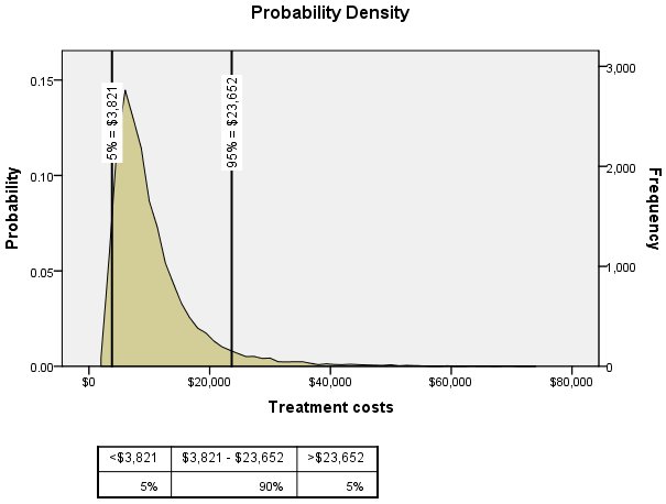
The Probability Density chart displays the distribution of the target of the predictive model. Reference lines are placed at the 5% and 95% points of the distribution. The table below the chart displays the probabilities in the three regions bounded by the reference lines.
You can interactively change the positions of the reference lines, allowing you to determine probabilities associated with any region of the distribution, and you can add static reference lines at specified positions.
- Double-click the Probability
Density chart.
Figure 2. Probability Density in Graphboard Editor 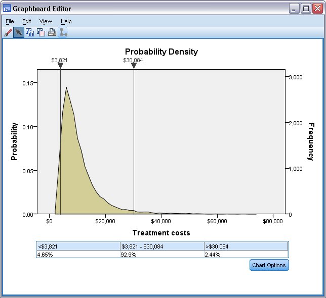
You can move either of the reference lines by clicking on the inverted triangle above the line, or anywhere along the line, and dragging the line. The label above the line, indicating the position of the line, updates as you move the line. In addition, the table below the chart displays the probabilities in the regions bounded by the reference lines and updates as you move the lines.
For example, you can determine the probability that treatment costs exceed $30,000 by dragging the right-hand line to approximately $30,000. The table below the chart shows that the associated probability is a little greater than 2%. Note: You can set the position of either line to an exact value from the Chart Options dialog, accessed by clicking Chart Options.
You can now easily answer the original question of the threshold such that treatment costs for 99% of the population are below that value. Simply drag the right-hand line until the probability in the third column of the table is approximately 1%. With the right-hand line at this position, the label above the line (as well as the header in the third column of the table) gives the associated cost. For presentation purposes you may want a labeled reference line at the threshold.
- Click Chart Options.
Figure 3. Chart Options dialog 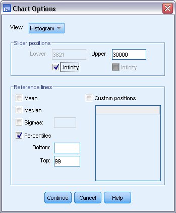
- Select Percentiles and enter 99 in the Top field.
This will add a static labeled reference line.
As previously noted, you can set the position of either of the sliding reference lines to an exact value.
- To be more precise
about the probability that treatment costs exceed $30,000, enter 30000 in the Upper field, in the Slider positions
group.
For this study, the analysts are concerned with values in the right-hand side of the distribution, so the left-hand reference line is not needed.
- Select -Infinity in the Slider positions group.
This effectively removes the left-hand sliding reference line.
Finally, perhaps you prefer a histogram view of the distribution, rather than viewing the distribution as a continuous curve.
- Select Histogram from the View drop-down list.
- Click Continue.
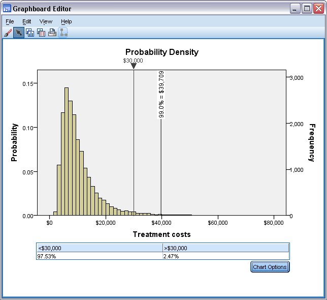
The new labeled reference line shows that 99% of the population have treatment costs below $39,709. Having explicitly set the right-hand sliding reference line to 30000, you can now state that 2.47% of the population have treatment costs above $30,000.