This topic describes changes that you see when you run ISPF in GUI mode.
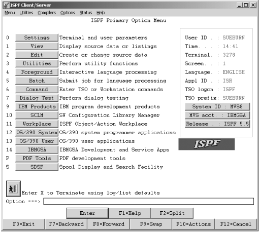
Figures Figure 1 through Figure 4 show the differences between ISPF panels displayed on a 3270 emulator and a GUI display. Emulator screens shown are from the Personal Communications Workstation Program. The GUI display panels are shown as they would be displayed on a workstation running Windows 2000.
Figure 1 shows the ISPF Primary Option Menu in 3270 mode.
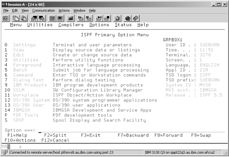
Figure 2 shows the same panel on a workstation using ISPF WSA.
- Action Bars and Pull-Down Menus
- Action bars are responsive entities at the workstation; that is, pull-down menus display without issuing an interrupt to the host so you can browse the action bars quickly and easily. If you have entered a command on the command line, this command is ignored when you select a pull-down choice.
- Title Bars
- Various
types of data can be displayed in the title bar. What data appears
in the title bar depends on which of these values ISPF finds data
in first:
- The value defined in the application dialog variable ZWINTTL is used if the panel is displayed in a pop-up.
- The value defined in the application dialog variable ZAPPTTL.
- The value specified in the title variable on the TITLE parameter of the ISPSTART command.
- The value specified in the title variable on the TITLE parameter of the WSCON service.
- The value specified in the "GUI Title" field on the Initiate GUI Session panel available from option 0.
- Your user ID.
If PANELID is set to On, the panel ID displays in front of the window title (or your user ID, if no window title is defined) rather than on the first line of the panel.
- Push Buttons
- Function
keys display as push buttons if FKA or PFSHOW is set to On. You can
determine whether the F= prefix is shown on the push button by specifying
PREFIX or NOPREFIX on the FKA command. Point-and-shoot output and
text fields display as push buttons. Note: If you entered a command on the command line, this command is ignored when you push a point-and-shoot push button.Point-and-shoot input fields are cursor-selectable.
- Cursor Movement
- The
up and down cursor keys move the cursor vertically through a group
of input fields, point-and-shoot fields, and pull-down choices. Use
the right and left cursor keys to move through the choices on an action
bar.
You can group pushbuttons and checkbox fields together by using Cursor Groups. If you choose to use Cursor Groups in an application, the cursor up and cursor down keys move the focus through each of the fields within a group, and the TAB key moves the focus out of the group.
You can also set Radio buttons in an application. When the focus is within a radio button group, the up and down keys move the focus and the selection through the radio button choices.
- Messages
- Long and short messages
are displayed as they are in non-GUI mode. If the message would appear
in a pop-up window, it will be displayed in a message box. The message
box will have CANCEL and HELP push buttons as well as the appropriate
CUA-defined icon:
- An i in a circle (the international symbol for information) signifies an informational message.
- An exclamation point (!) signifies a warning message.
- A red circle with a diagonal line across it signifies an error message.
Note: You can force long messages into pop-ups using ISPF option 0. - Mnemonics
- You can use a hot key to access a choice on an action bar or on a pull-down menu; that is, you can press the ALT key in combination with the letter that is underscored in the choice to activate the choice.
- Check Boxes
- A selection field
that is marked by a single underscore on the host displays as a check
box (that is, a square box with associated text that represents a
choice) if the attribute for the entry field has CKBOX(ON) and it
is a valid check box field.
When you select a choice, some operating systems display a symbol (such as ✓) in the check box to indicate that the choice is in effect. You can clear the check box by selecting the choice again. Some operating systems (AIX® and HP-UX) treat the check box as a pushbutton.
- List Boxes
- A control that enables you to display scrollable lists of choices in boxes. You can select a choice by tabbing to the desired choice and pressing Enter, or by positioning the mouse pointer on the desired choice. A single click selects the choice, a double click selects the choice and processes an Enter action. The vertical scroll bar of the list box enables you to scroll through the choices. The horizontal scroll bar enables you to scroll horizontally through the choices.
- Drop-down Lists
- A variation of a list box. A drop-down list only displays one item until you take action to display the other choices. You can select a choice by tabbing to the desired choice and pressing Enter, or by positioning the mouse pointer on the desired choice. A single click selects the choice, a double click selects the choice and processes an Enter action. The vertical scroll bar of the drop-down list enables you to scroll through the choices.
- Combination Boxes
- A combination box combines
the functions of an entry field with a drop-down list. It has an entry
field and contains a list of choices to select from to complete the
entry field. The list of choices is hidden until you take action to
display it.
You can also type text directly into the entry field. The text does not have to match one of the list choices.
The width of the combination box is the width of the input field.
- Separator bars
- You can provide visual distinction between two adjacent areas within a pull-down menu by coding a separator bar between the two areas.
- Accelerators
- You can use an accelerator to invoke an application-defined function from a pull-down menu. An accelerator is a key or combination of keys that you define.
- Radio buttons
- A radio button is a control
that shows a fixed set of mutually exclusive choices, one of which
is usually chosen.
To select a radio button, you can use your mouse pointing device to press the desired button. You can also use the TAB key to move the focus of your session to the currently selected radio button group, then use the cursor keys to move to the desired choice within the group. If the focus is on a radio button choice, the TAB key moves the focus to the next field or group of fields following the first radio button choice. After one of the radio buttons is selected, you cannot blank it back out. Some applications handle this situation by using a radio button choice of NONE.
- Unavailable Choices
- Radio button, checkbox, and push button choices can display as unavailable choices. The unavailable choice is colored gray and audible feedback occurs if you try to select it.
- Function Keys
- Function keys display as push buttons.
- Panel Display CUA Mode
- When you are running in GUI mode, the "Panel display CUA mode" option on the ISPF Settings panel is set to On.
- Enter Key
- An Enter key appears as a push button, by default, on all panels. You can control the display of this key from the GUI Settings panel (option 0).
- Color, Intensity, and Highlighting
- The Global GUI Color Change Utility allows you to map host colors to workstation colors. For more information, see the information about the Global GUI Color Change Utility in the Settings (Option 0) topic of the z/OS V2R2 ISPF User's Guide Vol II. Character-level color, intensity, and highlighting are not supported; field-level intensity and highlighting are not supported.
- Split Screen
- When you split a screen, the new screen is displayed as a new physical window that is added to the window list. Each modeless window is single-threaded to MVS™. SPLIT without parameters always acts as SPLIT NEW in GUI mode. Splitting a screen after the maximum number of screens is reached acts as a SWAP command. If you have only two split screens, SWAP simply toggles between the two. If you have more than two split screens, SWAP displays the Swap List.
- PRINT Command
- The PRINT, PRINT-HI, PRINTL, PRINTLHI, and PRINTG commands are not available in GUI mode.
- WINDOW Command
- The WINDOW command is not available in GUI mode.
- WS Command
- The WS command modelessly
invokes the command you specify to provide a seamless interface between
host and workstation applications. For example, this command opens
a modeless window and invokes the workstation editor on the file named "myfile":
WS e.exe myfile - APL/TEXT Character Sets
- The ZGE variable is set to Off when you are running in GUI mode. Any character defined with the GE(ON) attribute displays as a blank.
- Graphic Areas
- Graphic
areas are not supported. When a GRINIT statement is encountered, you
receive a message that panels with graphics cannot be displayed. You
may choose to continue. When a panel with graphics is encountered,
a pop-up is displayed that allows you to specify that the panel be
displayed on the host emulator session or on the workstation without
the graphic. Note:
- If you are in split screen mode, the graphic area panel cannot be displayed on the host session.
- If you specified GUISCRD or GUISCRW values on the ISPSTART invocation that are different from the actual host screen size, GDDM cannot be initialized, and the GRINIT service ends with a return code of 20.
- Input Fields
- See Sample screens for more information about how
input fields are displayed in GUI mode. Note: Blank fields and trailing blanks are displayed as nulls in GUI mode to avoid the need to delete blank characters when replace mode is not available.
- Fonts
- All GUI displays use the font that you specify in the Font option on the Workstation Agent window. If the GUI display of your panels does not appear as you expect, try using a monospace font.
- Codepages and Character sets
- Users invoking ISPF GUI from a terminal
or emulator that does not support code pages (indicated in the terminal
query response) should specify code page and character set parameter
values if values other than English are preferred when translating
host data to workstation data.
Use the CODEPAGE and CHARSET parameters of the ISPSTART command, and the Host Codepage and Host Character Set fields on the ISPF Settings Initiate Workstation Connection panel, to set your chosen values. See the topic about Extended Code Page Support in the z/OS V2R2 ISPF Dialog Developer's Guide and Reference for code page and character set values supported by ISPF.
- Images
- ISPF supports image
files in Graphics Interchange Format (GIF) when running in GUI mode.
ISPF ships sample files in the sample library SISPSAMP. The panel ISR@PRIM uses three of the images (ISPFGIFL, ISPFGIFS, and ISPEXIT).
To use images, store the image files on the host in a partitioned data set and allocate this image data set to ddname ISPILIB before invoking ISPF. For more information about allocating this image library see Allocating optional image ISPF library.