Adding columns and actions to existing tables
Understand and learn the buc-table-config.json syntax that defines the table properties to display in the user interface. You can add columns to tables to show more information that can be retrieved from the OMS APIs, or add actions that you want to complete on the records in the table.
Table of contents
JSON file locations
Update or create the JSON file within the module's src-custom/assets/custom folder. For example, packages/<route>/src-custom/assets/custom/buc-table-config.json.
If there are no additional customizations required other than the changes in the JSON file, the
JSON file does not need to be associated to any route. Instead, create the JSON file under
packages/<app>-root-config/src/assets/custom/buc-table-config.json. Doing so
ensures that future Order Hub releases are automatically applied without manually
synchronizing your customization code.
Note: This approach does not require updating routes in the
package-customization.json file during deployment.
JSON syntax
- JSON object name: The main JSON body contains uniquely defined objects that map to different tables. To find the object names to use in the JSON file, you can check the log messages in the browser console while you navigate through the user interface. Search for the
initializeTablemessage and you can see the object name. For example, the following snippet shows the object name order-table when you are on the outbound order search results page.Time since init (ms): 9334. Log type: LOG. Log generator: common-components. Message: BaseTableComponent.initializeTable(): Initializing configuration for order-table - Object attributes: Each object needs a set of defined attributes.
- name
- (Required) A mandatory unique identifier of the table.
- aliases
- (Optional) If you want to apply the same custom table configuration to multiple tables, specify the other table object names.
- tokenId
- (Optional) A token identifier to a custom service that is needed when adding custom editable columns to the table.
- headers
- The list of headers in the table. Each header can include the following attributes.
Headers description
Attribute Description id The unique ID of the column. name The text to display in the column header. If text is translated, you can add the translation files into the i18n folder and reference the label. For example,
The sample retrieves the text to display from the i18n folder and finds the attribute that matches CUSTOM_ORDER.SEARCH.CUSTOMER_ZIP_CODE."name": "CUSTOM_ORDER.SEARCH.CUSTOMER_ZIP_CODE",dataBinding The attribute to retrieve from the API response and display in the column. The attribute must exist in the getPage-templates.json. Update the file if the attribute does not exist. For more information, see Configuring the getPage API to retrieve additional data. Note: If you are using the formatter attribute, omit this dataBinding attribute.fixed Boolean. - true
- Column cannot be reordered or removed at the user-level settings through the standard table configuration options. A fixed column is also marked
default - false
- Column can be reordered or removed by any user at the user-level settings through the standard table configuration options.
default Boolean to indicate whether this column is displayed as part of the default configuration (visible by default). Default value is true.
sortable Boolean to indicate whether this column is sortable. Default value is true.
sortKey The key to sort on when the column is sortable. sorted Boolean to indicate whether this column is sorted by default. If true, the sortKeyis used for sorting the data.Default value is false.
style (Optional) The CSS to apply to the table column. For example, { "min-width": "100px" }sequence (Optional) The absolute position of the custom column in the table; starting at 1. If the specified position contains a fixed column, then this column is moved to the next nonfixed position in the table. If not defined, the custom column is added to the end of the table formatter Format the data in the column. Each formatter is an object with different properties. Thetypeproperty identifies the type of formatter. Supported type values arecurrency,dateTime, andquantity. To use the formatter attribute, you must omit the dataBinding attribute and instead, specify the binding in the formatter.value attribute.- type: currency
-
- value: The attribute to retrieve from the API response and display in the column.
- currencyCode: (Optional) The currency code to use when formatting the value. The currency code is also fetched from a property in the API response.
- type: dateTime
-
- value: The attribute to retrieve from the API response and display in the column.
- dateFormat: (Optional) The data format to use. Refer to the Moment JS library for formatting options. Default is
L LT.
- type: quantity
-
- value: The attribute to retrieve from the API response and display in the column.
isEditable Boolean to indicate whether this column is editable. Default value is true.
Note: Ensure that the column is editable: Adding editable columns to existing tables.fieldConfig Field configurations for editable columns. Applicable only when isEditable is true.
Example:"fieldConfig": { "type": "dropdown", "invalidText": " invalidText ", "helperText": " helperText " }Note: Ensure that the column is editable: Adding editable columns to existing tables.options Options for editable columns. Applicable only when isEditable is true.
Example:"options": { "fetch": { "api": "getPaymentStatusList", "type": "oms", "parameters": {}, "response": { "listAttribute": "PaymentStatus", "map": { "id": "CodeType", "label": "Description" } } } }Note: Ensure that the column is editable: Adding editable columns to existing tables. - toolbarActions
- Add actions to the toolbar when a user selects a checkbox from the table. Each toolbarAction can include the following attributes.
Attribute Description id The custom action unique ID. elem The element type. Always set to "button". type The button variant style as outlined in the Carbon design system. IBM uses "primary" for toolbar actions. value The text to display in the action label. If text is translated, you can add the translation files into the i18n folder and reference the label. For example, "value": "CUSTOM_ORDER.TABLE.TOOLBARACTION.VALUE",resourceId (Optional) The resource permission ID to evaluate when determining whether a user has access to this action. An administrator can use the Applications Manager to define the resource permission ID and allow or deny user groups access. For more information, see Creating resource permissions for custom pages and actions. metadata Add metadata for the action. - custom
- Always set to "true" to denote that you are adding a custom action.
- actionTargetType
- Valid values are "internal" or "external". Controls whether the route is defined in the same package/repository (internal) or separate package/repository (external).
- actionTarget
- The custom route that determines what happens when the user clicks this action.
- contextColumnIds
- A comma separated list of column IDs to be passed as parameters to the route. The column IDs and its column values are passed to the route.
iconTemplate (Optional) Append an icon to the text. IBM provides a set of icons within the buc-common-components.jar. Each icon has a defined bucTemplatestring that you can find in the icon-templates.component.html file. Specify thebucTemplatestring that corresponds to the icon you want to use. - overflowMenuActions
- Add actions when a user selects the overflow menu
 for a row. Each overflow menu action can include the following attributes.
Attribute Description id The custom action unique ID. label The text to display in the action label. If text is translated, you can add the translation files into the i18n folder and reference the label. For example, "value": "CUSTOM_ORDER.TABLE.TOOLBARACTION.VALUE",resourceId (Optional) The resource permission ID to evaluate when determining whether a user has access to this action. An administrator can use the Applications Manager to define the resource permission ID and allow or deny user groups access. For more information, see Creating resource permissions for custom pages and actions. metadata Add metadata for the action. - custom
- Always set to "true" to denote that you are adding a custom action.
- actionTargetType
- Valid values are "internal" or "external". Controls whether the route is defined in the same package/repository (internal) or separate package/repository (external).
- actionTarget
- The custom route that determines what happens when the user clicks this action.
- contextColumnIds
- A comma separated list of column IDs to be passed as parameters to the route. The column IDs and its column values are passed to the route.
JSON example
The following example provides some use cases.
Note: The following example includes inline comments as a guide to explain the attributes while you analyze the code. Since JSON does not support comments, this is not a valid JSON sample as displayed. If you plan to copy this sample, ensure that you remove the inline comments.
{
"order-table": { //Add new columns to the outbound order search results table
"name": "order-table",
"aliases": [
"inbound-order-table" //Add the same columns to the inbound order search results table
],
"headers": [
{ // 1 Add Customer zip code column
"id": "customerZipCode", //A unique ID for the column
"name": "CUSTOM_ORDER.SEARCH.CUSTOMER_ZIP_CODE", //Retrieves the display name from the language files in the /i18n/ folder
"sortKey": "CustomerZipCode", //When sorting, sort by this key
"dataBinding": "CustomerZipCode", //Get the CustomerZipCode from the API response. CustomerZipCode must be defined in the getPage-templates.json
"sequence": 1, //Put at column 1. In this case, Order number is fixed by IBM at column 1, so this moves to column 2.
"default": true, //Visible by default. Also, since "fixed" is not defined, users can remove this column in the UI
"sorted": true, //Sort by zip code first
"style": { //Set minimum column width to 100px
"min-width": "100px"
}
},
{ // 2 Add Customer phone no column
"id": "customerPhoneNo",
"name": "Customer phone no",
"sortKey": "CustomerPhoneNo",
"dataBinding": "CustomerPhoneNo",
"sequence": 2,
"sorted": true //This column is sequence is 2 so the data is sorted by customerZipCode first (sequence 1) and then customerPhoneNo
}
{ // 3 Add Draft order column
"id": "draftOrder",
"name": "CUSTOM_ORDER.SEARCH.DRAFT_ORDER",
"sortKey": "DraftOrderFlag",
"dataBinding": "DraftOrderFlag",
"sequence": 3,
"sortable": false, //Draft column cannot be sorted
"fixed": true // 5 Column cannot be removed or reordered by user
},
{ // 4 Format currency to display the code instead of symbol
"id": "total",
"name": "Amount",
"sortKey": "PriceInfo.TotalAmount",
"sorted": true,
"formatter": {
"type": "currency",
"value": "PriceInfo.TotalAmount",
"currencyCode": "PriceInfo.Currency",
"display": "code"
},
{ // Sample custom header with "isEditable" as true and values provided for "fieldConfig" and "options":
"id": "lineType",
"name": "Line type",
"sortable": false,
"isCustom": "true",
"isEditable": "true",
"style": {
"min-width": "8rem"
},
        "fieldConfig": {
          "type": "dropdown",
          "invalidText": " invalidText ",
          "helperText": " helperText "
},
        "options": {
          "fetch": {
            "api": "getPaymentStatusList",
            "type": "oms",
            "parameters": {},
            "response": {
              "listAttribute": "PaymentStatus",
              "map": {
              "id": "CodeType",
              "label": "Description"
              }
            }
          }
        }
}
],
"toolbarActions": [
{ // 6 Custom toolbar action
"id": "myCustomToolbarAction1", //Custom ID
"elem": "button", //Always use "button"
"type": "primary", //The button variant as defined in the Carbon design system
"value": "CustomAction1",
"resourceId": "",
"iconTemplate": "editIconTemplate", //Include an Edit icon (pencil) next to the text value.
"metadata": {
"custom": "true",
"actionTargetType": "external",
"actionTarget": "/customRoute",
"contextColumnIds": "customerZipCode,customerPhoneNo,total" //pass these values as parameters to the route
}
}
],
"overflowMenuActions": [
{ // 7 Custom overflow action
"id": "myCustomOverflowAction1",
"label": "CustomAction1",
"resourceId": "",
"metadata": {
"custom": "true",
"actionTargetType": "external",
"actionTarget": "/customRoute",
"contextColumnIds": "customerZipCode,customerPhoneNo,total"
}
}
]
}
}User interface example
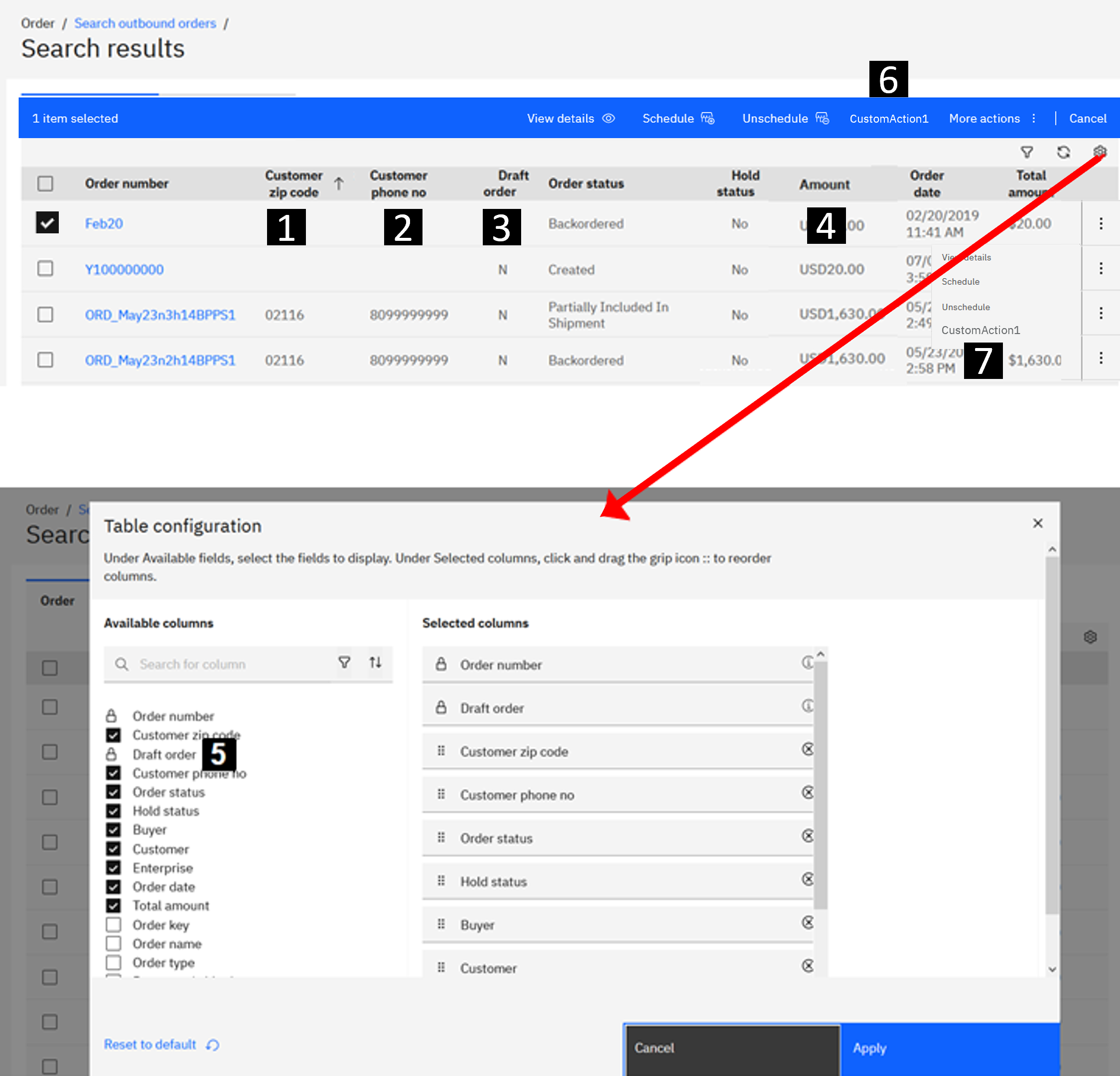
The following image illustrates the Order outbound search results table with the elements that are defined in the JSON example.
