Overview
Product: The Metrics Dashboard
- The Metrics Dashboard
- The Metrics Dashboard allows users to create visualizations for different data points that are
of interest to them and their organization. It goes beyond standard reporting to provide a visual
representation of your data. With the dashboard, you can create charts and graphs to easily analyze
your data.
- The Metrics Dashboard is only available in the production environment for all locales in the BrassRing responsive user interface and is not available in Staging, or for the Classic BrassRing User Interface.
- The Metrics Dashboard is refreshed hourly and only displays data for the previous 1 year. This is a rolling year and not a calendar year.
- Forms and form fields must be made searchable and outputable to pull into the Metrics Dashboard. After the field is made searchable and outputable, the hourly data refresh must occur before the data is viewable within the visualizations. Fields might be immediately available however, the visualization might be blank until the next hourly refresh occurs.
- For more information about configuring the Metrics Dashboard and admin processes, see Configuring the Metrics Dashboard.
- Relevant eLearning
-
- Accessing the Metrics Dashboard
- To open the Metrics Dashboard, select the Metrics Dashboard tab on the BrassRing on Cloud home page. is opened by selecting a tab on the BrassRing home page. The Metrics Dashboard tab is not available if you navigate away from the BrassRing home page. The tabs are not persistent from login to login, and Workbench Admins are not able to set a persona to land on the Metrics Dashboard tab by default.
- Things to Know / Best Practices / Tips and Tricks
-
- If you get the message There is no data to display for this visualization., review the report criteria to ensure correct fields are selected. If the visualization is correct, open a case in with the Global Support Center for review.
- Comparing the Metrics Dashboard data to the Data Insight Tool can sometimes lead to confusion. Data Insight Tool refreshes every 8 hours and the Metrics Dashboard refreshes every 1 hour. Any filters selected can differ between the tools and data tables might pull differently.
- Visualization Workspaces
- There are four workspaces options available. Different dashboards can be accessed by selecting
the workspace arrow. Dashboards display the date and time of the last data refresh.
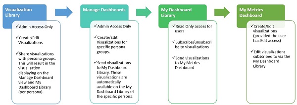
- The Visualization Library is a workspace where Admins can manage
visualizations and manage subscriptions. They can create, edit, or delete visualizations and share
them on the other visualization dashboards.
- Selecting Manage Subscriptions on the Visualization Library workspace is used to determine which personas have this visualization added to their My Dashboard Library workspace.
- The My Metrics Dashboard workspace contains all visualizations that are
either created by the user or subscribed to for the persona by an Admin. This is the default
workspace. The ability to edit the visualizations in the My Metrics Dashboard is
controlled by the user type privilege Metrics Dashboard User – Allow Edits.
- The first time a user logs in, they see the default IBM visualizations and any visualizations that are defaulted for their persona. The user does not need to subscribe to those visualizations to add them to their My Metrics Dashboard view. If no visualizations are defaulted for the persona, the user only sees the default IBM visualizations.
- The My Metrics Dashboard displays an alert if any of the visualizations have a newer version available on the My Metrics Dashboard workspace. Selecting the alert icon prompts additional actions to preview the new version, get the latest version, or overwrite the version or unsubscribe. Unsubscribing the version creates a stand-alone visualization on the My Metrics Dashboard and removes the link to the My Dashboard Library version.
- Editing a visualization in the My Metrics Dashboard that was pulled from the My Dashboard Library keeps its source visualization link and updates the time stamp.
- Selecting Unsubscribe unsubscribes the user from the selected visualization. This unlinks the visualization that the Admin maintains on the My Metrics Dashboard workspace making it a stand-alone visualization. The user no longer sees any updates that are made to that visualization on their My Metrics Dashboard workspace. The users can add the visualization back to their dashboard by selecting Add to my dashboard on the My Metrics Dashboard workspace.
- The My Dashboard Library is a workspace that contains visualizations that
are assigned to the user’s personas. This workspace is read-only for all users. Users can only see
their current persona-specific view and its associated visualizations.
- Users can select Add to My Dashboard on any visualization in the My Dashboard Library workspace to add the specific visualization to their dashboard.
- If the visualization is already added to the user’s dashboard, users can select Remove from My Dashboard on the specific visualization in the My Dashboard Library workspace to remove it from their dashboard.
- Selecting Unsubscribe unsubscribes the user from the selected visualization. This unlinks the visualization that the Admin maintains from the visualization on the My Metrics Dashboard workspace making it a stand-alone visualization. Users no longer see updates that are made to that visualization on their My Metrics Dashboard workspace.
- When an Admin edits a visualization in the My Dashboard Library that was pulled from the Visualization Library disconnects it from its Visualization Library counterpart, making the visualization a stand-alone visualization.
- The subscribed symbol
 indicates that the visualization has been subscribed to from the My Dashboard
Library.
indicates that the visualization has been subscribed to from the My Dashboard
Library. - A New indicator is displayed for new visualizations added to My Dashboard Library. This indicator is removed after the user logs out of BrassRing.
- Get latest version retrieves the latest version of the visualization for the user. If the user has customized the visualization, they do not see this option. Instead, they see the Overwrite option in the My Dashboard Library. Overwrite overwrites the user’s customizations made to the visualization with the admin defaults.
- The Manage Dashboards workspaces are only visible to Admin users. Each persona dashboard can be managed individually by users with the User Type Privilege Metrics Dashboard Admin enabled. Visualizations added in this workspace are not available in the Visualizations library workspace and are private for that persona.
- The Visualization Library is a workspace where Admins can manage
visualizations and manage subscriptions. They can create, edit, or delete visualizations and share
them on the other visualization dashboards.
- Example Workflow
-
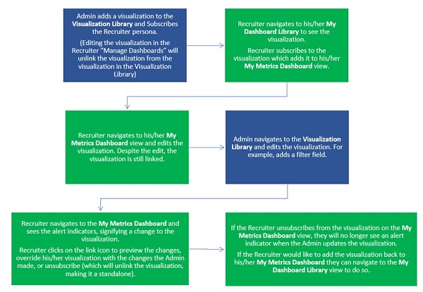
- Admin adds a visualization to the Visualization Library and Subscribes the Recruiter Persona. Editing the visualization in the Recruiter Manage Dashboards unlinks the visualization from the visualization in the Visualization Library.
- Recruiter navigates to their My Dashboard Library to see their visualization. Recruiter subscribes to the visualization, which adds it to their My Metrics Dashboard view.
- Recruiter navigates to their My Metrics Dashboard view and edits the visualization. Despite the edit, the visualization is still linked.
- Admin navigates to the Visualization Library and edits the visualization. For example, adds a filter field.
- Recruiter navigates to the My Metrics Dashboard and sees the alert indicators, signifying the change to the visualization. Recruiter selects the link icon to preview the changes, override their visualization with the changes the admin made, or unsubscribes. Unsubscribing unlinks the visualization making it stand-alone.
- If the Recruiter unsubscribes from the visualization on the My Metrics Dashboard view, they no longer see an alert indicator when the Admin updates the visualization. The Recruiter can use the My Dashboard Library to add the visualizations back to their My Metrics Dashboard.
- Default Visualizations
- There are four default visualizations on the dashboard. The ability to edit these are based on
new User Type privilege.
- Total Reqs by Req Status. Reqs that are shown are based on user’s privileges to view.
- Total Candidates by HR Status. Candidates that are shown are based on user’s privileges to view. HR Statuses that are shown are based on the User Type privileges.
- Total Submissions by Date Applied.
- Total Leads by Lead Source. The Lead Manager visualization displays if your organization uses Lead Manager.
These visualizations are stored in the Visualization Library, which is only available to Admin users, and appear for every logged in user in their My Metrics Dashboard view, except for the Lead Manager visualization.
- Visualization Types
-
- Pie Chart, or a circle chart, is a circular statistical graphic, which is divided into slices to illustrate numerical proportion. In a pie chart, the arc length of each slice, and its central angle and area, is proportional to the quantity it represents. Visualization options include: Slices, Show slices by, and Filters. Example: Total Candidates by HR Status Category.
- Donut Chart is a Pie Chart with an area of the center cut-out. Doughnut charts display data in rings, where each ring represents a data series. Visualization options include: Slices, Show slices by, and Filters. Example: Total Candidates by Candidate Forms.
- Stacked Bar Chart is a chart that uses horizontal bars to show comparisons between categories of data, but with ability to break down and compare parts of a whole. Each bar in the chart represents a whole, and segments in the bar represent different parts or categories of that whole. Visualization options include: Rows, Columns, Divide Columns by, and Filters. Example: Total Candidates by HR Status.
- Stacked Column Chart is a chart that uses bars to show comparisons between categories of data, but with ability to break down and compare parts of a whole. In a stacked column chart, data series are stacked in vertical columns. Visualization options include: Rows, Columns, Divide Columns by, and Filters. Examples: Total Reqs by Recruiter.
- Clustered Bar Chart is similar to the stacked bar chart with the only difference being the way the categories within each bar is represented as individual bars as opposed to stacking them in a single bar. Visualization options include: Rows, Columns, Divide Columns by, and Filters. Example: Total Candidates by Manager by HR Status.
- Clustered Column Chart is similar to the stacked column chart with the only difference being the way the categories within each column is represented as individual columns as opposed to stacking them in a single column. Visualization options include: Rows, Columns, Divide Columns by, and Filters. Example: Total Candidates by Req by Candidate Type.
- Line Chart or line graph is a type of chart, which displays information as a series of data points connected by straight-line segments. A line chart is often used to visualize a trend in data over a time period and the line is often drawn chronologically. Visualization options include: Rows, Columns, Divide Columns by, and Filters. Example: Total Candidates by Date Applied.
- Stacked Area Chart Area Graphs are Line Graphs but with the area filled with a certain color or texture. Like Line Graphs, Area Graphs are used to display the development of quantitative values over an interval or time period. They are most commonly used to show trends, rather than convey specific values. Stacked area chart can be used to represent multiple data series that start each point from the previous point by the previous data series. They do not work for negative values. Visualization options include: Rows, Columns, Divide Columns by, and Filters. Example: Total Submissions by Date Applied by Candidate Type.
- Line and Stacked Column Chart is a combination of a Line Chart and a Stacked column chart. Visualization options include: Rows, Columns, Divide Columns by, Line Values, and Filters. Example: Total Candidates and Total Reqs by Recruiter.
- Scatter Plot is a type of plot or mathematical diagram by using Cartesian coordinates to display values for typically two variables for a set of data. If the points are color-coded, one additional variable can be displayed. The data is displayed as a collection of points, each having the value of one variable determining the position on the horizontal axis and the value of the other variable determining the position on the vertical axis. Visualization options include: Rows, Columns, Divide Columns by, and Filters. Example: Total Reqs by Recruiter.
- Gauge Chart also known as dial charts or speedometer charts, use needles to show information as a reading on a dial. On a gauge chart, the value for each needle is read against the colored data range or chart axis. This chart type is often used in executive dashboard reports to show key business indicators. Gauge charts are useful for comparing values between a small number of variables either by using multiple needles on the same gauge or by using multiple gauges. Visualization options include: Minimum value, Maximum value, Target value, and Filters. Example: New Candidates by Total Candidates.
- Funnel Chart is a type of chart, often used to represent stages in a
process and show the volume of data in each stage. This type of chart can also be useful in
identifying potential problem areas of a process in an organization. Visualization options include:
Details, Values, and Filters. Example: Totally Candidates by HR Status Category.
- A funnel chart displays values as progressively decreasing proportions amounting to 100 percent
in total. Sorted by numeric value in descending order. Sort is retained after applying filters as
well. One way to get the workflow-based conversion rates is to use the HR Status History filter to
include both past AND current statuses.
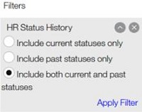
- Tree Map is a way of representing hierarchical data in the form of nested rectangles, the area of each corresponding to its numerical value. Visualization options include: Group, Values, Details, and Filters. Example: Total Reqs by Recruiter by Department.
- Table is a representation of data or information in rows and columns. Visualization options include: Columns and Filters. Example: Which Reqs are posted with which Gateway Questionnaires.
- Card is a view to represent a single numerical data point. Visualization options include: Values and Filters. Example: Total Submissions in the last 30 days.
- The Metrics Dashboard Icons
- This section describes the icons that display in the Metrics Dashboard.
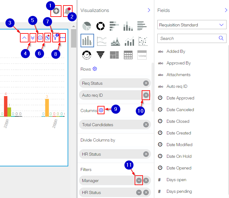
- Add a visualization.
- New visualizations or updated versions are available for your dashboard. Selecting this icon opens the users dashboard library to get the latest updates.
- Go to previous level. This allows users to back out of their drill-down into the visualization. This icon displays when you have already drilled down into a visualization by using the Go to next level icon.
- Go to next level. This allows users to drill further into the visualization. Only visualizations that have multiple rows display this icon.
- High level information about the visualization. The text in the information module might be provided by the Metrics Dashboard Admin while creating or editing the visualization. Users can also edit the information text by selecting to edit the visualization's display.
- This visualization has been subscribed to from the My Dashboard Library. The alert indicator shows if updates have been made to the original visualization from the library. Selecting this icon is used to preview the updated visualization, Get latest version, or Unsubscribe. This icon is only available in the My Metrics Dashboard. Any changes that are made to the visualization result in an alert icon to show on subscribed visualizations. Alerts persist until the user consumes the change to the visualization or the user opts to unsubscribe.
- Filter indicator displays a badge showing the number of filter fields for the visualization. This icon displays when filter fields are configured for the visualization. Selecting this icon displays the list of selections and values, and gives the user an option to quickly edit the filter criteria values. The Edit option is only available in the My Metrics Dashboard view.
- Additional actions for the selected visualization such as Edit Fields, Export, Copy, and Delete.
- The gear icons allow users to further customize the visualizations. This includes configuring the slices, showing slices by, configuring row field names, configuring columns, updating the aggregation, and creating groups to configure calculations.
- Remove a field selection from the visualization’s rows, columns, slices, or filters.
- Select filters to apply to the visualization.
- Email WatsonTalentTraining@us.ibm.com if you have a suggestion for improvement, or encounter an issue on this documentation. Include the product and page title in your email.