Highlighting conditionally formatted data with color
Use color in your table or crosstab visualizations to see the distribution of your data and highlight exceptional data points. For example, you might want to highlight low sales numbers in red, or use green to highlight sales numbers over a certain threshold.
Before you begin
Depending on the data that you are using and the outcome that you want, you can use several different ways to define thresholds for conditionally highlighting your data in tables and crosstabs.
When you choose a measure to apply conditional formatting to, you can base the conditionality on the measure itself or a related measure of your choosing. Then, you can decide whether you want the evaluation to be based on a numeric value comparison or a percentage comparison. If you choose the Numeric scale, you get a simple comparison of the number value for each row against the rules you define for the comparison. For example, greater than 100 highlights as green and lower than 50 highlights as red. If you choose the Percentage scale, then the measure you selected for conditional formatting is divided by the number you select in the Color By setting for your conditional rules. If the Color By measure matches the measure you are conditionally formatting, the result is always 100% because you are dividing the number by itself.
The following scenarios illustrate common use cases for defining conditional formatting rules. To try the procedures yourself, you can use one of the data samples such as the GO data warehouse (query) sample.
Comparing a measure to static values
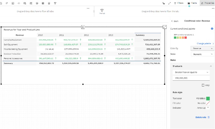
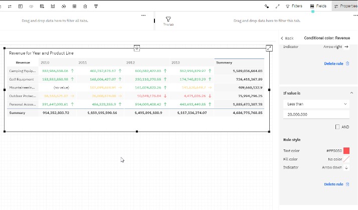
In this scenario, you have a value in your data source and you want to classify your result against hard targets. For example, you want to evaluate your revenue result with an arbitrary target of $150 million. If you meet or exceed $150 million, color the cells green. Likewise, if you achieve between $20 million and $150 million, then color the cells yellow. If your revenue is less than $20 million, then color the cells red.
Procedure
-
Select a crosstab visualization and click the Properties tab
 .
.
- Complete the following steps to create a rule:
- Under Rules, select Add rule.
- Under If value is, select Greater than or equal to.
- Type 150,000,000.
- Under Rule style, set the text color, fill color, and indicator
to match your preferences. The default rule style is to color the text green with an Arrow up icon indicator.
- Create a rule for the red values. Use the Less than condition and
complete the rest of the rule. Select an appropriate Indicator, such as the
Arrow down icon.
Evaluating a percentage against a static calculation
In this scenario, you have a percentage result, Gross Margin, in your data source that you’re looking to conditionally color. You can use a numeric evaluation as you did in the previous scenario and create rules for the underlying source values such as 0.37 or 0.62. Or, you can create a dummy calculation with a numeric expression of 1 that can be used to divide the underlying Gross Margin values to get the percentage variance.
Procedure
- Click Sources
 .
. - Click the More icon
 on the Selected sources panel, and then click
Create calculation
on the Selected sources panel, and then click
Create calculation
 .
. - Select the crosstab visualization on your dashboard and click the
Properties tab .
- Under Rule style, change the Text color to
red and change the Indicator to a Arrow down
icon.
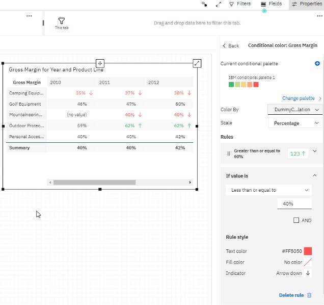
This procedure works because the underlying source value is divided by the value 1 in the DummyCalculation expression. For example, 0.37 divided by 1 returned as a percentage is 37%.
Coloring a measure based on the variance between two measures
In the previous scenario, you were conditionally highlighting the percentage value Gross Margin in your source data. The percentage calculation might not be included in your underlying model. You can automatically calculate the percentage variance between two measures in the conditional color settings. In this scenario, color your Revenue measure based on the percentage variance of Sales Target.
Procedure
-
Select a crosstab visualization and click the Properties tab .
- Complete the following steps to create rules:
- Under Rules, select Add rule.
- Under If value is, select Greater than.
- Type 110%. Keep the default Rule style formatting.
- Click Add rule.
- Under If value is, select Less than or equal to, and then type 110% for the value.
- Under Rule style, change the Text color to red and change the Indicator to an Arrow down icon.
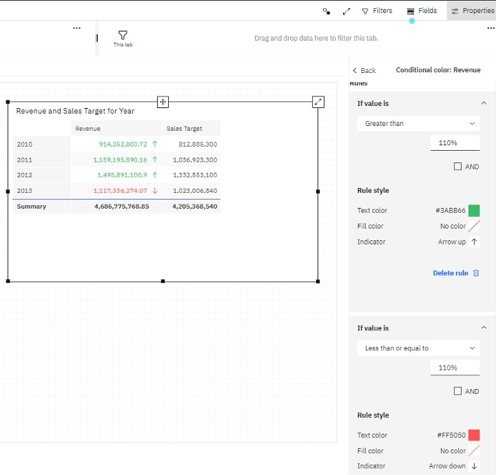
In this scenario, if you divided the first row Revenue value by the first row Sales Target value, the result is 1.12482. This result is a percentage return of 112% and is why Revenue in the first row is conditionally formatted as green.
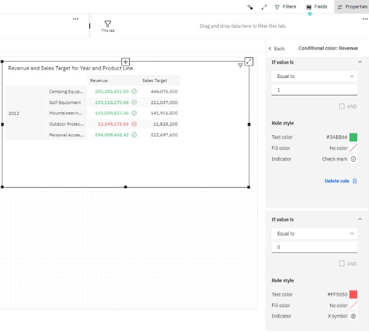
Coloring a measure based on a benchmark calculation
In this scenario, highlight Revenue based on how it compares to Sales Target. If Revenue is greater, it is green. If Revenue is lower, it is red. To achieve this result, create a calculation that compares the two values and assigns values of 1 or 0.
Procedure
- Click Sources
.
- Click the More icon on the Selected sources panel, and then click
Create calculation
.
- Select the crosstab visualization on your dashboard and click the
Properties tab .
- Under Rule style, change the Text color to
red and change the Indicator to an X symbol
icon.