Apache ECharts line code sample
Use a line visualization to show trends over time by using the Apache ECharts API.
About this task
For more information about the Apache ECharts custom visualization code sample on IBM Accelerator Catalog, see https://community.ibm.com/accelerators/catalog/content/Apache-ECharts-line .
Apache ECharts are supported as of IBM Cognos Analytics 11.1.7
This custom visualization code sample provides a way to show how to use Apache ECharts as custom visualization inIBM Cognos Analytics. This code sample explains how to integrate a Apache ECharts line chart but similar code can be used to integrate other Apache ECharts.
There are code samples available for developers of custom visualizations. The code samples illustrate certain aspects of the customvis library and tools. The main focus of each sample is not the completeness of the visualization, but rather to demonstrate how specific features work.
To view the source code and packed bundle (.zip file) for the Apache ECharts line chart sample, go to this public GitHub repository. To download the files, browse to the root of this directory and click Clone or download.
For more information, see Custom visualizations code samples.
For more information about custom visualizations, see Developing custom visualizations. For an excellent tutorial to get you started, see Custom visualizations - tutorial.
- You can upload the packed bundle (.zip file).
For more information, see Packaging the custom visualization.
- You can package a sample with
customvis packand upload the bundle (zip file) to IBM Cognos AnalyticsFor more information, see Packaging the custom visualization.
- You can run any sample locally by running
customvis startinside the folder that contains the sample. After that, you can use the Preview Vis in IBM Cognos Analytics Dashboard or Reporting to insert the custom visualization in your dashboard or report.For more information, see Using a D3 sample in your custom visualization.
The following steps demonstrate how to use the Apache ECharts line chart and populate it with data.
Procedure
-
Create a dashboard and click the Visualization
 icon in the toolbar.
- Click the Custom tab. If there are no custom visuals available, then you can add a custom visual by clicking the Add a custom visual
 icon on the Custom tab.
 -
Create the Apache ECharts line chart by dragging the following data items from the Customer
Analysis sample data source in the Sources pane
 :
: - Drag Month Key onto the Categories field.
- Drag Total Claim Amount onto the Values field.
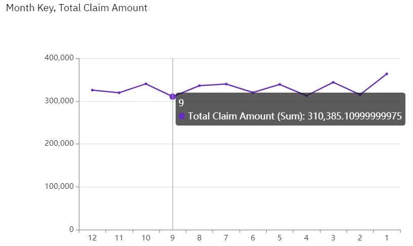
This sample Apache ECharts line chart displays data from a fictional insurance company.