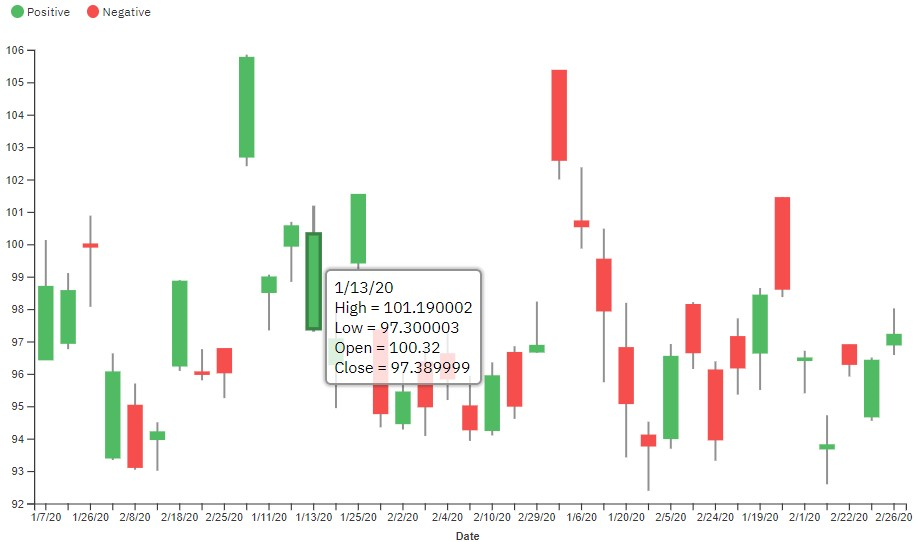
Candlestick visualization
Candlestick visualizations are used in analysis to display the high, low, open, and closing prices of, for example, stock prices for a specific period. The wide part of the candlestick shows if the closing price was higher or lower than the opening price.
About this task
For more information about the candlestick custom visualization sample on IBM Accelerator Catalog, see https://community.ibm.com/accelerators/catalog/content/Candlestick.
Candlestick visualizations are supported as of IBM® Cognos® Analytics 11.1.7.
For more information about custom visualizations, see Developing custom visualizations. For an excellent tutorial to get you started, see Custom visualizations - tutorial.
You can download the packed bundle (.zip file) and upload it directly into IBM Cognos Analytics.
The following steps demonstrate how to use the candlestick visualization and populate it with data.
Procedure
-
Create a dashboard and click the Visualization
 icon in the toolbar.
- Click the Custom tab. If there are no custom visuals available, then you can add a custom visual by clicking the Add a custom visual
 icon on the Custom tab.
 -
Create the candlestick visualization by dragging the following data items from the
Stock_Market_Performance.xlsx data source in the Sources
pane
 :
: - Drag Date onto the Categories field.
- Drag High onto the High field.
- Drag Low onto the Low field.
- Drag Open onto the Open field.
- Drag Close onto the Close field.