Creating a visualization to show expenses month by month
Now you'll duplicate the Expense input view so that you have two views on the Expense input sheet.
You'll also modify the new view and change it from an exploration (table) to a stack column visualization. Then you'll add the new visualization to the collection so that it can be easily reused in the same book or in another book.
Procedure
-
Change what you see in the Expense input view so that you have a global view of expenses.
-
In the view, click
 to display the shortcut bar, and then click
- In the snap command bar, type all business units and all departments.
-
In the view, click
-
Click the pencil
 to go into edit mode.
-
Click a cell to display the shortcut bar, then click the Duplicate icon
 to duplicate the Expense input view. Drag the duplicate beneath the
original view with the drag handle:
to duplicate the Expense input view. Drag the duplicate beneath the
original view with the drag handle:  Tip: You might need to click in the white space and then click on the duplicated chart to select it.
 -
You want to see only months, not quarters in the new view. In the tree, go to , and drag the n_level 2004 time set on top of the
Current Desc Year Qtr Month tile to replace the dimension.
Note: If you can't see the Planning Sample in the tree, click the up arrow
 at the top of the tree to go to the previous level in the tree.
 -
Turn the new view into a visualization. Click the view, click then click
 from the shortcut bar. Choose the Stack Column visualization.
-
You want time to be on the x-axis, so swap the rows and columns around by clicking and clicking
 .You now have a stack chart that shows you the operating expenses over the year.
 -
Click the Show/hide overview icon
 in the shortcut bar to hide the context area.
This gives the visualization more space. You can see that travel expenses are very high in February.
in the shortcut bar to hide the context area.
This gives the visualization more space. You can see that travel expenses are very high in February.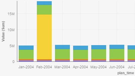
-
Select the collections icon
 in the shortcut bar.
This adds a link to your visualization to your collection at the top of the browser. Objects saved in Collection can be easily accessed and reused either in the same Planning Analytics Workspace book or in another book.Tip: Click the
in the shortcut bar.
This adds a link to your visualization to your collection at the top of the browser. Objects saved in Collection can be easily accessed and reused either in the same Planning Analytics Workspace book or in another book.Tip: Click the Collections icon at the top of the browser to show the Collection.