Input Group
Use Input Group to add an icon, text, or menu to controls that users use to provide input such as date, time, text, and so on.
Typically, you use the Input Group control to add a visual effect to input controls such as the Text Area, Date Time Picker, or Integer. For example, you might want to add a calendar button to the date picker. The Input Group control adjusts its size to the size of the contained form control. Input groups can be nested within each other.
Configuration properties
Set or modify configuration properties for the Input Group control in the Configuration properties tab.
- Screen size
- A configuration property that has the Screen Sizes icon
 beside the property name can have different values for each screen size. If you do not set
a value, the screen size inherits the value of the next larger screen size as its default value. If
you are using the Process Designer desktop editor
(deprecated), you are setting the value for the large screen size. The other screen sizes inherit
this value.
beside the property name can have different values for each screen size. If you do not set
a value, the screen size inherits the value of the next larger screen size as its default value. If
you are using the Process Designer desktop editor
(deprecated), you are setting the value for the large screen size. The other screen sizes inherit
this value.
- Theme definitions
- Theme definitions specify the colors and styles for a control and determine the appearance of the control. You can preview the look and feel of controls in the theme editor. See Themes.
| Appearance configuration property | Description | Data type |
|---|---|---|
| Width
|
The width of the control. You can specify the width in px (pixels), % (percent), or em units. For example, 50px, 20%, or 0.4em. If a unit type is not specified, px is assumed. | String |
| Label placement
|
The label placement for this control. A left placement of the label changes the specified width of the control. | String |
 Label width Label width  |
The width of the label. You can specify the width in px (pixels), % (percent), or em units. For example, 50px, 20%, or 0.4em. If a unit type is not specified, px is assumed. | String |
| Color style | The color style for the control. The colors correspond to variables in the specified theme. | String |
| Button location | The button location relative to the field. | String |
| Button type | You can create the control as a clickable icon, a text field, or a menu. Use the Menu option with a Pop-up Menu control. For more information about this control, see Pop-up Menu. | String |
| Button info | The name of the icon. See Font Awesome for a complete list of icons. |
String |
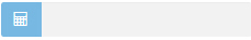
Example
To create an Input Group with a calculator icon next to an Integer input
field  , drop an Integer control into an Input Group control and set the Input Group options as
follows:
, drop an Integer control into an Input Group control and set the Input Group options as
follows:
- Leave Width blank.
- Set Label placement to Top.
- Set Color style to Primary.
- Set Button location to Left.
- Set Button type to Icon.
- Set Button info to calculator.
Configuring the Input Group in a read-only section
If the input group is nested within a section that is set to read only, such as a horizontal layout, vertical layout, or control, the icon becomes slightly dimmer.
me.setEnabled(true)Events
Set or modify the event handlers for the control in the Events tab. You can set events to be triggered programmatically or when a user interacts with the control. For information on how to define and code events, see User-defined events.- On load when the page loads, for example me.setIcon("rocket");
- On button click when an icon used as a button is clicked, for example ${PopupMenu1}.setMenuVisible(!${PopupMenu1}.isMenuVisible())
Methods
For more information about the available methods, see the Input Group JavaScript API.
Additional resources
For information about how to create a coach, see Building coaches.
For information about standard properties
(General, Configuration,
Positioning, Visibility, and HTML
Attributes), see Coach view properties.
For more information about input controls, see Text, Text Area, Date Time Picker, Integer.