Widget Types
Use the following links to learn more about the widgets:
Accessing the widgets
You can use the following steps to view the avaliable widgets:
-
On the Analytics page of the IBM Process Mining application, select the process and the dashboard for which you need to add the widget. The highlighted elements are described in the table that follows.

Element Description 1 Selected process 2 Selected dashboard -
On the page, click Edit to view the widget panel.

Types of widgets
The following figure shows the widgets panel of the IBM Process Mining application:

The following table describes the widgets available in the IBM Process Mining application. You can click each link to know more about the widget.
| Element | Category | Widget name |
|---|---|---|
| 1 | Filter summary | Filters |
| Timespan | ||
| 2 | Process widget | Activity monitor |
| Case list | ||
| Case status | ||
| Case variants | ||
| Influencers | ||
| Lead time distribution | ||
| Path Time Histogram | ||
| Process model | ||
| 3 | Histogram widget | Bar chart |
| Bubble chart | ||
| Line chart | ||
| Matrix chart | ||
| Pie chart | ||
| Row chart | ||
| Stacked bar chart | ||
| 4 | Table | Matrix |
| Table | ||
| 5 | Card | Card |
| 6 | KPI | Activity rework |
| Activity Trend | ||
| Automation Trend | ||
| Behavior Influence | ||
| Block stats | ||
| Case KPI Summary | ||
| Changes and automation stats | ||
| Path Trend | ||
| 7 | AI widget | Influencers & Predictions |
| Overview | ||
| Path summary | ||
| Prediction Avg | ||
| 8 | Custom widget | New JSPlugin+ |
Understanding the widgets
This section describes a few of the widgets available in the application.
Filter

The Filter widget displays the filters that are applied in the dashboard and allows you to remove them. On the widget, C indicates the percentage of cases involved and E indicates the percentage of events involved.
WARNING: You can use the filters on the Analytics page to further filter the event logs.
Starting from IBM Process Mining release 1.14.2, you can add and edit the filters created in the process analysis page of a project. You can also create filter templates for the project from the Analaysis page.
You can use the following steps to add or edit the filters:
-
On the Analytics page of the project, click Filters, and then click Edit.

-
On the Process Mining filters dialog, do one or both of the following steps:
- Click Add filter to create a filter in the project.
- Click Save as template to create a template using the filters in the Process Mining filters dialog.
For more information on creating a filter and filter templates, see the Filters topic.
Timespan
You can use the Timespan widget to analyse data or process within the specified timeframe. Note that this timeframe is applicable only for the widgets created in the same dashboard and it does not imply to the filters in the Processes page.
Example:
This example demonstrates how to create a timespan filter to display the cases for a specific timeframe.
-
On the Analytics page, click Edit to view the widget panel.
-
In the widget panel, click the Add filter summary icon, and then click Timespan.

-
In the Timestamp filter widget, click the settings icon.
-
In the Title field of the Time span dialog, type a name for the filter, select one of the following options, and then click OK.
-
Click All cases events are within the timespan boundaries to display all the case events that are within the selected timeframe.
-
Click At least one event is within the timespan to display at least one event that is within the selected timeframe.

-
-
In the Widget panel, click Save. The Timestamp filter now displays the date slider as shown in the following figure:

You can use the following steps to test the functionality of the slider
-
On the Analytics page, click Edit to view the widget panel.
-
In the widget panel, click the Add process widget, and then click Case list.

-
On the Case details widget, click the settings icon to view the Case list dialog.
-
In the Title field of the Case list dialog, type a name for the case list widget and then click OK

-
In the widget panel, click Save.
-
In the Timestamp filter widget, use the slider to select the required timeframe, and then click apply filters. Note that the Case details widget now displays the activities that are performed in the specified timeframe.

Activity monitor
You can use the Activity monitor widget to display the time distribution of the workforce activity.
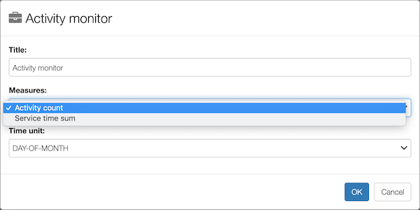
The time distribution can be measured daily, monthly, or yearly.
In the widget, select the Activity count measure to view the number of activities performed on day-by-day, month-by-month, or year-by-year basis. You can select the Service time sum measure to view the service time of the workforce in the required time.
The following figure shows how the results of the Activity monitor widget are displayed in a graph:

In the widget, you can also select a specific resource you want to focus.

Case list

You can use this widget to display the top 50 cases in a project along with the following information:
- Case ID
- Status (running or complete)
- Actual case lead time
- Actual case cost
- Violation of case cost KPI
- Violation of case lead time KPI
- Number of repetitions (recycles)
- Number of KPI violations
For every case, the violation of case cost/lead-time KPIs considers the actual cost/time of the case.
When defining the widget, you can enable the Enable case prediction to activate predictive analysis. This analysis helps you to predict the next activities of a running case and provides you a list of recommendations that are aimed at minimizing case lead time and cost. For more information, see Predictive Analytics.

From the Case list widget, you can do any of the following actions:
- Click download as CSV to export all the data displayed in the widget in CSV format.
- Click Monitor to create an Analytics widget monitor. For more information on how to create an Analytics widget monitor, see Setting a monitor for Analytics widgets

Case status

The Case status widget displayes a pie chart that represents the number of running and completed cases. You can click a segment to create a dashboard filter. On selectin, all widgets in the dashboard (except the widgets with disabled the Apply dashboard filters option) are updated to display the data of the selected segment, .
You can download the data in the widget as an SVG image or as a CSV file.
Case variants

For each variant, the following information are displayed in the widget:
- Frequency
- Number of events performed
- Average lead time
- Average number of repetitions (recycles)
- First time the variant appeared in the event log
- Last time the variant appeared in the event log
- Average variant cost
- Total variant cost
You can select multiple variants to compare them in the Process model widget. The selected variants are not used as filters in the dashboard unless you click the filter button.
You can export the data displayed in the widget as a CSV file.
Lead time influencers

This widget displays the percentage at which the main custom fields influence the lead time.
When you click one of the influencers, the widget displays the number of cases and the average case lead time for each value of the selected custom field.

You can choose to order the values by cases or by average lead time.
You can also select one of these values and then click  to create a dashboard filter on it. To quickly reset the filter, click the filter icon or use the action menu.
You can export the data in the widget as an SVG image or as a CSV file.
Lead time distribution

It displays the lead time distribution of cases (particularly useful to identify Outliers).
For example, in the figure, the selected column indicates that 2,063 cases are executed within 89d 16h and 107d 14h.
You can select a range to filter the dashboard by case lead time:

To quickly reset the filter, click the filter icon. You can also reset the filter from the action menu.
You can export this widget as an SVG image.
Path time histogram
This widget displays a certain Path Time distribution.
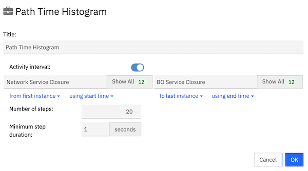
When defining the widget, you need to set the following values:
- Number of steps
The value in the field sets the number of bars in the histogram. When you set more steps, it provides a fine-grain result. - Minimum step duration
The value in this field indicates the minimum time interval that should be considered for each bar. You must set a lower value to get a fine-grain result.
The following figures shows the values when 20 steps are considered with 1 second as minimum duration.
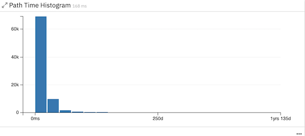
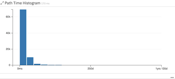
In the same scenario, when the number of steps are increased to 100, the widget displays the following result:

Likewise, when the the minimum duration is increased to 20 days, the widget displayes the following result:
Process model

Display an overlap of the selected variants to see, for example, most common behaviors.
You can select to visualize and compare one or more variants from the Case Variants widget or directly from this widget configuration (in this case the most frequent variants are automatically selected)

For each filter you can focus on frequency, performance, cost. Both in “absolute” terms or with respect to defined KPIs.

If you select more than one variant, you can compare them by activating the “analyze variants” toggle

Each variant is highlighted in a different color so that you can visually compare them.
On each activity and transition, a small histogram is displayed to compare the actual performance on that particular point of the process.
For example, if you activated the performance view, the average service and waiting times are compared. Click an activity or transition to obtain the details:

When you select an activity or transition, you apply respectively a contains activity filter or a directly follow dashboard filter.
This widget can be exported as an SVG image.

Bar chart
It displays selected data as a bar chart, based on the query you inserted.

To apply a dashboard filter, you must click a bar on the widget then click the Filter icon.
You can sort the chart by using the select box on the widget header.

From the action menu, you can reset the filters or export the current widget as an SVG image or as a CSV file. You can also click Monitor to navigate to the Monitor page.
Bubble chart
A scatterplot-like visualization that lets you represent up to two measures (bullet color and size) over other two measures. This widget needs two dimensions to work.

You can apply a filter on both dimensions by clicking a bubble. To reset the filters, you must use the filter bar.
From the action menu, you can export the current widget as an SVG image or as a CSV file.
Line chart
It displays the evolution of one or more values over a time span, based on the query you inserted.

Note that this widget allows you to group data only by a timeframe dimension.

This widget has a unique filtering option. For each measure you can choose the following actions:
- Apply all filters on the measure
- Not apply the filter template on the measure, but still considering other dashboard filters applied
- Ignore all the dashboard filters

Consider that filters applied on IBM Process Mining are not ignorable.
Matrix chart
It helps you to compare the selected measures on different dimensions, based on the query you inserted. This widget needs two dimensions to work, considering that the second dimension must have at most two values.

This widget is useful to evaluate the benefits of automation for each activity.
In the configuration, it is possible to activate the Compute subtotals option to see the subtotal values of the measures (for example, the sum of robot and human total activity costs).
Pie chart
It displays selected data as a pie chart, based on the query you inserted.

You can filter the dashboard by clicking a slice. To reset the filter, you can click the selected slice.
This widget has the following configuration options:
- Show total
If you select this option, it displays the total value that represents the 100% of the pie. - Cap results
If you select this option, it limits the number of slices of the pie chart by inserting an Other element to recap the less frequent values of the measure.
For example, number of cases in which each resource is involved:

From the action menu, you can export the current widget as an SVG image or as a CSV file.
Row chart
It displays the selected data in a row chart, based on the query you inserted.

You can filter the dashboard by selecting one or more bars and clicking the filter button.

From the action menu, you can reset the filters or export the current widget as an SVG image or as a CSV file.
Stacked bar chart
It displays the selected data in a stacked bar chart, based on the query you have inserted. This widget needs two dimensions to work.

By clicking a specific color within a specific bar, you can set a dashboard filter on both the relative dimensions. To reset the filters, you must use the filter bar.
From the action menu, you can export the current widget as an SVG image or as a CSV file.
Matrix
It displays selected data in a matrix table, based on the query you inserted. This widget needs two dimensions to work.

You can create a dashboard filter by clicking a row or column value. To reset the filter, you must use the filter bar.
All data from this widget can be exported as a CSV file.
Table
This widget displays a tabular representation of selected data, based on the query you inserted.

You can apply a filter on the dashboard by clicking a row. To reset it, you must use the filter bar.
All data from this widget can be exported as a CSV file.
Card

You can use this widget to display one or more indicators.
Tip: To ensure a fast comparison between overall and filtered information, you must insert two cards that compute the same indicators and then, in the overall card, disable the option Apply dashboard filters.

Activity reworks

You can use this widget to display the information about activities with reworks (an activity that is repeated more than once for the same case). The widget also includes the following information:
- Average number of reworks per case
- Self-loop ratio
Self-loop indicates that the process flow comes out and goes into the same activity - Number of cases in which the activity has had reworks
- Average lead time of cases in which the activity has had reworks
- Total number of reworks for the activity
- Total cost spent on reworks for the activity
- Average time to perform the rework of the activity
You can consider only the reworks on conformant activities, or only the reworks during a certain activity interval.

All data from this widget can be exported as a CSV file.
Activity trend

It shows the number of cases that occur each month (and the average number), for the selected process.
If you select a specific activity for which you want to visualize the activity trend, the widget shows the number of events that occurred in each month for that activity (and the average number).
You can also download the widget as an SVG image.
Automation trend

It represents the automation monthly trend.
- The orange area shows the number of activities that are carried out automatically, and the blue area shows the number of activities carried out manually. Both refer to the left axis
- The gray line shows the total working time per month and refers to the right axis
- The blue bar shows the average manual resources per month that are involved in the process, and the orange bar shows the average robots per month that are involved in the process
You can also select a specific activity for which you want to visualize the automation trend, on the upper right corner of the widget.

You can also download the widget as an SVG image.
Behavior influencer
This widget shows the percentage at which the filter template set on the dashboard influence the behavior. By applying a filter template, in this widget you will see the process attributes sorted by influence score in a row chart:

By clicking on an attribute, you enter the details of its distinct values, sorted in a bar chart by relevance:

-
The blue color represents the number of filtered houses in which that value appears.
-
The orange color represents the total number of houses in which that value appears.
The chart can be sorted either by the number of cases or by the total number of cases.

Block stats

It reads a custom field regarding the status of blocks and reports a series of information:
- Average lead time
- Number of cases with blocks
- Number of blocks
- Average lead time without blocks
- Number of cases without blocks
- % of cases with blocks
The block stats can be displayed either for specific activities or for a custom field for which you specify a True value.

Case KPI summary

It shows the number of cases that satisfies the specified KPIs thresholds and the corresponding average lead time.
By selecting one threshold, you create a dashboard filter on the relative cases. To reset the filter, you must use the filter bar.
Changes and automation stats
This widget reads a custom field regarding the status of changes and provides the following information:
- Average lead time (automatic and manual changes)
- Average lead time without changes
- Number of cases with or without changes
- Number of changes (manual or automatic)
- % of cases with changes
- % of changes
- Average manual changes per case
The changes and automation stats can be displayed either for specific activities or for a custom field for which you specify a True value.
You can also specify which stats to display.

The following figure shows the result of the widget:

Path trend
This widget displays the distribution of a given path configured by the user.