Performance views
Gain insight into the performance of the resources that are monitored in your storage environment. Use performance charts and tables to analyze trends, identify bottlenecks, and investigate performance issues.
You can compare performance metrics across storage systems and their components for the same time period by viewing multiple charts on a single page. For example, you can compare the I/O rate of a storage system with the I/O rate of its nodes to quickly identify performance relationships and pinpoint the source of issues.
| Tiles | Description |
|---|---|
| Performance | Use breadcrumbs to navigate. Select the storage system type from the Device type list. The modern UI currently supports fleet-level performance charts for block storage systems only. |
| Storage systems | View all available storage systems. By default, 6 systems are selected to simplify the view.
You can select up to 10 storage systems. Click the expand icon to view, export, or schedule the
report for the maximum, minimum, and average values for selected metrics.
|
| Toolbar | Select your time zone, customize the chart period by changing start and end dates, and choose the granularity (sample, hourly, or daily). These toolbar settings are applied across all storage system components and are retained as you navigate between components such as nodes and pools. You can also export performance data in CSV, PNG, or JPG format, or click the expand icon to view the chart in full screen. |
| Performance graph | The graph shows storage system performance trends over time.
|
If you are in the classic UI of IBM Storage Insights Pro, go to and click Performance.
On the Performance page, performance metrics for storage systems are displayed in a chart and related information for all storage systems is displayed in the performance chart legend.
By default, the 10 storage systems with the highest overall total I/O rate over a 12-hour period are displayed in the chart. These storage systems are listed under Resources on the left and are highlighted at the top of the performance chart legend, which is sorted by the Total I/O Rate - overall (ops/s) column.
The performance information is displayed in the following format:
- Viewing Performance Information
- The performance information can be viewed in a line graph (default) and a table format. Users
can switch between these modes as needed.
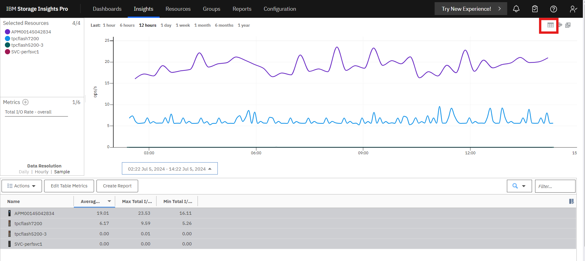
 Line
Graph (Default)
Line
Graph (Default)-
- The line graph visually represents storage system performance trends over time.
- The y-axis indicates the unit of measurement for each metric, while the x-axis represents time.
- Each line on the graph represents a metric and a storage system. For example, selecting two metrics and three storage systems will display six lines on the graph.
- To view a snapshot of performance information at a specific time, hover the mouse pointer over points on a line in the graph.
 Table Format
-
- The table displays performance information for the storage systems.
- Each row represents a storage system and a timestamp. For example, if a graph has six data points during the selected time range, there will be six rows for each storage system in the table.
- Each metric is displayed as a column in the table.
- To view additional metrics and information for a storage system, right-click anywhere in the header row of the table and select "extra column".
- Performance chart legend
- The bottom section of the performance view is a table that shows more information about the storage systems. Each row represents a storage system, and each column provides extra asset and performance information about the storage system.