Example: styling coach views
This example shows how to style individual coach views to change their appearance depending on whether users are viewing them on a web page or on a mobile device.
This example contains two sets of the same responsive controls that demonstrate how you can style the same control to appear different. In the first set, some of the style configurations optimize the controls for a web page. Some of the style configurations made to the second set optimize them for a mobile device, such as a smartphone.
The style configurations in the example use definitions in the IBM BPM Theme. These definitions control the look of any coach views that are use the theme. If your controls are using a different theme, they could look different depending on the differences between the two themes.
- Open the Process Designer and create a coach view. In the coach view, add the following
responsive controls:
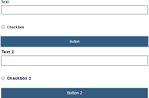
- Text
- Checkbox
- Button
- Text
- Checkbox
- Button
The coach view looks like this:

- Select the first Text control. In its configuration properties, expand the Style section and change the text size to Small. While the default size of Medium is fine, the smaller text lets you have more text on screen while preserving space. When you make the change, the label text shrinks. If you added placeholder text, the text inside the Text control also shrinks. In addition to changing the text size, the padding around the control changes as well. You can see the difference between small and medium text by looking at the two Text controls in the layout.
- Make the same changes to the first check box and the first button, changing the size of the text
to Small.
- Select the second Text control. In its configuration properties, expand the Style section and change the text size to Large. The larger text is easier to read on smartphones. However, you can use large text in a web page and small text in a smartphone if that is what your layout design requires.
- Select the second Checkbox control. In its configuration properties, expand the Style section and change the text size to Large. Since switches are generally easier to see and operate in a smartphone, change its Show as property to Switch.
- If it is defined as a switch, the Checkbox control typically uses a color to indicate which part of the switch is selected. By default, this is the Primary color, which the BPM Theme defines as a dark blue. Change the Switch on color property to Information to change it to the information color, which the BPM Theme defines as a light blue. In this case, this is only an aesthetic choice. However, you could choose to color the control based on the purpose of the control as an Information control, Success control, Warning control, or an Alert control.
- Select the second Button control. In its configuration properties, expand the Style section and
change the text size to Large and set the theme color type to
Success. In the layout, the coach view looks like this:

 and then set the text size for the controls to be small. Then you would set the layout to
the small screen size
and then set the text size for the controls to be small. Then you would set the layout to
the small screen size  and set the text size for the controls to be large. The final change to make is turn the
check box into a switch. Note that the color configuration options do not change when the screen
size changes. That is, a button with the success color is that color for all screen sizes. The
following screen captures show the one set of controls that change according to the screen
size:
and set the text size for the controls to be large. The final change to make is turn the
check box into a switch. Note that the color configuration options do not change when the screen
size changes. That is, a button with the success color is that color for all screen sizes. The
following screen captures show the one set of controls that change according to the screen
size:| Large screen size | Small screen size |
|---|---|
 |
 |