Themes reference
This reference section provides details about cascading style sheet (CSS) and hypertext markup language (HTML) fragments that you can customize for WebSphere® Service Registry and Repository themes.
Overview
A working knowledge of CSS and HTML is essential for the tasks involved. The WebSphere Service Registry and Repository (WSRR) web user interface (UI) is written using CSS 2.1 and XHTML 1.1, wherever possible, for standards compliance and browser compatibility. Inevitably, achieving browser compatibility results in some browser-specific settings in the CSS. These differences are highlighted. The use of a modern standards-compliant browser minimizes any problems encountered.
Page Layout
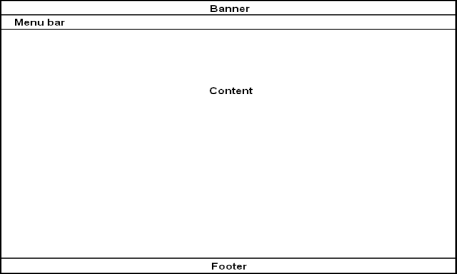
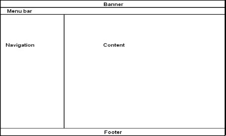
The web UI operates with two different layout styles:
Standard layout style with no navigation tree:
Banner and Footer
<div class="banner">
  <div class="bannerlogo" id="bannerlogo">
    <div class="bannerleft">
      <div class="bannerright"></div>
      <img src="theme/${currentTheme}/images/productLogo.png"
        alt="" id="webspherelogo"/>
      <img src="theme/${currentTheme}/images/productName.png"
        alt="<sr:message key='banner.wsrr.logo'/>"
        title="<sr:message key='banner.wsrr.logo'/>" id="productname"/>
      <img src="theme/${currentTheme}/images/companyLogo.gif"
        alt="<sr:message key='banner.IBM.logo'/>"
        title="<sr:message key='banner.IBM.logo'/>" id="ibmlogo"/>
    </div>
  </div>
  <div class="bannerbottom">
    <div class="bannerbottomleft"></div>
    <div class="bannerbottomright"></div>
  </div>
</div>- bannerlogo
- bannerleft
- bannerright
Keep the outer containing DIV, classed as banner or footer, to provide document containment and an additional selector for CSS style matching specifically for the banner and footer.
- bannerbottom
- bannerbottomleft
- bannerbottomright
Required images must be referenced from the currently active theme. To do this, the expression language (EL) variable currentTheme can be used as it is in the banner HTML fragment example above. For example, you specify the source location for an image as theme/${currentTheme}/images/productLogo.png which always resolves the image URL in the currently active theme.
Display text can either be given explicitly in the raw HTML or can be supplied in a resource bundle. To supply display text in a resource bundle you must load a UI resource JAR in WSRR that contains the resources you require to display. When the resource JAR is loaded you can then use the <sr:message> tag to place the Resource JAR in the HTML text. For further details about Resource JARs, see the related link.
Gutter
- The left gutter is defined in the body class
- The right gutter is defined in the gutters class
sr:message tag
| Attribute | Type | Description |
|---|---|---|
| arg0 | String | The first optional argument. |
| arg1 | String | The second optional argument. |
| arg2 | String | The third optional argument. |
| arg3 | String | The fourth optional argument. |
| key | String | The name of the key to find in the message bundle. |
| filter | Boolean | Whether to filter unsafe characters from the message value. |
| resourceBundle | String | The full name and path of the resource file as contained in the resource JAR. For example, com.ibm.sr.resources.MyResources would be given for a file called MyResources.properties contained in the directory com/ibm/sr/resources in the resource JAR. |
Perspective panel
The perspective panel overlay, including the logout link, on the right side of the banner is always present in the page and is set to overlay a blank part of the right side of the banner in the standard theme. If you need to reposition this panel, you must adjust the position information in the CSS class signoutcontainer.
Menu Bar
The menu bar is located below the banner area and provides space for the search box that is aligned to the opposite side of the menus. There are two menu bars present in every page; the perspective panel contains the second menu for the list of perspectives and uses the same basic styling as the primary menu bar.
- color
- border
- background
- padding
Navigation
You can show or hide the navigation tree area based on the user's preferences. This is achieved with a fixed-width DIV column present in the content area of the page and the use of the showLeftColumn.css and hideRightColumn.css files. The only change that you might make to either of these two files is to change the default width of 225 pixels. To adjust the navigation column width, change all occurrences of the dimension 225px with the new value, in pixels, in the files pageStyles.css and showLeftColumn.css, including the negative values.
Considerations for right-to-left (RTL) languages
In RTL mode, all elements on screen flow from right to left and are aligned to the right side of the browser window. Additionally, elements that have left or right positional association such as the navigation tree will be presented on the opposite side when in RTL mode. These changes are automatic and are based on the requested locale in the browser. Users who want to change the theme need to be aware of the existence of the RTL support even if the theme is not intended to be used with an RTL language.
CSS
| Section | Description |
|---|---|
| Consistency | Resets all browser default styles and provides core values inherited by all other elements. |
| Accessibility | Styles to hide the accessibility links from view. |
| Standard borders | Border settings for common HTML elements with borders. |
| Page structure | Defines all the column layouts. |
| Footer | Styles for the page footer. |
| Banner | Styles for the page banner. |
| Menu bar | Defines the appearance of the menu bars. |
| Search box | Styles for the search field. |
| Misc | Miscellaneous selectors. |
| Home page | Styles for the home page. |
| Graph view | Styles for the graph view. |
| Message boxes | Styles for inline message boxes. These are the panels that display messages at the top of most pages. |
| Portlets | Styles for portlets which are the main titled containers used in most web UI views. |
| Timer animation | Styles for the timer animation used in the graph view. |
| Detail view | Styles specific to the detail view and other pages that use the same types of layout. |
| Structural tables | Styles for tables that are used purely to aid in page layout. |
| Wizard table | Styles for wizard-based tables such as the query wizard. |
| Container divs | Styles for DIV elements used to contain sections of the page. |
| Auto-suggest | Styles for the auto-suggest list. |
| Tabs | Defines the appearance of tabs in tabbed views. |
| Buttons | Layout styles for all forms of buttons. |
| Drop shadow | Defines the drop-shadow effect as seen in the logon page. |
| Dojo template | Overrides for the styles provided in the default Dojo theme. |
| Date time widget | Styles for the date and time picker widget used in the business model creation wizard and the detail view. |
| Policy tree | Styles for the policy tree view. |
| Nav tree | Styles for the navigation tree. |
| Popups | Styles for hover popup panels. |
| Help console | Styles for the help console. |
Dimensions and measurements
Wherever possible, relative units such as em and ex, must be used to specify dimensions and measurement values. This ensures that font sizes will still appear to be in proportion with the spaces in the page when the text size is changed, either automatically by the choice of locale, or manually by the end user in the browser settings. Absolute units, such as px, pt, pc, cm, and mm, must be avoided except for things such as absolutely positioned items, borders and fixed-size elements such as images.
Fonts
The font family property is used very sparingly. The main value which is inherited by most HTML elements comes from the body tag. It is reinforced on inputs and tables for the same reason that the font size is repeated. Additionally, a non-proportional font is given for those elements that require it, pre and samp. This makes it very straightforward to change the master fonts for the whole UI.
Colors and backgrounds
You can apply foreground and background color to most HTML elements through CSS selectors. Adjusting the color scheme for the web UI involves finding the color and background-color properties in the pageStyles.css file as well as the implicit color statements in such items as border definitions.
background: url(../images/menu_grade.png) top left repeat-x;Browser-specific selectors
.ie6 .checkselection label {
  vertical-align: 50% !important;
}Dynamic CSS
| Variable | Type | Description |
|---|---|---|
| browserType | String | The type of browser currently being used. Possible
values:
|
| browserVersion | String | The major version of the current browser. |
| browserLocale | String | The locale the browser is currently operating in that is in the supported list of languages that WSRR is translated to. |
| browserPlatform | String | The operating system the browser is currently
running on. Possible values:
|
| fontMultiplier | String representation of a double | The adjustment factor applied to the font size to compensate for locale and platform. |
request.getParameter("<var_name>")Logon pages
- 1.The following include statement must be added as the first page
instruction:
This ensures that the correct page initialization takes place.<%@ include file="../../logonHeader.jsp" %> - 2.The form field inputs for user name and password must be left untouched. Any changes to the attributes on these fields might result in a complete inability to logon to the product. This includes the logic used for adjusting the display for when security is on or off.
- 3.The paragraph (p) element with the id of errormsg must remain in the page for the input validation messages to be presented to the user.
| Variable | Description |
|---|---|
| ${theme} | The name of the current logon theme. Used to reference images in the theme. |
| ${securityOn} | Determines whether security is enabled for the application server. It is a Boolean value. |