Cost/Asset Type Data and Donut Chart
Cost/Asset Type Data and Donut Chart
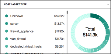
Use the Cost/Asset Type graph to view the highest-cost asset types in descending order by cost for the selected asset. By default, the chart displays Cost/Asset Type. Also by default, the total cost of all asset types is displayed in the center of the donut chart with the label Total. When only one asset type is selected, the associated value in the middle of the donut chart changes to that of the selected asset type. Use the scroll bar to view all of the assets in the list.
If there are more than 100 asset types, the 100 most costly assets are listed, and the remaining assets are grouped into a category called Other. If more than 100 asset types exist, look to the parenthesis beside Other to see the number of asset types combined in the category.
The Cost/Asset Type donut chart provides the following options to view cost by:
- Asset Type
- Asset Account
- Service Provider
- Tag Key
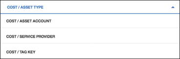
Selecting Cost Options
To select other cost options:
- Click the Cost/Asset Type heading.
- Click to select another cost option.
The color-coded list displays the highest-cost items in descending order and the total cost for all of the items in the center of the donut chart with the label Total.
In both the list and the donut chart, the darkest green color represents the highest-cost item and the lightest green represents the lowest-cost item.
When you mouse over a color in the donut chart, a text window displays data details. Clicking an item in either the list or the donut chart applies the selection across the dashboard and updates all of the graphs with the data for the selected asset.
Applying a Local Filter to a Cost
To apply a local filter:
- Click to select a list item or a color in the donut chart. When you apply a local filter, the dashboard is updated to show data for only the applied filter.
- Click the item again to remove the filter. Any global filters applied are reflected in the dashboard and remain intact.