As most UI developers know, a grid is an effective way to display data. The EGL Rich UI DataGrid widget is introduced in RBD 8.0.1 as a powerful way to display data, plus enable common data handling in an effective and efficient manner. DataGrid inherits most APIs of the previous Grid widget such as behaviors. Additionally, a lot of powerful features are built into DataGrid. Let's have a quick survey of the new features using a diagram.
Built-in Properties
DataGrid adds several useful built-in properties; most are shown in the visual editor's Properties view. If you click on the DataGrid in Design pane of visual editor, you can find the DataGrid specific properties in the "General" tab of properties view to control the grid's header, button bar, sorting, and checkbox column.
Some new features
- DataGridColumn: You can specify the name, displayName, width and alignment of a column within the DataGrid.
- Column drag and drop: Initially, the order of the DataGridColumn elements determines the order in which the columns are displayed. Simply, drag and drop a column to reorder it.
- Alignment: You can specify the header alignment and column alignment separately. Left alignment is the default.
- Formatter: Data can be formatted in different ways. Using formatter, you can even have a calculated column which is computed on the fly versus being part of a record.
- Selection: You can select a row in the DataGrid by clicking on it. DataGrid supports single selection, multiple selection, or you can disable the selection. You can also select a row or all rows by invoking a function in the EGL source code.With selectionListener, you can define a callback function after a row is selected in the DataGrid. By calling getSelection(), you can determine what rows are currently selected.
- Checkbox column: A DataGrid can have a checkbox column, with built-in functions to check and uncheck all rows. The checkbox selection is separate from the row selection. Similar to row selection, checkbox selection supports listeners, and getChecked() to determine rows where the checkbox is checked.
- Sorting: The DataGrid widgets provides built-in sorting for primitive types including boolean, int, string, etc. as well as the sort order (up / ascending or down / decending). DataGrid also provides sorting listeners which will invoke after a column is sorted. You can define functions for a specific column by implementing own comparator behavior.
- Paging & Scrollbar: If the amount of data is larger than the page size (which defaults to 10), a DataGrid provides paging function by default. You'll want ensure the showButtonBar property is set to true to see the paging buttons, or provide your own paging widgets using the paging API. If you prefer scrolling through data over paging, set the showScrollbar property to true.
- EditorBehavior: You can control the widgets that are placed in each cell of the DataGrid.
- DataLoader: You can provide a delegate to load part of the data from different data sources such as files, database etc and cached. By default, data will all be loaded at once.
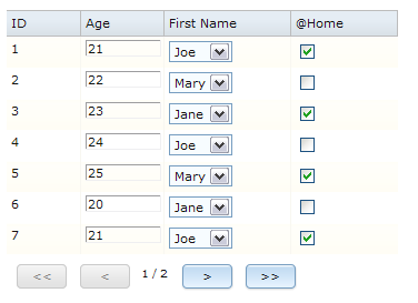
In this example DataGrid, the scrollbar is disabled so it defaults to paging the data. Data can be edited inline, and a checkbox column is used.
This blog has covered just some of the functionality of the new DataGird. For more information, please refer to the
Rich UI DataGrid page of the RBD information center.We hope you try out this new DataGrid widget in your Rich UI applications! We think it has a lot of useful features. If you have ideas for improving the DataGrid, add a comment to this blog post and let us know!
Ji Yong Huang