Cumulative Gains and Lift Charts
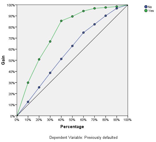
The cumulative gains chart shows the percentage of the overall number of cases in a given category "gained" by targeting a percentage of the total number of cases. For example, the first point on the curve for the Yes category is at (10%, 30%), meaning that if you score a dataset with the network and sort all of the cases by predicted pseudo-probability of Yes, you would expect the top 10% to contain approximately 30% of all of the cases that actually take the category Yes (defaulters). Likewise, the top 20% would contain approximately 50% of the defaulters, the top 30% of cases would contain 70% of defaulters, and so on. If you select 100% of the scored dataset, you obtain all of the defaulters in the dataset.
The diagonal line is the "baseline" curve; if you select 10% of the cases from the scored dataset at random, you would expect to "gain" approximately 10% of all of the cases that actually take the category Yes. The farther above the baseline a curve lies, the greater the gain. You can use the cumulative gains chart to help choose a classification cutoff by choosing a percentage that corresponds to a desirable gain, and then mapping that percentage to the appropriate cutoff value.
What constitutes a "desirable" gain depends on the cost of Type I and Type II errors. That is, what is the cost of classifying a defaulter as a non-defaulter (Type I)? What is the cost of classifying a non-defaulter as a defaulter (Type II)? If bad debt is the primary concern, then you want to lower your Type I error; on the cumulative gains chart, this might correspond to rejecting loans to applicants in the top 40% of pseudo-predicted probability of Yes, which captures nearly 90% of the possible defaulters but removes nearly half of your applicant pool. If growing your customer base is the priority, then you want to lower your Type II error. On the chart, this might correspond to rejecting the top 10%, which captures 30% of the defaulters and leaves most of your applicant pool intact. Usually, both are major concerns, so you have to choose a decision rule for classifying customers that gives the best mix of sensitivity and specificity.
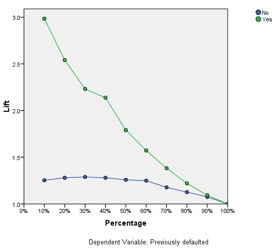
The lift chart is derived from the cumulative gains chart; the values on the y axis correspond to the ratio of the cumulative gain for each curve to the baseline. Thus, the lift at 10% for the category Yes is 30%/10% = 3.0. It provides another way of looking at the information in the cumulative gains chart.
Note: The cumulative gains and lift charts are based on the combined training and testing samples.