 Table Layout, Table Layout Row, and Table Layout Cell
controls
Table Layout, Table Layout Row, and Table Layout Cell
controls
These controls are sections that are meant to include other controls within them so that those controls are displayed in a table-like structure.
With the Table Layout, Table Layout Row, and Table Layout Cell controls, you can produce an HTML
table.
Note: Those controls are different from the Table and Service Data Table controls.
The Table Layout Row and Table Layout Cell do not have any configuration options. Instead, you
can use the colspan and rowspan HTML attributes to specify how a
table layout cell control is displayed in a table layout. For these controls, you must use the same
structure as in an HTML table:
- Table Layout Row controls are placed inside a Table Layout control.
- Table Layout Cell controls are placed inside Table Layout Row control.
Note: The layout of these controls is not WYSIWYG in the web Process Designer.
Configuration properties
Set or modify configuration properties for the Table Layout control in the Configuration properties tab.- Screen size
- A configuration property that has the Screen Sizes icon
 beside the property name can have different values for each screen size. If you do not set
a value, the screen size inherits the value of the next larger screen size as its default value. If
you are using the Process Designer desktop editor,
you are setting the value for the large screen size. The other screen sizes inherit this value.
beside the property name can have different values for each screen size. If you do not set
a value, the screen size inherits the value of the next larger screen size as its default value. If
you are using the Process Designer desktop editor,
you are setting the value for the large screen size. The other screen sizes inherit this value.
- Theme definitions
- Theme definitions specify the colors and styles for a control and determine the appearance of the control. You can preview the look and feel of controls in the theme editor. See Themes.
The Appearance configuration properties for the Table Layout control are shown in the following table:
| Appearance configuration property | Description | Data type |
|---|---|---|
| Border spacing | Specifies the spacing between cells in pixel units. | String |
| Border collapse | Specifies one of the following setting for space between the cells:
|
String |
Example
To display two Text controls in a table structure:
- Add a Table Layout control.
- Insert a Table Layout Row control within the Table Layout control.
- Insert two Table Layout Cell controls within the Table Layout Row control.
- Insert one Text control in each Table Layout Cell control.
- Optionally, set Border spacing property to 25, and the Border collapse property to Separate to add space between the cells.
You can also use multiple Table Layout Row and Table Layout Cell controls within a Table Layout
control, and use the colspan and rowspan HTML attributes to make
cells span over more than one column or row. For example: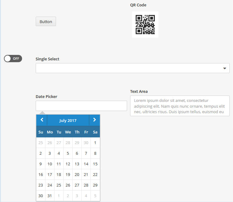
- Add a Table Layout control.
- Insert three Table Layout Row controls within the Table Layout control.
- Insert three Table Layout Cell controls within the first Table Layout Row control that you added in step 2.
- Insert one Table Layout Cell controls within the second Table Layout Row control that you added in step 2.
- Insert two Table Layout Cell controls within the third Table Layout Row control that you added in step 2.
- In the HTML attributes of the first cell in the first row, add the attribute rowspan, set it to 3, and insert a Switch control within the cell.
- Insert a Button control within the second cell of the first row.
- Insert a QR Code control within the third cell of the first row.
- In the HTML attributes of the cell of the second row, add the attribute colspan, set it to 2, and insert a Single Select control within the cell.
- Insert a Date Picker control within the first cell of the third row.
- Insert a Text Area control within the second cell of the third row.
Methods
For detailed information on the available methods for the Table Layout, Table Layout Row, and Table Layout Cell controls, see the Table Layout, the Table Layout Row, or the Table Layout Cell JavaScript documentation.
Additional resources
For information about how to create a coach, see Building coaches.
For information about standard properties
(General, Configuration,
Positioning, Visibility, and HTML
Attributes), see Coach view properties.
Parent topic: Controls in the BPM UI toolkit
Controls in the BPM UI toolkit