Radio Buttons control (deprecated)
This control creates a group of radio buttons from which the user can select one. The radio buttons in the group derive from the list provided by the data binding or the selection service or a union of both lists.
Tip: The deprecated Radio Buttons control is replaced with the responsive
Radio Button control in the Responsive Coaches toolkit. See Radio Button control.
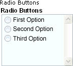
When you add a Radio Button control to a coach or coach view, it has default values. At
design time, its appearance depends on whether you are using the web editor or the desktop editor in
Process Designer.| Process Designer desktop editor | Process Designer web editor |
|---|---|
 |
 |
Restrictions and limitations
None
Data binding
Set the data binding for the control in the General properties tab.| Binding description | Data type |
|---|---|
| Sets the initial selection and then contains subsequent selections | ANY (List) |
Configuration properties
Set or modify control configuration in the Configuration properties tab.- Screen size
- A configuration property that has the Screen Sizes icon
 beside the property name can have different values for each screen size. If you do not set
a value, the screen size inherits the value of the next larger screen size as its default value. If
you are using the Process Designer desktop editor,
you are setting the value for the large screen size. The other screen sizes inherit this value.
beside the property name can have different values for each screen size. If you do not set
a value, the screen size inherits the value of the next larger screen size as its default value. If
you are using the Process Designer desktop editor,
you are setting the value for the large screen size. The other screen sizes inherit this value.
| Configuration property | Description | Data type |
|---|---|---|
| Selection Service | Identifies the service that is
called using Ajax to dynamically return a list of options to display as radio buttons. You can use
the selection service input text option to identify the specific list that the service
returns. The default value is Default Selection Service, which serves as a template for the selection service implementation that you must provide. |
Service
|
| Selection List | Identifies the list that contains options to show as radio buttons. | SelectionType |
| Selection Service Input Text | Provides the text to send to the selection service as input. For example, if the selection service contains named lists, enter the name of the list that you want. | String |
| Display Name Property | For data objects in selection lists
that are not String or NameValuePair types, specify which property
to use as their display names. The default value is name.
For example, if you have a business object with parameters called field1 and field2, and you want to use field2 as the display name, enter field2 or set this property to a variable that contains "field2" as a string. The default value is name. |
String |
| Disable Sorting | Specifies whether to display the radio buttons sorted alphabetically by label
or by the order in which they appear in the list. The default value is not selected (False). |
Boolean |
| Layout |
Specifies whether the radio buttons stack vertically or align
horizontally. The default value is Vertical. |
RadioButtonsOrientation |